Remember those stark white walls? The ones that felt a bit like living inside a hospital waiting room or a very expensive apple store? Yeah, they’re gone. If you’ve walked through a home renovation show or scrolled past a designer’s portfolio lately, you’ve probably noticed something different. The air feels warmer. The colors feel heavier, richer, more alive. We are finally saying goodbye to the "Millennial Grey" and the cold, crisp Modern Farmhouse aesthetic that held a tight grip on our interiors for the better part of a decade. It was fun while it lasted, sure, but let’s be honest—it lacked soul.
In 2026, the design landscape isn’t just changing; it’s breathing. There is a profound shift happening, one that prioritizes how a space makes you feel over how it looks on a perfectly lit Instagram feed. Homeowners and designers alike are turning outward, looking to forests, riverbanks, and sun-dried clay for inspiration. It’s not just about painting a wall green. It’s about creating environments that support mental wellness, offer emotional comfort, and connect us back to the natural world we spend so much time disconnected from. This isn’t a fleeting trend. It’s a correction. A return to basics. And it’s beautiful.
The End of Cold Minimalism
For years, we were told that less was more. That clean lines and neutral, cool-toned palettes were the height of sophistication. But somewhere along the line, "sophisticated" started feeling a lot like "sterile." The data backs this up too. Recent reports from design hubs indicate a massive drop in searches for pure whites and greys, replaced by queries for "warm neutrals," "earthy tones," and "cozy spaces." People are tired of coming home to spaces that feel empty. They want spaces that hug them.
This shift away from cold minimalism is driven by a desire for longevity. Virality is exhausting. Chasing the next big color trend every six months is expensive and emotionally draining. In 2026, the focus is on schemes that work across renovations and stand the test of time. Nature-derived colors do exactly that. They don’t shout for attention. They settle in. A deep terracotta or a smoky sage doesn’t feel dated because it’s been around since the earth cooled. By choosing these hues, homeowners are making a statement that they value substance over style, comfort over coolness. It’s a permanent design shift, not a seasonal fling.
Think about the psychological impact. Cool tones can be energizing, sure, but they can also be anxiety-inducing if overused. Warm, nature-inspired palettes lower the heart rate. They signal safety. When you walk into a room painted in soft, muddy greens or warm beiges, your shoulders drop. You exhale. That’s the power of biophilic design. It’s not just decoration; it’s regulation. And in a world that feels increasingly chaotic, having a home that acts as a regulatory device is pretty much essential.
The Core Earth Tones of 2026
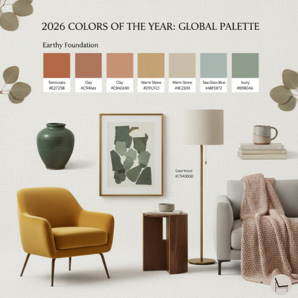
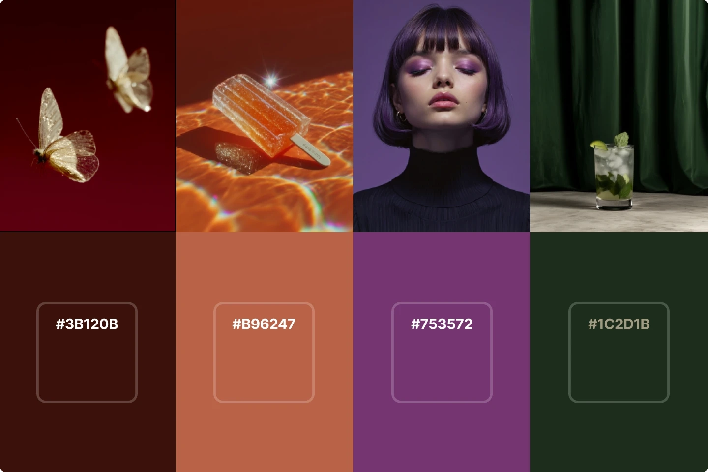
So, what exactly does this palette look like? If you had to paint a picture of 2026’s favorite colors, you’d start with the ground beneath your feet. The core of this movement is built from nature’s own neutral family. We aren’t talking about bright, primary colors here. We are talking about the subtle, complex hues you see on a walk through an old-growth forest or along a dried-up riverbed in late summer. These are colors with history. Colors with texture.
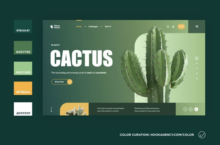
Terracotta is having a major moment. But not the bright, orange-heavy version from the 90s. This is deeper, redder, almost burnt. It’s grounding. It brings a sense of warmth that radiates through a room, especially when paired with natural light. Then there are the greens. Not lime, not emerald, but smoky greens. Think of moss on a north-facing stone. Or dried eucalyptus leaves. These greens are muted, sophisticated, and incredibly versatile. They act as neutrals, bridging the gap between warm and cool without committing fully to either.
Don’t forget the browns and beiges, either. But again, these aren’t the flat, boring beiges of the past. These are rich, chocolatey browns and sandy, sun-bleached beiges. They provide a backdrop that allows other elements—like wood grain, woven textiles, or plants—to shine. The key is variation. A monochromatic room in 2026 isn’t one single shade; it’s five different shades of the same earth tone, layered to create depth and interest. It’s messy in the best possible way. It feels lived-in. Real.
Biophilic Exteriors: Bringing the Outside In
It’s not just inside the house where this change is happening. Step outside, and you’ll see the same story playing out on siding, trim, and front doors. The exterior renovation season of 2026 has been defined by a move toward biophilic painting. Homeowners are realizing that their homes don’t need to stand out against the landscape; they need to belong to it. The stark white boxes of the suburbs are being repainted in hues that mimic the surrounding environment.
This is particularly evident in areas with strong natural features. In wooded regions, you’re seeing more homes painted in deep charcoals and forest greens, allowing the structures to recede into the tree line. In arid, sunny climates, stucco and siding are shifting toward warm sands, clays, and pale ochres. It’s a respectful approach to architecture. It acknowledges that the land was here first. By choosing these palettes, homeowners are creating a visual harmony between their property and the planet. It’s soothing to look at, both for the resident and the passerby.
There’s also a practical side to this. Darker, earth-toned exteriors often hide dirt and weathering better than pristine whites. They age gracefully. A white house looks dirty after a rainstorm; a taupe or olive house just looks wet. This low-maintenance aspect appeals to the modern homeowner who wants beauty without the constant upkeep. Plus, these colors tend to absorb and reflect light in ways that highlight architectural details rather than flattening them. Shadows play differently on a textured, earth-toned surface. It adds drama. Depth. Character.
The Nature-Tech Fusion
Here is where it gets interesting. While we are craving nature, we aren’t abandoning technology. We live in a digital world, after all. The second major direction for 2026 is what experts are calling the "Nature-Tech" palette. It sounds contradictory, right? Nature and tech? But it actually makes perfect sense. This palette represents the tension and harmony between ecological grounding and technological acceleration. It’s for the person who meditates in the morning and codes in the afternoon.
The Nature-Tech palette fuses natural tones with soft, digital-inspired colors. Think of the glow of a screen at night, but softened. Lavenders that lean towards grey. Blues that have a slight electric hum but are muted enough to feel calm. These colors acknowledge our digital lives without letting them dominate our physical spaces. They are bridges. They help transition the eye from the organic textures of wood and stone to the sleek surfaces of laptops and smart home devices.
This fusion is crucial for mental balance. Pure nature palettes can sometimes feel too rustic or disconnected from modern life for some people. Pure tech palettes feel cold and alienating. The Nature-Tech blend offers a middle ground. It’s futuristic but friendly. Innovative but rooted. You might see this in a home office where a wall of soft, digital blue meets a desk of raw walnut. Or in a living room where a sage green sofa sits under a smart lighting system that mimics the circadian rhythm. It’s about integration. Making peace with the tools we use while staying connected to the world we inhabit.
Emotional Neutrals and Mental Wellness
Let’s talk about feelings. Because that’s really what this is all about. The 2026 color forecast is heavily focused on "emotional neutrals." These are colors that don’t just sit there; they do work. They support mental wellness. In a post-pandemic world, where many of us spent unprecedented amounts of time indoors, the quality of our indoor environment became a health issue. We learned that our surroundings affect our mood, our productivity, and our sleep.
Emotional neutrals are designed to reduce cognitive load. They are easy on the eyes. They don’t demand interpretation. When you enter a space painted in these hues, your brain doesn’t have to work hard to process the visual information. This creates a sense of calm. It allows for rest. For creativity. For connection. Designers are prioritizing these schemes because they know that a home should be a sanctuary, not a stimulus.
This is also why we’re seeing a rise in countryside vibes and vintage-inspired decor alongside these palettes. There’s a nostalgia at play. A longing for simpler times. Slower paces. The colors evoke memories of grandmothers’ kitchens, of summer holidays, of quiet afternoons. They trigger positive emotional responses. It’s subconscious, sure, but it’s powerful. By wrapping ourselves in these hues, we are literally wrapping ourselves in comfort. It’s self-care through paint. And honestly? We could all use a bit more of that.
Okay, so you’re convinced. You want to ditch the grey. You want to bring the outside in. But where do you start? It can be overwhelming. The key is to start small. Don’t repaint the whole house in a day. Pick one room. One wall. See how the light hits it. Remember, these colors are chameleons. They change throughout the day. A smoky green might look blue in the morning and brown in the evening. That’s the point. It’s dynamic.
First, look at your existing furniture and flooring. Work with what you have. If you have cool-toned floors, lean into the cooler earth tones like slate blues and mossy greens. If you have warm wood floors, embrace the terracottas, sands, and ochres. This ensures cohesion. Next, think about lighting. Natural light is your best friend here. These palettes thrive in daylight. If a room is dark, choose lighter shades of the earth tones to keep it from feeling cave-like. If a room is bright, you can go darker and moodier.
Finally, layer textures. Color alone isn’t enough. The nature-inspired look relies on tactile experiences. Pair your painted walls with linen curtains, wool rugs, wooden bowls, and ceramic vases. Let the materials speak to each other. The roughness of the wood complements the smoothness of the paint. The softness of the textile softens the hardness of the wall. It’s about creating a sensory experience. And don’t be afraid of imperfection. Hand-thrown pottery, slightly uneven plaster, visible brush strokes. These things add humanity. They make the space yours.
In the end, the dominance of nature-inspired palettes in 2026 is more than just a design trend. It’s a reflection of where we are as a society. We are seeking grounding. We are seeking comfort. We are seeking a connection to something larger than ourselves. By bringing these colors into our homes, we are creating spaces that nurture us. Spaces that allow us to breathe. And isn’t that what a home is supposed to do? So go ahead. Pick up that brush. Choose that earthy hue. Your walls will thank you. And so will you.