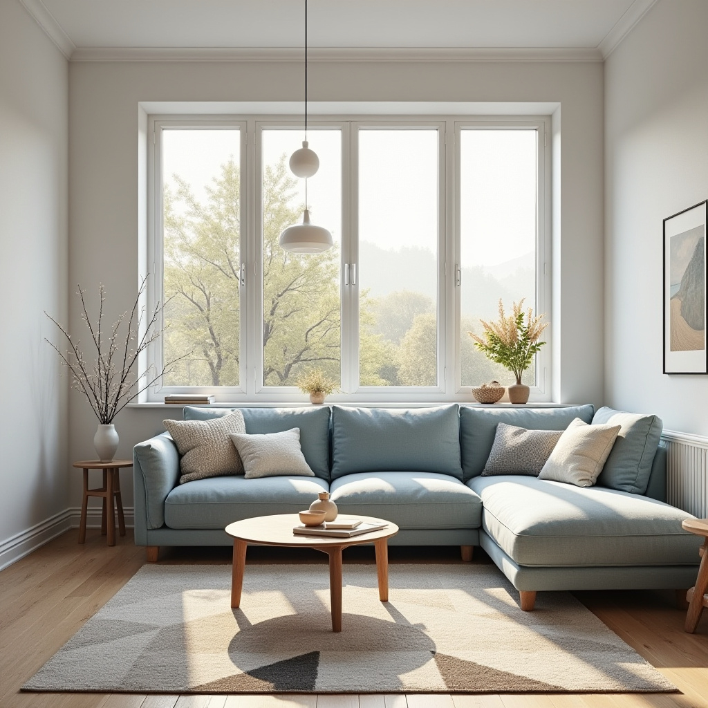
Remember that feeling when you walk into a room and just… exhale? It’s not magic. It’s color. For years, we’ve been chasing the perfect crisp white or that cool, detached gray that looked great on Instagram but felt like a hospital waiting room in real life. We’re done with that. Seriously. The exhaustion with sterile aesthetics has hit a breaking point, and thank goodness for it. In 2026, our homes aren’t just showrooms; they are sanctuaries. They need to hold us.
This year is about longevity over virality. It’s about choosing hues that don’t just look good for a season but feel right for a lifetime. We are seeing a massive shift away from the cold tones of the early 2020s toward schemes that are warm, grounded, and deeply connected to the natural world. It’s a scientifically backed return to colors that actually lower your cortisol levels and boost serotonin. Imagine that. Paint that makes you happier. It’s not just about trends; it’s about biology. It’s about creating a space that whispers rather than shouts.
So, how do you navigate this shift without getting overwhelmed by the endless swatches at the hardware store? It starts with understanding that "modern" no longer means "minimal." Modern in 2026 means soulful. It means layered. It means letting go of the fear of color and embracing the comfort of warmth. Whether you are renovating an old Victorian or refreshing a suburban split-level, the principles remain the same. You want depth. You want character. You want a home that feels lived-in from day one. Let’s dive into how you can master this new, comforting palette.
The Great Warmth Shift: Goodbye Cool Gray, Hello Living Neutrals
Let’s address the elephant in the room: gray is out. Well, not entirely, but the cool, blue-based grays that dominated the last decade are definitely taking a backseat. In their place? Warm neutrals that have actual temperature. Think creams, beiges, taupes, and soft browns. These aren’t the muddy colors of the past; they are sophisticated, complex, and incredibly versatile. Designers are calling them "colors with soul" because they introduce a sense of history and comfort that stark white simply cannot achieve.
Why the change? It’s largely psychological. We spend so much time looking at screens—cold, bright, blue-light-emitting devices—that our eyes and brains crave the opposite when we log off. Warm neutrals mimic the light of sunset or the glow of candlelight. They soften the edges of a room. When you paint a wall in a rich, warm beige, it doesn’t just sit there; it interacts with the light in the room, changing subtly from morning to night. This dynamism makes a space feel alive. It creates a connection between the inhabitant and the environment.
Practically speaking, this shift makes decorating easier. Warm neutrals are the ultimate team players. They don’t clash with wood tones (in fact, they enhance them). They provide a cozy backdrop for both vintage finds and modern furniture. If you are worried about your space looking too monochromatic, remember that texture is your best friend. A warm cream wall looks vastly different next to a chunky wool rug than it does next to sleek leather. Layering these textures within a neutral palette creates the depth and interest that used to require bold accent walls. It’s subtle, but it’s powerful.
Grounding Greens: Bringing the Outdoors In Without the Cliché
If there is one color family defining 2026, it’s green. But forget the neon lime or the dark, moody forest greens of previous trends. The greens of 2026 are soft, muted, and incredibly grounding. We’re talking about sage, olive, moss, and tranquil teal. These shades bridge the gap between neutral and color, offering the calmness of nature without the heaviness of a dark jewel tone. They are restorative. They remind us of slow walks in the park and the quiet stillness of a garden at dawn.
The appeal here is biophilic design, which is just a fancy way of saying we feel better when we are connected to nature. Studies have shown that green hues can reduce anxiety and improve focus. In a post-pandemic world where the home office is still a reality for many, this is crucial. A soft sage green in a study area can help clear the mind. A muted olive in the living room can encourage relaxation. It’s not just about aesthetics; it’s about function. These colors work hard to support your mental wellness.
Incorporating green doesn’t mean you have to paint every wall. Start small. Try a powder room in a deep, earthy moss. Or use a soft teal as an accent behind a bed headboard. The key is to pair these greens with natural materials. Think linen curtains, rattan baskets, and stone countertops. When you combine soft greens with organic textures, you create a seamless flow between the interior and the exterior. It blurs the lines. It makes the outside feel like it’s coming in, which is exactly the vibe we are chasing this year. It’s calming, confident, and undeniably fresh.
The New Jewel Tones: Depth, Drama, and Creativity
While neutrals and greens are the backbone of the 2026 palette, there is a growing appetite for richness. We are seeing a resurgence of jewel tones, but they are being used differently. Instead of overwhelming a room, they are being used to add dimension and creativity. Think mellow reds, burnt oranges, and deep plums. These aren’t the bright, primary colors of the mid-century modern era. They are subdued, almost dusty versions of themselves. They feel aged and wise.
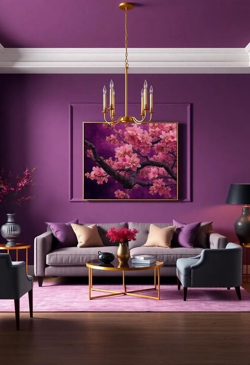
These saturated hues invite us to rethink how we use color in everyday spaces. A terracotta wall in a kitchen doesn’t just look nice; it stimulates appetite and conversation. A deep plum in a library creates a sense of intimacy and focus. These colors add weight to a room. They anchor the space. In a world that often feels fleeting and digital, these heavy, rich colors feel permanent. They have gravity. They tell a story of tradition and craftsmanship, even if the furniture is brand new.
The trick to mastering jewel tones in 2026 is balance. You don’t need to go full maximalist. One accent wall is often enough. Or, consider painting the ceiling. A soft, mellow red on the ceiling can make a high-ceilinged room feel cozier and more enclosed. It’s unexpected but incredibly effective. Pair these rich colors with plenty of light-reflecting surfaces, like mirrors or metallic fixtures, to keep the room from feeling too dark. The goal is to create pockets of drama within a generally calm environment. It’s about contrast. It’s about surprise.
Emotional Impact: Choosing Colors That Lower Cortisol
We mentioned earlier that color affects our biology, but let’s dig deeper into that. The 2026 trend is heavily influenced by the desire for mental wellness. We are tired. We are stressed. Our homes need to be the antidote. This is why we are seeing such a strong move toward colors that are proven to lower cortisol, the stress hormone. Warm whites, soft blues, and earthy browns all play a role in this. They signal safety to our primitive brains. They tell us we can rest.
When choosing your palette, ask yourself: How do I want to feel in this room? If it’s a bedroom, you probably want tranquility. Soft, cool-leaning neutrals or pale blues work well here. If it’s a kitchen, you might want energy and warmth. Terracotta or golden yellows can provide that lift. Don’t just pick a color because it’s trendy. Pick it because it serves a purpose. This intentional approach to color selection is what separates a designed home from a decorated one. It’s about aligning your environment with your emotional needs.
This also means being mindful of lighting. Natural light changes how a color feels. A color that looks calming in the morning might look dreary in the evening. Test your samples at different times of day. Watch how the shadow moves across the wall. Does it still feel good? Does it still feel safe? If not, adjust. Maybe you need a warmer undertone. Maybe you need a lighter shade. Listen to your gut. Your emotional response to a color is the most important data point you have. Trust it.
Creating Flow: Cohesion Across Different Rooms
One of the biggest challenges in home design is making sure the whole house feels connected. You don’t want to walk from a warm beige living room into a cool blue kitchen and feel like you’ve entered a different universe. Disjointed spaces create visual noise, which adds to stress. In 2026, the goal is flow. You want a narrative that threads through every room. This doesn’t mean every room has to be the same color. Far from it. It means using a consistent underlying tone or palette family.
Start with a main neutral that appears in most of your common areas. This could be a warm white or a soft taupe. Use this as your canvas. Then, introduce variations in the private spaces. The bedrooms might lean into softer greens, while the dining room might feature a richer earth tone. Keep the undertones consistent. If your main neutral has yellow undertones, make sure your accent colors also have warm undertones. Clashing undertones are what make a space feel chaotic. Harmonious undertones create peace.
Another tip for cohesion is to repeat colors. If you have a specific shade of olive green in your living room pillows, echo that same green in the artwork in the hallway or the vase on the kitchen counter. These small repetitions create a subconscious link between spaces. They guide the eye. They make the home feel curated and thoughtful. It’s like a melody that repeats throughout a song. You might not notice it immediately, but you feel the unity. It ties everything together.
Okay, so you have your palette. Now what? The execution is where things often go wrong. The biggest mistake people make is trusting the tiny paint chip. Those little squares are deceiving. They are too small to give you a true sense of how the color will look on a large surface. Always buy sample pots. Paint a large swatch (at least 2×2 feet) on the wall. Live with it for a few days. Watch it in the rain, in the sun, and under your artificial lights at night.
Lighting is critical. LED bulbs come in different color temperatures, usually measured in Kelvin. A 3000K bulb will cast a warm, yellow light, which will enhance warm neutrals. A 4000K bulb is cooler and whiter, which might make your warm beige look pink or washed out. Choose your bulbs carefully. In 2026, designers recommend sticking to 2700K-3000K for living spaces to maintain that cozy, warm atmosphere. Don’t let cheap lighting ruin your expensive paint job. It’s a simple fix that makes a huge difference.
Finally, don’t forget texture. Color looks flat on a smooth wall. But add some plaster, some wood grain, some fabric, and suddenly the color has life. In 2026, we are seeing a lot of limewash paints and textured finishes. These add depth and movement to the color. They catch the light in interesting ways. Even if you stick to standard paint, you can achieve this effect through your furnishings. A nubby wool throw, a smooth ceramic lamp, a rough jute rug. Mix it up. Let the color interact with the materials. That’s where the magic happens. That’s how you get a home that feels truly yours.
Wrapping all this up, the 2026 color palette is really an invitation to slow down. It’s a rejection of the fast, disposable aesthetic that has dominated design for so long. It’s about choosing colors that nurture you. Colors that age well. Colors that feel like a hug. Whether you go for warm neutrals, grounding greens, or rich jewel tones, the key is intention. Think about how you want to live. Think about how you want to feel. Then, let the color follow.
It’s not about following rules. It’s about breaking the ones that don’t serve you. If you love gray, keep it, but warm it up. If you hate green, skip it. There is no police force coming to check your swatches. The only opinion that matters is yours. But if you are feeling stuck, lean into the warmth. Lean into nature. You won’t regret it. Your home will thank you. And honestly? So will you.