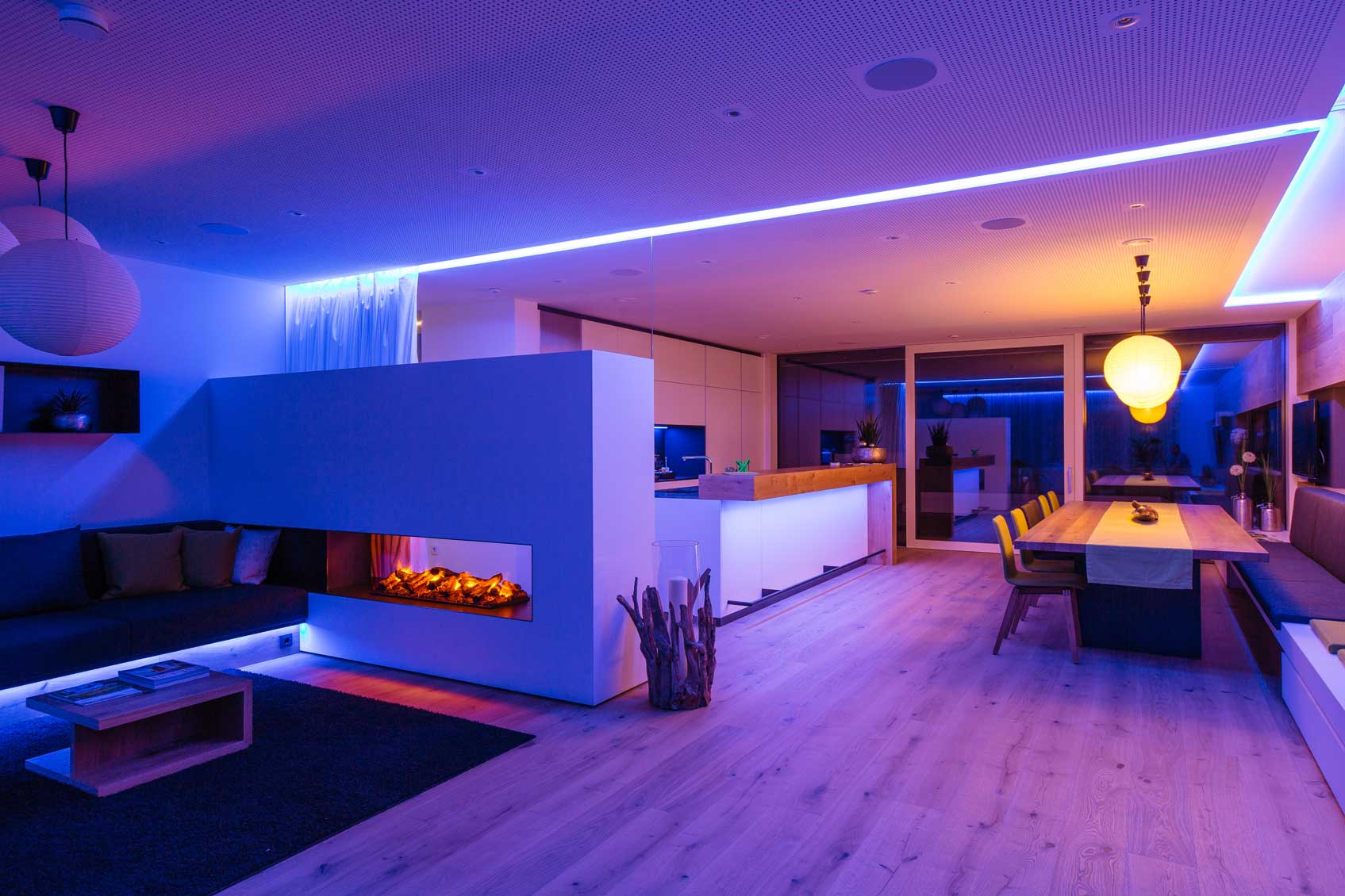
Ever walked into a friend’s house and felt an instant sense of calm? You couldn’t quite put your finger on why, but everything just felt right. Chances are, it wasn’t magic. It was color. Or rather, the lack of chaotic color. In 2026, our homes have become more than just places to sleep; they are sanctuaries, offices, gyms, and social hubs all rolled into one sprawling, wall-less expanse. The open concept floor plan is still king, dominating new builds and renovations alike. But with great openness comes great responsibility. Specifically, the responsibility of making sure your kitchen doesn’t clash with your living room while you’re trying to enjoy your morning coffee.
It’s tricky, isn’t it? Without walls to act as natural breaks, your eyes travel uninterrupted from the fridge to the sofa to the dining table. If the colors fight each other, the whole space feels anxious. But get it right, and you create a visual symphony that makes your home feel larger, brighter, and infinitely more inviting. You don’t need a degree in interior design to pull this off. You just need a little bit of strategy and a willingness to trust your gut. Let’s dive into how you can master the art of color flow without losing your mind or your budget.
Start With a Strong Neutral Foundation
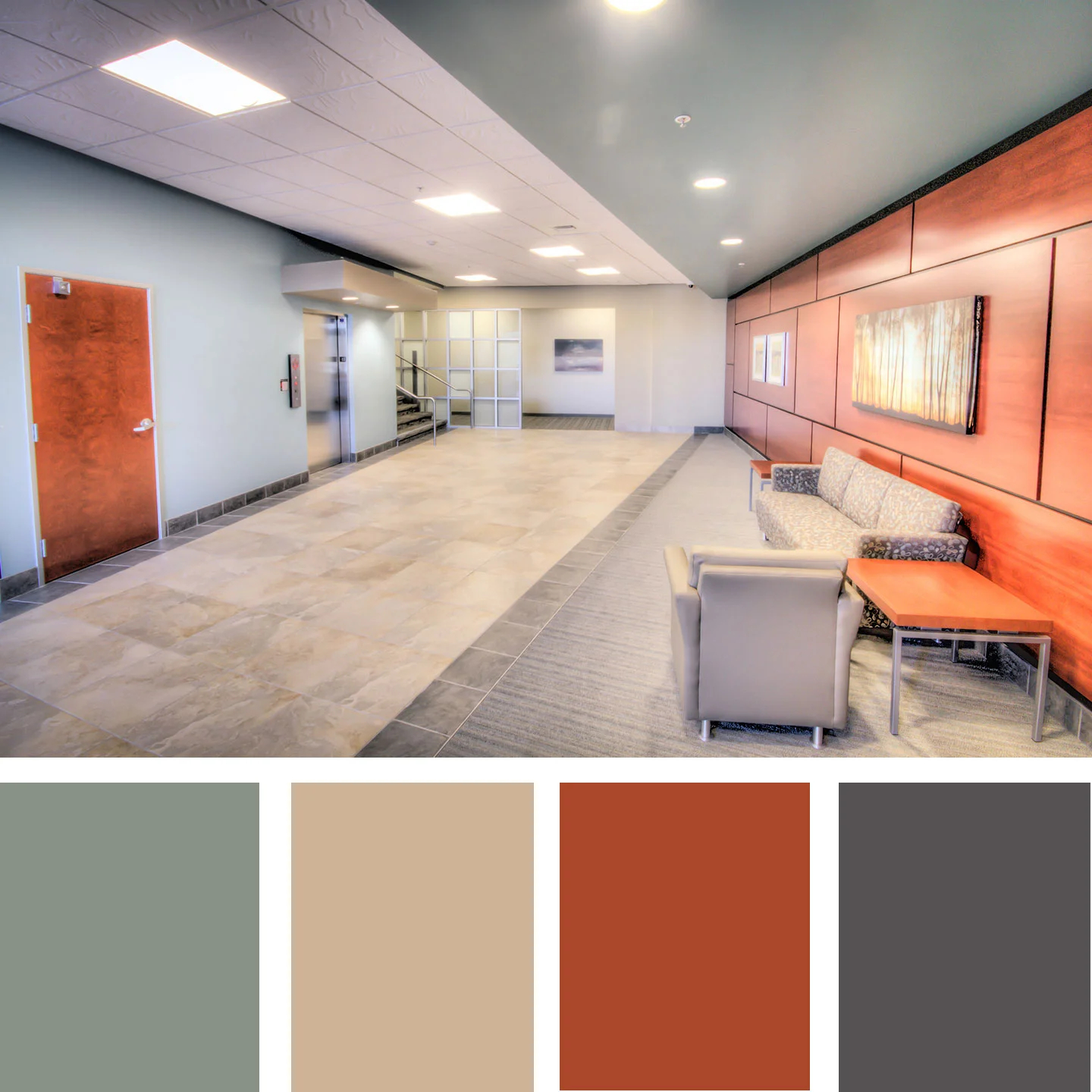
Think of your neutral base as the canvas for your masterpiece. In an open concept home, this isn’t just a suggestion; it’s practically a rule. Most designers in 2026 agree that picking one primary neutral for about 60-70% of your wall space creates an immediate sense of unity. This doesn’t mean you’re stuck with boring beige, though. The definition of "neutral" has expanded wildly. We’re talking warm whites, soft greiges, earthy taupes, and even muted sage greens that act as neutrals because they pair with almost anything.
When you choose this main color, test it in different lights. Morning light is cool and blue-toned, while evening light is warm and golden. A color that looks crisp at noon might look muddy at dusk. Paint large swatches on multiple walls—especially where rooms connect—and live with them for a few days. Once you’ve locked in that foundational hue, you’ve created a backdrop that allows your furniture, art, and accessories to shine without competing for attention. It’s the glue that holds the disparate zones together.
Define Zones With Subtle Shifts
Just because you want cohesion doesn’t mean every single square inch needs to be identical. That’s a recipe for a flat, hotel-like vibe that lacks personality. Instead, try using subtle shifts in tone or texture to define specific areas. For instance, if your main living area is a warm white, you might paint the kitchen island or the accent wall behind the dining table a shade or two darker in the same color family. This technique, often called "tone-on-tone," creates depth and interest without breaking the visual flow.
Another clever trick is to use architectural features to your advantage. If you have a change in ceiling height or a transition from hardwood to tile, let that guide your color choices. You might keep the walls consistent but change the trim color slightly to mark the boundary between the kitchen and the lounge. In 2026, we’re seeing a lot of homeowners use matte finishes in living areas and semi-gloss in high-traffic zones like kitchens, not just for durability but to create a tactile difference that the eye picks up on subconsciously. It’s subtle, but it works wonders for zoning.
The Power of the 60-30-10 Rule
If you’ve ever felt overwhelmed by choosing accent colors, the 60-30-10 rule is your new best friend. It’s a classic design principle that remains incredibly relevant today. Here’s how it breaks down: 60% of the room should be your dominant color (usually those walls we talked about), 30% should be a secondary color (think upholstery, rugs, or cabinetry), and 10% should be an accent color (pillows, vases, artwork). In an open concept home, you apply this rule to the entire visible space, not just one corner.
Let’s say your 60% is a soft greige. Your 30% could be a rich navy blue found in your sectional sofa and kitchen cabinets. Then, your 10% accent might be a vibrant terracotta or mustard yellow scattered through throw pillows, a statement lamp, or a piece of abstract art. The key is consistency. If you introduce that terracotta in the living room, echo it somewhere in the dining area or kitchen. Maybe it’s a bowl of fruit on the counter or a runner on the table. These little echoes create a rhythm that guides the eye smoothly across the room, making the space feel intentional rather than accidental.
Connect Rooms Through Repeated Elements
Color doesn’t exist in a vacuum. It interacts with everything around it. To ensure your palette feels cohesive, you need to repeat key elements throughout the open space. This is where many people stumble—they pick a beautiful emerald green for the kitchen backsplash but never reference it again. Suddenly, the green feels isolated and out of place. Instead, bring that emerald into the living room through a velvet armchair, a stack of books, or a patterned rug that includes hints of green.
In 2026, sustainability and personalization are huge trends, so think about using items you already love. Do you have a favorite painting with splashes of coral? Pull that coral out and use it for your dining chairs. Do you love the wood tone of your dining table? Match your kitchen island stools to that same wood finish. These repetitions act like visual breadcrumbs, leading your eye from one zone to the next. It creates a narrative thread that ties the whole home together. It’s less about matching everything perfectly and more about creating a conversation between the different parts of your home.
Lighting Changes Everything
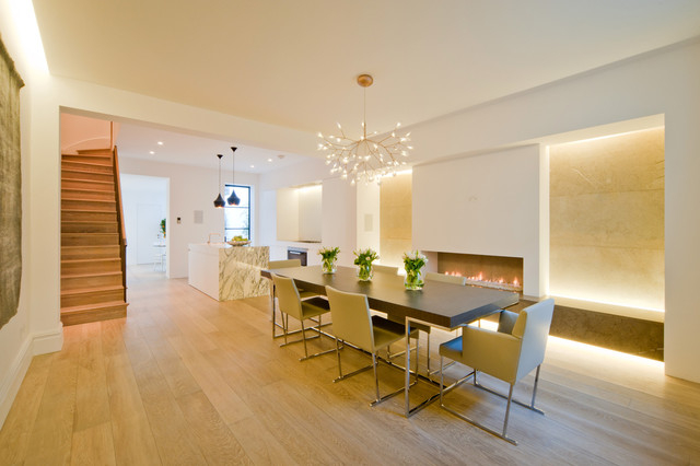
You can pick the perfect palette, but if your lighting is off, it will all fall apart. Natural light is the great equalizer, but artificial light is where things get complicated. In an open concept home, you likely have different types of lighting fixtures serving different purposes. Pendant lights over the island, recessed lighting in the hallway, and floor lamps in the living area. Each of these emits light at different color temperatures, which can drastically alter how your paint colors look.
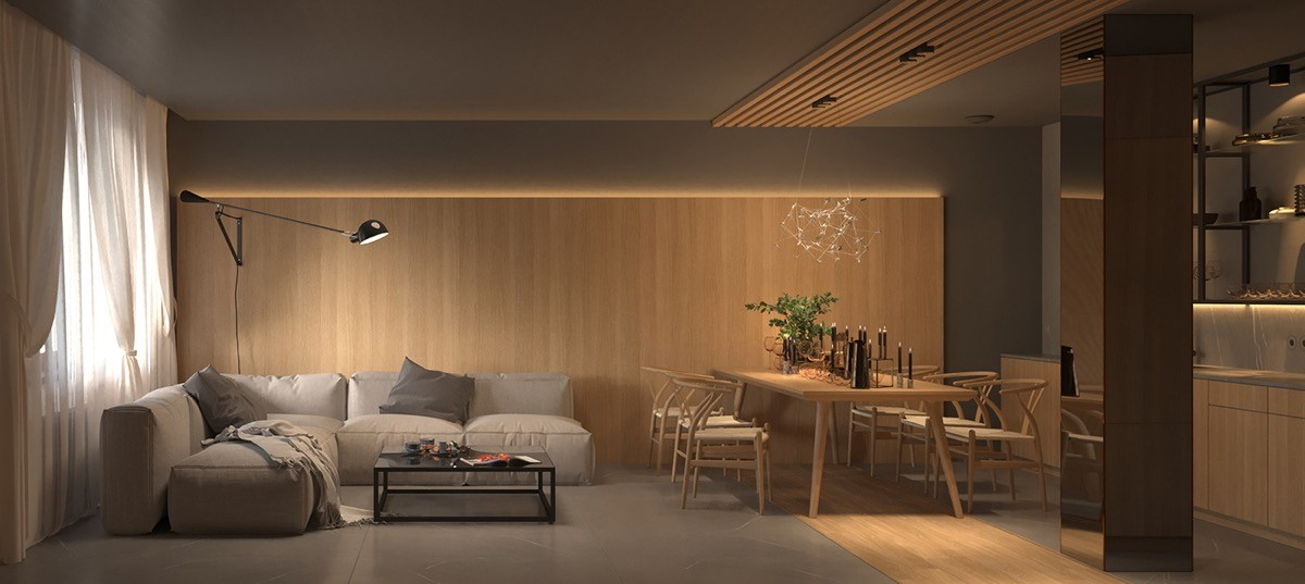
Stick to a consistent color temperature for your bulbs throughout the main open space. In 2026, most experts recommend 2700K to 3000K for a warm, inviting glow that complements most neutral palettes. Avoid mixing cool daylight bulbs (5000K) with warm soft white bulbs (2700K) in the same visual field, as it creates a disjointed, sterile feel. Also, consider how your window treatments affect light. Sheer curtains diffuse light softly, while heavy drapes block it. Make sure your color choices look good at night under your artificial lights, not just during the day. Test your paints with your actual lamps turned on. It’s a small step that saves huge headaches later.
At the end of the day, your home should reflect you, not a magazine spread from five years ago. Trends in 2026 are leaning towards biophilic design—bringing the outdoors in—with earthy tones, organic textures, and calming hues. But if you hate brown and love bright pink, make it work! Cohesion doesn’t mean bland. It means harmony. If a color makes you happy when you walk into the room, it’s the right color. Don’t be afraid to break the rules once you understand them.
Start small if you’re nervous. Add a pop of color with removable wallpaper in a powder room that’s visible from the main area, or swap out cabinet hardware for a bold metallic finish. See how it feels. Live with it. Your taste will evolve, and your home should evolve with you. The beauty of an open concept is its flexibility. You can rearrange furniture, swap textiles, and refresh accents without major renovations. Keep your base neutral and stable, and let the rest be playful and changeable. It’s your sanctuary, after all. Make it sing.
Creating a cohesive color palette for your open concept home doesn’t have to be a source of stress. By anchoring your space with a strong neutral, using subtle shifts to define zones, applying the 60-30-10 rule, repeating key elements, managing your lighting, and trusting your own style, you can create a space that feels both unified and dynamic. It’s about balance. It’s about flow. And mostly, it’s about creating a backdrop for your life that feels good every single day. So grab those paint swatches, take a deep breath, and start experimenting. Your dream home is waiting to be revealed, one color at a time.