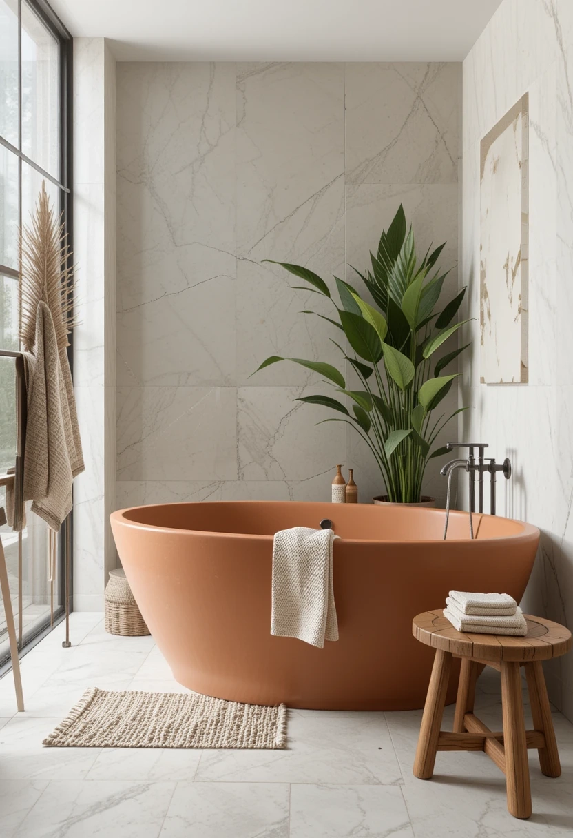
The alarm goes off at 6:00 AM, and the light filtering through the sheer curtains hits the floor. If you designed your primary suite around the latest hyper-saturated color trend, your eyes might instantly sting from sensory overload before your feet even touch the ground. Conversely, stepping onto a sea of uniform, uninspired beige can leave you feeling like you woke up inside an architectural holding cell. The modern primary suite is meant to be a sanctuary, yet it must also reflect personality, grit, and sophisticated design choices.
Achieving this sanctuary requires navigating a delicate tightrope walk. You want the heart-stopping drama of a moody, saturated accent wall behind your headboard, but you also need the grounding, enduring calm of high-end neutral tiles beneath your feet or wrapping your en-suite bath. It is the architectural equivalent of high-low dressing: pairing a structured, statement-making piece with timeless foundation items that anchor the entire composition.
For years, residential design swung wildly between two extremes. We endured eras of aggressively monotone gray boxes and, conversely, phases of wall-to-wall vibrant jewel tones that left homeowners scrambling to repaint within eighteen months. Today’s design philosophy recognizes that the human nervous system craves both stimulation and rest. By anchoring a room with enduring neutral tiles—such as honed travertine, large-format porcelain, or pale limestone—you create a resilient blank canvas. This foundation allows you to introduce bold accent walls featuring deep charcoal paints, intricate botanical murals, or dramatic slab marble without tipping the room into chaos.
The Architectural Psychology of Contrast and Composure
When designing a primary suite, the floor plan typically divides into distinct zones: the sleeping quarters and the adjoining en-suite bathroom or dressing area. This layout creates a natural transition point where hard surfaces meet soft textiles, making it the ideal laboratory for balancing bold choices with quiet backdrops. The psychology of space dictates that vertical surfaces—like your walls—command immediate visual attention, while horizontal surfaces—like your flooring and tile work—shape your subconscious sense of stability.
Choosing a bold accent wall behind the bed serves a functional design purpose. It naturally frames the primary furniture piece, drawing the eye inward and establishing a focal point that eliminates the need for excessive wall decor. However, a bold vertical plane requires a visual counterweight. If every surface shouts for attention, the room loses its restorative quality. This is where timeless neutral tiles come into play. Tiles in soft alabaster, warm greige, or subtle oat tones absorb and diffuse natural light, softening the punch of a dramatic paint color or a high-contrast patterned wall.
Material selection dictates how these two opposing forces interact. Glossy, highly reflective tiles can amplify the intensity of a bold wall by bouncing color across the room, sometimes creating unintended neon undertones under harsh artificial lighting. On the other hand, matte-finish porcelain or textured limestone tiles absorb light, creating a velvety contrast that grounds the saturated pigment of an accent wall. Understanding the interplay of undertones—such as warm yellow bases versus cool blue bases—prevents your bold wall and neutral tiles from fighting each other when the afternoon sun shifts.
Engineering the Color Palette: Undertones, Light Values, and Spatial Geometry
Mastering the balance between a bold feature wall and neutral tiles begins long before the first brushstroke or mortar bed is laid. It demands a rigorous examination of color theory, specifically regarding Light Reflectance Value (LRV) and underlying chromatic temperatures. A neutral tile is rarely just "white" or "gray." It carries subtle undertones of green, pink, yellow, or violet that dictate how it responds to adjacent colors.
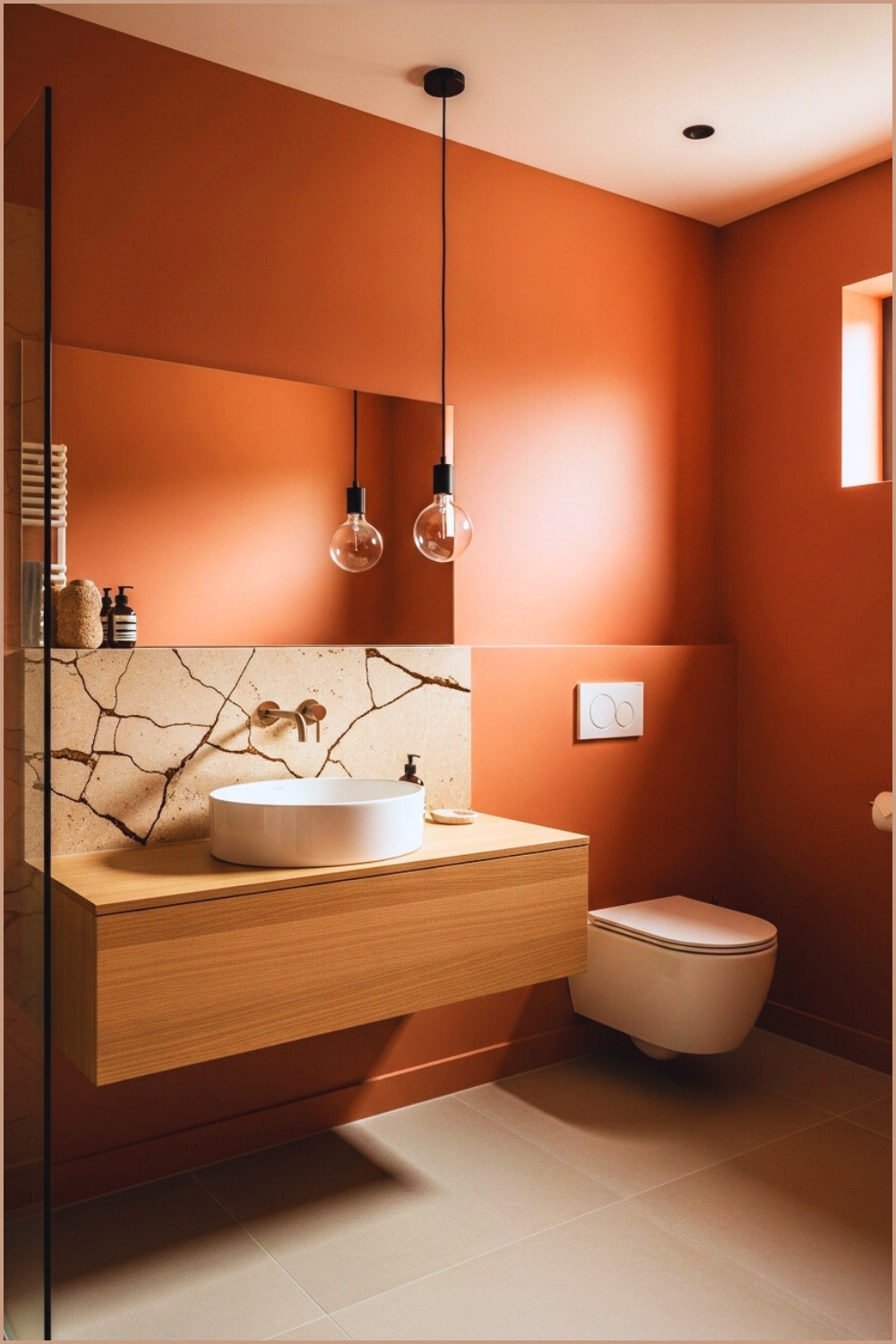
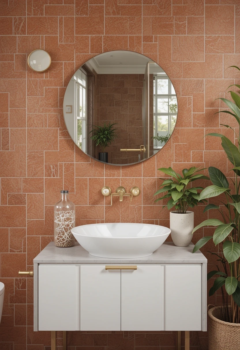
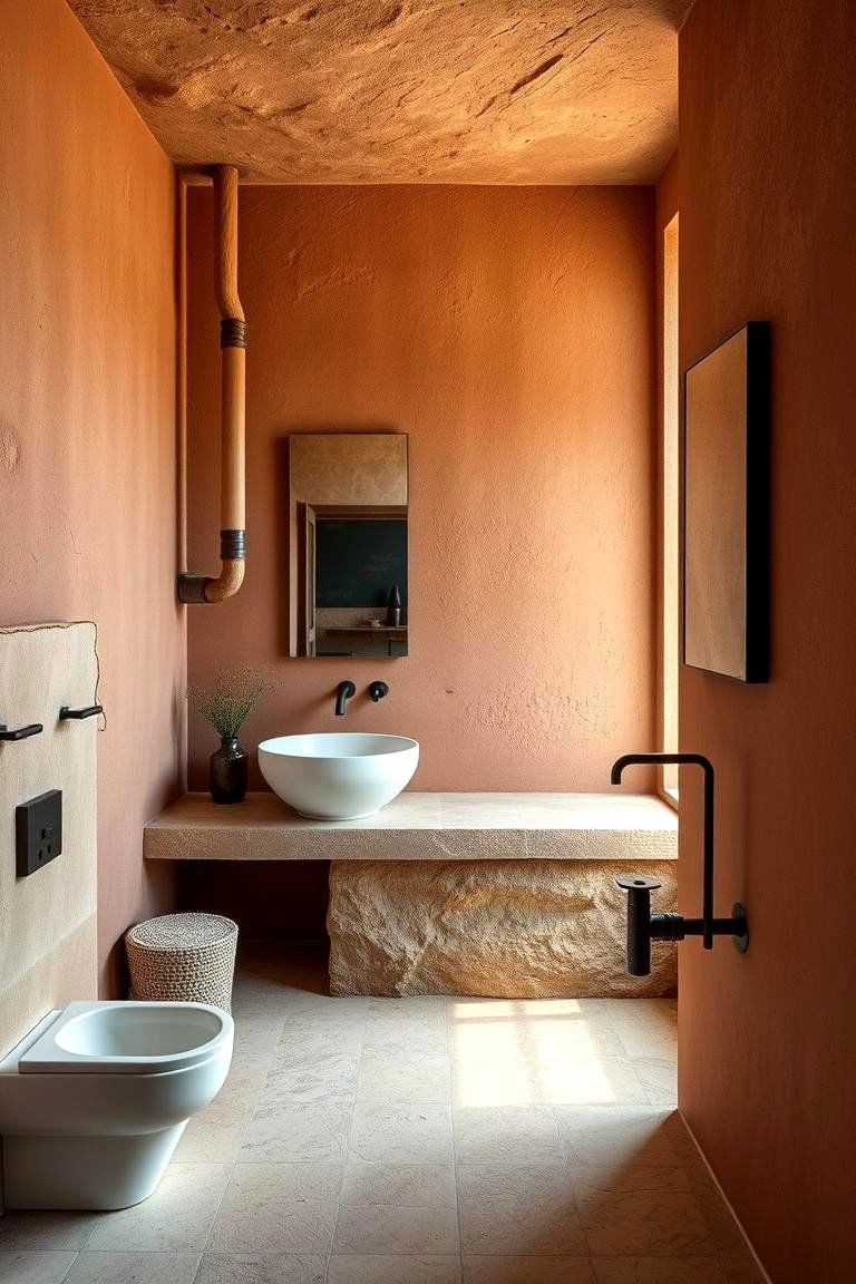
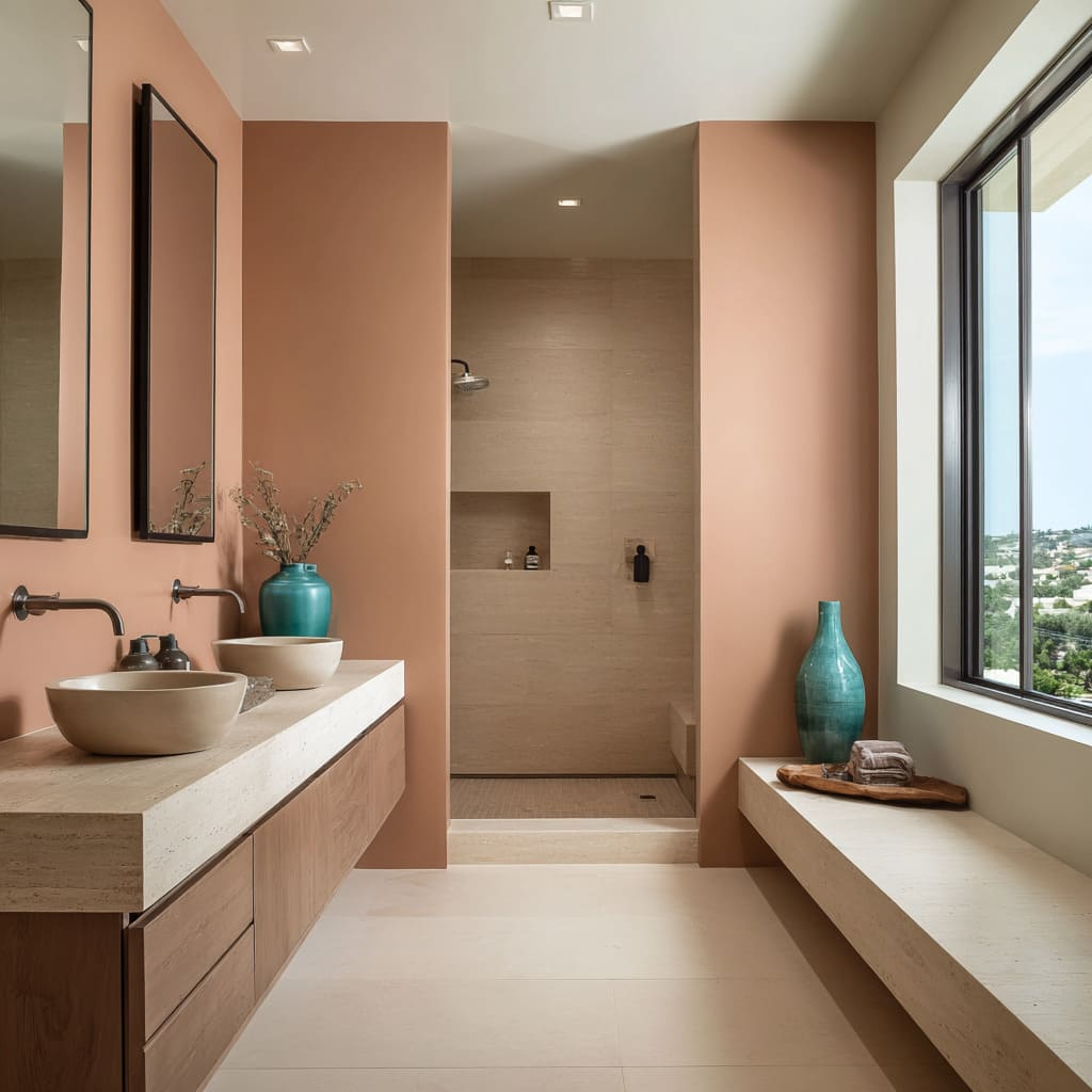
When pairing a saturated jewel tone or a dark, moody charcoal wall with neutral tiles, evaluate the LRV of both elements. If your floor tile has an extremely high LRV (reflecting nearly all light) and your accent wall absorbs most of it, the resulting contrast can feel jarring rather than curated. Designers often mitigate this by selecting a mid-to-high LRV neutral tile that shares a similar underlying temperature with the accent wall. For instance, a terracotta-infused earthy red accent wall pairs magnificently with warm, sandy limestone tiles because both share an underlying warmth, even though their saturation levels differ vastly.
Spatial geometry also dictates success. In compact primary suites, extending neutral tiles from the bathroom floor up into a walk-in shower or partial half-wall creates continuity that tricks the eye into perceiving more square footage. Meanwhile, confining the bold color strictly to the headboard wall prevents the room from feeling constricted. By keeping the perimeter walls and flooring neutral, the room retains an airy volume, ensuring that even the boldest emerald, navy, or plum accent wall feels intentional and expansive rather than heavy and oppressive.
Step-by-Step Methodology for Designing a Balanced Primary Suite
Transforming this design theory into a finished bedroom and bath requires a structured, sequential approach. Skipping steps or installing finishes out of order often leads to costly rework and mismatched undertones. Follow this field-tested methodology to guarantee a cohesive, high-end result.
- Step 1 (Source and Secure Tile Samples First): Never pick your accent wall color based on a digital swatch or before you have your tile samples in hand. Bring physical samples of your neutral tiles directly into the primary suite, observing them at 8:00 AM, 1:00 PM, and 8:00 PM to track how natural and artificial light alter their hue.
- Step 2 (Map the Visual Weight and Focal Points): Identify the primary sightlines as you walk through the doorway. The accent wall should ideally be the first wall your eyes encounter, while the neutral tiles should provide a seamless, uninterrupted flow from the bedroom threshold into the en-suite wet areas.
- Step 3 (Select and Test the Bold Accent Medium): Choose whether your accent wall will be paint, lime wash, Roman clay, wood slatting, or wallpaper. Paint sample large 3-foot-by-3-foot squares directly onto the wall adjacent to your tile samples, observing the juxtaposition for at least 48 hours before committing.
- Step 4 (Coordinate Grout and Trim Details): Pay obsessive attention to the transition details. Select tile grout that matches the neutral tile background rather than contrasting sharply, as clean lines prevent visual clutter that competes with your bold accent wall.
- Step 5 (Layer Secondary Textures and Soft Furnishings): Once the permanent hard finishes are in place, introduce transitional elements like textured linen bedding, brushed brass or matte black hardware, and neutral wool rugs that bridge the gap between your bold vertical statement and your calm horizontal tiles.
Avoiding Common Missteps: Pitfalls and Field-Tested Workarounds
Even experienced DIYers and seasoned renovators occasionally stumble when trying to balance extreme design elements. Recognizing these common traps before picking up a trowel or paint roller saves time, money, and design regret.
- Pitfall 1 (Ignoring Undertone Clashes): Pairing a cool, blue-based gray tile with a warm, mustard-yellow accent wall creates a subconscious visual dissonance that makes the room feel unsettled. Workaround: Always test materials side-by-side in natural daylight; if one looks dingy or clinical next to the other, change one of the base temperatures immediately.
- Pitfall 2 (Over-accessorizing the Space): Believing that a bold accent wall requires equally loud artwork, patterned window treatments, and bright furniture. Workaround: Let the accent wall do 80% of the heavy lifting. Keep window treatments, drapery, and accent furniture strictly within the neutral tile color family to maintain breathing room.
- Pitfall 3 (Neglecting Finish Sheen Consistency): Combining a high-gloss lacquer accent wall with ultra-glossy polished marble tiles creates a glaring, commercial funhouse effect unsuited for a restful bedroom. Workaround: Pair high-impact colors with matte or honed finishes, or use texture (like limewash or vertical wood paneling) to diffuse light gracefully.
- Pitfall 4 (Isolating the Tile to the Bath Only): Stopping neutral tiles strictly at the bathroom door threshold, missing an opportunity to carry large-format tiles into a dressing area or fireplace hearth for cohesive flow. Workaround: Use a unified flooring material across adjacent zones to blur boundaries and make the entire primary suite feel larger and more intentional.
- Pitfall 5 (Skimping on Lighting Layers): Relying solely on a single overhead flush-mount light that washes out the subtle variations in neutral tiles and makes the bold wall look flat. Workaround: Install a multi-tiered lighting plan featuring dimmable wall sconces, recessed perimeter lighting, and warm bedside lamps to enhance the depth of both surfaces.
The Longevity of Balance: Economic Value and Sustainable Design
Trends come and go with dizzying velocity, but rooms built on a foundation of balance possess genuine staying power. When you invest in premium, timeless neutral tiles—such as durable porcelain engineered to mimic natural stone or authentic natural slate—you are laying down infrastructure that will easily outlast three or four iterations of wall color. This approach aligns with modern sustainability principles, reducing material waste and renovation churn.
From a real estate valuation perspective, neutral hard surfaces remain a massive selling point. Prospective buyers appreciate knowing that if they dislike a bold accent wall, transforming the room requires nothing more than a few hours with a roller and a can of primer, leaving the expensive tile work completely untouched. This flexibility minimizes financial risk while allowing homeowners to fully express their current aesthetic desires without locking themselves into a permanent design cage.
Furthermore, the physical materials chosen for these spaces increasingly reflect a desire for tactile authenticity. Homeowners are moving away from sterile, mass-produced synthetics in favor of textured limewashes, artisan tiles with slight dimensional variance, and organic stone surfaces. These materials age gracefully, developing a rich patina over time that deepens the connection between the occupant and the space. Balancing these rich textures with a restrained, calming color palette ensures that your primary suite remains a restorative escape for decades to come.
Essential Frameworks for Crafting Your Sanctuary
Synthesizing these concepts into a final design plan comes down to honoring a few core rules. First, respect the ratio of bold to neutral. As a general rule of thumb, let your neutral tiles and perimeter surfaces occupy roughly 70% to 80% of the visual field, reserving the bold accent wall for the remaining 20% to 30%. This proportion ensures that the eye has plenty of resting places, which is crucial for a room dedicated to sleep and recovery.
Second, treat texture as your primary mediator. If your bold accent wall is flat matte paint, introduce a subtle tactile element through your neutral tiles, such as a zellige tile finish, a linen-textured porcelain, or a basketweave mosaic. Texture adds organic depth that pure color cannot achieve on its own, preventing the room from feeling flat or sterile.
Finally, trust your intuition regarding mood. If a moody, charcoal-black wall feels too intimidating, step back to a deep slate blue or a rich forest green. The goal is not to prove design bravery to guests who rarely see your primary suite, but to curate an environment that lowers your heart rate the moment you close the door at night.
Designing a primary suite is ultimately an exercise in self-care translated into architecture. By pairing the vibrant, expressive energy of a bold accent wall with the steadfast, grounding calm of timeless neutral tiles, you create a room of profound duality. It is a space capable of holding both your morning vitality and your evening exhaustion.
As you embark on your own renovation or refresh, remember that perfection lies not in following rigid design rules, but in curating a harmonious dialogue between contrasting elements. Take your time with the material samples, respect the play of light across your chosen surfaces, and build a sanctuary designed to weather the changing seasons of your life with grace and style.