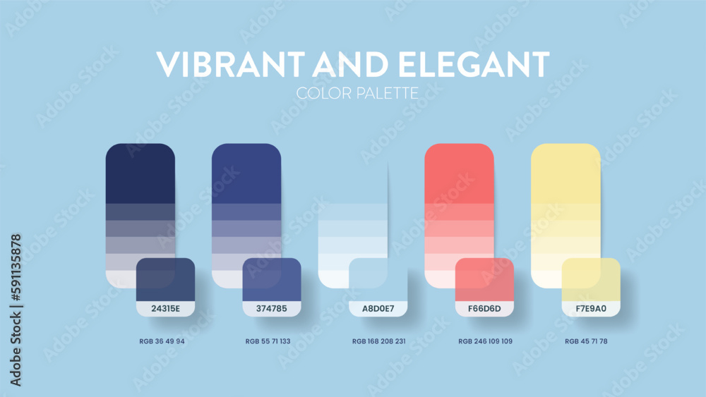
Ever walked into a room and felt like you were being shouted at? It’s exhausting. Maybe the walls were a screaming red, or the furniture was a chaotic mix of neon greens and electric blues. It’s too much. Our eyes don’t know where to rest. Now, think about the opposite. A room that is entirely beige, white, or gray. It’s calm, sure. But is it interesting? Probably not. It feels a bit like a waiting room at a dentist’s office. Sterile. Safe. Boring.
The magic happens somewhere in the middle. It’s that sweet spot where you have a foundation of peace, but with little sparks of joy scattered throughout. This isn’t just about picking pretty colors. It’s about psychology. It’s about how we feel when we sit down after a long day. We want our homes to hug us, but we also want them to reflect who we are. And who we are isn’t always just "calm." Sometimes we are loud. Sometimes we are vibrant. The trick is letting those loud parts sing without drowning out the quiet ones.
In 2026, we are seeing a huge shift away from the all-white minimalist trend that dominated the last decade. People are craving personality again. But they are also terrified of making a mistake. Paint is expensive. Sofas are a commitment. So, how do you get that dynamic look without regretting it next month? You start with a conservative base. You build a stage. And then, you let the bold accents perform. It’s a dance. And once you learn the steps, it becomes second nature.
The Foundation: Why Neutral Bases Are Your Best Friend
Think of your neutral base as the canvas. If you’ve ever tried to paint on a busy patterned paper, you know how hard it is to make your subject stand out. The same logic applies to interior design. When your walls, large rugs, and main seating pieces are in conservative tones—think warm whites, soft grays, creamy beiges, or even deep charcoals—you create a visual silence. This silence is crucial. It gives your eyes a place to rest. Without it, every bold color fights for attention, and nothing wins.
But "neutral" doesn’t have to mean boring. In fact, in 2026, the definition of neutral has expanded. It’s no longer just about stark white. We are seeing a rise in "warm neutrals" that have subtle undertones of green, pink, or brown. These shades add depth and warmth without adding visual noise. For example, a wall painted in a soft greige (a mix of gray and beige) provides a sophisticated backdrop that makes a bright teal chair pop in a way that a cold, clinical white never could. The key is consistency. If your base is warm, keep it warm. If it’s cool, stick to cool tones. Mixing warm and cool neutrals can work, but it’s tricky and often leads to a space feeling disjointed.
Another reason to love conservative bases is their longevity. Trends come and go. Remember when everyone had millennial pink walls? Or those dark, moody navy accent walls? They were everywhere. And now, many people are repainting them. But a good neutral base is timeless. It allows you to change the mood of the room simply by swapping out pillows, art, or a throw blanket. It’s sustainable, too. You aren’t throwing out a massive sofa because the color went out of style. You’re just updating the accessories. This flexibility is priceless, especially when life changes quickly.
The 60-30-10 Rule: A Simple Framework for Balance
If you take one thing away from this guide, let it be the 60-30-10 rule. It’s an old decorator’s secret, but it works like a charm every single time. It’s a simple formula for distributing color in a room. Here is how it breaks down: 60% of the room should be your primary color (the base), 30% should be your secondary color (supporting tone), and 10% should be your accent color (the bold pop). This proportion creates a natural hierarchy that feels pleasing to the human eye. It’s balanced, but not symmetrical.
Let’s put this into practice. Imagine a living room. The 60% is your walls, your large area rug, and maybe your biggest piece of furniture, like a sofa. Let’s say these are all in varying shades of oatmeal and cream. This sets the stage. The 30% is your secondary color. This could be your curtains, your armchairs, or perhaps a large piece of artwork. Let’s choose a muted sage green for this layer. It complements the oatmeal but adds a bit more substance. It bridges the gap between the background and the foreground.
Now, the fun part: the 10%. This is where you bring in the bold. That bright magenta pillow? The cobalt blue vase? The abstract painting with splashes of fiery orange? This is it. Because it only takes up 10% of the visual space, it doesn’t overwhelm. Instead, it draws the eye. It creates a focal point. If you tried to make the walls magenta, it would be 60% bold, which is intense. But at 10%, it’s spicy. It’s exciting. It’s the cherry on top. Stick to this ratio, and you’ll rarely go wrong. It takes the guesswork out of decorating.
Choosing Your Bold: Color Theory Made Simple
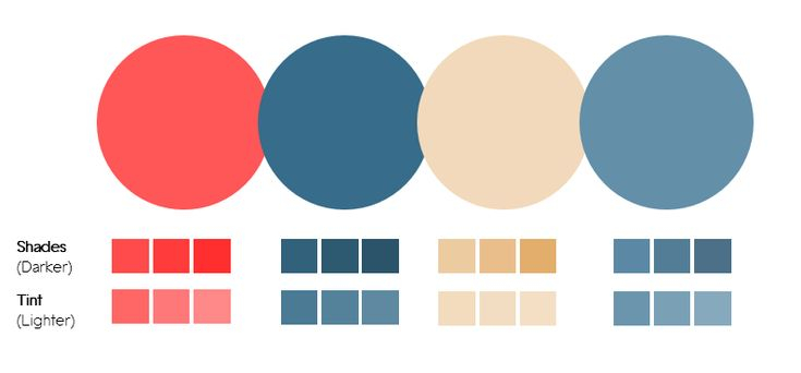
So, you have your neutral base. You know you need a 10% accent. But which color do you pick? This is where people get stuck. There are so many options. To make it easier, lean on basic color theory. You don’t need a degree in art to use it. The easiest way to choose a bold accent is to look at the color wheel. If you want high contrast and energy, go for a complementary color. These are colors opposite each other on the wheel. Blue and orange. Red and green. Purple and yellow. If your neutral base has cool undertones (like gray), a warm accent (like mustard yellow) will vibrate with energy.
Another approach is to use analogous colors. These are neighbors on the color wheel. Think blue and green, or red and orange. This creates a more harmonious, serene feel, even with bold colors. For instance, if your room is mostly white and light gray, adding accents in deep emerald green and teal feels lush and organic. It’s bold, but it’s not jarring. It feels like it belongs. This is a great option for bedrooms or spaces where you want drama but still need relaxation.
Don’t forget about the emotional impact of color. Colors aren’t just visual; they are emotional. Red raises your heart rate. It’s passionate and urgent. Blue lowers it. It’s calming and trustworthy. Yellow is happy but can be anxious if it’s too bright. When you choose your bold accent, ask yourself: How do I want to feel in this room? If it’s a home office, maybe a bold green helps with focus and reduces eye strain. If it’s a dining room, a deep terracotta or red can stimulate conversation and appetite. Let the function of the room guide your choice. And remember, you can always test it. Buy a small sample pot. Paint a patch on the wall. Live with it for a few days. See how it looks in the morning light versus the evening lamp light.
Texture and Pattern: The Secret Ingredients
Color is important, but it’s not the only player in the game. Texture and pattern are what keep a neutral-and-bold scheme from looking flat or cheap. If you have a beige sofa and beige walls, it can look like a monolith. It lacks dimension. This is where texture saves the day. Mix materials. Pair a smooth leather chair with a chunky knit wool throw. Put a sleek metal lamp on a rough-hewn wooden table. Add a velvet pillow to a linen sofa. These differences in surface catch the light differently. They create shadows and highlights. They make the eye travel around the room, discovering new details.
Patterns work similarly. A solid neutral base is the perfect place to introduce a bold pattern. Think about a rug with a geometric design that includes your accent color. Or curtains with a subtle floral print that picks up the hue of your vase. The key here is scale. If you have a large, bold pattern, keep the rest of the room relatively quiet. If you mix multiple bold patterns, they need to vary in scale. One large print, one medium, and one small. This prevents visual clutter. In 2026, we are seeing a lot of organic, hand-drawn patterns that feel less rigid and more artistic. These pair beautifully with conservative bases because they feel human and imperfect.
Also, consider the finish of your paints and fabrics. A matte wall paint absorbs light, making the color feel deeper and softer. A satin or semi-gloss reflects light, making it feel brighter and more energetic. You can use this to your advantage. Maybe your neutral walls are matte, but your trim is semi-gloss white. This adds a subtle layer of interest without adding a new color. Similarly, a shiny silk pillow will stand out more against a matte cotton sofa than a cotton pillow would. It’s all about creating contrast through touch and light, not just hue.
Lighting: The Invisible Designer
You can pick the perfect colors, follow the 60-30-10 rule, and choose amazing textures, but if your lighting is bad, it will all fall apart. Lighting changes everything. It can make a bold accent look muddy or brilliant. It can make a neutral base look warm and inviting or cold and sterile. Natural light is the most honest, but it changes throughout the day. A north-facing room gets cool, blue-ish light. A south-facing room gets warm, golden light. You need to account for this. A bold yellow accent might look cheerful in a south-facing room but sickly in a north-facing one. Always test your colors in the actual light of the room.
Artificial lighting is equally critical. In 2026, LED technology allows us to tune the color temperature of our lights. You can have warm white (2700K) for evenings and cool white (4000K) for working. Use this to your advantage. Warm light enhances reds, oranges, and yellows. It makes neutrals feel cozier. Cool light enhances blues and greens. It makes neutrals feel crisper. For a room with bold warm accents, stick to warm bulbs. For cool accents, you can go either way, but cool light will make them pop more. Avoid mixing color temperatures in the same room. It creates a disjointed, confusing atmosphere.
Layer your light, too. Don’t rely on a single overhead fixture. That creates harsh shadows and flattens the room. Use floor lamps, table lamps, and sconces to create pools of light. This highlights your accent pieces. Imagine a spotlight effect on that beautiful blue ceramic vase. It becomes a star. The rest of the room fades into the background. This dramatic effect is hard to achieve with just one ceiling light. By controlling where the light falls, you control where the eye goes. You are directing the narrative of the room.
Even with the best intentions, things can go wrong. The most common mistake is using too many bold colors. It’s exciting to find colors you love, so you want to use them all. But resist the urge. Stick to one or two bold accents per room. If you have a red sofa, don’t also have red walls and red curtains. It’s too much. Let the sofa be the hero. Keep the rest supportive. If you feel like the room is lacking something, add another texture or a metallic element, not another bright color. Less is often more.
Another mistake is ignoring the flow between rooms. Your living room might be beautiful with teal accents, and your kitchen might be stunning with mustard accents. But if you can see both rooms from one spot, the clash might be jarring. You don’t need to match everything perfectly, but you do need harmony. Try to carry one accent color through multiple spaces. Or, use a neutral transition zone. If the rooms are adjacent, ensure the neutral bases are compatible. A warm beige in the living room and a cool gray in the kitchen might fight if they are visible together.
Finally, don’t forget about scale and proportion. A tiny red pillow on a massive sectional sofa might get lost. It won’t have the impact you want. Conversely, a huge, bright orange rug in a small bedroom might feel overwhelming. Make sure the size of your accent pieces matches the size of the room and the furniture. In a large room, you can handle larger bold statements. In a small room, keep the accents small and strategic. A bold piece of art above a desk is better than painting all four walls bright purple. It’s about balance. And if you mess up? Don’t panic. Paint is cheap. Pillows are interchangeable. Design is a process, not a perfection contest.
Finding the right balance between bold accents and conservative bases is less about rigid rules and more about intuition. It’s about listening to your space. Start with the calm. Build that peaceful foundation. Then, add the sparks of joy that make you smile. Use the 60-30-10 rule as a guide, not a law. Play with texture. Respect the light. And don’t be afraid to make mistakes. They are just part of the journey.
Your home should tell your story. It should be a place where you can breathe deeply, but also a place that inspires you. By anchoring your design in neutral tones, you give yourself the freedom to change, to grow, and to express different sides of your personality over time. The bold accents are the exclamation points in that story. They emphasize what matters. They highlight what you love.
So, go ahead. Buy that emerald green velvet chair. Hang that vibrant abstract print. Just make sure it’s sitting on a stage that lets it shine. Keep the background quiet. Let the colors speak. And enjoy the process. After all, it’s your home. It should feel like you.