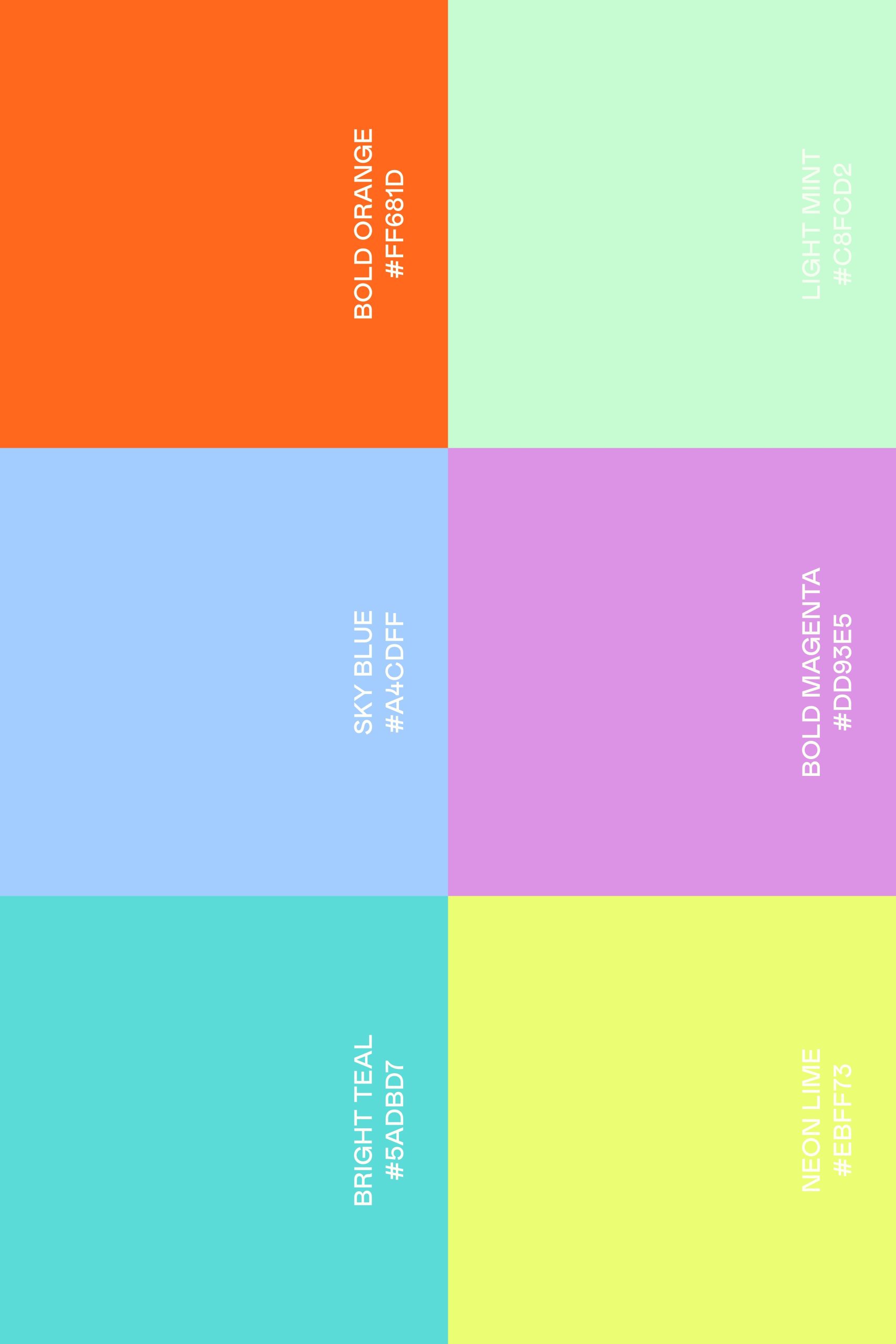
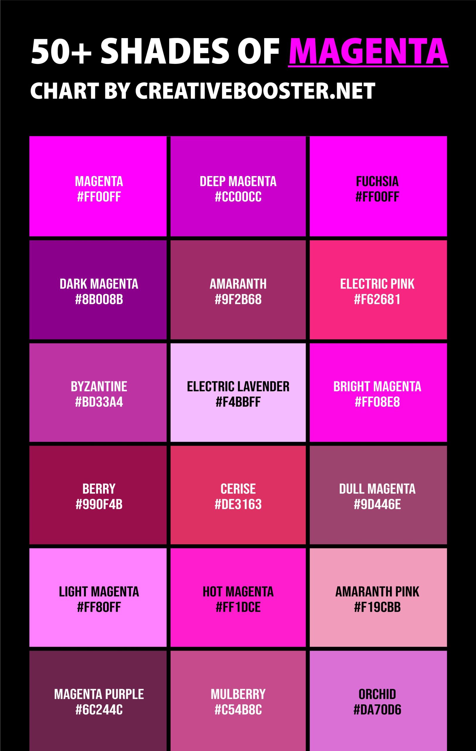
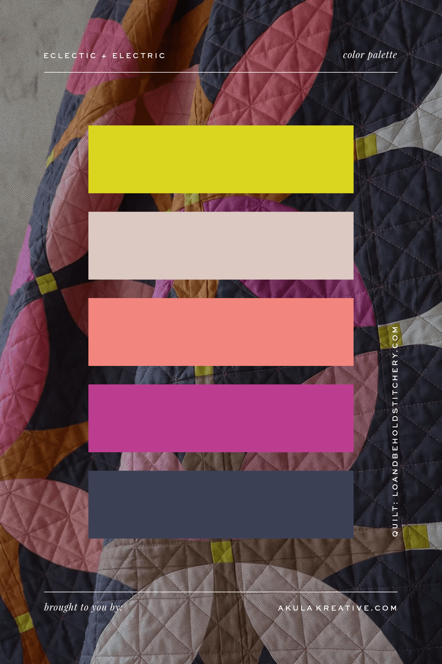
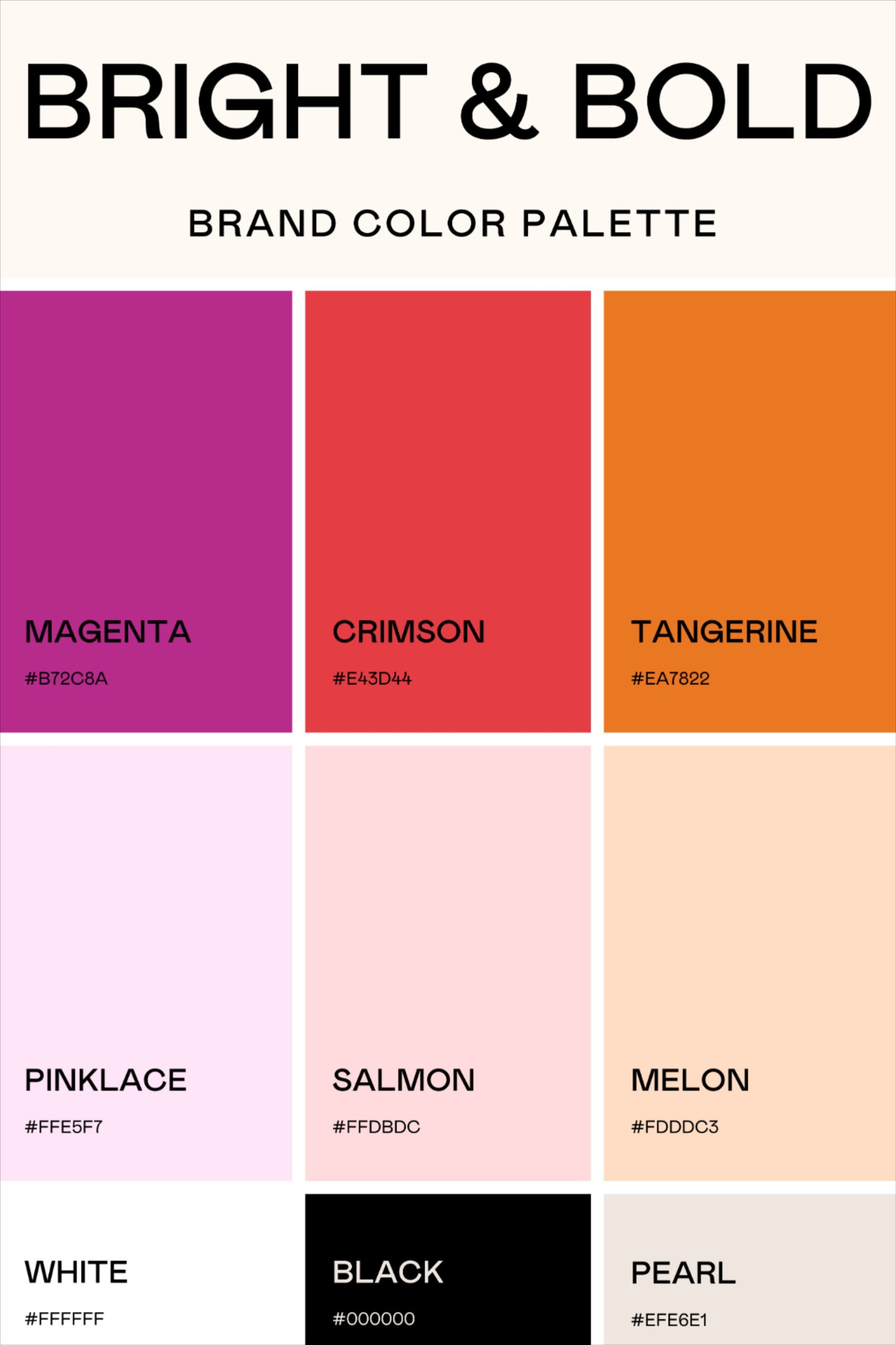
Your monitor blinks at 11:42 PM, casting a harsh cerulean glow against your retinas. On the screen sits a hero banner that looked transcendent in your sketchbook earlier that afternoon. Neon coral text leaps forward from a deep, obsidian background. It pulses with vibrant energy, screaming for attention. But as you squint through the glare, a subtle sense of dread creeps in. Is that blinding juxtaposition actually driving engagement, or is it inducing a throbbing headache? You drag a color meter across the artboard, and your heart sinks. The contrast ratio sits at a dismal 2.1:1. The typography is entirely illegible for anyone reading on an aging smartphone screen under direct sunlight.
This is the eternal tightrope walk of high-contrast design. We crave visual drama. We want our interfaces, brand identities, and editorial layouts to punch through the digital noise. Yet, the moment we dial up the saturation and push chromatic opposites to their absolute limits, the safety net vanishes. Contrast is not merely a stylistic preference; it is the fundamental physics of visual communication. Without it, our compositions collapse into a muddy, inaccessible mess. Fearless creation demands more than bold intuition. It requires a rigorous, methodical framework that lets you play with fire without getting burned.
Color theory has undergone a profound evolution over the past few years. We have moved far beyond rigid, print-era color wheels and rudimentary RGB approximations. Modern design ecosystems—powered by advanced color spaces like OKLCH, strict Web Content Accessibility Guidelines (WCAG 2.1 and evolving 2.2 standards), and sophisticated screen technologies—demand a smarter approach. High contrast is no longer just about slapping black text onto a white canvas. It is a nuanced orchestration of relative luminance, chromatic separation, and contextual human perception that must perform seamlessly across dark mode toggles, chaotic mobile environments, and data-dense dashboards.
The Physics of Luminance Versus Pure Chromatic Hue
Most creators stumble because they conflate hue contrast with luminance contrast. Your eyes do not measure color the same way a digital sensor measures wavelengths. Human photoreceptors—specifically our rods and the three types of cone cells—are fiercely optimized for light and shadow rather than pure color variation. You can place a hyper-saturated, electric lime green directly next to a vibrant, electric magenta, and your brain will still experience visual exhaustion. Why? Because their relative luminance values are too closely matched. They vibrate against each other, creating an optical static that fries user focus.
Understanding this biological reality changes everything about how you build a palette. Relative luminance—measured on a scale from 0 (absolute black) to 1 (pure white)—is the true anchor of any legible design. When you pair two hues that sit at opposite ends of the luminance spectrum, you create instant visual hierarchy. The human eye naturally tracks toward the point of highest contrast. If your interface relies purely on shifting hues without altering brightness levels, you are actively fighting human biology.
Modern tooling has revolutionized how we measure this phenomenon. Traditional HSL and RGB color models are notorious for perceptual inconsistencies; a yellow in HSL often looks significantly brighter to the human eye than a blue of the exact same numerical lightness value. Enter OKLCH, the perceptually uniform color space that has become the gold standard for digital creators. OKLCH aligns digital color math with actual human vision. When you select a lightness value of 90% in OKLCH, it looks genuinely bright whether it is a cyan, a yellow, or a purple. Mastering this perceptual uniformity is the secret weapon that allows designers to push bold, contrasting palettes safely.
We must also reckon with the global reality of visual impairment. Over 300 million people worldwide navigate digital and physical environments with varying forms of color vision deficiency, ranging from protanopia to complete achromatopsia. High-contrast combinations that rely exclusively on red-green differentials are completely invisible to a massive portion of your audience. Designing fearlessly means designing inclusively. By anchoring your high-contrast choices in stark luminance variations rather than perilous hue pairs, you guarantee that your message cuts through regardless of how a user’s eyes process the light spectrum.
Deconstructing WCAG Standards and Real-World Accessibility Metrics
Accessibility guidelines are frequently dismissed as bureaucratic red tape that stifles creative freedom. That perspective is short-sighted and professionally dangerous. The Web Content Accessibility Guidelines—specifically the benchmark ratios of 4.5:1 for normal body text and 3:1 for large typography or interactive user interface components—are born from rigorous optometric research. They define the absolute baseline threshold where text transitions from being a guessing game to an effortless reading experience.
Meeting these thresholds in high-contrast scenarios requires treating your design system as a living contract. When you introduce a dark mode variant, the math shifts dramatically. A dark background combined with a stark white foreground easily clears a 15:1 ratio, which sounds incredible on paper. Yet, pure #FFFFFF text on a #000000 background creates an aggressive optical phenomenon known as halation. The stark light bleeds into the dark surround, causing astigmatism-afflicted eyes to see ghosting trails. A truly safe high-contrast system uses off-whites, such as #F4F4F6 or warm ivory tones, paired with deep charcoal grays rather than pitch black, achieving the sweet spot of readability without sensory overload.
Dashboards, marketing graphics, and data visualizations present an entirely different battleground. When you build a multi-variable bar chart or a complex financial dashboard, users need to distinguish between adjacent data points in milliseconds. Relying solely on color to convey data states is a cardinal sin. High contrast in UI assets means leveraging structural cues alongside chromatic separation—combining contrasting stroke weights, distinct textural patterns, and clear spatial separation.
Evaluating your work against these standards cannot happen at the final QA stage. By the time you hand off a fully realized high-contrast layout to development only to find out your brand orange fails contrast checks against a light gray background, your timeline is already in jeopardy. Accessibility metrics must be integrated into the foundational wireframing phase. Treating contrast ratios as non-negotiable design tokens ensures that your brand identity remains cohesive, legal, and universally legible across every asset you export.
The Step-by-Step Methodology for Pairing High-Contrast Colors
Building a high-contrast palette that feels both daring and harmonious requires a systematic process. Skip a step, and your design risks looking like an unpolished carnival ride. Follow this disciplined workflow to engineer stunning, accessible color systems from scratch.
- Step 1 (Audit the Luminance Spread): Choose your dominant background color and calculate its relative luminance using an OKLCH or WCAG-compliant checker. Establish whether your base is deeply dark or intensely light to dictate the inverse foreground range.
- Step 2 (Define the Hero Contrast Pair): Select your primary typography or primary call-to-action color against your base. Force this pair to clear the 4.5:1 ratio for body text or 3:1 for large display headers before introducing any secondary accent colors.
- Step 3 (Introduce Chromatic Accent Chunks): Inject your high-intensity accent hues (such as electric violets, neon crimsons, or acid yellows) strictly for focal points, badges, and interactive triggers, ensuring they never host essential body copy.
- Step 4 (Simulate Global Vision Deficiencies): Run your active palette through real-time simulation filters to test for protanopia, deuteranopia, and tritanopia, verifying that critical UI cues don’t vanish when specific color channels are muted.
- Step 5 (Export and Tokenize for Scale): Lock your winning combinations into design system tokens (CSS custom properties or Figma styles) with explicit notes on where each contrast pairing is legally and aesthetically approved for use.
This methodical progression removes the guesswork from bold design choices. By locking down your luminance foundation first, you earn the creative freedom to experiment wildly with vibrant, high-impact hues for your accent elements without compromising the integrity of the overall user experience.
Navigating Advanced Pitfalls and Field-Tested Practitioner Workarounds
Even seasoned designers fall into classic traps when chasing high-contrast aesthetics. Recognizing these failure points before they manifest in production saves countless hours of painful revision and brand dilution.
- Pitfall 1 (The Neon Vibration Trap): Pairing two highly saturated, complementary hues of identical luminance creates a nauseating optical vibration. Workaround: Shift the lightness of one color drastically upward or downward in OKLCH space, or introduce a desaturated neutral buffer zone between them.
- Pitfall 2 (Over-Reliance on Pure Black and White): Using #000000 on #FFFFFF creates harsh optical glare that strains eyes during extended reading sessions. Workaround: Soften your canvas to an off-white or cream, and use a deep, rich charcoal (#121212) instead of flat black for primary text elements.
- Pitfall 3 (Ignoring Contextual State Changes): A high-contrast button that looks stunning in its default state may completely fail contrast requirements when hovered, focused, or disabled. Workaround: Test every interactive pseudo-state independently, ensuring focus rings maintain a minimum 3:1 contrast ratio against both the button fill and the surrounding page canvas.
- Pitfall 4 (The Transparent Overlay Illusion): Placing high-contrast text over a semi-transparent black or white overlay (
rgbavalues) looks great on a solid white background, but breaks unpredictably when placed over shifting photography. Workaround: Flatten overlays into solid hex values or use gradient backdrop filters with guaranteed minimum opacity floors. - Pitfall 5 (Failing the Small-Text Trap): Using a stylish, ultra-thin geometric typeface at a small point size against a high-contrast background, rendering it razor-sharp yet unreadable. Workaround: Restrict thin font weights (like 100-300) to large display sizes (24px+), enforcing medium or bold weights for any body text under 16px.
Mastering these workarounds transforms you from a reckless stylist into an elite visual engineer. You learn to spot the subtle technical failures that amateur portfolios gloss over, delivering work that looks breathtaking and performs flawlessly in the real world.
The Broader Economic and Cultural Value of Inclusive Contrast
Color is an emotional language, but in the modern digital marketplace, it is also a powerful economic driver. When your brand identities and digital interfaces prioritize high-contrast accessibility, you immediately expand your total addressable market. Millions of potential customers experience age-related macular degeneration, mild cataracts, or temporary visual fatigue from staring at screens under harsh lighting. If your product requires users to strain their eyes to decipher navigation menus or promotional pricing, they will abandon your platform in seconds for a competitor who values their comfort.
Beyond immediate conversion rates, rigorous contrast systems fortify brand equity. Consistency is the bedrock of trust. When a global brand launches a multi-channel campaign—spanning responsive web applications, physical out-of-home billboards, packaging, and social media reels—color drift can destroy professional credibility. A structured approach to high-contrast design ensures that your brand signature remains instantly recognizable and legally compliant, whether it is rendered on a high-end OLED television or a fading, scratched smartphone screen under midday sun.
This evolution reflects a broader cultural shift toward empathetic design. For decades, aesthetic brilliance was often treated as an exclusive luxury that required users to compromise their physical comfort. Today, the most celebrated design systems prove that constraint breeds creativity. Working within the boundaries of WCAG accessibility standards and perceptual color spaces does not shackle your imagination; it channels it toward solutions that are structurally sound, universally welcoming, and visually magnetic.
Actionable Frameworks for Sustainable Color Systems
Translating these high-contrast principles into a daily studio workflow requires practical frameworks that scale across teams of designers, content writers, and front-end developers. Color cannot be treated as an arbitrary afterthought applied at the end of a project sprint. It must be codified into your design tokens from day zero.
Start by auditing your existing brand guidelines. If your primary brand orange fails to meet accessibility thresholds against white backgrounds, do not abandon the brand—re-engineer the palette. Derive a darker, deeper shade of that orange specifically designated for body text or button fills, while keeping the vibrant hue reserved for large graphical accents. Document these rules explicitly within your design system documentation, accompanied by clear do’s and don’ts that educate non-design stakeholders on why certain pairings are restricted.
Foster a collaborative feedback loop between design and engineering teams. Modern CSS tooling makes it remarkably easy to implement dynamic color systems that adapt to user preferences, such as forced-colors modes or high-contrast operating system settings. By utilizing modern CSS features like relative color syntax and OKLCH variable declarations, developers can automatically generate accessible hover and active states without manual guesswork. When design intent and technical execution align, your high-contrast systems become bulletproof.
The pursuit of striking visual contrast is a timeless design ambition. From the high-contrast woodblock prints of Edo-period Japan to the blinding neon typography of modern cyberpunk interfaces, we have always been magnetized to the electric friction of opposing forces. Yet, our tools and responsibilities have matured. We no longer design for static pages viewed under controlled gallery lighting. We build for a complex, hyper-connected world inhabited by human beings with diverse visual realities and demanding environments.
Embracing this checklist transforms how you approach color. You stop guessing, stop fighting with your tools, and start engineering visual experiences with fearless precision. When you balance raw creative audacity with deep respect for human biology and accessibility standards, your work doesn’t just catch the eye—it resonates, communicates, and endures. Open your artboard, check your luminance spread, and start building something brilliant.