Have you ever picked out the absolute perfect shade of blue at the store, only to roll it onto your bedroom wall and realize it looks completely different. You are definitely not alone. It happens to almost everyone who dives into a home renovation project. One minute you have a serene ocean vibe, and the next, your room feels like a dark, chilly cave.
Blue is famously one of the trickiest colors to get right in interior design. It is a total shapeshifter. The way a color looks depends entirely on the light bouncing off it, which means that gorgeous swatch under the bright fluorescent bulbs of a hardware store will look like a completely new animal under the warm glow of your bedside lamp.
The Science Behind the Switch
Light isn’t just bright or dim—it actually carries its own color temperature. Have you ever noticed how some lightbulbs look yellow and cozy while others look crisp and blueish. This is measured in Kelvins, and it plays a massive role in how your paint behaves.
When you put blue paint in a room with warm, yellow lighting, the yellow and blue mix in your eyes. Suddenly, your crisp navy looks a bit muddy or even slightly green. On the flip side, cool light will amplify the blue, sometimes making it feel way too intense or icy. It’s a phenomenon designers call metamerism, where colors change based on their surroundings.
The North and South Exposure Factor
The direction your windows face changes everything about the daylight entering a room. If you are painting a room with north-facing windows, you are getting cool, bluish light all day long. This can make a pale blue paint feel cold and sterile.
South-facing rooms, however, get bathed in warm, golden sunlight for most of the day. This beautiful warmth can soften a bright blue and make it look incredibly inviting. If you don’t test the paint on that specific wall, you might end up with a room that feels totally different from what you imagined.
East and West: The Time of Day Shift
East and west-facing rooms are even more chaotic because the light changes drastically from morning to night. An east-facing room gets bright, warm light in the morning, which makes blue paint look lively. But by the afternoon, the sun moves, leaving the room in shadow, making the blue look much darker and muted.
West-facing rooms start the day looking a bit dull, but by late afternoon, they are hit with an intense, fiery orange glow. This warm sunset light can do crazy things to a blue wall, sometimes turning it into a weird shade of slate or violet. Testing the paint throughout the entire day is the only way to catch these shifts.
Artificial Lights and Your Walls
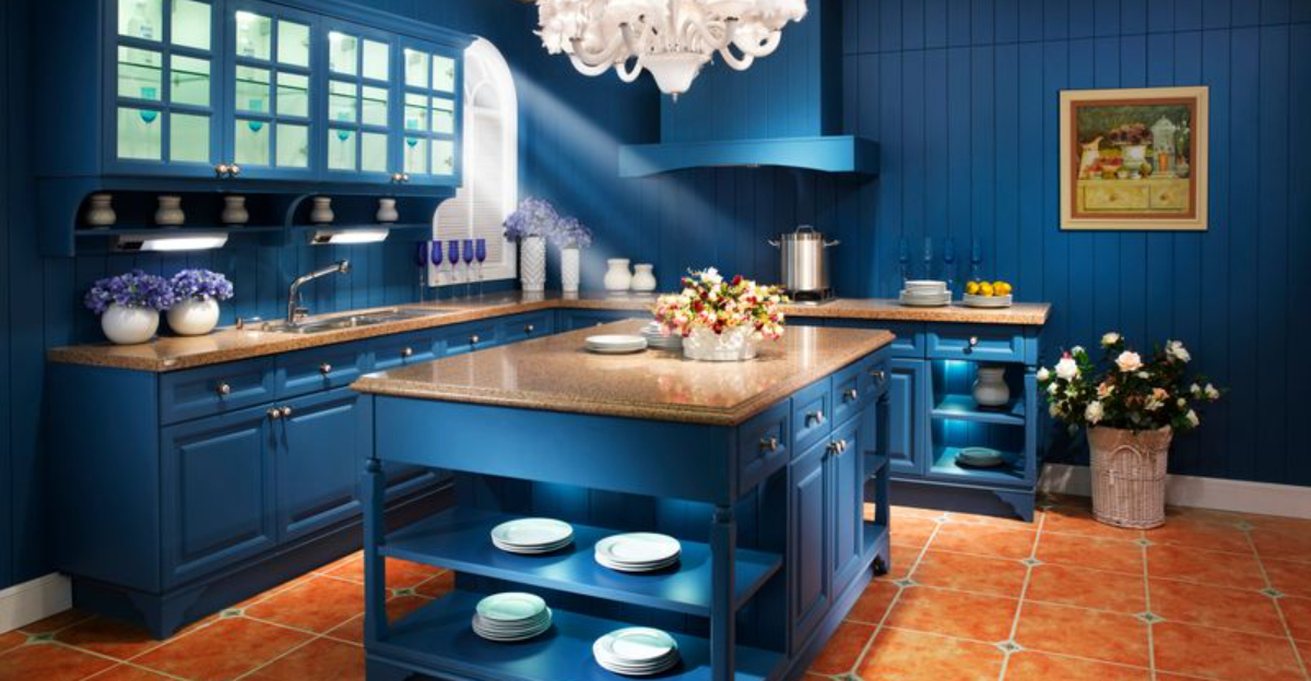
Once the sun goes down, your lightbulbs take over the job of illuminating your walls. LEDs, incandescent bulbs, and halogens all bring something different to the table. If you use cheap LED bulbs that lean heavily into the blue spectrum, your room might start feeling like a hospital waiting room.
Soft white bulbs can help tone down an overly vibrant blue, making it feel more relaxing for an evening vibe. It is always a smart move to test your paint swatches with your actual light fixtures turned on before you buy a whole gallon.
The Magic of Large Swatch Samples
Tiny little paper paint chips from the store are almost useless when trying to figure out how a color behaves. To truly see what a blue will do, you need to create big samples. You can buy peel-and-stick paint samples or paint large squares on poster board.
Move these big samples around to different walls during the week. Put them next to your trim, right beside the window, and in the darkest corner of the room. You will be amazed at how much the color appears to change just by moving it a few feet.
Light doesn’t just come from the windows or the ceiling—it also bounces off everything else in the room. If you have bright orange hardwood floors, that warmth is going to reflect right onto your lower walls, affecting the blue paint.
Similarly, a large green sofa or dark curtains will throw their own color casting onto the walls. Testing your paint next to your actual furniture ensures that all your decor elements work together instead of fighting against each other.
Choosing the right blue paint doesn’t have to be a stressful guessing game. By taking the time to test your options under different lighting conditions, you save yourself the headache of a costly repaint. It is all about watching how the color responds to the natural rhythm of your home.
So, grab a few samples, stick them on your walls, and watch them change throughout the day. With a little patience, you will find that perfect, dreamy blue that looks amazing no matter what time it is.