Ever walked into a tiny room and felt like the walls were gently closing in on you. It is a common frustration for anyone living in a cozy apartment or dealing with a cramped spare bedroom. We are often told to just paint everything stark white and hope for the best, but let’s be honest: that can sometimes feel a bit clinical and lifeless.
What if you could use color to actually push those walls back visually. It sounds like magic, but it is just clever visual science. By pairing two specific shades—powder blue and light charcoal—you can create an incredible illusion of depth. This dynamic duo works together to trick your brain into seeing distance where it does not exist.
The Science of Receding Colors
Have you ever looked at a mountain range in the distance. The furthest peaks always look a bit blue and hazy. That is because cool tones naturally seem to step back away from our eyes. Powder blue is an absolute champ at this visual trick. When you paint a wall this color, it does not just sit there; it visually recedes, mimicking the wide-open sky.
This soft hue brings a light, airy energy that makes a tight space feel like it has room to breathe. Instead of bouncing light harshly like bright white, it absorbs and softens it, creating a gentle blur at the edges of the room. It is the perfect foundation for making a cramped area feel instantly more expansive.
Enter Light Charcoal for Instant Dimension
Now, you might think adding a dark color like charcoal to a small room is design suicide. But wait a minute. While dark colors can sometimes make a space feel intimate, light charcoal provides a grounding anchor. Think of it as the shadow that gives a drawing its three-dimensional look.
When you use a soft, smoky gray alongside your blue, you create contrast. This contrast is what tells your brain there is depth to look at. Without a darker tone to balance things out, a light room can look flat and boring. The charcoal creates an intentional shadow effect that makes the blue walls look even further away.
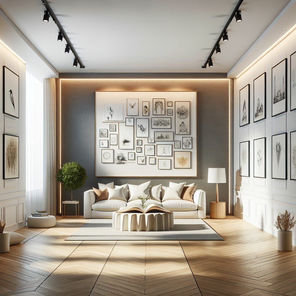
So, how do you actually use this setup without making a mess of things. One great trick is painting the furthest wall in your room with light charcoal, and the remaining walls in powder blue. This technique focuses the eye directly through the space, making a short room feel much longer than it actually is.
- Choose the back wall: Pick the wall across from the doorway to draw people in.
- Keep it matte: A flat or eggshell finish helps absorb light and hides