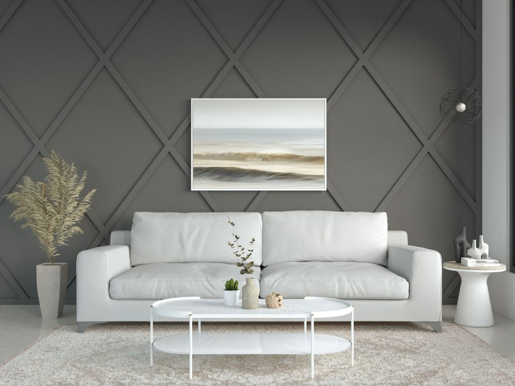
Remember when offices looked like a sea of endless beige cubicles? For decades, corporate design was obsessed with neutrality. The thinking went that loud colors would distract us, so everything from the walls to the carpets was bathed in an uninspiring, clinical gray or off-white. It was safe, predictable, and frankly, a bit soul-crushing.
But things have changed completely. As we navigate 2026, the way we work looks radically different than it did even a few years ago. With hybrid schedules, flexible spaces, and a massive focus on mental well-being, our surroundings have to work harder than ever. People don’t just need a desk; they need an environment that actively helps them feel good and do their best work. That’s where a fresh, creative color palette comes in.
The End of the Monochromatic Corporate Era
Let’s be honest, walking into a sterile, stark white office feels more like visiting a hospital than a place of innovation. Companies are finally waking up to the fact that bland environments lead to bland thinking. Today’s dynamic workplaces are casting off those old chains and embracing vibrant, expressive hue choices.
This shift isn’t just about making things look pretty for social media. It’s a direct response to the flexible, multi-functional nature of modern work. When an office has to serve as a collaboration hub, a quiet zone, and a social space all in one day, a single paint color just won’t cut it anymore.
How Chromaticism Sparks Everyday Creativity
Have you ever noticed how a bright pop of color can instantly lift your mood? That’s the magic of chromaticism at work. Major workplace design firms like Steelcase have noted that versatile environments are fueling the creation of new, complex colors. We are moving away from simple primary colors and toward rich, layered tones.
When you introduce unexpected color pairings—like a deep forest green mixed with a soft terracotta—it stimulates the brain. It signals to your mind that you are in a place of creation, not just repetition. These fresh palettes act as a visual spark plug, keeping your environment dynamic and inspiring for your daily tasks.
The Mental Strategy Behind Wall Colors
Color psychology is no longer just a theory for artists; it’s a vital tool for business culture. The shades you pick for your walls directly influence your focus and well-being. Instead of grabbing a cheap can of white paint for convenience, smart companies use research-backed palettes.
- Soft Blues and Greens: Ideal for high-stress zones or areas where intense focus is needed, like coding or editing bays.
- Warm Yellows and Oranges: Perfect for brainstorming rooms where team energy and creative output need a major boost.
- Deep Earth Tones: Great for quiet retreat spaces or meditation corners to help workers unwind and decompress.
Furniture and Accents as Functional Art
You don’t always have to repaint the entire building to make a big impact. A lot of the best color strategies emerge from experimentation with furniture selection and placement. Using colorful chairs, vibrant acoustic panels, and bold rugs allows a space to remain flexible.
Think about a movable green couch or a bright teal privacy screen. These pieces don’t just provide comfort; they create visual landmarks within an open office plan. They tell your eyes exactly what that specific area is meant for, helping employees feel their best throughout the changing workday.
Designing for Diverse Moods and Varied Tasks
Today’s professionals do a million different things in a single week. One hour you are on a high-stakes video call, and the next you are quietly reading a long proposal. A dynamic work setup needs to cater to these shifting mental states.
Multi-colored office spaces use color to map out different functional zones. A bright, sunny kitchen area encourages casual chats and networking during lunch. Meanwhile, a moody, deeply saturated navy library space tells everyone that it’s time for quiet, solitary concentration. It’s all about creating a balance that prevents sensory overload while fighting off boredom.
Overcoming Cultural Differences in Color Perception
When designing a modern space, you also have to think about the people using it. Color perception isn’t entirely universal; there are unique cultural differences in how we interpret shades. For instance, while some cultures view red as a sign of danger, others see it as a symbol of luck and prosperity.
The goal for modern professional palettes in 2026 is to strike a balance between excitement and sophistication. Curated collections blend rich neutrals with fresh, creative edges. This ensures the environment feels welcoming and respectful to a diverse workforce while still maintaining an innovative spirit.
At the end of the day, the colors we surround ourselves with tell a story about what we value. If we want people to bring their full, creative selves to work, we can’t keep asking them to sit in uninspiring gray boxes. The transition to fresh, expressive palettes is a sign of respect for the human element of labor.
Take a good look around your current workspace today. Is it fueling your motivation, or is it draining your energy. Don’t be afraid to experiment with color, even if it’s just a small desk lamp, a colorful art piece, or a new coat of paint on a single accent wall. Your mind, and your productivity, will thank you for it.