Ever walked into a room that felt just… right? Not too loud, not too boring. It had that perfect mix of energy and calm. You probably couldn’t put your finger on why it worked, but it did. That’s the magic of mixing bold colors with neutrals. It’s not just about picking pretty shades. It’s about creating a vibe. A feeling. In 2026, we’re seeing a huge shift away from the all-beige-everything trend that dominated the early twenties. People want personality again. But they don’t want chaos. They want their homes to feel like them, without giving them a headache.
So, how do you get there? It’s easier than you think. You don’t need a degree in color theory or a massive budget. You just need a little confidence and some basic rules. Think of neutrals as the stage and bold colors as the actors. The stage needs to be solid so the actors can shine. If the stage is falling apart, nobody notices the performance. If the stage is too flashy, the actors get lost. It’s a dance. And once you learn the steps, you’ll never look at a paint swatch the same way again. Let’s dive in.
Understanding the Neutral Foundation
Neutrals are often misunderstood. Many folks think "neutral" means white, beige, or gray. And sure, those are classics. But in modern design, the definition has expanded. A neutral is any color that doesn’t compete for attention. It recedes. It supports. This includes warm taupes, soft greiges, creamy off-whites, and even muted earth tones like clay or sand. The key is saturation. Neutrals have low saturation. They are quiet. When you start with a quiet base, you give your eyes a place to rest. This is crucial. Without rest, bold colors become exhausting.
In 2026, we’re seeing a move toward "warm neutrals." Cool grays are out. Warm, organic tones are in. Think of the color of unbleached linen or weathered wood. These tones add depth without adding noise. They make a space feel grounded. When you choose your neutral base, consider the light in your room. North-facing rooms get cool light, so a warm neutral can balance that chill. South-facing rooms get warm light, so you might want a slightly cooler neutral to keep things fresh. Test your paints. Always. What looks like a soft cream in the store might look like yellow butter under your specific ceiling lights.
Don’t be afraid to layer neutrals either. Using just one shade of beige can feel flat. Try mixing textures instead. A chunky wool rug in oatmeal, smooth linen curtains in ivory, and a matte painted wall in taupe. The color family is similar, but the textures create interest. This adds sophistication. It makes the room feel curated, not just decorated. This layered neutral backdrop is what allows the bold colors to pop later. It’s the secret sauce. Without it, your bold choices might look accidental rather than intentional.
Choosing Your Bold Accent Colors
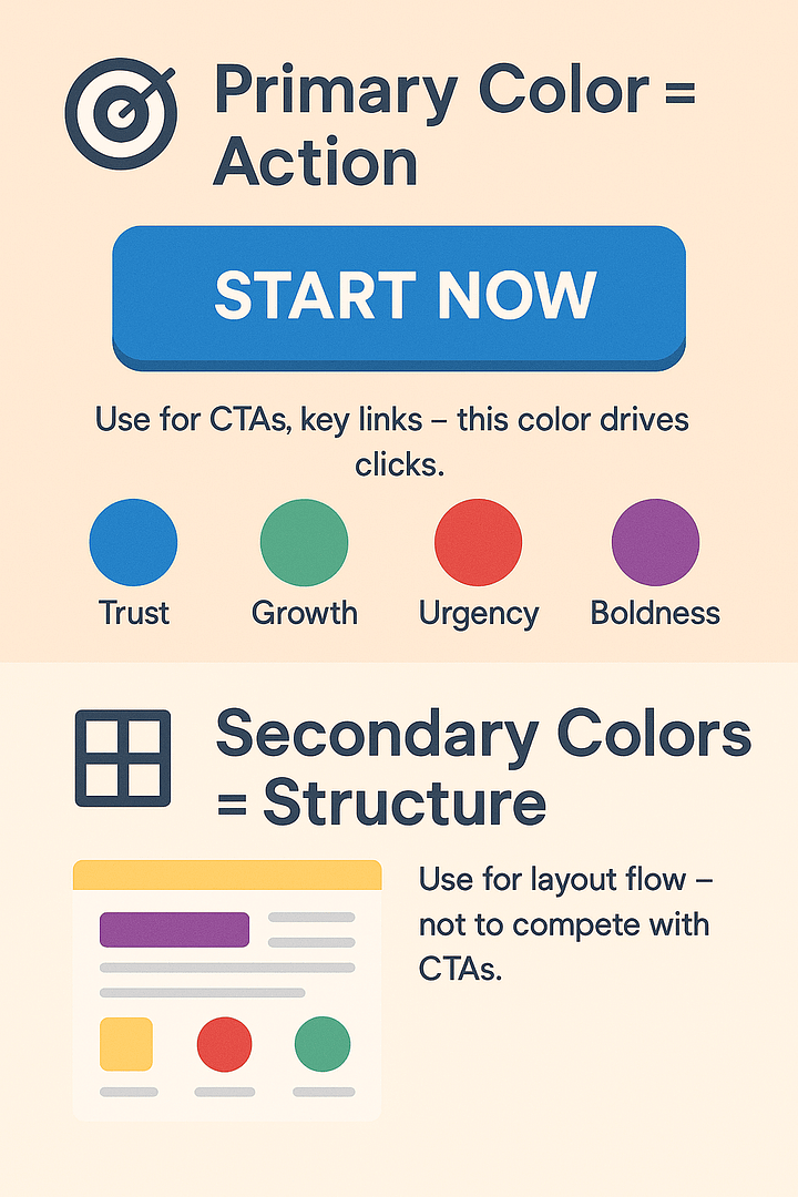
Now for the fun part. Picking the bold colors. This is where people get nervous. What if I pick the wrong blue? What if the red is too aggressive? Here’s the thing: there are no wrong choices, only wrong applications. But let’s make it easier. Start with one or two bold hues. Don’t try to use the whole rainbow. Pick a color that speaks to you. Do you love the deep calm of navy? The energy of tangerine? The mystery of emerald green? Go with that. In 2026, jewel tones are making a big comeback, paired with those warm neutrals we talked about.
Consider the mood you want to create. Blue is calming. Yellow is cheerful. Red is passionate. Green is restorative. Think about the function of the room. A bedroom might benefit from soothing blues or greens. A dining room could handle a spicy orange or a dramatic plum. Look at nature for inspiration. Nature never gets it wrong. Think of a bright red flower against green leaves. Or a blue sky against sandy dunes. These combinations work because they are balanced. One color dominates, and the other accents. Try to mimic that balance in your home.
Also, think about the intensity. A neon pink is very different from a dusty rose. Both are pinks, but they have different energies. For a beginner, start with slightly muted bold colors. Instead of electric blue, try a saturated cobalt. Instead of fire-engine red, try a brick or terracotta. These colors are still bold, but they are easier to live with. They blend better with natural materials like wood and stone. As you get more confident, you can experiment with brighter, sharper hues. But remember, the goal is harmony, not shock value.
The 60-30-10 Rule Explained
You’ve probably heard of the 60-30-10 rule. It’s a classic interior design principle for a reason. It works. Here’s how it breaks down. 60% of your room should be your dominant color. This is usually your neutral. Walls, large rugs, big sofas. This sets the tone. 30% should be your secondary color. This can be another neutral or a softer version of your bold color. Think chairs, curtains, or an accent wall. 10% is your accent color. This is where the bold stuff lives. Pillows, art, vases, small accessories.
Why does this matter? Because it creates visual balance. If you have 50% bold color, the room feels chaotic. If you have 5% bold color, it feels timid. The 60-30-10 split ensures that the bold colors have enough presence to be noticed, but not enough to overwhelm. It’s a safety net. When you’re unsure, stick to this ratio. It’s hard to mess up. For example, imagine a living room. The walls and sofa are a warm beige (60%). The curtains and armchairs are a soft sage green (30%). The throw pillows and a piece of abstract art are a vibrant teal (10%). See how that works? The teal pops because it’s rare.
But don’t be a slave to the numbers. It’s a guideline, not a law. Sometimes you might want a 70-20-10 split if you really love minimalism. Or a 50-40-10 if you’re feeling brave. The key is intentionality. Make sure the distribution feels right to your eye. Step back. Squint. Does one area feel too heavy? Does another feel empty? Adjust accordingly. The 10% accent is the spice. You wouldn’t put a cup of salt in your soup. You’d use a pinch. Same idea here. Less is often more when it comes to high-impact color.
Texture and Material Matters
Color doesn’t exist in a vacuum. It lives on surfaces. And surfaces have texture. Texture changes how we perceive color. A glossy red paint looks very different from a matte red velvet. The gloss reflects light, making the color seem brighter and harder. The matte absorbs light, making the color seem deeper and softer. When mixing bolds and neutrals, play with this. Use matte finishes for your neutrals to keep them calm. Use glossy or textured finishes for your bolds to make them sing.
Think about materials. Leather, wood, metal, glass, fabric. Each interacts with light differently. A bold blue ceramic vase will catch the eye differently than a bold blue wool blanket. The ceramic is hard and reflective. The wool is soft and absorbent. Mixing these materials adds richness. It prevents the room from feeling one-dimensional. In 2026, there’s a big focus on tactile experiences. People want to touch their homes. So, choose materials that invite touch. A rough jute rug next to a smooth silk pillow. A cold marble table next to a warm wooden chair.
Also, consider the weight of materials. Heavy fabrics like velvet or chenille feel more substantial. They can handle darker, bolder colors well. Light fabrics like linen or cotton feel airy. They work well with lighter, brighter colors. If you put a heavy, dark bold color on a light, airy fabric, it might look muddy. If you put a light, bright color on a heavy fabric, it might look washed out. Match the intensity of the color to the weight of the material. This subtle tweak can make a huge difference in how professional your design looks. It’s the kind of detail that separates good design from great design.
Lighting Changes Everything
Light is the invisible ingredient in every design recipe. It can make or break your color choices. Natural light changes throughout the day. Morning light is cool and blue. Afternoon light is warm and golden. Evening light is dim and artificial. Your bold colors will look different at 9 AM than they do at 9 PM. This is why testing is so important. Paint a large swatch on your wall. Watch it for a full day. Does the bold yellow look cheerful in the morning but glaring in the afternoon? Does the deep navy look sophisticated in the day but black at night?
Artificial lighting matters too. LED bulbs come in different color temperatures. Warm white (2700K-3000K) enhances reds, oranges, and yellows. It makes neutrals feel cozier. Cool white (3500K-4000K) enhances blues and greens. It makes neutrals feel crisper. Daylight bulbs (5000K+) show colors most accurately but can feel sterile. Choose your bulbs wisely. If you have a room with lots of bold warm colors, go with warm white bulbs. If you have cool bold colors, you might prefer a neutral white. Don’t just grab the cheapest bulb off the shelf.
Layer your lighting as well. Don’t rely on one overhead light. Use lamps, sconces, and candles. This creates pools of light and shadow. Shadow adds drama. It makes bold colors feel more mysterious and deep. A well-placed lamp can highlight a bold piece of art or a colorful chair. It draws the eye exactly where you want it. In the evening, dimmer switches are your best friend. They allow you to control the mood. Bright light for cleaning, dim light for relaxing. Your colors should work in both scenarios. If they don’t, adjust your palette or your lighting plan.
Even pros make mistakes. But knowing the common pitfalls can save you time and money. One big mistake is ignoring the existing elements. You can’t just pick colors in a void. You have to work with what’s already there. The floor, the countertops, the fixed cabinets. If you have orange-toned wood floors, a cool gray wall might look dirty. A warm beige would look harmonious. Always start with the fixed elements. They are the hardest to change. Build your palette around them.
Another mistake is using too many bold colors. It’s tempting. You love blue, and you love green, and you love yellow. But putting them all together can look like a circus. Stick to one or two bold hues per room. Save the other colors for other rooms. This creates flow. When you walk from one room to another, the experience should feel connected, not jarring. You can repeat a bold color in small doses throughout the house to tie things together. A blue pillow in the living room, a blue vase in the kitchen. Subtle echoes.
Finally, don’t forget scale. A bold color on a small accent wall might feel overwhelming if the room is tiny. A bold color on a large sofa might feel lost if the room is huge. Consider the size of the space and the size of the object. Large spaces can handle larger blocks of bold color. Small spaces are better with small pops of bold color. Also, consider the visual weight. Dark, bold colors feel heavier. Light, bold colors feel lighter. Balance the visual weight in the room. Don’t put all the heavy, dark colors on one side. Spread them out. Keep the eye moving.
Getting it right takes practice. But it’s worth it. A home that reflects your personality is a joy to live in. It boosts your mood. It inspires creativity. It welcomes guests. So don’t be afraid to experiment. Buy a sample pot of paint. Grab a colorful throw blanket. Move things around. See what happens. Design is not static. It’s a living thing. It evolves with you. And remember, you can always paint over it. You can always swap the pillows. There’s no permanent mistake, only lessons learned.
In the end, mixing bold colors with neutrals is about balance. It’s about confidence. It’s about knowing when to shout and when to whisper. Use the neutral base to ground yourself. Use the bold accents to express yourself. Follow the guidelines, but trust your gut. If it feels right, it probably is. Look at your space. Does it make you smile? Does it feel like you? If yes, you’ve done it. You’ve mastered the art of the mix. Now, go enjoy your beautiful, balanced home.