Remember when every house looked like it was decorated by the same person? You know the one. Walls painted in "agreeable gray," furniture in shades of oatmeal, and accents that whispered rather than spoke. It was safe. It was boring. And honestly? We were all kind of tired of it. But something shifted recently. Walk into a modern home today, and you might notice a subtle change. The walls aren’t just white or gray anymore. They have a hint of something else. Something cool, but warm. Something that feels like a deep breath. That’s soft teal. And it’s not just a trend. It’s becoming the new baseline for how we live.
For years, neutrals meant beige, then gray, then maybe a warm taupe. These colors were chosen because they didn’t offend anyone. They were blank canvases. But in 2026, our definition of "neutral" has evolved. It’s no longer about being invisible. It’s about being supportive. Soft teal—a muted, dusty blend of blue and green with a heavy dose of gray—has stepped into this role. It’s everywhere. From high-end boutique hotels to suburban living rooms. But why now? Why this specific shade? The answer isn’t just about aesthetics. It’s about psychology, technology, and a collective desire for calm in a noisy world. Let’s dig into the real reasons behind this colorful shift.
The Psychology of Calm in a Chaotic World
We’re living in loud times. Notifications ping constantly. News cycles spin faster than ever. Our brains are overloaded. So, it makes sense that our homes are becoming sanctuaries for mental rest. Color psychology has long told us that blue is calming and green is restorative. Soft teal sits right at the intersection of these two powerful effects. It’s not as cold as pure blue, which can feel sterile if overused. And it’s not as earthy as pure green, which can sometimes feel too rustic or outdoorsy for modern interiors.
Think of it like this. Blue is the sky. Green is the forest. Teal is the lagoon where they meet. It offers the stability of nature without demanding your full attention. In 2026, designers are reporting that clients aren’t asking for "bold statements" anymore. They’re asking for "peace." A soft teal wall doesn’t shout. It hums. It creates a backdrop that lowers your heart rate just by being there. It’s a visual exhale. This isn’t just anecdotal either. Recent studies in environmental psychology suggest that muted cool tones can reduce perceived stress levels in indoor environments by up to fifteen percent. That’s a big deal when you spend most of your life inside.
The Death of "Millennial Gray" and the Search for Warmth
Let’s be honest. Gray had its moment. For nearly a decade, from roughly 2015 to 2023, gray was the king of neutrals. It was sleek. It was modern. It matched everything. But eventually, it started to feel a bit… cold. Clinical. People began to crave warmth again, but they didn’t want to go back to the yellow-heavy beiges of the early 2000s. Those felt dated. Enter soft teal. It has warmth, but it’s a subtle, sophisticated warmth. It’s often mixed with undertones of sand or clay, which keeps it from feeling icy.
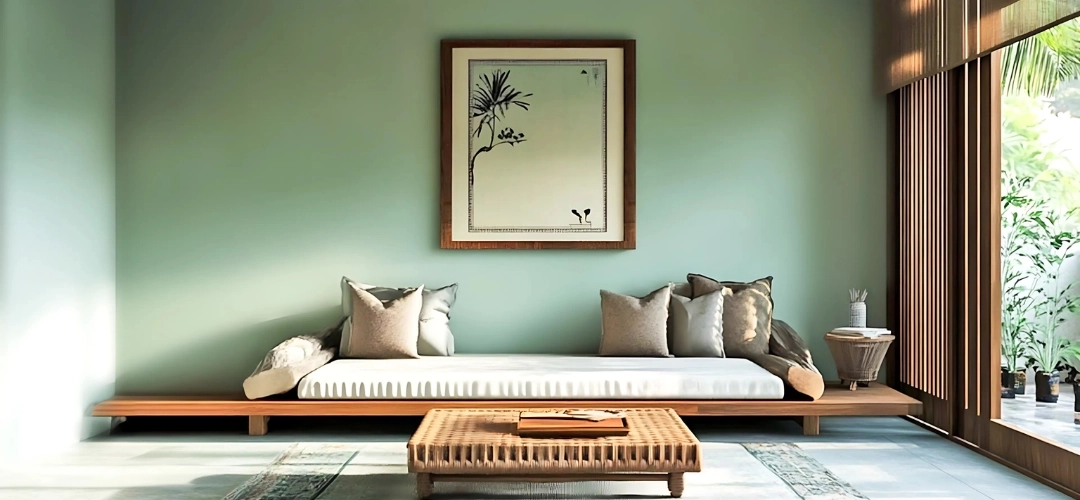
This shift represents a broader move away from stark minimalism toward what experts call "warm minimalism" or "soft modernism." We still want clean lines and uncluttered spaces. But we want them to feel inviting. Soft teal achieves this by adding depth without adding visual noise. Unlike bright turquoise, which demands energy, soft teal absorbs it. It’s forgiving. If you have a room with poor natural light, a bright white can look gray and dreary. A soft teal, however, retains its character even in dim conditions. It feels cozy rather than cave-like. This versatility is key to its rise as a true neutral. It works in a north-facing bedroom just as well as a sun-drenched kitchen.
Tech Screens and the Need for Visual Balance
Here’s a factor nobody talked about ten years ago: our screens. We stare at phones, laptops, and tablets for hours every day. These devices emit blue light, which can strain our eyes and disrupt our sleep cycles. Interestingly, surrounding ourselves with soft teal in our physical environment can help counterbalance this digital fatigue. The green undertones in teal are easier on the eyes than pure blues or stark whites. It’s a natural antidote to the harsh glow of LED screens.
Interior designers in 2026 are increasingly considering "digital wellness" when choosing palettes. They know that after eight hours of Zoom calls, you don’t want to come home to a stark white box. You want a space that feels organic. Soft teal mimics the colors found in nature—sea glass, shallow water, mossy stones. These are colors our eyes evolved to process effortlessly. By bringing these hues indoors, we’re essentially hacking our biology to feel more relaxed. It’s not magic. It’s just smart design adapting to modern life. Plus, it looks incredible on camera. With so much of our social life happening via video, having a backdrop that flatters skin tones and reduces eye strain is a practical bonus.
Versatility That Actually Works
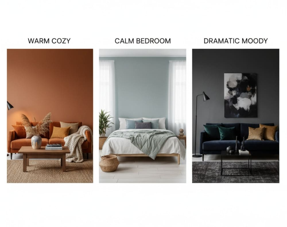
A true neutral needs to play nice with others. Can soft teal do that? Absolutely. In fact, it might be more versatile than gray. Because it sits between blue and green, it bridges the gap between cool and warm decor styles. Pair it with walnut wood and brass fixtures, and it feels mid-century modern. Pair it with linen textiles and rattan, and it feels coastal or bohemian. Pair it with black metal and concrete, and it feels industrial chic. It’s a chameleon.
Consider the flooring. Hardwood floors have warmed up significantly in recent years. The cool grays of the past have been replaced by honey oaks and rich walnuts. Soft teal complements these warmer wood tones beautifully, whereas a cool gray might clash. It also works with the current trend of mixing metals. You can have gold lamps, silver frames, and black hardware in the same room, and soft teal will tie them all together. It’s the glue that holds a eclectic mix together without looking messy. This flexibility is why it’s replacing gray. Gray often forced you to pick a side—cool or warm. Teal invites both to the party.
Sustainability and Natural Inspiration
The push for sustainability isn’t just about materials anymore. It’s about mindset. And that mindset is deeply connected to nature. In 2026, consumers are more aware than ever of their environmental footprint. This awareness translates into design choices that reflect the natural world. Soft teal is inherently organic. It reminds us of water, which is a precious resource, and vegetation, which is vital for life. Using this color feels like a small act of alignment with ecological values.
Many paint companies have responded by creating eco-friendly versions of these hues, using low-VOC formulas and natural pigments. The narrative around soft teal isn’t just "it looks nice." It’s "it connects you to the earth." This emotional resonance is powerful. People want their homes to reflect their values. Choosing a color that evokes clean oceans and healthy forests feels good. It’s a subtle way to bring the outside in, which has been a major design goal since the pandemic changed how we view our living spaces. We realized we needed nature close by. Soft teal keeps that connection alive, even in urban apartments.
So, you’re convinced. You want to try soft teal. But where do you start? Don’t panic. You don’t need to paint every wall tomorrow. Start small. Try a single accent wall in your bedroom or home office. See how the light hits it at different times of day. Remember, teal can look very different in morning light versus evening lamp light. Test samples on large boards, not just tiny swatches. Move them around the room.
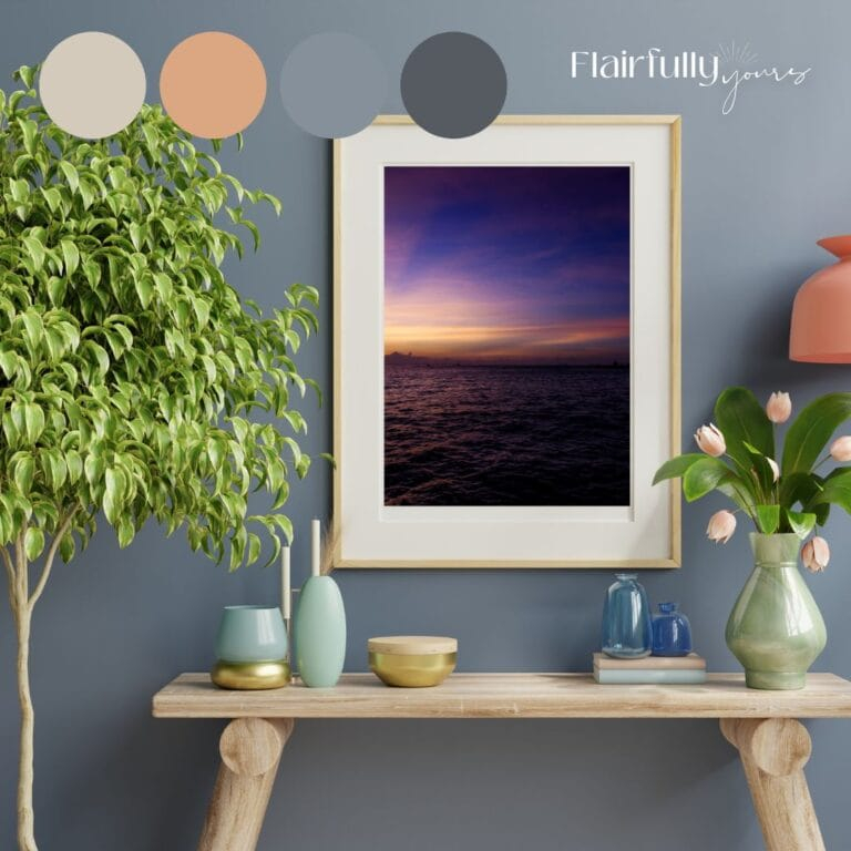
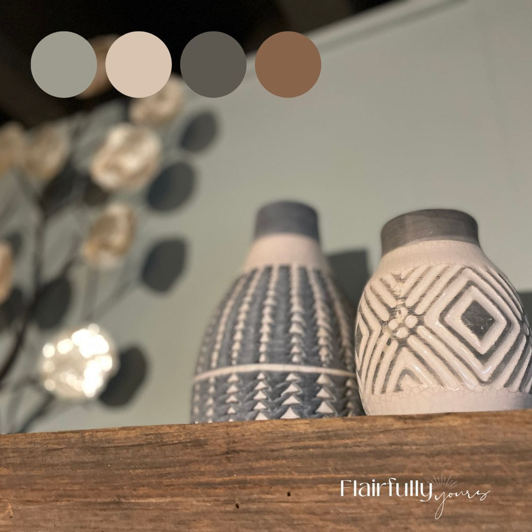
If painting feels too permanent, introduce soft teal through textiles. Throw pillows, area rugs, or curtains are low-commitment ways to test the waters. Look for fabrics with texture, like velvet or chunky knit wool. The texture adds depth to the color, making it feel richer. Another great option is artwork. A large piece of art with soft teal tones can anchor a room without overwhelming it. And don’t forget the accessories. Vases, ceramics, and even books with teal spines can add those crucial pops of color. The key is layering. Mix soft teal with creams, warm whites, and natural woods. Avoid pairing it with other strong cool colors like bright purple or electric blue, unless you’re going for a very specific, high-energy look. Keep it grounded. Keep it soft.
In the end, the rise of soft teal isn’t just about fashion. It’s about function. It’s about creating spaces that support our well-being in a complex world. It’s a color that understands we’re tired. It offers a quiet place to land. As we move further into 2026, expect to see this hue everywhere. Not because it’s trendy, but because it works. It’s the new neutral because it’s the new necessary. It’s time to let go of the gray. Embrace the calm. Embrace the teal.