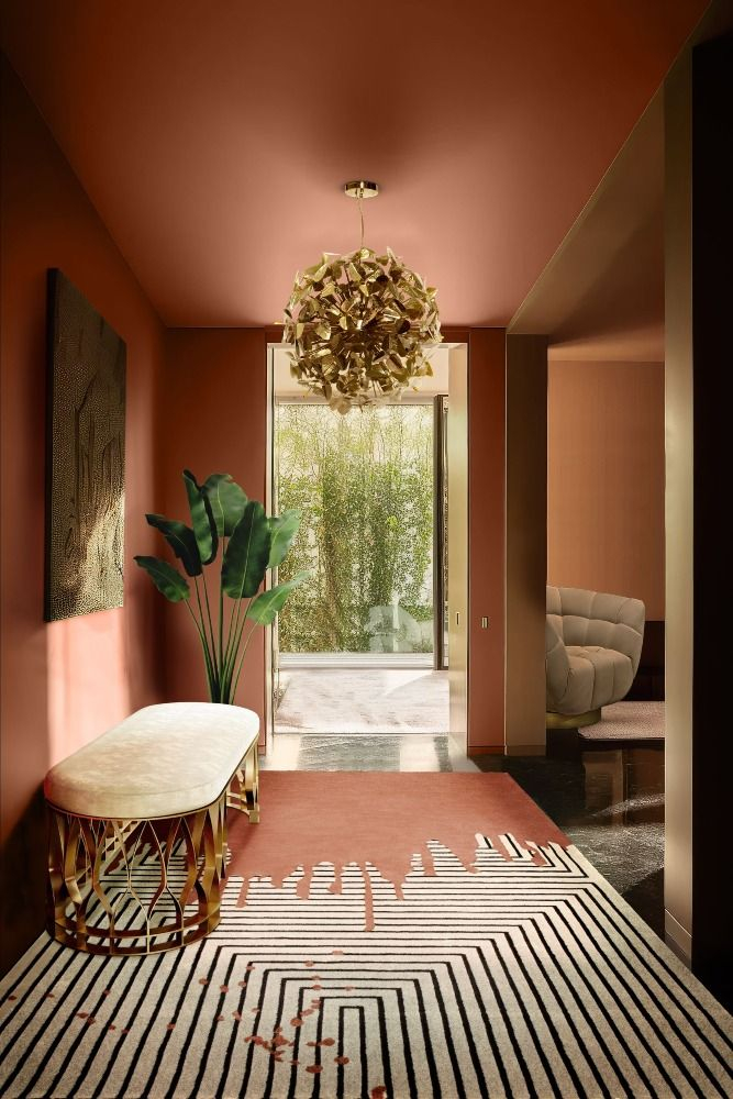
There is something instantly comforting about walking into a space or opening an app that greets you with a sun-drenched glow. Warm colors—those rich reds, fiery oranges, and golden yellows—have a psychological superpower. They advance toward the viewer, instantly grabbing attention and wrapping us in a digital or physical hug.
But have you ever noticed how quickly a cozy terracotta can turn into an aggressive, eyesore orange. Or how a soft honey yellow can suddenly look like outdated mustard. It happens way more often than you think. In fact, color theory experts point out that warm palettes are among the trickiest to pull off without looking messy, overwhelming, or just plain cheap.
The Aggressive Advance of Hot Hues
The main problem with warm colors comes down to science and psychology. Because warm tones literally look like they are moving toward your eyes, they take over a design fast. If you fill a screen or a room with high-saturation red and orange, your eyes don’t know where to rest. It triggers a fight-or-flight response instead of a welcoming feeling.
A common misstep is overusing bold hues because they are trending. When everything is screaming for attention, nothing stands out. This is why people get headaches looking at certain websites or feel anxious in heavily painted rooms. The secret lies in restraint and understanding how these shades behave in the real world.
The Muddy Trap of Bad Mixing
Another huge issue is when things start looking muddy. This happens when designers try to tone down a bright warm color by blindly mixing in blacks or random grays. Instead of looking rich, the color loses its life and ends up looking dirty.
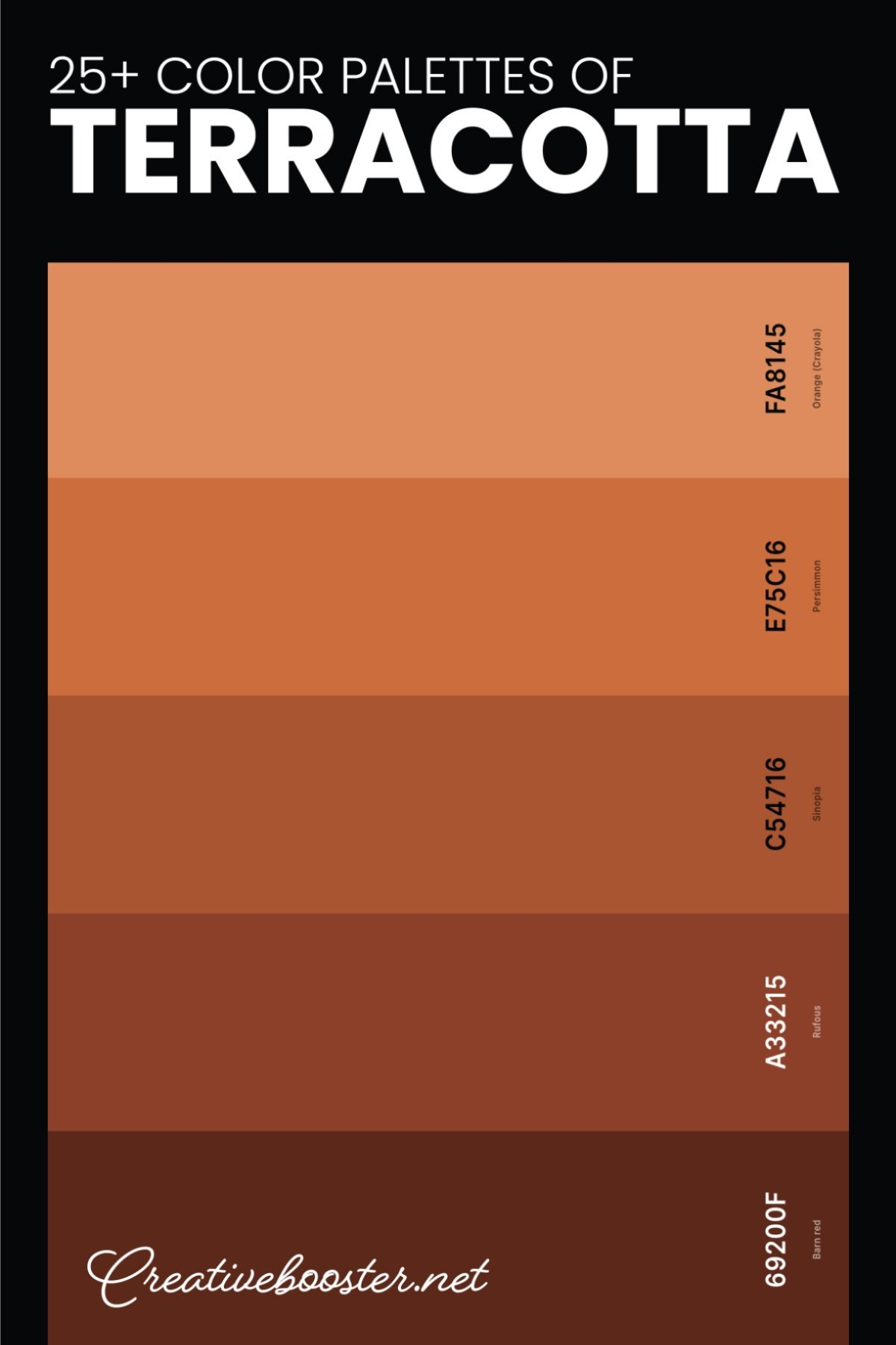
To keep things looking expensive and clean, top designers use a technique called under-toning. Instead of flattening a red with straight black, they might deepen it with a touch of a complementary cool tone or a rich burgundy. It keeps the color vibrating with life rather than flattening it into sludge.
Ignoring the Power of Contrast and Lighting
You can pick the most beautiful amber shade in the universe, but if you don’t think about lighting and contrast, it will fail. A warm palette needs breathing room. Without proper contrast, text becomes impossible to read, and shapes blend into each other, which breaks basic accessibility rules.
Lighting also changes everything. A warm paint color that looks like a cozy latte in a sunny studio might look like toxic sludge under fluorescent office bulbs. Digital designers face the same issue with different screen brightness levels. You always have to test how these colors look in different environments before committing.
The Secret Ingredient: Lean into Neutral Anchors
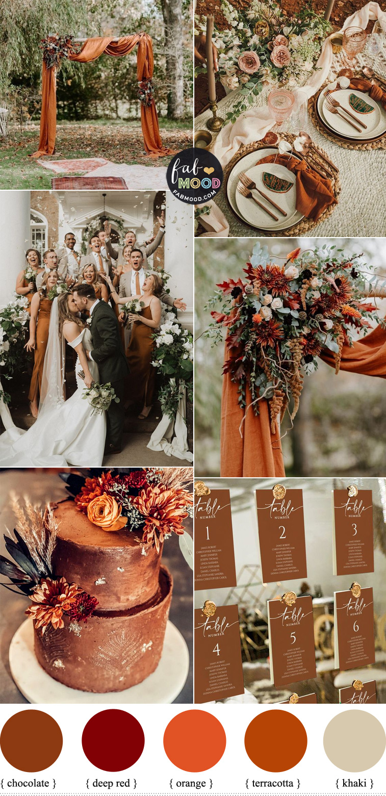
So, how do the pros make warm palettes look like luxury chocolate rather than a fast-food wrapper. They anchor them with sophisticated neutrals. Instead of pairing an orange with a stark, blinding white, they will use a creamy ivory, a soft charcoal, or a muted taupe.
These neutral backgrounds act like a stage. They absorb the excess energy of the hot colors, letting the warm tones feel rich and intentional rather than chaotic. It is all about giving those loud colors a quiet place to sit.
Stick to One Dominant Temperature
A lot of people think they need to balance a warm room or website by throwing in an equal amount of cool blue or green. But color experts actually advise against a perfect 50-50 split. When you mix warm and cool temperatures equally, they fight each other for dominance, creating visual confusion.
The trick is to let one temperature rule the school. If you want a warm vibe, let the warm colors do 80% of the heavy lifting. You can still use a tiny splash of a cool color as an accent to make the warm tones pop, but keep it minimal. Think of it like adding a pinch of salt to a sweet dessert.
The Magic of Textures and Tonal Depth
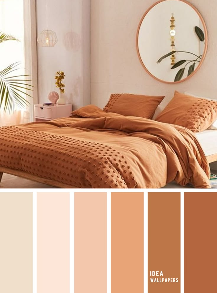
If you look at high-end designs, you will notice they rarely use just one flat shade of red or yellow. They build tonal depth by layering different shades, tints, and textures of the same color family. This stops the design from looking like a flat block of plastic.
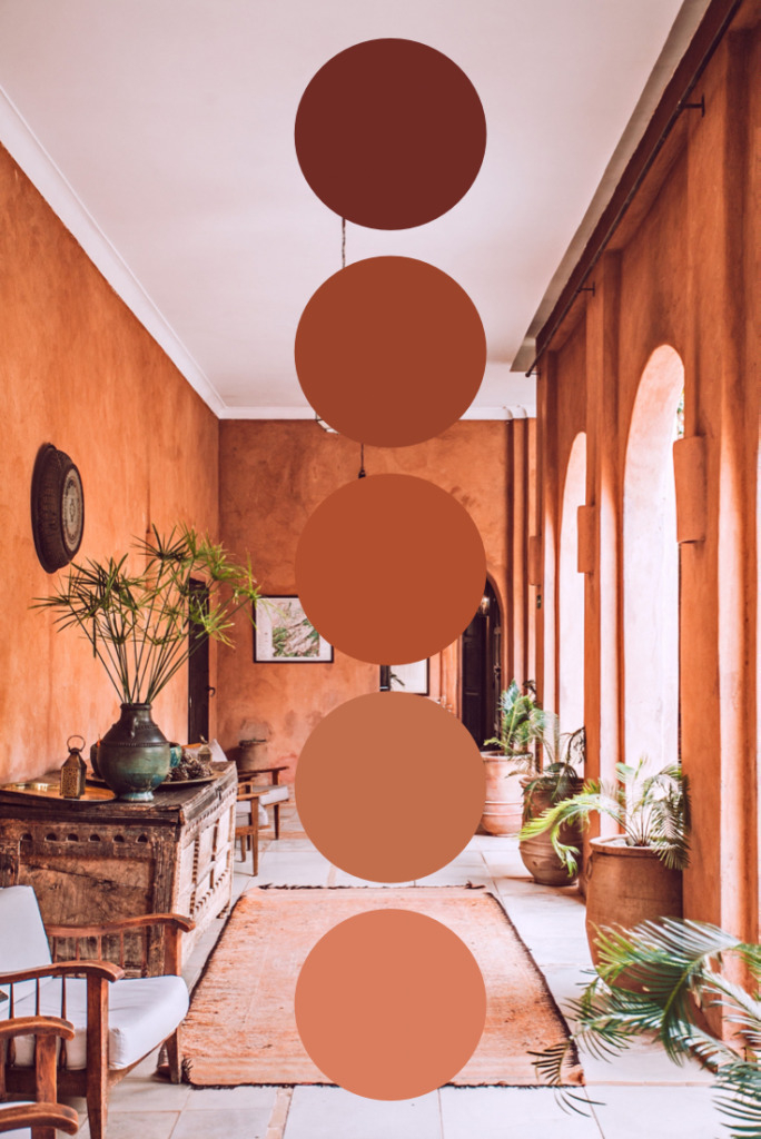
In interior design, this means pairing a velvet rust couch with a matte terracotta wall and a shiny brass lamp. In digital design, it means using subtle gradients and soft shadows. This layering creates a sense of luxury and richness that a single flat color can never achieve.
Creating a beautiful warm color scheme is definitely a balancing act. It is so easy to go overboard and end up with something that feels stressful or outdated. But by limiting your boldest hues, anchoring them with rich neutrals, and keeping a eye on contrast, you can create something truly magical.
Remember to design with intention rather than just following the latest trends. Keep your colors clean, give them room to breathe, and don’t be afraid of a little imperfection. With these tricks up your sleeve, your next warm design will look effortlessly rich and cozy.