Ever walked into a house where the living room is a calm sandy beige and then—bam. You step into the kitchen and it is suddenly screaming in bright lime green. It gives you a little bit of whiplash, doesn’t it. When colors clash badly, your home starts feeling like a bunch of unrelated chapters instead of one beautiful story.
We want our homes to feel cozy and put together, not like a disjointed maze. But trying to figure out where one wall color should stop and another should start is honestly pretty intimidating. The good thing is that you do not need to be a professional painter to get this right. With a few basic tricks, you can create a smooth vibe throughout your whole place.
Trust the Magic of Undertones
Before you buy twenty different plastic paint samples, you need to understand one basic rule: look for the hidden shade underneath. Every single paint color has a cool or warm undertone hiding beneath the surface. If you choose a gray with a blue base for the hallway, throwing a beige with a yellow base next to it will look totally weird.
To keep things looking unified, try to stick with the same family of undertones across your rooms. If you love warm, cozy vibes, make sure all your neutrals share a tiny hint of brown, cream, or tan. When your spaces share this secret DNA, walking between them feels completely natural and easy on the eyes.
Use Your Trim as a Buffer
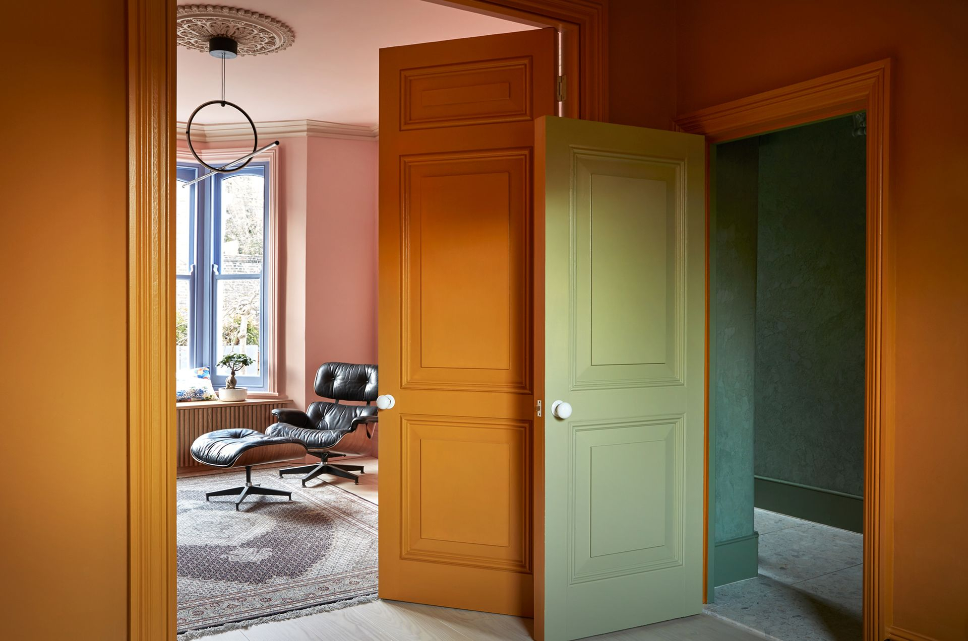
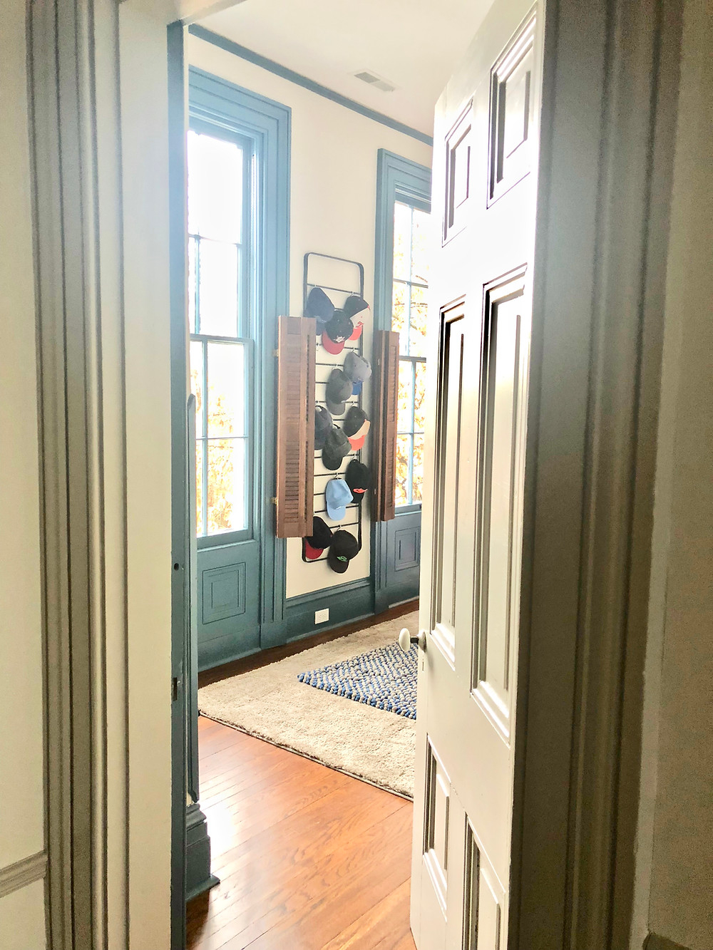
What happens when you want to put two totally different colors right next to each other. That is where your doorways and trim come to save the day. Think of your baseboards and door frames as a safety zone that stops colors from fighting.
Painting all the trim and doors the exact same shade of crisp white or soft cream throughout the whole house is a total game changer. It acts like a visual frame, holding everything together. So even if your home office is a deep navy blue and the main living room is light grey, the matching white trim acts as a bridge that keeps the flow steady.
Map Out Your Sightlines
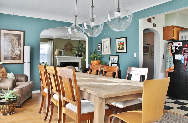
Here is a quick experiment for you. Sit down on your favorite spot on the living room couch and look around. What other rooms can you see from there. Whatever walls are visible from that single viewpoint are part of your "sightline," and they need to get along nicely.
When planning out your palette in 2026, always think about what spaces peek into each other. If you can see the kitchen wall from the dinner table, those two colors should complement each other. Try using a lighter and darker version of the very same color family to create depth without creating a choppy mess.
Natural Breaking Points Are Your Best Friends
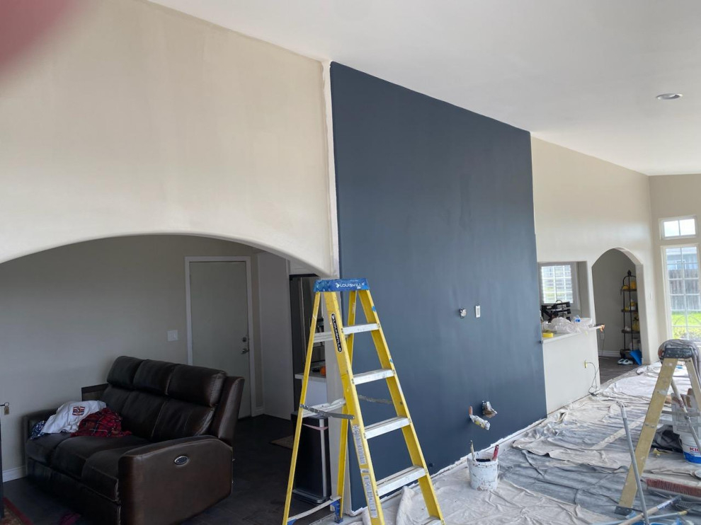
One of the biggest headaches people run into, especially in modern open floor plans, is deciding exactly where to stop the paint roller. If you try to change colors right in the middle of a long, flat wall, it almost always looks like an accident.
Instead, look for natural architectural boundaries. Inside corners, archways, and protruding pillars are perfect spots to switch things up. If you have an open space with zero breaks, you can use a beautiful bookcase or a vertical wood trim piece to create an intentional transition line.
Play with the 60-30-10 Rule
If you are feeling stuck on how to distribute your choices, interior stylists often use a simple math trick to balance things out. Dedicate about 60% of your visible space to a dominant neutral color, which is usually your main living area or hallways.
Then, use a secondary color for about 30% of the space, like an adjacent dining area or accent walls. The final 10% is for fun accent pops—think rugs, pillows, or a fun painted powder room. This easy breakdown ensures no single color overwhelms the rest of the house, keeping the energy feeling balanced.
Test Your Samples in Real Light
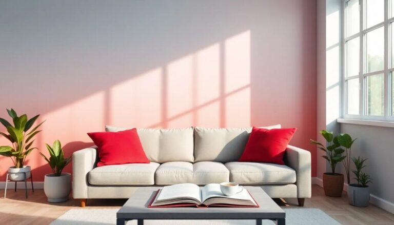
Please do not just pick a color swatch under the harsh fluorescent lights of a hardware store and call it a day. Paint is a total chameleon, and it changes completely depending on how the sun hits it throughout the day.
Paint some large poster boards and tape them up in different rooms. Watch how the morning light makes them look versus how they appear at night under your lamps. This extra step prevents terrible surprises and guarantees that your color transitions look seamless no matter what time it is.
At the end of the day, making your home feel cohesive is all about creating a sense of balance. You do not have to paint your entire house the exact same boring shade of beige just to avoid a choppy look. By paying attention to undertones and using your trim wisely, you can totally use different colors successfully.
Take your time, trust your gut, and enjoy the process of experimenting. Your home should reflect your personal style, and with these simple tricks, you can make sure every room flows together beautifully.