We’ve all been there. Standing in a room that feels… fine. It’s clean. It’s tidy. It’s safe. But it doesn’t spark joy. For years, the interior design world whispered that neutral tones were the only way to go if you wanted your home to feel sophisticated or resellable. Beige walls. Gray sofas. White trim. It was the uniform of adulthood. But something shifted. Maybe it was the long months spent indoors during the early 2020s. Maybe we just got tired of blending in. Whatever the reason, people started reaching for the bright paint cans. And they didn’t look back.
This isn’t about following a trend that will fade by next season. It’s about the real, messy, beautiful journey of living in color. We’re talking about actual homes. Real budgets. Genuine fear before that first brush stroke. And the incredible relief—and energy—that comes after. These stories aren’t from glossy magazines with unlimited funds. They’re from everyday folks who decided their surroundings should reflect their inner vibrancy. Let’s dive into how bold colors changed not just their walls, but their daily lives.
The Fear Factor: Why We Stick to Safe Neutrals
Let’s be honest. Painting a wall emerald green or mustard yellow is scary. Really scary. Most of us grow up hearing that bold colors are "too much" or "will make the room look smaller." It’s a deeply ingrained belief. Sarah, a teacher from Ohio, admitted she lived with off-white walls for eight years because she was terrified of regretting a bold choice. "I thought if I painted my living room navy blue, I’d hate it within a week," she said. "And then I’d have to live with my mistake." This fear is universal. It’s the worry that a bold choice is permanent, even though paint is one of the easiest things to change.
The hesitation often comes from a lack of confidence in our own taste. We look at Pinterest and see perfect rooms, but we don’t see the trial and error. We don’t see the samples tested on different walls at different times of day. Designers call this "analysis paralysis." You want to do something different, but the risk feels too high. So, you buy another gray throw pillow instead. It’s comfortable. It’s predictable. But it’s also a bit soul-crushing after a while. Breaking through that mental barrier is the first step in any bold transformation. It requires admitting that your home is for you, not for a hypothetical future buyer who might prefer beige.
Once people start questioning why they’re afraid, things get interesting. They realize that "safe" often means "boring." And boredom in your own sanctuary? That’s a heavy price to pay. The decision to go bold isn’t just about aesthetics; it’s an act of courage. It’s saying, "I trust myself to create a space that feels alive." That shift in mindset is crucial. Without it, you’ll second-guess every shade. With it, you’re ready to play. And playing is where the magic happens.
Small Spaces, Big Impact: The Power of Accents
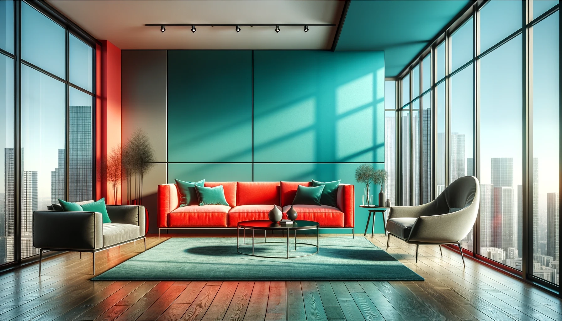
You don’t need to paint every wall neon pink to make a statement. In fact, some of the most striking transformations start small. Take the story of Mark and Jen, a couple in a cramped city apartment. They couldn’t change the flooring or the kitchen cabinets, so they focused on accents. They added a hot pink tufted bench in the entryway, paired with a bold teal accent wall. It sounds clashing, right? But it worked. The teal set the tone, while the pink added a playful punch. It turned a dull hallway into a welcoming vignette.
This approach is perfect for renters or anyone on a tight budget. You can test the waters without committing to a full-room overhaul. Think about textiles. A vibrant rug can anchor a room. Colorful curtains can frame a window like a piece of art. Even swapping out lampshades for bright hues can change the mood of a space when the light is on. The key is intentionality. Don’t just throw color at the wall. Think about balance. If you have a bold sofa, maybe keep the walls lighter. If you go dark on the walls, bring in light, airy fabrics to keep it from feeling cave-like.
Another trick? Look up. Ceilings are often called the "fifth wall," and they’re hugely underutilized. Painting a ceiling a darker shade than the walls can make a room feel cozier and more intimate. One homeowner in Portland painted her bedroom ceiling a deep celadon green, while keeping the walls a light ash color. The contrast created depth and drew the eye upward, making the small room feel taller and more dramatic. It’s a subtle move, but it packs a serious punch. These small changes prove that you don’t need a massive renovation to live boldly. You just need a little creativity and a willingness to experiment.
The Therapeutic Glow-Up: Budget Transformations
For many, going bold is also about resourcefulness. Kim, a DIY enthusiast featured in recent home tours, described her whole-house transformation as "therapeutic." She thrived on pattern clashing and dramatic colors, all while working with a very limited budget. "It was challenging," she admitted, "but it allowed me to create an incredible glow-up." Her secret? Thrift stores, leftover paint, and a lot of elbow grease. She didn’t wait for the perfect expensive furniture. She bought old pieces and painted them in vibrant shades of orange and blue.
This scrappy approach is inspiring because it’s accessible. You don’t need thousands of dollars to live in color. You need vision. Kim’s story highlights a key point: bold colors can hide imperfections. A dented dresser looks intentional when it’s painted a glossy cobalt blue. A scratched table becomes a rustic charm piece when stained a rich walnut. By focusing on color rather than perfection, you free yourself from the pressure of having everything brand new. It’s about character, not catalog perfection.
Moreover, the process itself can be healing. There’s something primal about covering up the old with the new. It’s a physical manifestation of change. For people going through life transitions—a breakup, a new job, empty nesting—repainting a room in a bold hue can feel like shedding an old skin. It’s active, not passive. You’re doing something to your environment, which gives you a sense of control. And when you step back and see that bright yellow kitchen you painted yourself, the pride is undeniable. It’s proof that you can create beauty with your own hands, no matter your bank account.
Room-by-Room Revolutions: Kitchens and Baths
Kitchens and bathrooms are often the last places people think to add bold color. We’re told they should be clean, white, and sterile. But why? These are high-traffic areas where we start and end our days. Injecting color here can transform mundane routines into joyful rituals. Imagine brushing your teeth in a bathroom with deep plum walls and brass fixtures. Or cooking dinner in a kitchen with sage green cabinets and terracotta tiles. It changes the energy completely.
One recent makeover showcased a kitchen where the lower cabinets were painted a daring navy, while the upper ones remained white. This grounded the space while keeping it feeling open. The homeowner added open shelving with colorful ceramics and plants, creating a lively display. It wasn’t just functional; it was personal. The kitchen became a place to gather, not just to cook. Similarly, a small powder room was transformed with wallpaper featuring large, tropical leaves. It turned a forgettable closet-sized room into a conversation starter. Guests actually commented on it. That’s the power of unexpected color.
These spaces also offer a chance to play with texture. Bold colors look different on matte vs. glossy surfaces. A high-gloss red tile in a shower niche catches the light differently than a matte red paint. Layering these textures adds sophistication. It prevents the color from feeling flat or childish. The goal is richness. When you combine bold hues with varied materials—wood, metal, stone, fabric—you create a space that feels curated and thoughtful. It’s not just loud; it’s layered. And that distinction is what separates a trendy room from a timeless one.
The Psychology of Hue: How Color Changes Mood
It’s not just about looks. Color affects how we feel. Science backs this up. Warm colors like reds, oranges, and yellows can energize and stimulate appetite. That’s why they’re popular in dining rooms and kitchens. Cool colors like blues and greens promote calm and focus, making them ideal for bedrooms and home offices. But it’s not that simple. A bright electric blue can feel anxious if overused, while a muted teal can feel serene. Context matters.
Take the story of a remote worker who painted his home office a soft, earthy green. He reported feeling less stressed during video calls. The color reminded him of nature, providing a visual break from the screen. Conversely, a creative writer painted her studio a vibrant coral. She said it helped combat writer’s block by keeping her energy levels up. These aren’t placebo effects. Our brains respond to visual stimuli. Living in bold colors allows you to curate your emotional environment. You can design your home to support the mood you want to feel.
However, balance is key. Too much intensity can be overwhelming. That’s why experts recommend the 60-30-10 rule. Sixty percent of the room is a dominant color (often neutral), thirty percent is a secondary color (bold), and ten percent is an accent (very bold or metallic). This structure keeps the space from feeling chaotic. It allows the bold colors to shine without shouting. Understanding this psychology helps you make choices that feel good, not just look good. It turns design into a tool for well-being. And honestly, who doesn’t need a bit more well-being in their daily routine?
So, you’ve taken the plunge. The walls are painted. The furniture is bright. Now what? Living with bold colors requires a different maintenance mindset. Dust shows up more on dark surfaces. Sunlight can fade vibrant hues faster than neutrals. You need to be mindful of lighting. Natural light changes how color looks throughout the day. A room that looks cheerful at noon might feel gloomy at dusk if you haven’t planned for artificial lighting. Layering light sources—overhead, task, and ambient—ensures your bold choices look their best 24/7.
Also, expect your taste to evolve. That’s okay. Bold doesn’t mean permanent. If you tire of a bright orange accent wall, you can paint it over. Or you can soften it with neutral decor. The beauty of starting with paint and accessories is flexibility. You’re not stuck. Many homeowners find that once they go bold, they become more confident in making other changes. They start mixing patterns. They add eclectic art. The bold color acts as a gateway drug to a more expressive lifestyle. It opens the door to experimentation.
Finally, share your journey. Post those before and after photos. Talk to friends about your choices. You might inspire someone else to take the leap. There’s a community of people out there who are tired of beige and hungry for inspiration. By living boldly, you’re contributing to a larger cultural shift. You’re proving that homes can be fun, personal, and vibrant. And that’s a message worth spreading. So, don’t hide your colorful corners. Celebrate them. They’re a testament to your courage and your creativity.
Living in bold colors is more than a design choice. It’s a declaration. It says you’re willing to take risks. You value joy over safety. You understand that your environment shapes your experience. From the fear of that first brush stroke to the therapeutic satisfaction of a budget-friendly glow-up, these stories show us that color is powerful. It can transform a small apartment, energize a kitchen, or calm a workspace. It’s accessible, flexible, and deeply personal. So, look around your home. What’s waiting to be brightened? What’s yearning for a splash of personality? The paint is cheap. The regret is rare. But the joy? That’s priceless. Go ahead. Make it bold.