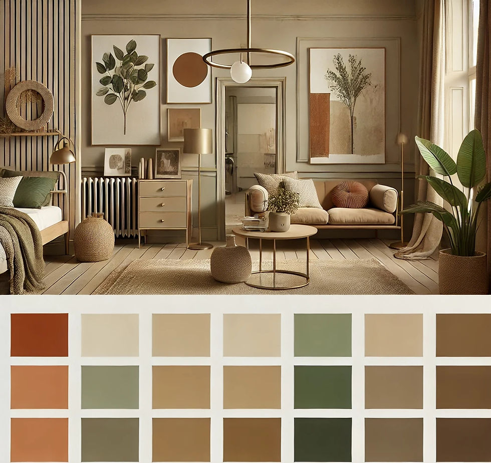
Ever walked into a room that felt just right? Not too loud, not too quiet. It’s like the space was breathing with you. That’s the magic of getting the color balance right. We all crave that sense of calm, that connection to the outdoors, but let’s be honest—sometimes "natural" can feel a bit… beige. Boring, even. You want personality. You want energy. But you don’t want your living room to look like a circus tent.
So, how do you thread that needle? How do you keep the serenity of nature while injecting the kind of boldness that makes guests stop and stare? It’s simpler than you think. In 2026, the trend isn’t about choosing one side or the other. It’s about the dance between them. It’s about letting the earth tones hold the floor while the bright colors take the spotlight for a brief, dazzling moment. This guide is here to show you exactly how to do it, without the stress or the expensive mistakes.
Starting with a Grounded Base
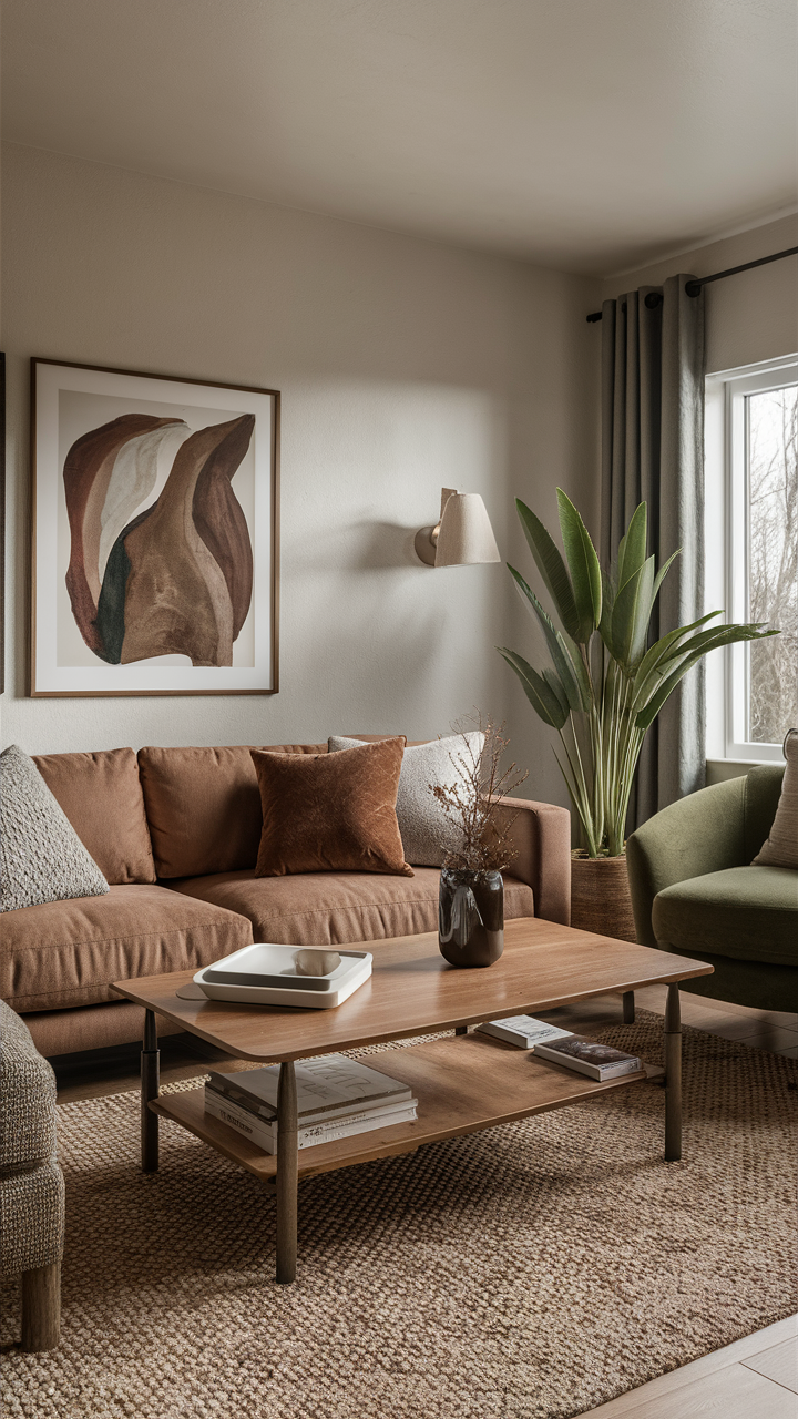
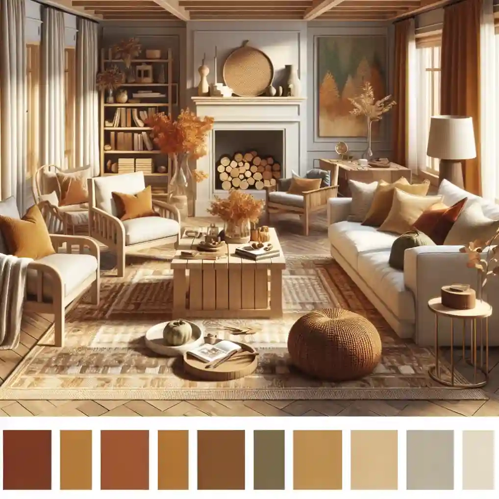
Think of your natural shades as the foundation of a house. You wouldn’t build a mansion on sand, right? Same logic applies here. Start with colors that mimic what you see outside your window. We’re talking about coffee-bean browns, warm grays, creamy whites, and soft taupes. These aren’t just "safe" choices; they are anchors. According to recent insights from Better Homes & Gardens, these earth-tone palettes evoke images of sunbeams and verdant landscapes. They create a backdrop that feels timeless.
When you pick your base, texture matters just as much as hue. A flat white wall is different from a linen-textured cream one. The latter catches light differently, adding depth without adding visual noise. This is crucial because when you eventually add those bold accents, you need a surface that can handle the contrast. If your base is too busy, the bold colors will fight for attention. Keep it simple. Let the natural shades do the heavy lifting of creating a serene atmosphere.
Don’t be afraid to layer these neutrals either. Mix a cool gray with a warm sand color. It creates a subtle complexity that keeps the eye interested. As noted by Ideal Home, experts are finding gorgeous ways to use muted palettes that are anything but boring. The key is variation. Use a darker brown for your larger furniture pieces, like a sofa or a rug, and lighter creams for the walls. This gradient effect draws the eye upward and makes the space feel airy, setting the perfect stage for what comes next.
Choosing Your Bold Accents Wisely
Now for the fun part. Picking the bold colors. This is where people often panic. "What if I pick the wrong blue?" Relax. There is no wrong, only different vibes. The trick is to choose accents that complement, not clash with, your natural base. Look at nature for inspiration again. Think of a bright red berry against green leaves, or a splash of citron green in a field of dry grass. These combinations work because they exist together in the wild.
In 2026, we’re seeing a rise in dynamic palettes that pair deep navys or emerald greens with softer pastels. Havenly highlights several bold color combinations that designers love right now. For instance, a deep ocean blue pairs beautifully with sandy beiges. It’s calming yet striking. Or consider a vibrant mustard yellow against a charcoal gray. It’s energetic but grounded. The goal is to pick one or two bold hues and stick to them. Don’t try to use every color in the rainbow. That’s how you get chaos.
Also, consider the emotional impact of the color. Do you want the room to feel energizing? Go for oranges or yellows. Want it to feel restful? Try soft blues or lavenders. Martha Stewart’s recent advice on decorating with bold colors suggests that using them strategically prevents overwhelming the space. Test your choices. Buy small sample pots. Paint a patch on the wall. Live with it for a few days. See how it looks in the morning light versus the evening lamp glow. Your eyes will tell you if it’s right.
The Power of the Accent Wall
If you’re nervous about going full-bold, start with a single wall. The accent wall is a classic technique for a reason. It allows you to experiment with high-impact color without committing the entire room. Benjamin Moore’s recent inspiration guides emphasize how accent walls add character to every room. It’s a focal point. It draws the eye immediately. But here’s the secret: the rest of the room must remain subdued to let that wall shine.
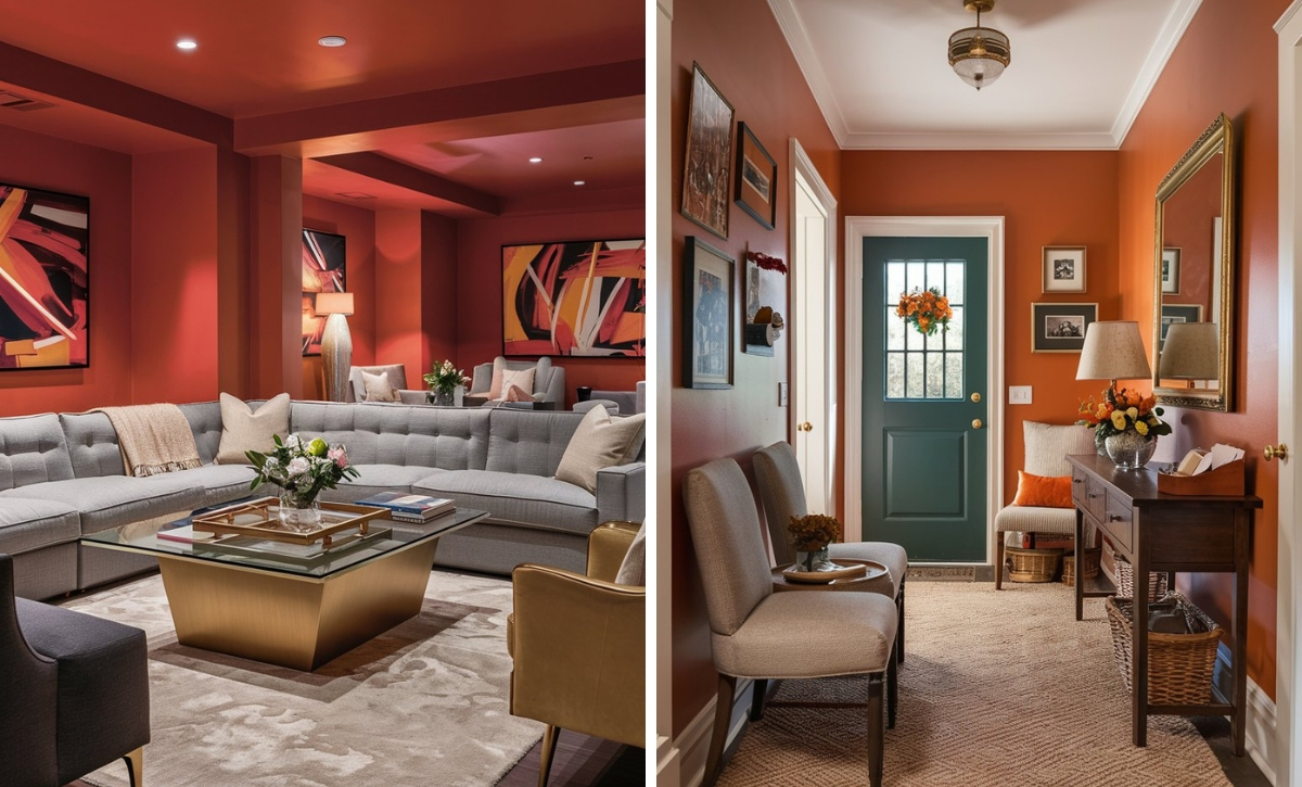
Choose the wall wisely. Usually, it’s the one you see first when you enter, or the one behind a key piece of furniture like a bed or a sofa. Paint it in your chosen bold shade. Maybe a deep terracotta or a rich teal. Then, keep the other three walls in your natural neutral palette. This creates a frame. The neutral walls act as a border, containing the energy of the bold wall. It feels intentional, not accidental.
You can also play with patterns here. Homes & Gardens notes that different shades of blue pair well with various patterns. Instead of solid paint, maybe use a bold wallpaper with a natural motif—like large leaves or geometric shapes in your accent color. This adds another layer of interest. Just remember, if the wall is loud, the accessories on it should be quiet. A simple wooden shelf or a minimalist mirror works better than a cluttered gallery wall. Let the color speak.
Textiles and Soft Furnishings
Not ready to paint? No problem. Textiles are the easiest way to test the waters. They’re low-commitment and high-impact. Throw pillows, rugs, curtains, and blankets are your best friends here. House Beautiful’s 2026 guide on window treatments highlights how sheer accents and blackout curtains can enhance natural light. Imagine heavy, cream-colored linen curtains framing a window, with a bold, patterned valance or tie-backs in a vibrant green. It’s a subtle nod to color that doesn’t dominate.
Rugs are another great anchor. A large, neutral jute or wool rug defines the space. Then, layer a smaller, brightly colored rug on top. Or, keep the rug neutral and use colorful cushions on your sofa. This is where you can mix and match. Try a combination of textures—a velvet emerald pillow next to a chunky knit cream one. The contrast in fabric adds richness. It makes the bold color feel more luxurious and less like a plastic toy.
Don’t forget about bedding. Your bedroom is a sanctuary. Keep the sheets and duvet in crisp whites or soft grays. Then, add a bold throw at the foot of the bed or a couple of accent pillows in a striking hue. It’s an easy swap. If you get tired of the color, you just change the pillows. It’s cheap, it’s fast, and it instantly refreshes the room. This flexibility is key to keeping your home feeling current without constant renovations.
Bringing Nature Indoors with Plants
Here’s a cheat code: plants are natural bold accents. Green is a color, after all. And not just any color—it’s the most restful one for the human eye. Integrating live plants bridges the gap between your natural shades and your bold desires. A large fiddle-leaf fig in a corner adds a sculptural element. Its deep green leaves pop against a beige wall. It’s organic, it’s alive, and it requires zero paint.
Vary the sizes and types of plants. Use trailing pothos on high shelves to create vertical lines. Place snake plants in sleek, modern pots for a structured look. The pots themselves can be another place to introduce boldness. A matte black pot is chic. A bright ceramic blue pot is playful. Bydesignandviz suggests that earth tones create a warm vibe, and plants amplify that warmth. They soften the hard edges of furniture and architecture.
Grouping plants together creates a mini-jungle effect. This density of green acts as a major visual block of color. It balances out large neutral areas. If you have a big, empty white wall, a cluster of tall plants in front of it breaks up the monotony. Plus, caring for plants adds a ritual to your day. It connects you to the rhythm of nature, which is ultimately what this design style is all about. It’s not just about looks; it’s about feeling.
Lighting can make or break your color scheme. Natural light changes how colors look throughout the day. A bold yellow might look cheerful at noon but muddy at dusk. That’s why layering your lighting is essential. Use warm-white bulbs to enhance the cozy feel of your natural shades. Avoid cool, clinical lights unless you’re going for a very specific modern look. Warm light makes browns richer and creams softer.
Use lamps to highlight your bold accents. Place a table lamp with a colorful base next to a neutral sofa. When it’s off, it’s a sculpture. When it’s on, it casts a glow that emphasizes the surrounding textures. Dimmer switches are your friend. They allow you to adjust the mood. Bright light for cleaning and working, dim light for relaxing and watching the colors settle into the shadows.
Finally, add personal artifacts. A bold piece of art, a vintage vase, or a collection of colorful books. These items tell your story. They shouldn’t match perfectly. In fact, a little mismatch is good. It shows life. As Quiet Minimal suggests, incorporating vibrant hues adds personality. So, don’t be too rigid. If you love a certain quirky item, find a place for it. Let it sit against a neutral background. Let it stand out. Your home should feel like you, not like a catalog page.
Getting the balance between natural shades and bold accents is a journey, not a destination. It’s okay to tweak things. Move a pillow. Swap a rug. Paint a wall. The beauty of this approach is its flexibility. You’re building a home that breathes, one that respects the calm of nature but celebrates the joy of color. Start small. Trust your instincts. And remember, the best rooms are the ones that feel like home.