Remember when every startup logo looked like it was dipped in oat milk? For nearly a decade, we lived in the era of "safe." Soft grays, muted sages, and endless variations of beige dominated our screens. It was clean. It was professional. It was also, let’s be honest, a little bit boring. But if you’ve opened your social media feed or walked down a city street lately, you’ve probably noticed something shifting. The quiet is over. The volume has been turned up.
We are witnessing a massive swing back toward vibrancy. From absinthe green to electric blue, color is no longer just a background detail—it’s the main character. This isn’t just a random aesthetic twitch. It’s a reaction. After years of digital minimalism and pandemic-induced uncertainty, people are craving energy. They want brands that feel alive, playful, and unapologetically themselves. In 2026, playing it safe is the riskiest move a brand can make.
The Fatigue of Minimalism and the Craving for Joy
Let’s talk about why this is happening now. For years, design trends leaned heavily into minimalism. The logic was simple: less clutter means more clarity. But somewhere along the line, "clarity" started looking a lot like "sameness." When every app, website, and coffee shop uses the same muted palette, nothing stands out. You scroll past it without really seeing it. It becomes visual white noise.
Psychologically, we’re tired of the neutral zone. The last few years have been heavy. People are looking for hits of dopamine in their daily interactions. Bright colors trigger that response. They signal optimism. They suggest that a brand has personality and isn’t afraid to show it. According to recent insights from Color Colour Creative, we are entering a season where beige takes a back seat to play. It’s not just about looking pretty; it’s about feeling something. A splash of kelly green or a shock of mauve breaks the monotony. It wakes up the brain.
This shift is also about authenticity. Minimalism often felt corporate and distant. Bold colors feel human. They mimic the way people actually dress, decorate, and express themselves in the real world. We don’t live in grayscale. So why should the brands we love? By embracing saturated palettes, companies are signaling that they’re ready to connect on a more emotional, energetic level. It’s a invitation to have fun again.
Digital Screens Demand High Contrast Visibility
Here’s a practical reason for the neon surge: our eyes are glued to screens. And not just any screens—we’re talking about high-resolution mobile displays, smartwatches, and VR headsets. In a crowded digital landscape, subtle tones get lost. A pastel pink might look elegant on a printed business card, but on a small phone screen scrolling at lightning speed? It disappears.
Hyper-saturated colors cut through the noise. They grab attention instantly. Zeesia.com notes that high-intensity color blocking is transforming modern graphic design for this exact reason. When you’re competing for split-second attention spans, you need visual hooks that work hard. Bold contrasts—like bright yellow against deep purple—create immediate focal points. They guide the eye exactly where the brand wants it to go.
Think about accessibility too. High contrast isn’t just a stylistic choice; it’s a functional one. It helps users with visual impairments navigate interfaces more easily. By choosing bold, distinct hues, brands are inadvertently (or intentionally) making their content more inclusive. It’s a win-win. The design pops, and more people can actually see it. In 2026, if your brand identity doesn’t pop on a smartphone in direct sunlight, does it even exist?
AI Tools Are Unlocking New Color Possibilities
Technology is playing a huge role in this comeback. Specifically, artificial intelligence. In the past, picking a color palette was a slow, intuitive process. Designers relied on experience and trend books. Now, AI-driven tools can analyze thousands of successful campaigns in seconds. They can predict which color combinations will resonate with specific audiences before a single pixel is placed.
Adobe’s recent reports highlight how AI is shaping color trends for 2025 and beyond. These tools allow designers to experiment with combinations that might have seemed "too risky" or "clashing" in the past. AI can show how a neon orange interacts with a deep teal across different devices and lighting conditions. It removes the fear of failure. When you know the data supports a bold choice, you’re more likely to make it.
This tech democratization means smaller brands can punch above their weight. You don’t need a massive agency budget to find a unique, eye-catching palette. You just need the right tools. This has led to an explosion of creativity. We’re seeing unexpected pairings—like powder blue with hot pink—that feel fresh because they haven’t been overused. AI isn’t replacing the designer’s eye; it’s giving them a superpower to test boundaries faster than ever before.
Psychology: How Bold Hues Drive Recognition and Trust
Color isn’t just decoration. It’s communication. Before a customer reads your tagline or checks your prices, they’ve already made a snap judgment based on your colors. This is the core of color psychology. Blue signals trust. Red creates urgency. But in 2026, the rules are getting more nuanced. It’s not just about single colors; it’s about the combination.
Bold, contrasting pairs create memory hooks. Think about some of the most iconic brands. They don’t use shy colors. They use combinations that stick in your mind. DesignRush explains that color speeds up recognition, helping people identify a brand instantly, even from a distance. When a brand uses a surprising pairing—say, electric lime and charcoal gray—it creates a distinctive visual signature. It says, "We are different."
There’s also an emotional component. Bold colors convey confidence. A brand that uses vibrant hues is perceived as innovative, energetic, and approachable. In a market where consumers are skeptical of corporate speak, this perceived authenticity builds trust. It feels like the brand has nothing to hide. It’s standing out in the open. As NumberAnalytics points out, these choices influence behavior and decision-making. If you want to be seen as a leader, you can’t dress like a follower.
Breaking the Rules: Unexpected Pairings That Work
So, what does this actually look like? The old rules of color theory said you should stick to analogous colors (those next to each other on the wheel) or safe complements. Those days are gone. The trend in 2026 is about tension. It’s about pairing colors that shouldn’t work together, but do.
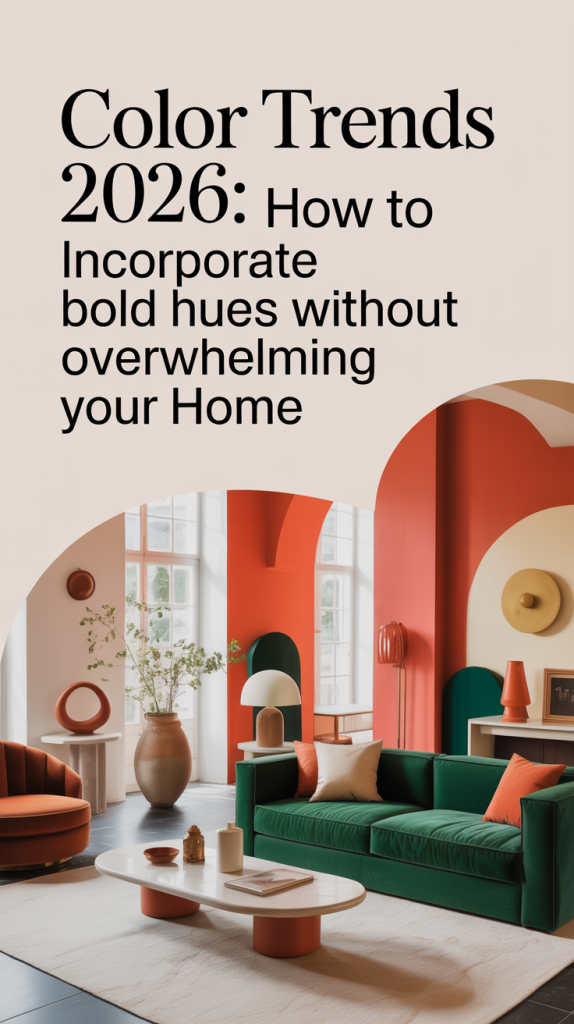
Sage Design Group highlights expressive, high-contrast combinations as a key trend. Think bold accents against muted backgrounds. Or clashing warm and cool tones that vibrate against each other. Here are a few examples of what’s working right now:
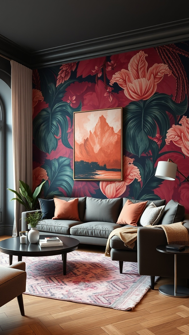
- Absinthe Green and Deep Plum: This combo feels lush and mysterious. It’s organic but also digital-native.
- Kelly Green and Powder Blue: A fresh, sporty look that feels nostalgic yet modern. It’s playful without being childish.
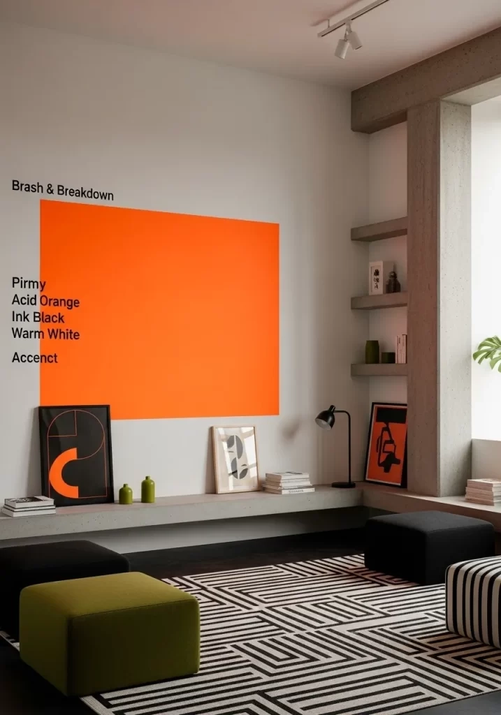
- Neon Orange and Slate Gray: The gray grounds the neon, making it usable for text and UI elements while keeping the energy high.
- Mauve and Electric Yellow: A soft, feminine tone paired with a harsh, industrial one. The contrast creates immediate interest.
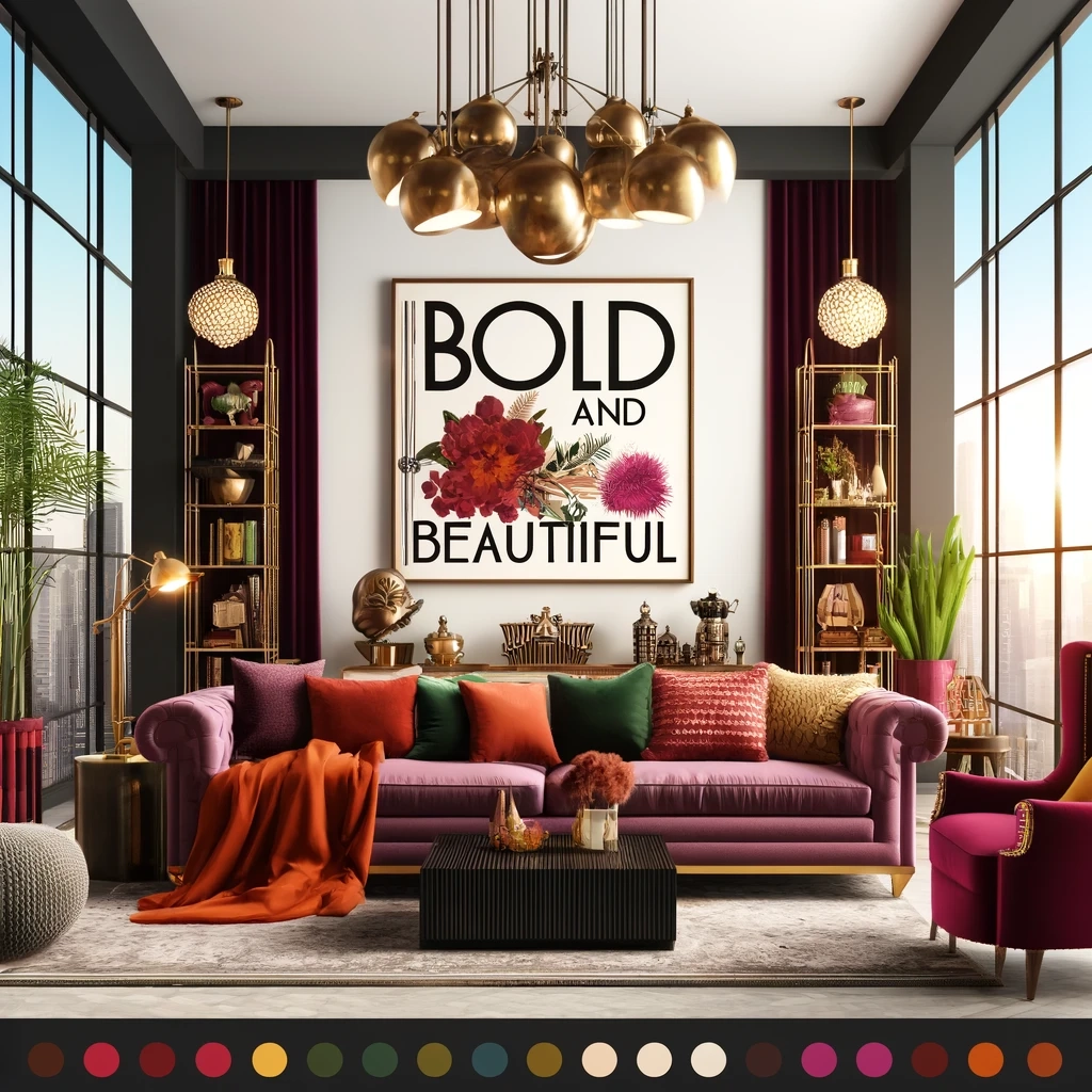
The key is balance. You can’t just throw every bright color at the wall. Successful brands use one or two dominant bold hues and support them with neutrals or secondary tones that let the stars shine. It’s about intentionality. The "clash" is calculated. It’s designed to stop the scroll. And it works. These pairings are memorable because they break the pattern of what we expect to see.
Practical Tips for Implementing Bold Palettes
If you’re thinking about refreshing your brand identity, where do you start? It can feel intimidating. Going from safe beige to bold magenta is a big leap. But you don’t have to overhaul everything overnight. Start small. Test the waters.
First, audit your current presence. Look at your website, social media, and packaging. Where do you blend in? Identify one touchpoint where you can introduce a bolder accent color. Maybe it’s your call-to-action buttons. Maybe it’s your Instagram story templates. See how your audience reacts. Do engagement rates go up? Do people comment on the new look? Feedback is your best guide.
Second, ensure consistency across digital touchpoints. Synergy MKT Solutions emphasizes that consistency drives recognition. If your website is bold but your email newsletter is muted, you’re sending mixed signals. Pick your palette and stick to it. Create a style guide that defines exactly how these colors should be used. When should you use the bright version? When should you use the dark? Clarity prevents chaos.
Finally, don’t forget accessibility. Bold doesn’t mean unreadable. Always check your contrast ratios. Make sure your text is legible against your vibrant backgrounds. There are plenty of free online tools that can help with this. You want to be bold, not blurry. The goal is to enhance the user experience, not hinder it. Take your time. Experiment. And remember, it’s okay to make mistakes. That’s part of finding your voice.
The shift toward bold color combinations isn’t a fleeting fad. It’s a reflection of where we are as a culture. We’re done with hiding. We’re done with blending in. In 2026, brands are expected to have personalities, opinions, and energy. Color is the quickest, most visceral way to communicate that.
We’ve moved past the idea that professional means plain. Professional means purposeful. Whether you’re a tech startup, a local bakery, or a global retailer, your color choices tell a story. Are you telling a story of caution and conformity? Or are you telling a story of innovation and joy? The data shows that consumers are leaning toward the latter. They want to feel something when they interact with your brand.
So, don’t be afraid to turn up the saturation. Step away from the safe zone. Experiment with those clashing hues. Let your brand’s true colors shine. The world is colorful enough; your brand should be too. After all, in a sea of beige, the boldest ship is the one that gets remembered. And isn’t that what we’re all trying to achieve? To be seen. To be felt. To be unforgettable.