Have you ever walked into a space and felt like you stepped straight inside a furniture catalog. It looks super neat, but something feels totally off. That is the sneaky trap of matching every single thing.
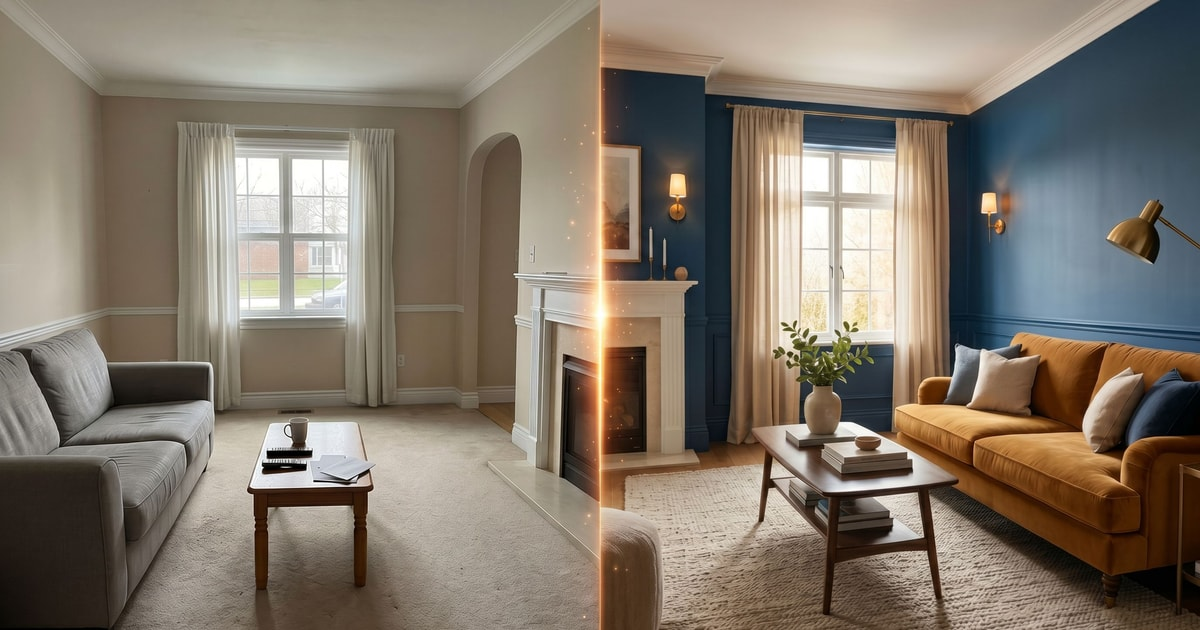
We have all been there. You want your house to look put together for 2026, so you buy the couch, pillows, and rug in the exact same shade of navy blue. It feels safe. But instead of feeling cozy, the room ends up feeling flat and lifeless.
The Illusion of Perfection
When every pillow, curtain, and wall matches down to the precise hex code, your brain stops exploring the room. Total uniformity strips away all the natural visual friction that makes a space interesting. Real homes need a little bit of breathing room.
Think about nature. Nothing out there is painted in one solid swatch. Forests have hundreds of greens, and sunsets shift through countless warm tones. When we force a human room into one strict color prison, it loses its soul.
The Psychology of Visual Fatigue
Our eyes actually crave variety. Staring at the same identical tone across a massive living space causes quick eye strain and mental boredom. It tricks your brain into thinking you are in a waiting room rather than a sanctuary.
Subtle shifts in shade keep things lively. If your sofa is charcoal, your rug shouldn’t be the exact same charcoal. Mixing textures and slightly off-target hues gives your eyes places to rest and wander.
Breaking Free from the Swatch Card
The biggest mistake people make is trusting those tiny paint store cards too much. Those little squares look great together under harsh store lights, but they fall apart in a real room with changing sunlight.
Instead of buying a prepackaged collection, try collecting pieces over time. Grab a vintage wooden coffee table or an odd-patterned throw blanket. That accidental layering is what gives a house genuine character and warmth.
The Power of Contrast and Tension
Design is all about balance and gentle tension. If everything blends together seamlessly, nothing stands out. You want certain elements to catch the light and draw your gaze across the room.
Try tossing in a wild card item. It could be a bright rust-colored chair in a sage green room or a dark walnut shelf against pale walls. That little bit of friction is what transforms a generic box into an actual home.
Textures Save the Day
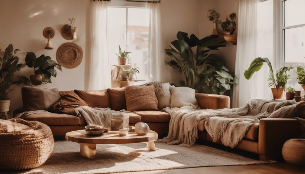
If you are terrified of adding new colors, use texture instead of pigment to break up the monotony. You can keep a neutral color palette without making it boring by mixing heavy knit blankets, smooth leather, and rough jute.
Different materials bounce light around in unique ways. A shiny ceramic lamp next to a matte linen cushion creates depth without needing a loud color clash. It tricks the eye into seeing richness where a flat color scheme would fail.
Perfectionism is the ultimate enemy of cozy interior design. Stop worrying about whether your decor items look like they belong to the exact same family tree. Let things look a bit lived-in and accidental.
Your living room should tell your story, not mirror a corporate showroom. Embrace the little clashes and unexpected pairings. That is where the real magic happens.
At the end of the day, your home is meant for you to relax in, not to win an award for strict color coordination. Ditch the matching sets and trust your gut.
Mix up your textures, throw in a weird lamp you found at a flea market, and let your space breathe. You will notice the vibe shift instantly from stiff to wonderfully alive.