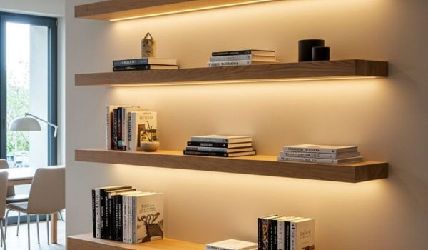
You know that feeling when you walk into a room and it just feels… right? Not necessarily because of the expensive furniture or the rare art on the walls, but because your eyes can rest. There’s a calmness there. A confidence. Now think about the opposite. That shelf in your living room that’s packed so tight with knick-knacks, books, and plants that it feels like it’s holding its breath. It’s exhausting to look at, isn’t it?
We’ve all been there. We buy a beautiful floating shelf or a sturdy bookcase, and our instinct is to fill it. Every inch. We think more is more. But here’s the secret that interior designers have known for decades, and that high-end hotels use to make their lobbies feel serene: what you leave out matters just as much as what you put in. This is the power of negative space. And mastering it is the quickest way to make your home look curated, intentional, and yes—expensive.
Understanding the Void
Negative space sounds a bit intimidating, doesn’t it? Like something you’d study in an advanced art theory class. But really, it’s just the empty area around your objects. It’s the breathing room. In design terms, "positive space" is the stuff—the vase, the book, the sculpture. "Negative space" is the air around it. It’s not nothing. It’s an active part of the design.
Think of it like this. If you’re shouting in a crowded room, no one hears you. But if you whisper in a quiet library, everyone leans in. Negative space is that quiet library. It tells your eye where to look. When you isolate a single, beautiful ceramic bowl on a wide shelf, you’re telling anyone who walks by, "Look at this. This is important." Without that space, the bowl is just another item in a lineup. With the space, it becomes a statement piece.
This concept comes straight from the world of fine art and graphic design, where white space is used to create balance and harmony. In our homes, it does the same thing. It prevents visual chaos. According to recent design insights from 2026, the trend isn’t moving toward stark minimalism, but rather "intentional emptiness." It’s about giving the objects you love the respect they deserve by letting them stand out, rather than drowning them in clutter.
The Psychology of Luxury
Why does empty space feel expensive? It’s partly psychological. Clutter often signals necessity. It suggests we don’t have enough storage, or we’re holding onto things out of habit rather than joy. Space, on the other hand, signals abundance. It says, "I have enough. I don’t need to fill every corner to prove my worth." It’s a subtle flex, sure, but it’s effective.
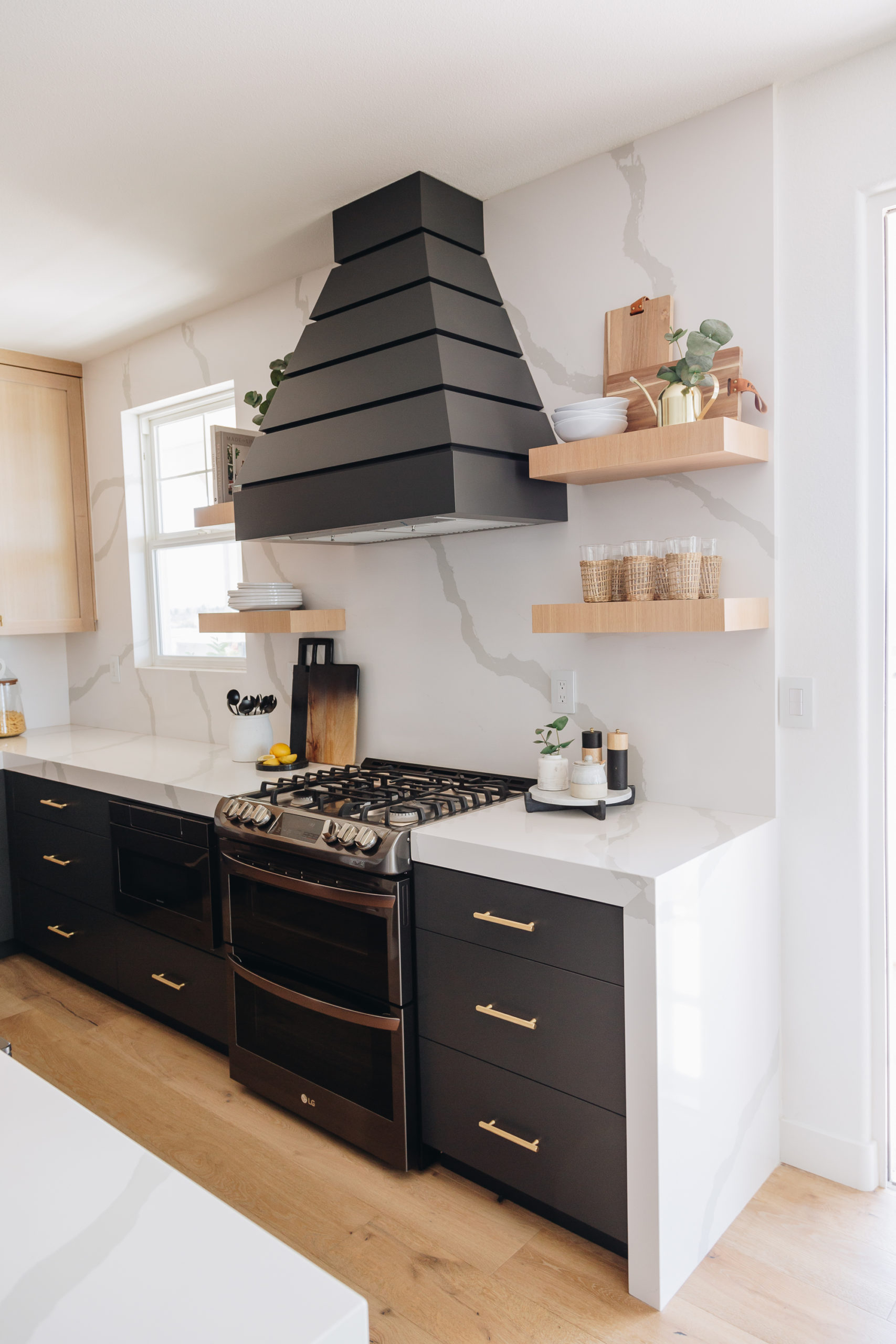
When you scroll through images of luxury hotels or high-end boutiques, notice the shelves. They aren’t packed. You might see three items on a six-foot shelf. The rest is just wall, or wood, or stone. This creates a sense of order and control. It feels calm. And in our busy, noisy lives, calm is the ultimate luxury. People are craving environments that lower their cortisol levels, not raise them.
Research into consumer behavior in recent years has shown that spaces perceived as "cluttered" are often associated with stress and lower perceived value. Conversely, spaces with ample negative space are rated as more sophisticated and tranquil. By embracing the void, you’re not just decorating; you’re curating an experience for yourself and your guests. You’re creating a sanctuary. It’s less about having less stuff, and more about making the stuff you have count.
The Rule of Three and Grouping
So, how do you actually do this without your shelves looking bare or unfinished? One of the most reliable tricks is the rule of three. Our brains are wired to find odd numbers pleasing. They create a dynamic balance that even numbers sometimes lack. Instead of lining up five small vases, try grouping three items together.
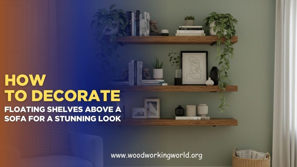
But don’t just spread them out evenly. Cluster them. Create a little vignette. Maybe it’s a tall candle, a small stack of books, and a textured stone. Place them slightly off-center. This clustering creates a focal point, while the rest of the shelf remains open. This negative space around the cluster allows the eye to travel smoothly from one group to the next, rather than getting stuck in a traffic jam of decor.
Housedigest and other design resources often highlight this technique for a reason. It works. By grouping items, you reduce the number of visual "stops" your eye has to make. If you have ten separate items scattered across a shelf, your eye jumps ten times. If you have two groups of three, your eye jumps twice. It’s easier to process. It feels cleaner. And remember, vary the heights and textures within your group to keep it interesting. A flat line of objects is boring, no matter how much space you leave around them.
Scale and Visual Hierarchy
One of the biggest mistakes people make when trying to embrace negative space is using only small items. A tiny vase, a small frame, a little plant. When everything is small, the shelf can still look cluttered, even if there’s space between them. It’s like whispering when you need to project. To make negative space work, you need scale.
Scale is the secret ingredient that makes decor look expensive. You need at least one "anchor" piece in each section. This could be a large piece of art leaning against the back, a oversized basket, or a substantial sculpture. This large item commands attention and justifies the empty space around it. It creates a visual hierarchy. The eye sees the big thing first, then notices the smaller details.
Without this variation in scale, the eye gets bored fast. It scans the shelf and finds nothing to hold onto. By introducing a large element, you create depth and drama. As noted by styling experts, layering is key here. Place the large item at the back, maybe leaning. Put medium items in front of it. And leave the foreground clear. This layering, combined with the negative space, creates a 3D effect that feels rich and thoughtful. It’s not just flat decoration; it’s a composition.
Avoiding the Common Pitfalls
It’s easy to go too far. Sometimes, in an effort to be minimalist, shelves end up looking sterile or like a showroom nobody lives in. That’s not the goal. The goal is warmth and intention. Another common mistake is ignoring the background. If your shelf is against a busy wallpaper or a cluttered wall, the negative space on the shelf won’t have the same impact. The background needs to be relatively calm to let the objects breathe.
Also, beware of symmetry. While symmetry can be nice, it often feels rigid and formal. Asymmetry is where the magic happens with negative space. Try placing a tall object on the left side of a shelf and leaving the right side mostly empty, perhaps with just one small item tucked away. This imbalance creates tension and interest. It feels more organic, more human. Designer Dre Shapiro has pointed out that pushing a small piece of art low and to one side can be far more compelling than centering a large work.
Don’t be afraid to edit ruthlessly. Take everything off the shelf. Clean it. Then, put back only the items you truly love. Not the ones you feel obligated to keep. Not the ones that match perfectly. The ones that spark joy or curiosity. If you put something back and it feels crowded, take something else off. It’s a process of subtraction. It might feel uncomfortable at first, like you’re losing something. But trust the process. The result will be stronger.
Ready to try it? Start with one shelf. Just one. Don’t overwhelm yourself by redoing the whole house. Clear it completely. Wipe it down. Now, look at the items you removed. Pick your top three to five favorites. Consider their shapes, colors, and textures. Do they complement each other? Do they contrast in interesting ways?
Place your largest item first. Position it slightly off-center. Then, add your second-largest item, overlapping it slightly or placing it in front to create depth. Add your smallest item last, perhaps tucking it into a corner of the arrangement. Step back. Look at the empty space. Is it balanced? Does your eye flow naturally across the shelf? If it feels heavy on one side, adjust. If it feels empty, resist the urge to fill it immediately. Live with it for a day.
Remember, negative space is not static. You can change it with the seasons. Swap out a heavy ceramic for a light glass piece in summer. Change the angle of a leaning frame. The beauty of this approach is its flexibility. Because you’re not gluing things down or filling every gap, you can easily refresh the look. It’s sustainable, too. You’re working with what you have, just arranging it differently. It’s about seeing your existing belongings in a new light.
In the end, styling with negative space is a practice in mindfulness. It asks you to slow down. To look closely. To choose carefully. It transforms the act of decorating from a chore of accumulation into a ritual of curation. And that shift in mindset is what truly makes a home feel expensive. Not the price tag on the objects, but the care taken in their presentation. So take a breath. Leave some space. Let your shelves breathe. You might just find that your home feels a little lighter, and a lot more luxurious.