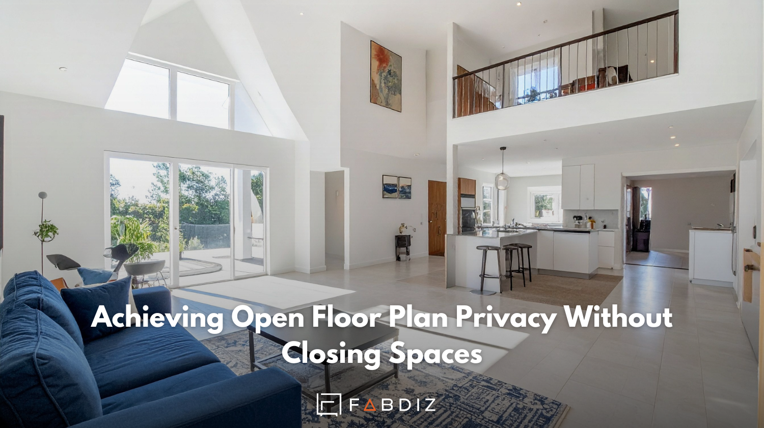
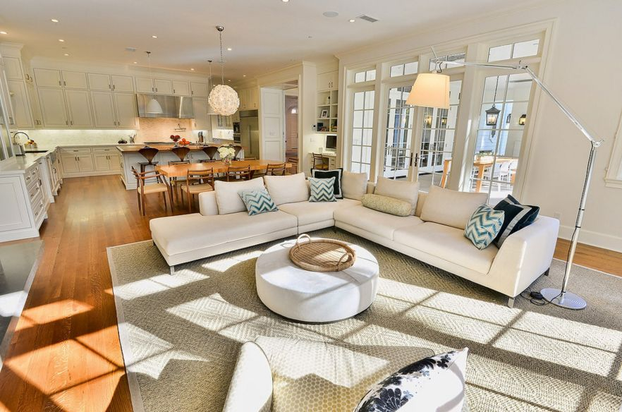
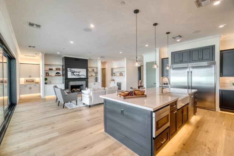
You walk into a room and something feels… off. Maybe it’s too busy. Maybe it feels cold. Or perhaps the kitchen screams "look at me" while the living room whispers "go away." It happens more often than you’d think in those sprawling, wall-less spaces we all love so much. Open concept living is fantastic for keeping an eye on the kids or chatting with guests while you chop veggies, but it presents a unique puzzle for color. Without walls to act as natural breaks, how do you define spaces without making them feel chaotic?
That’s where color flow comes in. It’s not just about picking a pretty shade of white and slapping it everywhere. It’s about rhythm. It’s about guiding the eye gently from one zone to the next. In 2026, the approach has shifted. We’ve moved away from the stark, cool minimalism of the early twenties. Today, it’s warmer. It’s softer. It’s about creating a home that feels like a hug, not a showroom. If you’re staring at paint swatches feeling overwhelmed, take a breath. You’re not alone. Let’s break down exactly how to make your open plan sing.
The Shift to Warmth and Biophilic Connection
Remember when everything was gray? Or that brief, intense moment when digital blues and Viva Magenta were everywhere? Those days are gone. The 2026 color palette has firmly planted its feet in the earth. Designers are seeing a massive surge in requests for sun-soaked terracotta, dusty emerald, and rich chocolate browns. Why? Because people are tired of screens. We crave connection to nature. This trend, often called biophilic design, isn’t just about adding plants (though those help). It’s about using colors that mimic the natural world to create a sense of calm and longevity.
This shift is crucial for open concepts because earth tones naturally blend. A sandy beige doesn’t clash with a soft olive green the way a bright neon might. These hues share underlying warmth. When you use a consistent neutral base—think warm whites, creams, or light taupes—you create a seamless canvas. This allows you to introduce those deeper, earthier accents without the space feeling fragmented. It’s like wearing a neutral outfit and adding a scarf; the base keeps it cohesive, while the accent adds personality.
So, what does this look like in practice? Imagine your kitchen cabinets in a soft, warm white. The island could be a deep, grounding chocolate brown. Then, in the adjacent living area, you might have walls in a pale, dusty sage. Because both the brown and the sage are muted and earth-derived, they talk to each other. They don’t shout. This creates that elusive "flow" everyone wants. It’s not about matching everything perfectly. It’s about ensuring the tones belong to the same family.
The Power of the Consistent Neutral Base
Let’s talk about the backbone of your home: the neutral base. In 2026, builders and designers agree that using a consistent neutral throughout the main living areas is the single most effective way to achieve harmony. This doesn’t mean every wall must be the exact same shade of off-white. That can feel flat. Instead, think of it as a spectrum. You might choose one primary neutral for the walls and trim, then use slightly darker or lighter variations of that same hue to define zones.
For instance, you could use a warm cream on the living room walls. Then, in the dining area, which might get less natural light, you could go a shade lighter to keep it airy. Or, if you want to cozy up a reading nook, you might deepen the tone. The key is that the undertones remain consistent. If your cream has yellow undertones, don’t switch to a gray with blue undertones in the next zone. That’s where the visual jar happens. That’s where the flow breaks.
Why does this matter so much in open plans? Because your eye travels. In a closed-off room, you only see four walls. In an open concept, you might see twenty feet of continuous space. If the colors jump around, your brain has to work harder to process the environment. It creates low-level stress. A consistent base acts like a visual glue. It holds the disparate functions—cooking, eating, relaxing—together into one unified whole. It makes the space feel larger, too, because there are no hard stops for the eye.
Zoning with Color Drenching and Accents
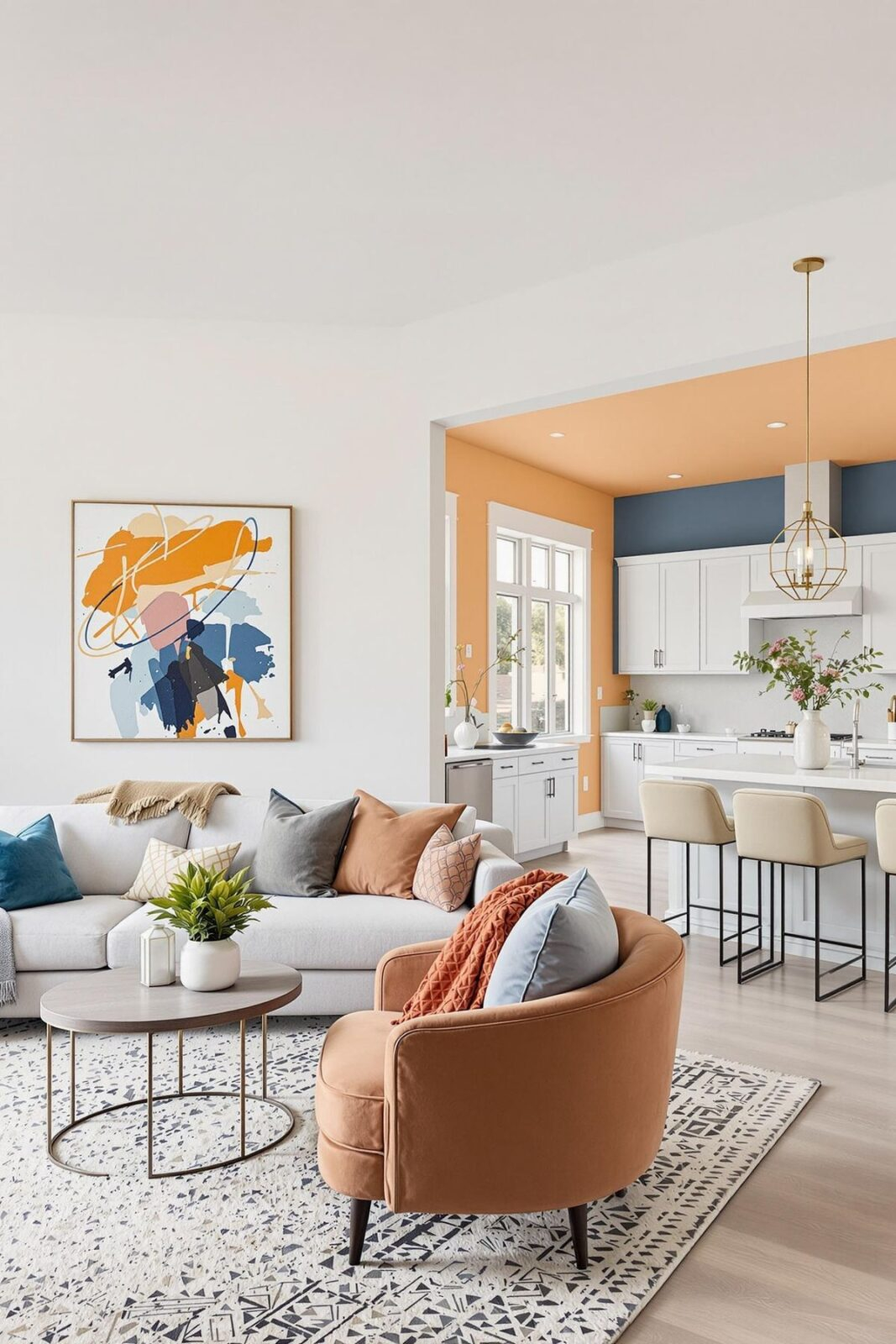
Now that we have our base, how do we stop the space from feeling like a blank sheet of paper? Enter "color drenching." This is one of the biggest trends of 2026, and it’s perfect for open concept homes. Color drenching means painting everything in a specific zone—walls, trim, ceiling, even built-in shelves—in the same bold or saturated color. It sounds scary, but it’s incredibly effective. By monochromatically treating a specific area, you create a distinct "room" within the open plan without building a single wall.
Imagine your dining area. Instead of just painting the walls, you paint the ceiling and the crown molding in a deep, moody periwinkle or a rich terracotta. Suddenly, that space feels intimate. It feels separate from the kitchen, even though there’s no door between them. The color acts as a boundary. It tells your brain, "This is where we eat. This is a different vibe." It’s a powerful tool for zoning. And because you’re keeping the rest of the open plan in that neutral base we talked about, the drenched zone pops without overwhelming the whole house.
If full drenching feels like too much commitment, you can still use accents to zone. A large rug in a dusty emerald can anchor the living room. A set of bar stools in chocolate brown can define the kitchen island area. The trick is to repeat these accent colors subtly elsewhere. Maybe throw pillows in the living room pick up the brown from the kitchen stools. This repetition creates a rhythm. It leads the eye through the space, connecting the dots. It’s like a musical motif that repeats, giving the composition structure.
Lighting: The Invisible Color Changer
Here’s the thing nobody tells you until it’s too late: light changes everything. You can pick the perfect warm beige, but if your lighting is cool and clinical, that beige will look gray and sad. In open concept homes, lighting is even more critical because you likely have multiple light sources serving different functions. You’ve got task lighting over the kitchen counter, ambient lighting in the living room, and maybe some pendant lights over the dining table. Each of these casts a different glow.
In 2026, the focus is on layering light to support your color choices. Start with your color temperature. Aim for consistency. If you’re using warm neutrals and earth tones, stick to warm white bulbs (around 2700K to 3000K). Mixing cool and warm lights in one open space is a recipe for disaster. It makes the colors look disjointed. Next, think about placement. Don’t rely on a single overhead fixture. Use floor lamps, table lamps, and sconces to wash walls with light. This highlights the texture and depth of your paint colors.
Also, consider the finish of your paint. There’s a big move towards washable matte finishes in 2026. Gone are the days when you had to use semi-gloss in high-traffic areas. Modern matte paints are durable and scrubbable, but they also absorb light rather than reflecting it. This gives colors a richer, more velvety appearance. In an open plan, this reduces glare and helps soften the transition between zones. It makes the whole space feel more sophisticated and less like a sterile box. Just remember to test your paint samples under your actual lighting conditions, day and night.
Texture and Material Continuity
Color doesn’t exist in a vacuum. It interacts with every surface in your home. Wood floors, stone countertops, metal fixtures, fabric sofas—they all have their own color and texture. To master flow, you need to consider these elements as part of your palette. If you have warm oak flooring, that’s a major color component. Your wall colors need to complement that wood tone, not fight it. This is why those earthy, warm neutrals are so popular right now. They play nicely with natural materials.
Think about continuity in materials, too. If you have black metal window frames in the living room, consider echoing that black in the kitchen hardware or light fixtures. This creates a visual thread that ties the spaces together. It’s subtle, but it works. Same with stone. If your kitchen island is quartz with warm veining, maybe choose a backsplash or a bathroom vanity top that shares those same warm tones. These small connections build a cohesive narrative throughout the home.
Don’t forget textiles. Rugs, curtains, and upholstery add huge blocks of color and texture. In an open plan, these soft elements help absorb sound and add warmth. They also offer a low-risk way to experiment with color. If you’re nervous about painting a wall in dusty emerald, try a large rug in that shade first. See how it feels. See how it interacts with the light. Textiles are the bridge between the hard architecture and the soft living experience. They soften the edges and make the color flow feel organic, not forced.
Practical Steps for Your Own Space
Okay, so where do you actually start? It’s easy to get lost in theory. Here’s a simple, actionable plan to tackle your open concept home. First, stand in the center of your main living area. Look around. What do you see? Identify the fixed elements you can’t change easily, like flooring, cabinetry, or fireplace stone. These are your anchors. Your color palette must work with them. Pull out the dominant undertones. Are they warm or cool? Yellow or gray? This decision dictates your entire direction.
Second, choose your base neutral. Pick one main wall color for the majority of the space. Buy a sample pot. Paint a large poster board or a section of the wall. Live with it for a few days. Watch it in the morning light, the afternoon sun, and under your evening lamps. Does it feel right? Does it make the space feel open and connected? If yes, great. If no, tweak it. Lighter or darker. Warmer or cooler. Don’t rush this step. It’s the foundation.
Third, define your zones. Decide which areas need distinction. Is the dining area too close to the kitchen? Consider a color-drenched accent wall or a bold piece of art there. Is the living room feeling vast? Use a large, textured rug to ground it. Introduce your accent colors here. Remember the 60-30-10 rule as a loose guide: 60% base neutral, 30% secondary color (maybe wood tones or large furniture), and 10% accent color (pillows, decor, small painted features). Keep repeating those accents to weave the story together. And dont be afraid to make mistakes. Paint is cheap compared to remodeling.
Mastering color flow in an open concept home isn’t about following rigid rules. It’s about understanding how space, light, and hue interact. It’s about creating an environment that supports how you live. In 2026, we’re seeing a beautiful return to warmth, nature, and comfort. We’re moving away from perfection and toward personality. The trends of earthy neutrals, color drenching, and biophilic connection aren’t just aesthetic choices. They’re responses to a world that feels increasingly fast and digital. Our homes are becoming sanctuaries.
When you get it right, you won’t even notice the "design." You’ll just feel good. You’ll feel relaxed. The space will feel intuitive. You’ll move from cooking to dining to lounging without any visual friction. That’s the goal. It’s not about impressing guests with bold statements. It’s about creating a backdrop for your life that feels seamless and supportive. So, trust your instincts. Test your samples. Layer your lights. And remember, it’s okay to take your time.
At the end of the day, your home should reflect you. If you love bold colors, use them. If you prefer serene minimalism, stick to that. The principles of flow—consistency, repetition, and harmony—apply regardless of your style. Use the warm, earthy palette of 2026 as a starting point, not a constraint. Let your home breathe. Let the colors connect. And enjoy the process of making your space truly yours. After all, it’s the one place where you can truly let your colors fly.