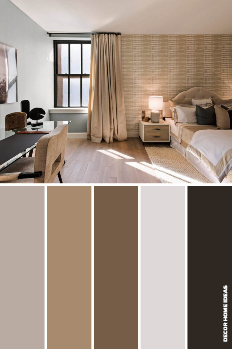
Let’s be honest for a second. When you hear the word "beige," what’s the first thing that pops into your head? For a long time, it was probably something like "landlord white" or "safe but sad." It’s the color of waiting rooms and generic office cubicles. It’s the shade people choose when they’re too afraid to commit to anything real. But here’s the thing: that reputation is totally undeserved. And frankly, it’s outdated.
In 2026, beige isn’t just back; it’s having a full-on renaissance. But this isn’t the flat, lifeless beige of the early 2000s. We’re talking about a rich, complex palette that breathes warmth and sophistication into a space. It’s about creating a sanctuary that feels grounded, calm, and deeply personal. If you’ve been hesitant to embrace neutral tones because you’re worried your home will look like an empty canvas, you’re not alone. But stick with me. By the end of this, you’ll see beige not as a backup plan, but as the star of the show.
The secret isn’t in avoiding beige. It’s in understanding it. Really understanding it. It’s about knowing how light hits it, how texture changes it, and how to pair it so it sings instead of whispers. So, grab a cup of coffee (or tea, no judgment here) and let’s dive into how you can master this misunderstood hue like a total pro.
Understanding the Chameleon Nature of Beige
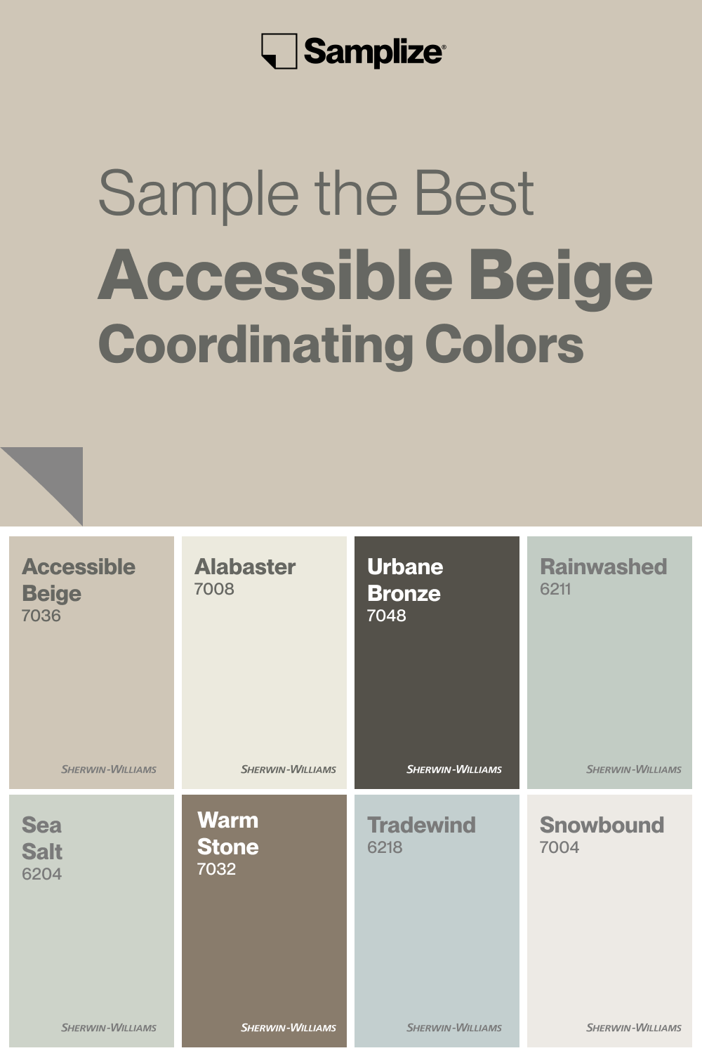
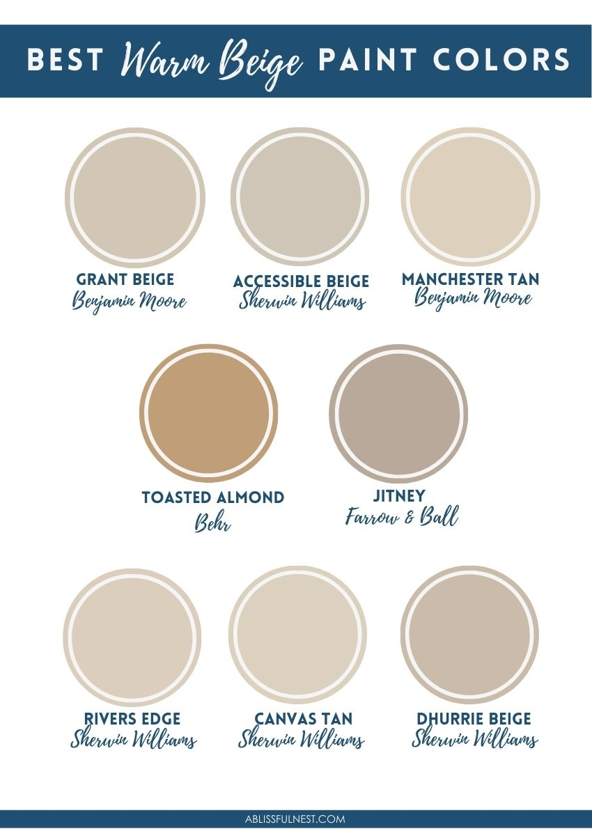
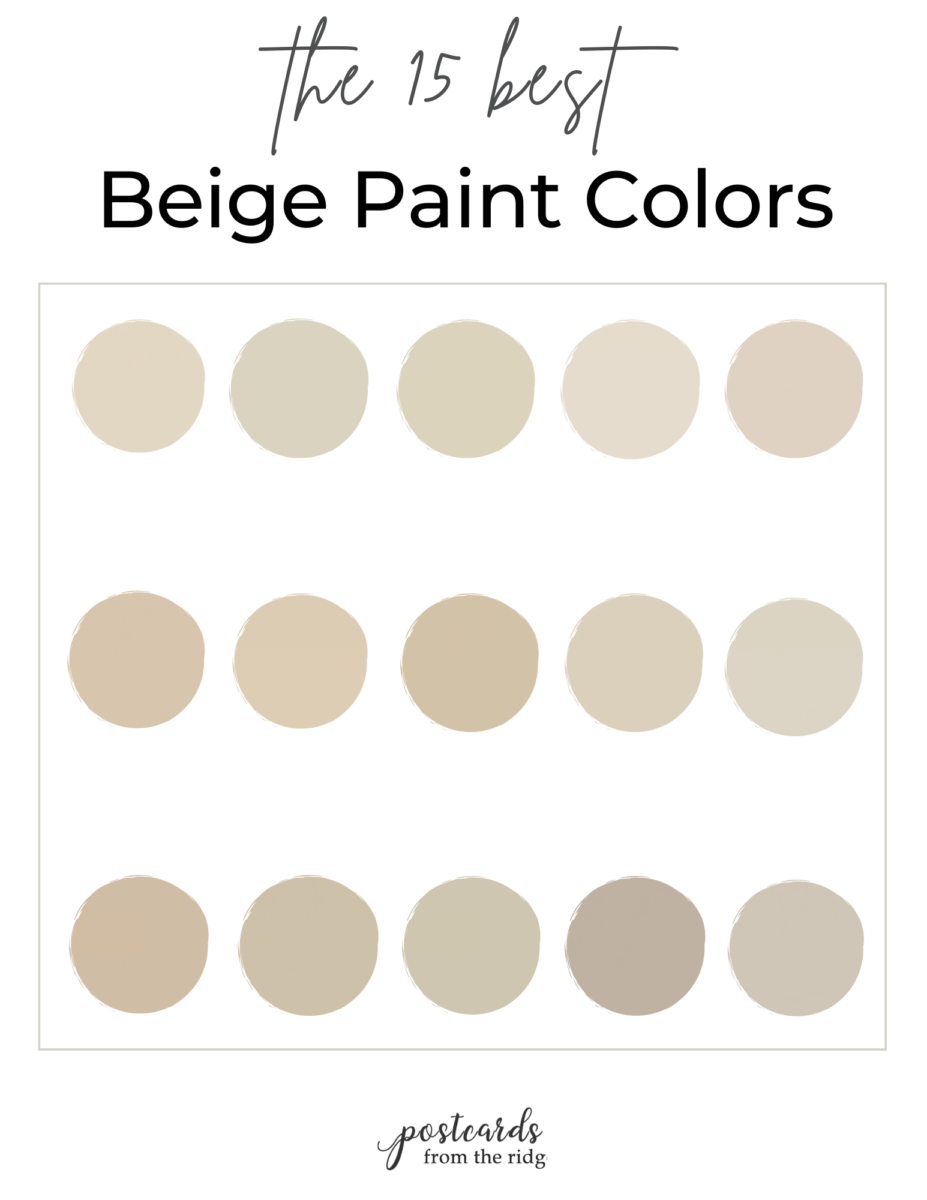
First off, we need to clear up a major misconception. Beige is not just one color. It’s actually a whole family of shades that can shift and change depending on where you put them. Think of it like a chameleon. One minute it’s reading as a cool, sophisticated gray (often called "greige"), and the next, it’s warming up to a soft, sandy tan or even picking up hints of pink or purple. This complexity is exactly why it can feel so tricky. If you pick the wrong undertone for your room, it can clash with your furniture or look muddy in certain lights.
The key is to identify the undertone before you even buy a drop of paint. Undertones are the subtle colors hiding beneath the surface. A beige with yellow or red undertones will feel warm and cozy, perfect for a living room where you want to curl up with a book. On the flip side, a beige with green or gray undertones feels cooler and more modern, which might work better in a sleek kitchen or a minimalist bedroom. In 2026, designers are leaning heavily into these nuances, choosing specific beiges to evoke specific moods rather than just covering walls.
To test this, don’t just look at a paint chip in the store. Bring it home. Tape it to the wall. Watch it in the morning light, the harsh afternoon sun, and the soft glow of evening lamps. You’ll be shocked at how much it changes. A shade that looks perfect at noon might look dreary at dusk. Taking this extra step saves you from the heartache of repainting later. It’s about finding the shade that harmonizes with your fixed elements, like flooring and countertops, rather than fighting against them.
The Power of Texture and Layering
If color is the skeleton of a room, texture is the flesh and blood. Without it, everything feels flat. This is especially true when you’re working with a monochromatic or neutral palette. When you remove bold colors from the equation, you have to amp up the tactile experience. This is where beige truly shines. It provides a quiet backdrop that allows textures to take center stage. Think about the difference between a smooth cotton sheet and a chunky knit throw. Both might be cream-colored, but they feel completely different.
Start by mixing materials. Combine the roughness of natural linen with the sleekness of leather. Add a plush wool rug over hardwood floors. Throw in some rattan or wicker baskets for storage. These elements add depth and interest without needing a single bright accent pillow. In fact, many top interior designers in 2026 are advocating for "quiet luxury" interiors, where the quality of materials speaks louder than loud patterns. A velvet cushion in a deep taupe can feel just as dramatic as a neon sign if the lighting is right.
Don’t forget about the walls themselves. Flat paint is fine, but consider adding dimension with wallpaper that has a subtle grasscloth texture, or use wood paneling painted in a varying shade of beige. Even simple architectural details like crown molding or shiplap can break up large expanses of color. The goal is to create a room that invites touch. You want people to walk in and feel the urge to run their hands along the surfaces. That’s when you know you’ve nailed the layering. It turns a static space into a dynamic, livable environment.
Strategic Use of Contrast and Accents
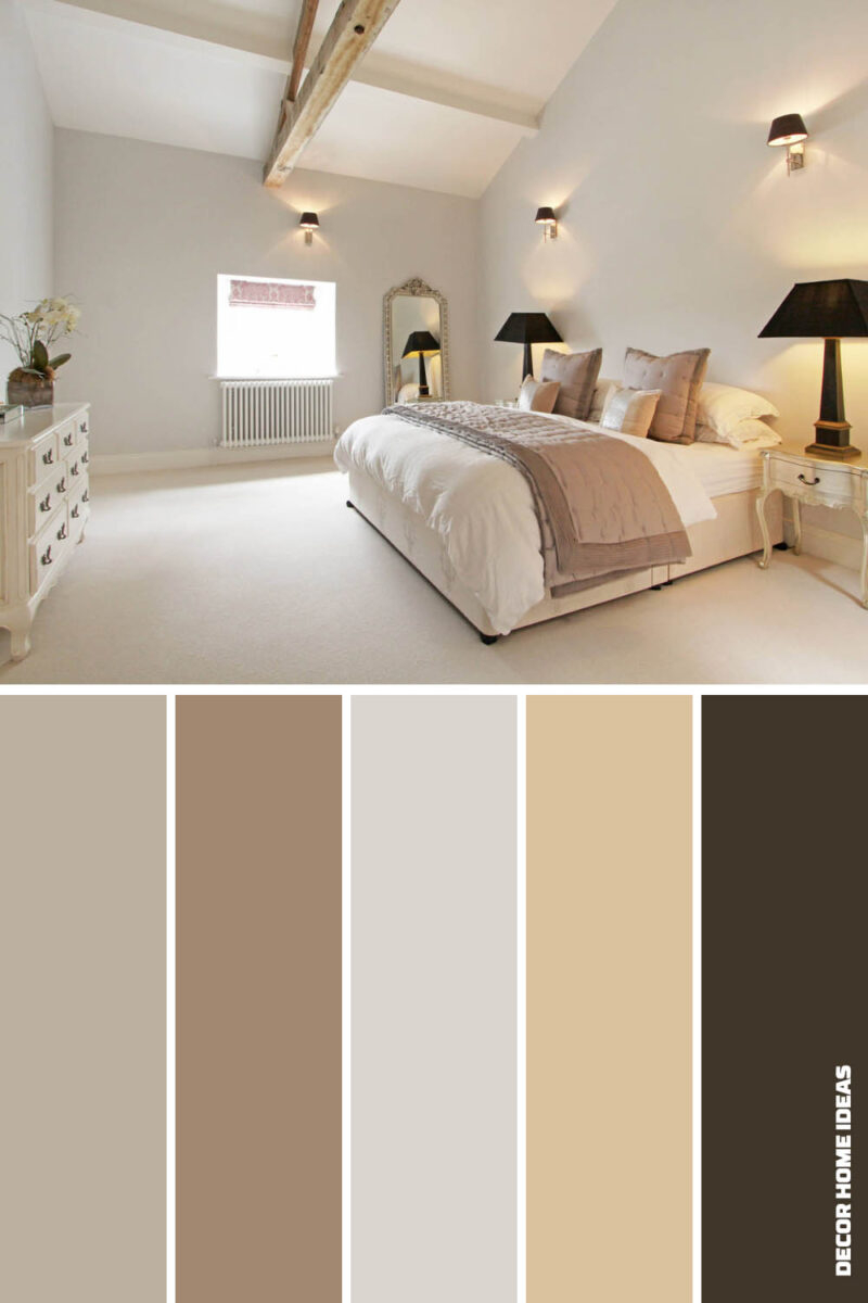
Now, I know what you’re thinking. "Isn’t all-beige everything going to look boring?" Not if you use contrast wisely. Beige is the ultimate team player. It doesn’t need to be the loudest voice in the room to make an impact. Instead, think of it as the foundation that allows other elements to pop. You don’t need to paint a wall bright red to create interest. Sometimes, the contrast comes from within the neutral spectrum itself. Pairing a light, airy cream with a deep, moody chocolate brown creates a sophisticated tension that feels intentional and chic.
But let’s talk about color accents too. Beige plays incredibly well with nature-inspired hues. Olive green, sage, and terracotta are huge trends in 2026, and they look stunning against a beige backdrop. Imagine a living room with warm beige walls, a large olive-green sofa, and some terracotta pottery on the shelves. It feels earthy, grounded, and fresh. Or, if you want something sharper, try pairing beige with black. Black metal fixtures, dark wood frames, or even a black statement chair can anchor the space and prevent it from feeling too floaty or washed out.
The trick is to use these accents sparingly, like punctuation marks in a sentence. They should enhance the beige, drawing attention to specific areas or objects, rather than overwhelming the peaceful atmosphere you’ve worked so hard to create. If you go too heavy on the accents, you lose the calming effect of the neutral base. Start small. A few books with dark spines, a piece of abstract art with bold lines, or a single vibrant plant can do the trick. It’s about balance. You want the eye to travel around the room, resting on the beige but lingering on the contrasts.
Lighting: The Make-or-Break Factor
Here’s a hard truth: bad lighting can ruin the best beige scheme in the world. And good lighting can save a mediocre one. Because beige is so reflective and subtle, it relies heavily on light to reveal its true character. Natural light is your best friend here. It brings out the warmth and complexity of the undertones. But since we can’t control the sun, we have to be smart about artificial lighting. The temperature of your light bulbs matters more than you think.
Avoid cool, blue-toned LEDs if you’re going for a cozy vibe. They will make your warm beige look gray and sterile. Instead, opt for warm white bulbs (around 2700K to 3000K). These mimic the glow of sunset and enhance the golden or pink undertones in the paint. Layer your lighting sources too. Don’t rely on a single overhead fixture. Use floor lamps, table lamps, and sconces to create pools of light and shadow. This adds drama and depth, preventing the room from feeling like a flat box.
In 2026, smart lighting systems are making this easier than ever. You can adjust the brightness and color temperature throughout the day to match the natural rhythm of light. Imagine your living room shifting from a bright, energizing space in the morning to a dim, intimate retreat in the evening, all while keeping the same beige walls. It’s a game-changer. Also, consider the placement of mirrors. Strategically placed mirrors can bounce natural light around the room, brightening up darker corners and making the beige feel more expansive and airy. It’s a simple trick with a huge payoff.
Bringing Nature Indoors
Beige is, at its core, an earth tone. It comes from the natural world—sand, stone, wool, wood. So, it makes perfect sense to bring other elements of nature into the mix. This biophilic design approach isn’t just a trend; it’s a way to create spaces that feel inherently soothing and connected to the outdoors. Plants are the most obvious choice. A large fiddle leaf fig or a trailing pothos adds life and a splash of green that complements beige beautifully. The organic shapes of leaves break up the straight lines of furniture and architecture.
But go beyond just plants. Think about raw materials. Stone countertops, wooden beams, clay pots, and jute rugs all reinforce the natural narrative. These elements add visual weight and authenticity to the space. In a beige room, a live-edge wood coffee table isn’t just furniture; it’s a sculpture. It tells a story. And because beige is so neutral, it doesn’t compete with these natural textures. Instead, it highlights them. You notice the grain of the wood, the roughness of the stone, the weave of the basket.
This connection to nature also has a psychological benefit. Studies have shown that environments with natural elements reduce stress and improve well-being. When you pair the calming effect of beige with the restorative power of nature, you create a home that truly supports your mental health. It’s not just about aesthetics; it’s about how the space makes you feel. In a world that’s increasingly digital and fast-paced, having a home that feels like a natural refuge is more valuable than ever. So, don’t be afraid to get a little messy with mud cloth pillows or imperfect ceramic vases. Perfection is boring. Nature is not.
Personalizing Your Neutral Canvas
Finally, remember that beige is just the background. The story of your home is told through the objects you choose to display. A neutral palette is actually the best way to showcase your personality because it doesn’t distract from your treasures. Whether you’re a collector of vintage cameras, a lover of mid-century modern art, or someone who just likes to display family photos, beige lets those items shine. It’s like a gallery wall where the art is the focus, not the frame.
Don’t be afraid to mix eras and styles. A modern beige sofa can sit comfortably next to an antique wooden chest. A contemporary abstract painting looks great above a traditional fireplace. The neutrality of the walls acts as a glue that holds these disparate elements together. This eclectic approach is very popular in 2026, as people move away from rigid design rules and toward more personalized, curated spaces. Your home should reflect your journey, your interests, and your memories.
So, how do you start? Look around your house. What do you love? What makes you smile? Bring those things forward. If you love travel, display maps or souvenirs. If you love music, hang your guitar on the wall. Let these personal touches dictate the final layers of your design. Beige gives you the freedom to change these accents whenever you want without having to repaint. It’s a flexible, forgiving canvas that grows with you. And isn’t that what a home should be? A place that evolves as you do.
Mastering beige isn’t about following a strict set of rules. It’s about developing an eye for detail and a sense of confidence. It’s about understanding that "neutral" doesn’t mean "nothing." It means "everything else gets to speak." By paying attention to undertones, layering textures, using contrast wisely, mastering lighting, bringing in nature, and personalizing your space, you can create a home that is far from boring. It will be warm, inviting, and uniquely yours.
So, the next time someone tells you beige is safe, smile and tell them it’s strategic. Tell them it’s sophisticated. Tell them it’s the perfect backdrop for a life well-lived. Go ahead and paint that wall. Mix that rug. Hang that art. You’ve got the tools now. And honestly? Your home is going to look amazing.