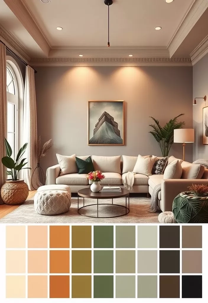
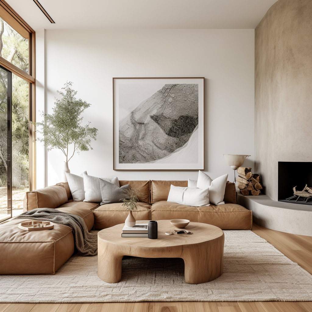
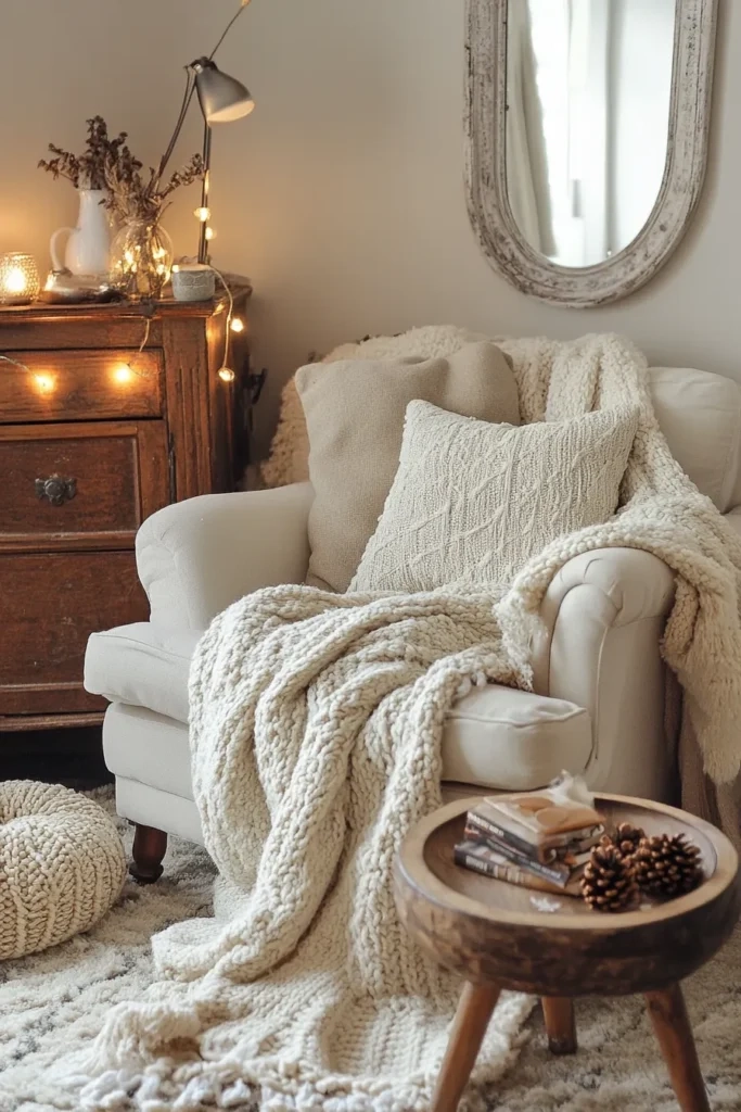
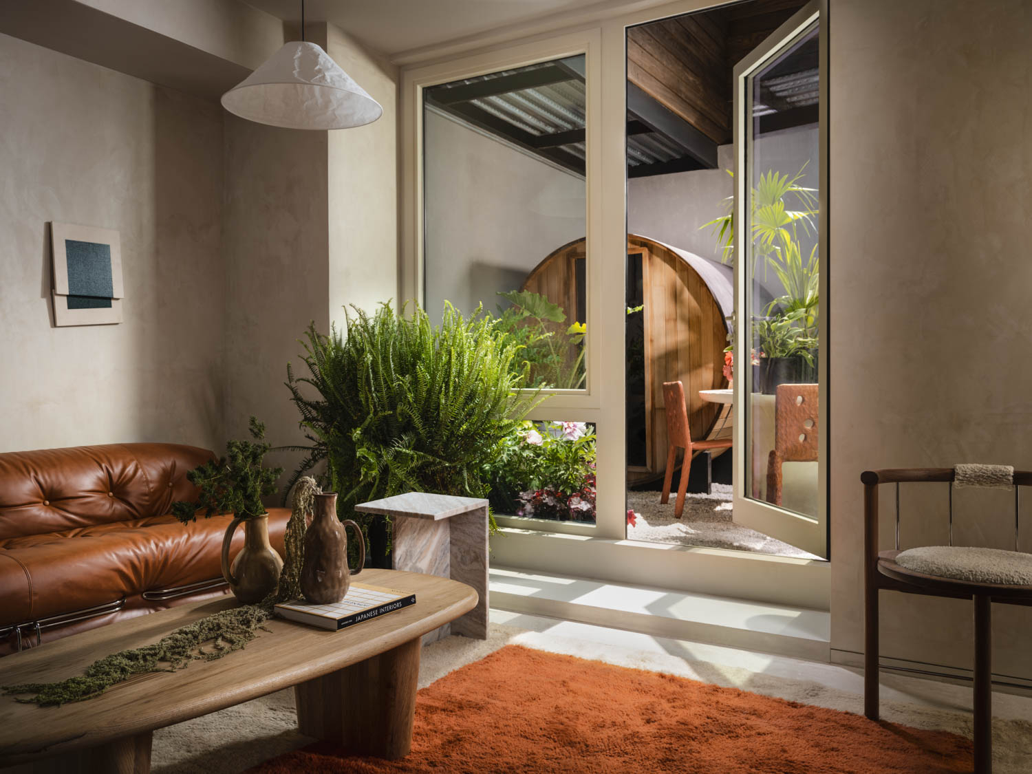
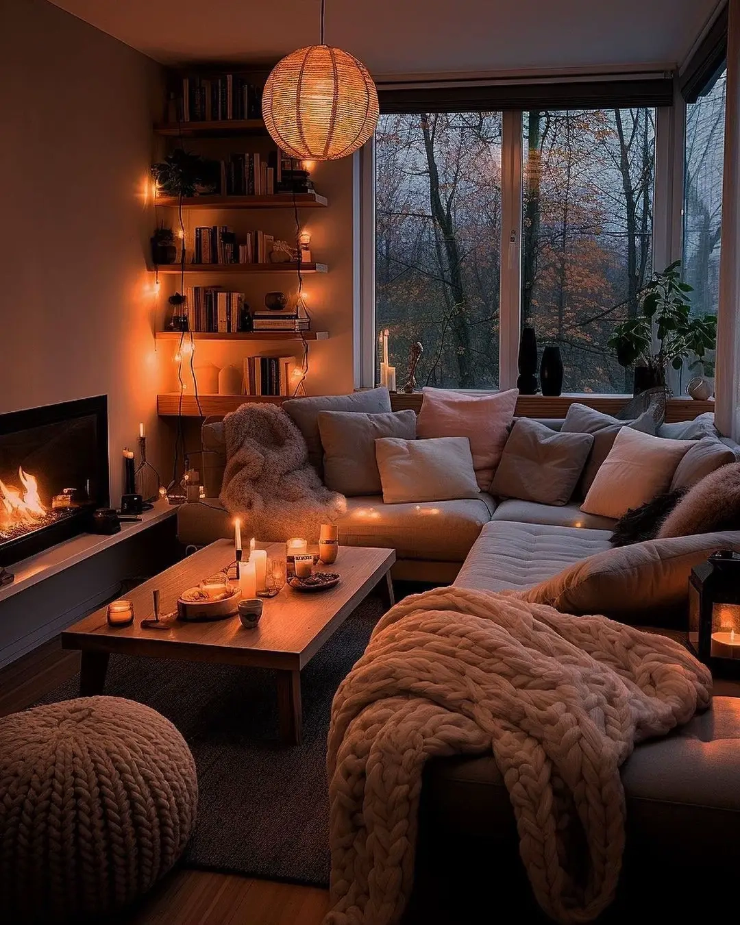
You open a gallon of paint, dip the roller, and trace a wet line across the stark, builder-grade drywall. Suddenly, the entire room shifts. The afternoon sun hits the wet swatch, and what looked like a crisp, sophisticated cream on the color chip morphs into an aggressive, butter-yellow glare that screams cheap rental property. It is a familiar, expensive heartbreak shared by countless homeowners who discover that choosing a neutral is far more complicated than simply pointing at a card of white swatches at the local hardware store.
The market is flooded with endless variations of beige, gray, greige, and soft off-white, all promising instant architectural dignity. Yet, the reality of budget-friendly painting is filled with pitfalls. Cheap paint often suffers from poor hide, forcing three or four coats where two should suffice, or it lacks the complex colorants needed to prevent a room from feeling flat, cold, and institutional. Achieving a high-end, timeless aesthetic on a modest budget requires looking past marketing hype and understanding the mechanical realities of how paint pigments interact with light, architecture, and time.
Neutral paint colors are the quiet workhorses of residential interior design. They do not shout for attention; instead, they serve as the foundational canvas upon which daily life unfolds, furniture is rearranged, and personal histories are built. In 2026, the design ethos has shifted decisively away from the sterile, high-contrast grays of the previous decade toward grounding, earthy neutrals that foster mental calm and visual warmth. Understanding how to select budget-friendly formulations that maintain their integrity under changing seasonal light is the ultimate shortcut to creating a home that feels curated, expensive, and enduringly relevant.
The Architecture of Undertones: Why Budget Neutrals Sometimes Look Muddy
Every neutral paint color possesses a secret life dictated by its undertones—the subtle hints of green, pink, yellow, blue, or violet hiding beneath the primary hue. When homeowners buy affordable paint lines, they frequently make the mistake of assuming a white is just a white. In reality, budget-friendly off-whites often rely on low-cost yellow or black colorants to achieve opacity. When painted across an entire room, these inexpensive tint bases interact unpredictably with ambient light, turning a peaceful living room into an unintended mustard box or a chilly holding cell.
Decoding these hidden chromatic shifts requires looking at the Light Reflectance Value (LRV), a metric running from zero (absolute black) to one hundred (pure reflective white). High-LRV neutrals bounce massive amounts of natural light around a space, making compact rooms feel expansive and airy. Conversely, lower-LRV shades absorb light, creating moody, intimate sanctuaries that swallow harsh glare. Affordable paint options from mainstream manufacturers can perform remarkably well, provided you track their LRV and test them against your specific architectural orientation—north-facing rooms demand warm, high-yellow or red undertones to combat icy blue daylight, while south-facing spaces can easily neutralize warmer paints into clean, crisp backdrops.
The danger of muddy walls typically stems from failing to test swatches across multiple planes within a room. A swatch painted directly over an existing saturated wall color will visually trick the eye, as the surrounding old paint alters your perception of the new neutral. Professional designers always paint samples onto large poster boards, leaving a white border around the edge, and move them from wall to wall throughout the day. This simple, low-cost habit prevents the costly disaster of buying five gallons of a budget paint only to realize it flashes an unwelcome pink hue every time the afternoon clouds roll in.
Navigating the Economy Paint Market Without Sacrificing Durability and Finish
There is an ongoing debate among DIYers and professional contractors regarding whether cheap paint is ever a sound financial investment. The truth lies in the chemical composition of the binder—the resin that holds the pigment particles together and anchors them to the wall once the water or solvent evaporates. Ultra-budget paints often cut corners by reducing resin content and increasing filler minerals like calcium carbonate. The result is a chalky film that burnishes easily, meaning that every time a stray backpack or dog tail brushes against the hallway, it leaves a permanent, shiny burn mark.
Fortunately, modern paint science has evolved to the point where mid-tier and budget-friendly lines from major brands offer exceptional performance without requiring a luxury price tag. Look for 100% acrylic latex or acrylic-alkyd hybrid formulations, even within economy tiers. These binders provide superior flexibility, allowing the paint film to expand and contract with seasonal humidity fluctuations without cracking or chalking. Furthermore, modern affordable lines frequently boast zero-VOC (volatile organic compounds) or low-VOC formulations, improving indoor air quality while you paint—a vital consideration for families tackling weekend whole-house repaints.
Choosing the right sheen is equally critical when balancing cost and longevity. While matte and ultra-flat finishes hide surface imperfections on older drywall masterfully, they are notoriously difficult to clean in high-traffic zones like hallways, stairwells, and kitchens. A quality eggshell or low-sheen satin finish offers the ideal compromise. It provides a soft, light-diffusing glow that mimics high-end lime wash or specialty mineral paints, yet possesses enough washable resin content to withstand repeated wipe-downs with a damp microfiber cloth and mild soap.
Step-by-Step Methodology for Selecting and Testing Affordable Neutral Palettes
Transforming a home with budget-friendly neutral paint requires a disciplined, step-by-step approach that eliminates guesswork and prevents costly material waste. Rushing straight from the hardware store aisle to the roller tray is the fastest way to squander both time and money.
- Step 1 (Audit Your Natural Light): Walk through each room at three different times of day—morning, midday, and late afternoon. Note whether windows face north, south, east, or west, as this dictates whether you need warm or cool neutral undertones.
- Step 2 (Establish a Whole-House Flow): Select a primary neutral anchor shade that will unify open-plan spaces, hallways, and transitional zones. This core color creates visual continuity and prevents the choppy, disjointed feel of mismatched rooms.
- Step 3 (Purchase Large Peel-and-Stick Swatches): Avoid painting small, haphazard squares directly onto your existing wall color. Invest in large adhesive color samples or paint large boards, observing how the color behaves against your trim, flooring, and furniture.
- Step 4 (Calculate Precise Coverage and Buy the Right Tier): Measure your square footage accurately, factoring in two coats for proper hide. Choose a reputable mid-tier or value line that features a 100% acrylic binder to ensure washability and longevity.
- Step 5 (Prep Rigorously Before Rolling): Never skip cleaning and priming, especially when transitioning from dark or vibrant colors to a light neutral. A well-primed surface reduces the number of finish coats required, saving both labor and expensive paint product.
Common Pitfalls in Budget Neutral Painting and How to Avoid Them
Even seasoned DIYers can stumble when working with neutral palettes, particularly when trying to cut corners on materials or preparation. Recognizing these frequent missteps helps ensure your finished project looks professionally executed rather than hastily slapped together.
- Pitfall 1 (Skipping Primer on Dark or Patchy Walls): Trying to save money by omitting primer on dark accent walls usually backfires, forcing you to buy two or three extra gallons of expensive topcoat to achieve complete coverage. Workaround: Always tint your primer to a gray or neutral base coat when transitioning from dark hues, cutting your topcoat requirements in half.
- Pitfall 2 (Ignoring Trim and Ceiling Contrast): Painting walls a warm neutral while leaving ceilings a stark, builder-grade blue-white can make the entire room feel disjointed and cheap. Workaround: Match your ceiling paint to a softened, flat white and ensure your trim color creates a deliberate, subtle contrast with your wall neutral.
- Pitfall 3 (Chasing Micro-Trends Over Timelessness): Selecting hyper-trendy, highly specific greiges that lean too heavily into moody purples or cold grays can leave your home looking dated within two years. Workaround: Stick to balanced, earthy neutrals with organic warmth that harmonize effortlessly with natural wood tones and textiles.
- Pitfall 4 (Using the Wrong Roller Nap Length): Buying cheap roller covers that shed lint into your wet paint ruins the smooth, professional finish of your neutral walls. Workaround: Invest in woven microfiber roller covers with a 3/8-inch nap for smooth drywall, ensuring an even, lint-free stipple.
- Pitfall 5 (Failing to Box Your Paint): Mixing multiple cans of paint together in a larger bucket (boxing) can reveal subtle batch-to-batch tint variations halfway through a wall. Workaround: Always combine all cans of the same color into a single container before starting your project to guarantee absolute color uniformity.
The Broader Economic and Psychological Impact of Cohesive Neutral Interiors
Beyond the immediate aesthetic gratification, curating a home with thoughtful, enduring neutral paint shades yields profound psychological and economic dividends. Environmental psychology consistently demonstrates that color saturation directly impacts cortisol levels and cognitive fatigue. High-intensity colors can stimulate excitement temporarily, but they frequently induce sensory overload over long periods. Soft, earthy neutrals act as a visual exhale, creating an internal sense of spaciousness and calm that supports mental restoration in an increasingly fast-paced world.
From a financial perspective, investing time in selecting the right neutral palette is one of the highest-return home improvements available. Whether you plan to stay in your home for decades or intend to list it on the real estate market, neutral walls act as an economic stabilizer. They allow prospective buyers or future visitors to project their own lives and furnishings onto the architecture without mental friction. When executed with high-quality, budget-conscious formulations, a neutral interior transcends fleeting design fads, proving that sophistication and affordability are not mutually exclusive.
Furthermore, a neutral backdrop provides unparalleled financial flexibility in home decor. Because the permanent architectural surfaces remain understated and versatile, updating the look of a room no longer requires a disruptive, expensive overhaul. Swapping out inexpensive throw pillows, rotating area rugs, or introducing new botanical elements allows you to completely shift the emotional tone of a space with minimal expense. The wall color remains the steadfast, reliable anchor holding the entire design ecosystem together through changing seasons and shifting personal tastes.
Strategic Frameworks for Long-Term Maintenance and Interior Harmony
Maintaining the pristine look of affordable neutral walls requires adopting a proactive maintenance mindset. Even the most durable low-sheen formulations will eventually collect scuffs, fingerprints, and dust, particularly in high-traffic family zones. Establishing a simple, routine upkeep schedule ensures your investment continues to pay aesthetic dividends for years to come without requiring frequent, disruptive repainting projects.
Keep a dedicated, labeled quart jar of your exact wall color stored in a temperature-controlled environment—never out in a freezing garage where the chemical emulsion can separate and ruin. When minor scuffs occur, resist the urge to roll an entire wall. Instead, use an artist’s brush or a small wedge sponge to touch up only the damaged area using the stippling technique, feathering the edges gently into the surrounding paint film. This targeted maintenance approach preserves the integrity of the original coat while keeping your walls looking freshly painted with zero effort.
Ultimately, designing timeless spaces is less about following rigid rules and more about understanding the dialogue between light, material, and human experience. By choosing affordable neutral paint shades rooted in warm, organic undertones, you create a resilient foundation that honors both your budget and your desire for a beautiful, serene home. The walls become more than mere vertical barriers; they transform into a quiet, enduring canvas for the art of everyday living.
The journey of transforming a house into a home rarely happens overnight, and neither does the mastery of color. Armed with a deeper understanding of LRVs, undertones, and the realities of paint chemistry, you are now equipped to navigate the paint aisle with absolute confidence. No longer will you fall victim to the trap of accidental yellow walls or chalky, fragile finishes that fail under pressure.
As you embark on your painting project, remember that perfection is found in the deliberate steps of preparation and testing. Take your time, honor the changing light in your rooms, and trust your eye over any trend report. The timeless space you are building is an investment in your daily peace and comfort—a place where affordable design meets enduring elegance, ready to hold the stories of your life for years to come.