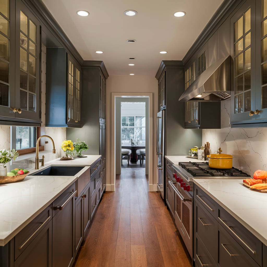
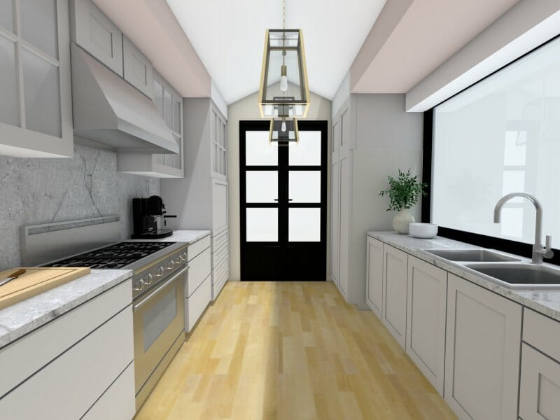
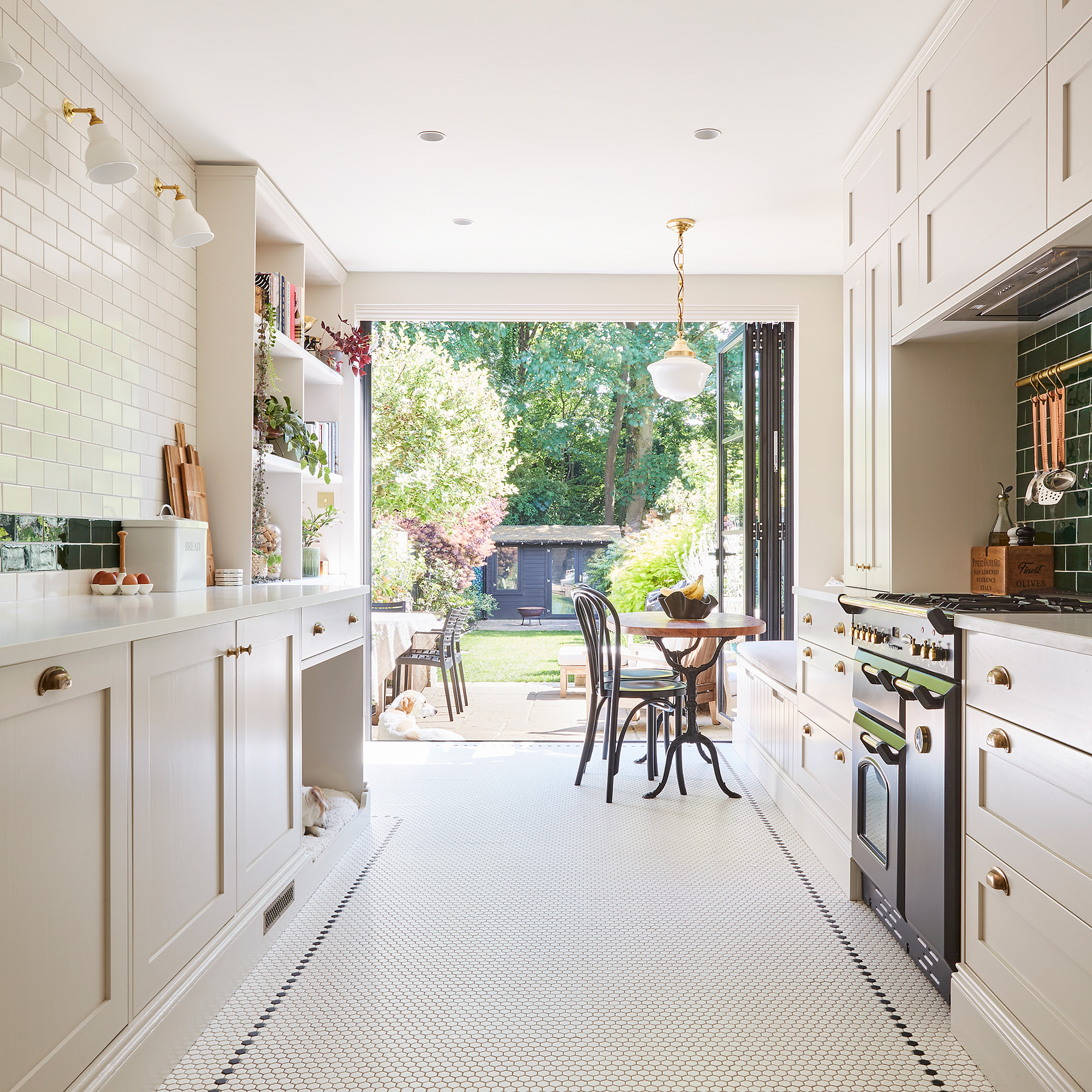
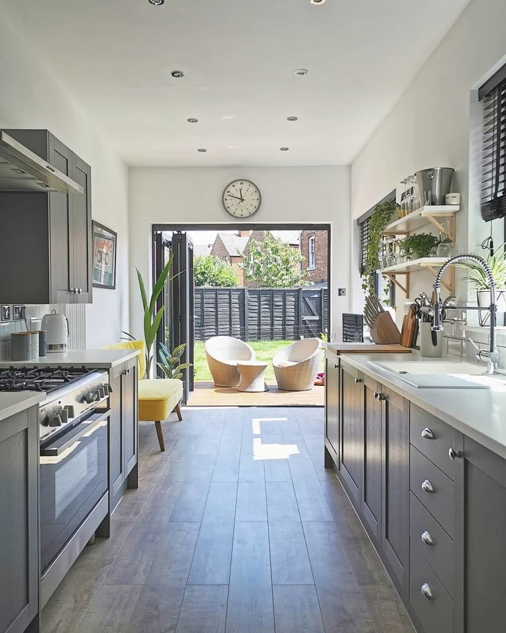
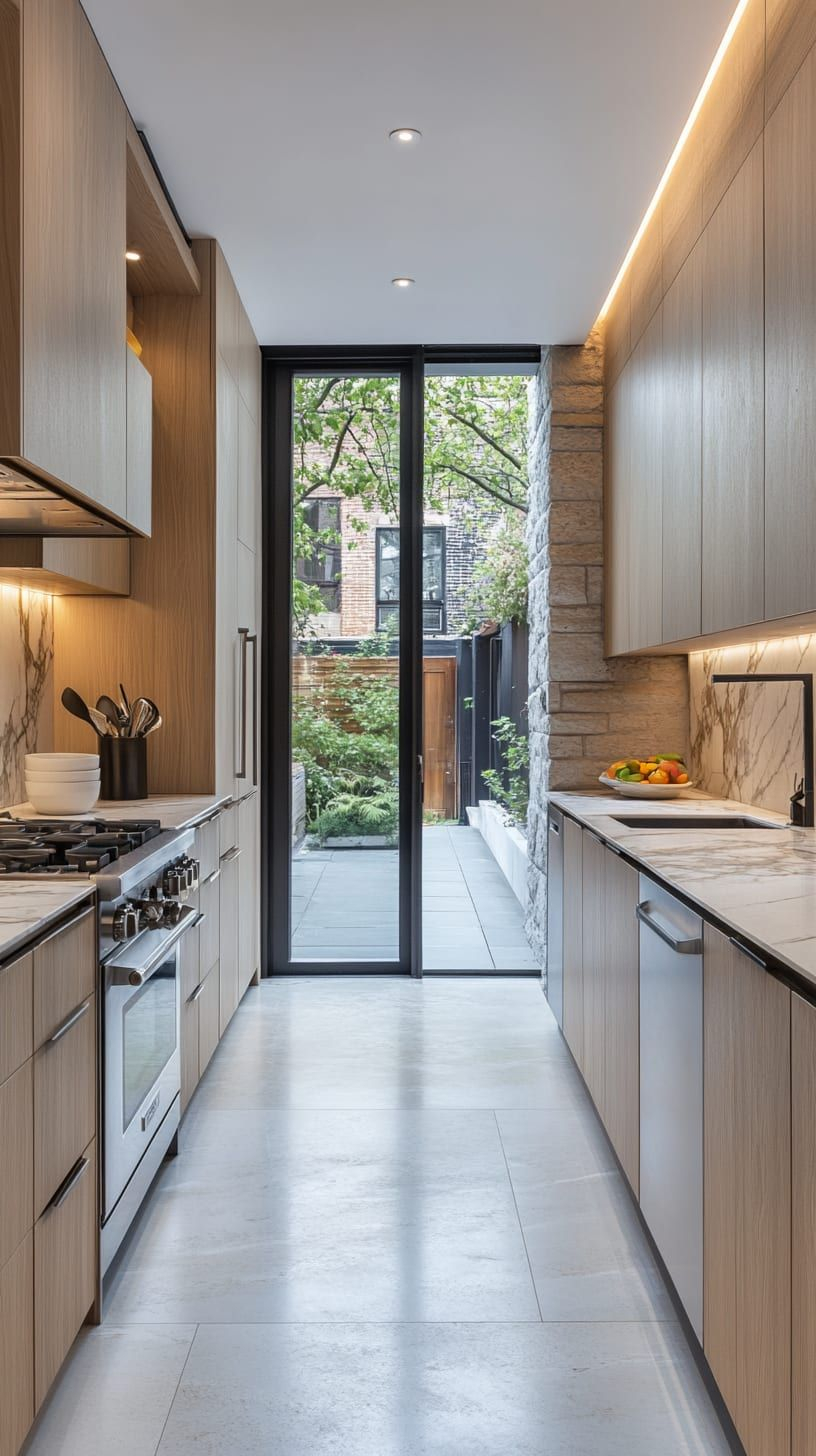
Ever walked into your kitchen and felt like you were stepping into a cave? You’re not alone. For years, the galley layout has been the unsung hero of efficient cooking—everything is within arm’s reach—but it often comes with a heavy price tag: darkness and a sense of being boxed in. If you’ve ever felt like you’re cooking in a hallway, that feeling is real. But here’s the good news. You don’t need to knock down walls or take out a massive loan to fix it.
We spent months tackling this exact problem. The goal was simple yet daunting: turn a shadowy, narrow cook space into a room that felt open, airy, and inviting. No structural changes. No moving walls. Just smart design choices, a bit of elbow grease, and some clever visual tricks. What we found wasn’t just about making things look bigger; it was about changing how the space felt. And honestly? It changed everything about how we use our home.
The Power of Light Layers
Lighting is probably the single most important factor in a galley kitchen. Most older galleys have one sad ceiling fixture in the middle, which leaves the corners dark and the countertops in shadow. That’s a recipe for a gloomy vibe. To fix this, we stopped thinking of lighting as just "overhead" and started treating it like layers. Think of it like dressing for the weather—you need a base layer, but you also need accessories to complete the look.
First, we tackled the task lighting. Under-cabinet LED strips are a game changer. They wash the countertop in light, making food prep easier and bouncing light off the backsplash. We chose warm white bulbs (around 3000K) because cool white can feel sterile, almost like a hospital. Then, we added puck lights inside the glass-front upper cabinets. This draws the eye upward and adds depth. Finally, we swapped the central fixture for a semi-flush mount with a translucent shade. This diffuses light evenly instead of casting harsh shadows. By illuminating work surfaces and brightening dark corners, the corridor-like space instantly felt wider and taller.
It’s not just about brightness; it’s about direction. Lighting experts in 2025 and 2026 have really championed this multi-layered approach. When you light the vertical surfaces—like the backsplash or the inside of shelves—you push the boundaries of the room out visually. It tricks the brain into perceiving more volume. We also added a small plug-in sconce on the far wall. It sounds minor, but having a light source at eye level breaks up the tunnel effect. It creates a focal point that isn’t just the sink or the stove. Suddenly, the kitchen felt less like a passage and more like a destination.
Color Choices That Bounce Light
Paint and finishes do the heavy lifting when you can’t change the square footage. The old rule was "white makes it bigger," and while that’s mostly true, it’s a bit more nuanced than that. Pure, stark white can sometimes feel cold and clinical, especially in a narrow space with limited natural light. We opted for a soft, warm white with a hint of gray for the cabinets. This color, often called "greige" or off-white, reflects light beautifully but adds a touch of warmth that pure white lacks. It feels cozy, not cavernous.
The countertops played a huge role too. We went with a light gray quartz with subtle veining. Dark countertops absorb light, which is the last thing you want in a dim galley. Light surfaces bounce it around. We kept the backsplash simple—a glossy white subway tile laid in a classic brick pattern. The gloss finish is key here. Matte finishes absorb light; glossy ones reflect it. Every little bit of reflection helps stretch the space. Even the hardware got an upgrade. We switched from dark bronze knobs to brushed nickel. These small metallic accents catch the light and add tiny sparkles throughout the day.
Don’t forget the ceiling. It’s often overlooked, but painting it a crisp, bright white lifts the whole room. If your ceiling is even slightly off-white or yellowed, it makes the space feel lower and more oppressive. We also painted the trim and baseboards the same white as the walls. This blurs the lines between surfaces. When your eye doesn’t stop at a contrasting trim line, the space feels more continuous and less chopped up. It’s a subtle trick, but it works wonders for creating a seamless flow. As noted by renovation pros, homeowners are often amazed at how a kitchen with the exact same footprint can feel significantly larger just by switching from dark cherry cabinets to light shaker styles.
Reflective Surfaces and Visual Tricks
If light is the fuel, mirrors and reflective surfaces are the amplifier. You don’t need to hang a giant mirror in your kitchen (though some people do!), but incorporating reflective materials can double the perceived space. We installed a mirrored backsplash behind the stove area. It’s practical because it’s easy to clean, but visually, it reflects the opposite wall and the window, creating an illusion of depth. It’s like adding a virtual window where there wasn’t one before.
Another trick we used was high-gloss paint on the cabinet doors. While matte is trendy, gloss bounces light around like a pinball machine. We only did this on the upper cabinets to keep the bottom half grounded, but the effect was noticeable. The light from the under-cabinet LEDs hit the glossy surface and scattered, filling the room with a soft glow. We also chose a faucet and fixtures with a polished chrome finish. Again, it’s about maximizing every photon of light available.
Glass is another best friend for small spaces. We replaced two of the solid upper cabinet doors with clear glass panels. This breaks up the solid mass of cabinetry. When you can see through to the back of the cabinet, your eye travels further, making the wall feel less imposing. We kept the shelves inside tidy and styled with light-colored dishes to maintain the airy feel. If glass feels too exposing, frosted glass is a great alternative. It still lets light pass through but hides the clutter. These visual tricks quietly stretch the space without requiring any construction.
Smart Storage to Reduce Clutter
Clutter is the enemy of small spaces. In a galley kitchen, every item left on the counter shrinks the usable workspace and makes the room feel tighter. We adopted a "clear surface" policy. This meant getting ruthless with storage. We installed pull-out drawers in the base cabinets instead of standard shelves. Drawers let you see everything at once, so you’re not digging around in dark corners. It also encourages keeping things organized because mess is more visible.
Vertical space is your secret weapon. We added open shelving on one end of the galley, near the entrance. This drew the eye up and made the ceiling feel higher. But here’s the catch: open shelves must be curated. We only displayed pretty, useful items like ceramic bowls and cookbooks. Everything else went behind closed doors. We also used the inside of cabinet doors for spice racks and cleaning supplies. It’s hidden storage that frees up drawer space.
Another clever hack was using the toe-kick space. We installed shallow drawers in the kickplate area under the base cabinets. It’s perfect for storing flat items like baking sheets or cutting boards. It sounds minor, but reclaiming that dead space meant we could keep the countertops clear. A clear countertop reflects light and gives the eye a place to rest. When the surfaces are bare, the room breathes. It’s not just about aesthetics; it’s about functionality. A clutter-free galley is a calm galley.
Flooring That Flows
Flooring can make or break the perception of space. In our old kitchen, the floor was a busy, dark pattern that chopped the room up visually. We replaced it with large-format porcelain tiles in a light beige tone. Large tiles mean fewer grout lines. Fewer grout lines mean less visual noise. The eye glides over the floor instead of stopping at every grid intersection. We laid the tiles diagonally. This diagonal pattern leads the eye toward the corners of the room, effectively stretching the dimensions.
If replacing the floor isn’t in the budget, a large rug can help. But be careful. A small rug will make the space feel fragmented. We chose a runner that spanned most of the galley’s length. It anchored the space and added texture without blocking the flow. The key is continuity. Whether it’s tile, wood, or vinyl, keeping the flooring consistent and light-colored helps unify the space. We avoided transitions strips where possible. A seamless floor makes the room feel like one cohesive unit rather than a series of small zones.
We also considered the sheen of the floor. A slight satin finish reflects a bit of ambient light from above, adding to the overall brightness. It’s not as dramatic as a glossy backsplash, but every bit counts. The combination of light floors and light walls creates a "light box" effect. The boundaries of the room become softer. It’s less about the specific material and more about how it interacts with light and space. In 2026, sustainable luxury vinyl plank (LVP) is a popular choice for this because it’s durable, water-resistant, and comes in wide, light planks that mimic wood without the maintenance.
A bright kitchen shouldn’t feel sterile. Once we had the light and color sorted, we needed to add soul. Plants were our go-to. A trailing pothos on top of the fridge and a small herb garden on the windowsill added greenery and life. Green contrasts beautifully with white and gray, making the space feel fresh and vibrant. Plus, plants improve air quality, which is always a bonus in a cooking space.
We also introduced texture. A woven basket for fruit, a wooden cutting board left out (because it’s pretty), and linen towels added warmth. These natural materials soften the hard surfaces of tile and stone. Artwork played a role too. We hung a single, large piece of abstract art on the far wall. It created a focal point that drew you into the room. Instead of feeling like a tunnel, the kitchen became a gallery. The art didn’t have to be expensive; it just had to be meaningful and sized correctly. A tiny picture gets lost; a large one anchors the space.
Finally, we kept the window treatments minimal. Heavy curtains block light. We installed simple Roman shades in a light, neutral fabric. They provide privacy when needed but roll up completely to let every ray of sunlight in. During the day, the windows were bare. This connection to the outside world is crucial. It reminds you that the kitchen is part of the larger home, not an isolated box. By blending function with personal touches, the space became not just brighter, but happier. It became a place we wanted to spend time in, not just rush through.
Turning a dark galley kitchen into a bright haven doesn’t require a sledgehammer. It requires a shift in perspective. By layering light, choosing reflective and light colors, managing clutter, and adding personal touches, you can transform the feel of the room entirely. It’s about working with the space you have, not fighting against it. The result is a kitchen that feels open, efficient, and genuinely welcoming. And honestly, that’s worth more than any extra square footage.