Ever painted a room, stepped back a few months later, and thought, what was I thinking? We’ve all been there. Kitchens are notoriously tricky because painting cabinets and walls takes a lot of time and money. Nobody wants to re-do their kitchen every two years just because a trend went out of style.
The good news is that 2026 has brought a massive shift in how we think about home colors. The era of cold, sterile all-white kitchens is officially behind us. People want warmth, grounded energy, and real personality in their homes. But how do you pick bold hues like moody greens or rich earth tones without your home looking dated by 2028? It comes down to classic contrast, natural lighting, and testing your palettes properly.
Warm Neutrals and Natural Wood Tones
If you have honey oak or maple cabinets, don’t rush to paint over them. One of the biggest trends this year is pairing real wood with rich, creamy neutrals instead of stark whites. Shades like Sherwin Williams warm taupes or warm off-whites soften the bright yellow undertones of older wood without making the space look dark.
When you mix natural wood with soft earthy walls, you get a cozy cottage feel that never really goes out of style. Try pairing mid-tone brown cabinets with creamy wall paint and black countertop accents. It creates a grounded look that feels intentional and effortless.
Moody Greens and Deep Forest Shades
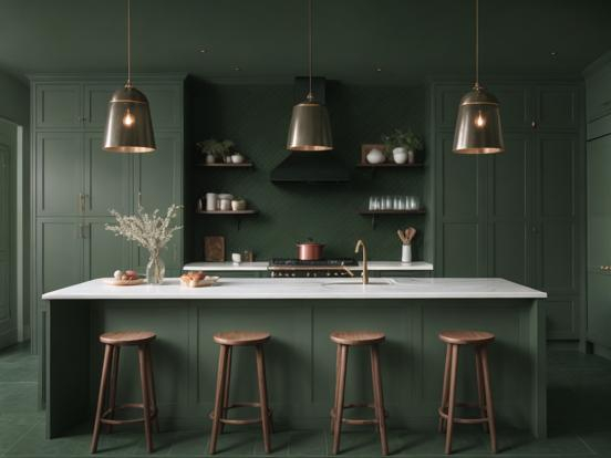
Sage green was everywhere a few seasons ago, but right now, deeper tones are taking over. Forest greens and moody olive shades bring a sense of nature straight into the heart of your home. They look stunning on lower cabinets when paired with lighter walls on top.
Why do green paint schemes age so well? Because green acts as a natural neutral in our eyes. Think about how grass and trees fit into any outdoor landscape without clashing. Combine deep forest green cabinets with warm quartz tops and warm brass hardware for a look that feels both historic and fresh.
Creamy Whites Paired with Deep Blue
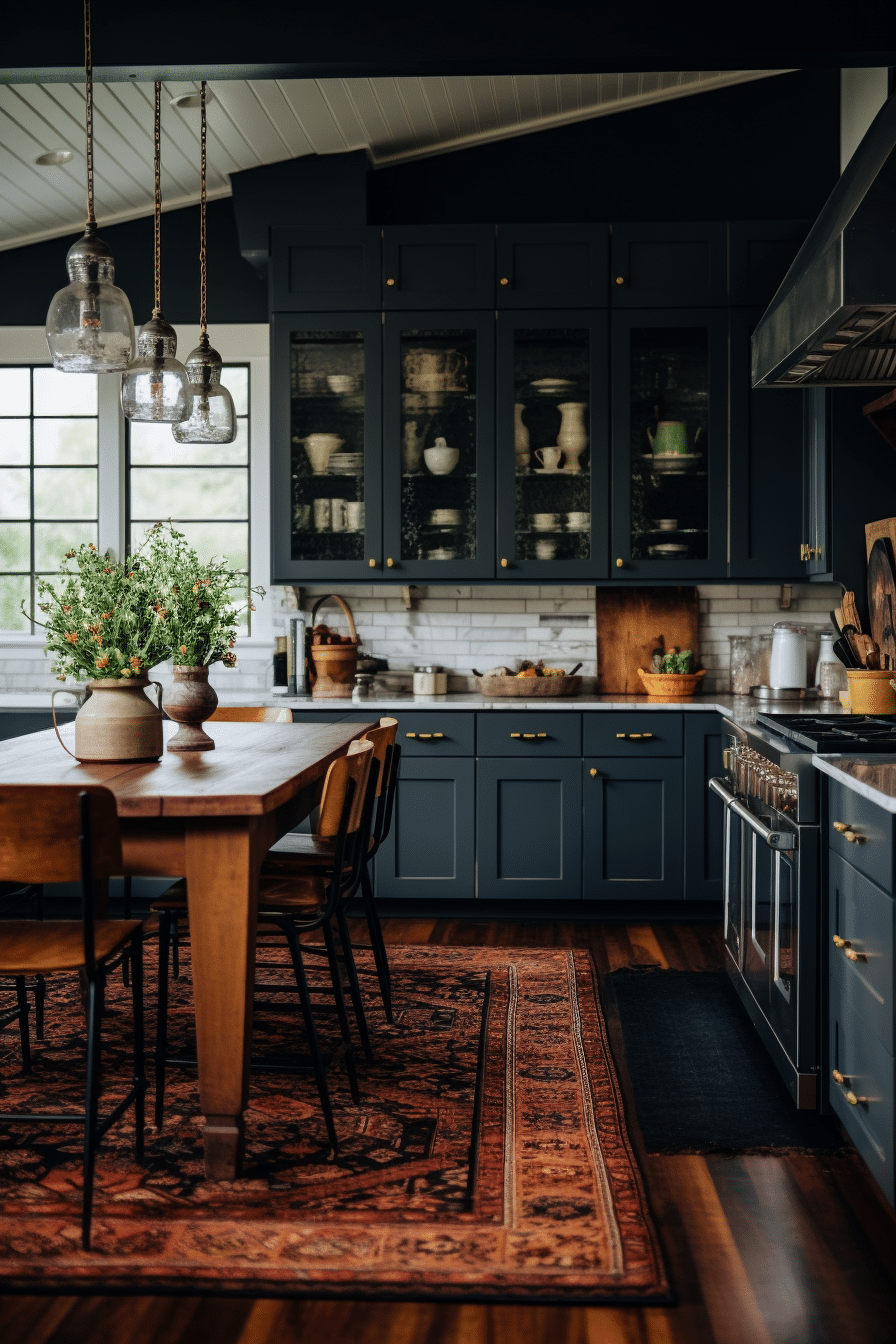
White isn’t totally gone, but it has evolved into something much softer. Instead of bright, hospital-like whites, homeowners are choosing rich buttermilk creams and ivory shades. These softer whites look amazing when balanced by deep, stormy navy or coastal blue accents.
For instance, painting your kitchen island a dark navy blue while keeping the surrounding walls a warm cream creates a focal point that won’t make you bored. The contrast keeps the space looking sharp, while the warm base keeps it inviting.
Golden Mustard and Warm Earth Accents
It might sound risky at first, but mustard yellow and terracotta accents are making a huge comeback this year. The trick to keeping yellow from feeling cheap or tacky is selecting muted, earthy undertones rather than bright primary colors.
A soft ochre wall paired with natural oak or dark walnut cabinets brings incredible warmth to a dimly lit room. If painting an entire wall yellow feels like too much, try using it on a pantry door or a built-in breakfast nook to add a splash of sunshine.
Subtle Charcoal and Warm Stone Pairings
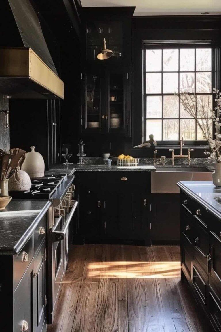
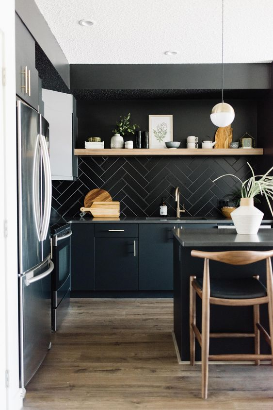
If you love a clean, modern look, stay away from cold charcoal grays and move toward warm stone colors. Think of colors inspired by river rocks, warm slate, and graphite. These moody neutrals bring drama to a room while staying completely timeless.
Try using a deep charcoal shade on your kitchen cabinets paired with pale stone walls. It adds contrast without feeling harsh. Add a few warm wood cutting boards or open shelving, and the balance between sleek and cozy is instantly achieved.
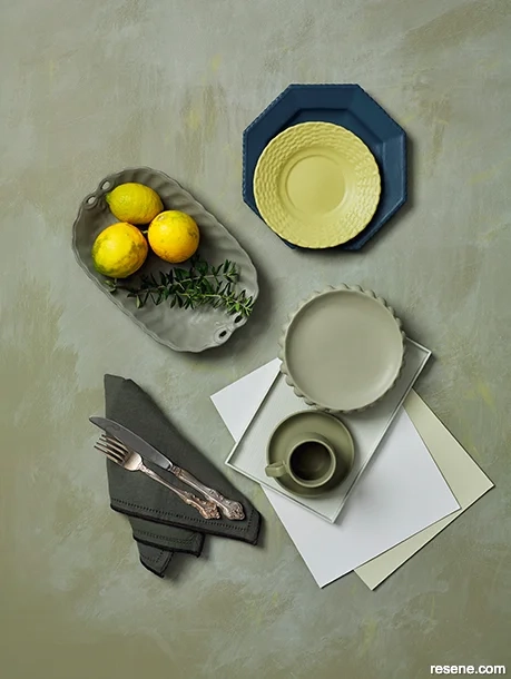
The biggest mistake people make is buying paint based entirely on a tiny swatch from the store. Lighting in your actual kitchen changes completely throughout the day, and artificial light bulbs can drastically alter how a shade looks on your walls.
Always paint a large test patch on a board and move it around your kitchen at morning, noon, and night. Look at it next to your countertops, backsplash, and flooring. Taking this simple extra step will save you hours of regret and a whole lot of money.
Choosing the right color palette for your kitchen doesn’t have to be overwhelming or risky. By stepping away from ultra-bright whites and leaning into warm neutrals, deep forest greens, and rich earthy accents, you can create a kitchen that feels stylish today and remains gorgeous for a decade to come. Take your time, test your shades in real light, and trust what feels like home to you.