Picture this: You are standing in the center of your living room at 8:00 PM under the unforgiving glare of recessed LED lighting. In your left hand, you hold a foam-core board smothered in sixteen different white paint swatches that all look suspiciously identical yet wildly different. In your right hand is your smartphone, flashing between an Instagram influencer’s moody sage-green sanctuary and a designer-approved minimalist ivory loft. Your chest feels tight. You put down a deposit on a sofa you haven’t seen in person yet, and suddenly every single color decision you’ve made feels like a ticking time bomb.
You aren’t failing at interior design. You are simply suffering from the modern curse of infinite choice. When the internet hands you forty-six trending color schemes for 2026 alongside thousands of paint formulations, paralysis is the only logical human response. The sheer volume of inspiration acts as white noise, drowning out your own intuition. You want your living room to feel like a sanctuary, but right now, it feels like an exam you forgot to study for.
Color is not merely decorative; it is biological. The moment you walk into a space, your autonomic nervous system responds to hue, saturation, and light value long before your conscious mind can process the style. A poorly balanced room can elevate cortisol levels, making a family room feel restless instead of restorative. Conversely, a considered palette anchors the eye, directs movement, and creates an invisible structural harmony that holds an entire home together. Understanding how to navigate this terrain requires stripping away the digital noise and returning to first principles: physics, architecture, and your own lived reality.
The Tyranny of the Swatch and Why Your Brain Shuts Down
The modern paint aisle is engineered to induce panic. Hundreds of tiny paper rectangles boast poetic, highly specific names like "French Roast," "Clouded Vision," or "Quietude," yet none of them look anything like what you see on the wall once the brush dries. When you tape these erratic squares to a blank drywall surface, you are forcing your eyes to make micro-comparisons in an uncontrolled environment. Your visual cortex overloads, trying to balance the undertones of an adjacent rug, the shadow cast by a television screen, and the golden hour sunlight bleeding through the curtains.
Most people attempt to solve this overwhelm by consuming more content. They save hundreds of pins, watch endless home renovation reels, and collect contradictory opinions from friends and family. This strategy fails because it substitutes external validation for internal clarity. You do not need more ideas; you need a filtering mechanism. Design professionals do not walk into a blank room and guess a color palette based on a whim. They rely on constraints. By artificially narrowing your field of vision, you turn a chaotic infinite universe into a manageable set of choices.
Consider the physical reality of pigment. Every paint color is a mixture of raw colorants suspended in a base, and those colorants react dynamically with light waves. A gray paint with a hidden blue undertone will look positively glacial in a north-facing room with cool daylight, but it might read as a sophisticated slate in a south-facing room bathed in warm afternoon sun. When you ignore these physical properties and choose purely based on a digital photograph or a tiny paper chip, you are rolling the dice. Overwhelm is the natural consequence of gambling without understanding the rules of the house.
Decoding the Architectural DNA of Your Space
Before you even look at a color wheel, your living room is already whispering its preferences to you. Every architectural space possesses a distinct DNA dictated by three immutable factors: natural light orientation, fixed architectural elements, and existing structural volumes. If you try to force a moody, light-absorbing charcoal palette into a tiny basement living room with a single high window, you are fighting the physics of the room. The space will push back, feeling cramped, dim, and depressing rather than cozy and intimate.
Mapping your room’s natural light is the single most effective way to eliminate bad options early. North-facing rooms receive cool, indirect light throughout the day, which drains warmth from colors and makes soft tones look flat or muddy. Compensating for this requires leaning into warm-leaning neutrals—hues with subtle red, yellow, or terracotta undertones that can withstand the chill. South-facing rooms are the darling of interior designers because they receive abundant, warm light that makes almost any color sing. However, overly intense sun can blow out pale pastels, turning a buttery cream into a blinding glare.
East-facing rooms enjoy crisp morning sun that fades into soft, cool shadows by afternoon, while west-facing spaces experience dramatic, golden-hour radiance that intensifies warm yellows, oranges, and reds before plunging into darkness at night. Once you identify your light signature, half of the color palette options on your Pinterest board instantly disappear. You stop agonizing over colors that will never work in your specific spatial ecosystem, narrowing your focus to shades designed to thrive in your exact environment.
The Four-Step Framework to Build a Resilient Color Palette
Breaking free from color paralysis requires a methodical, step-by-step assembly process. By tackling your living room palette sequentially rather than all at once, you eliminate the cognitive load of coordinating everything simultaneously.
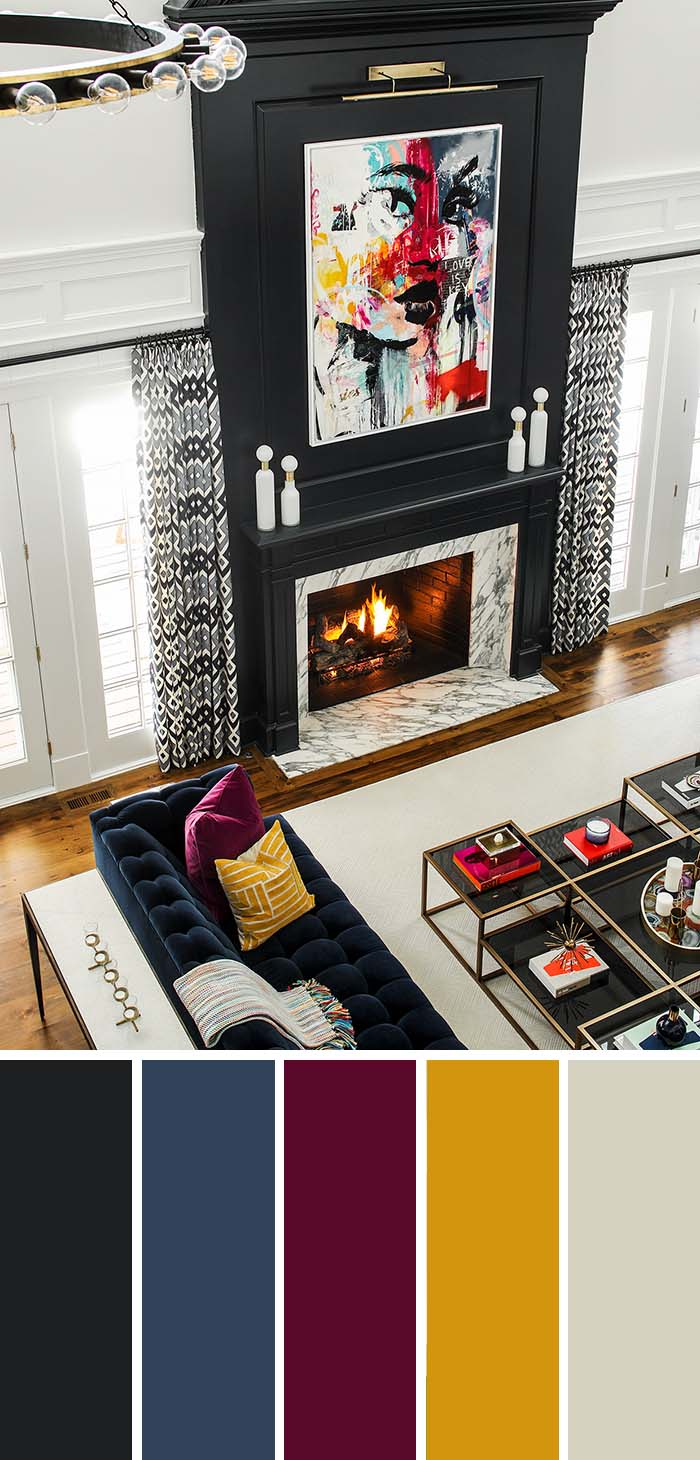
- Step 1 (Identify Your Anchor Asset): Find the one item in your living room that you cannot or will not change—be it a multi-colored vintage Persian rug, a beloved leather sofa, or a massive piece of abstract art. Pull three dominant colors directly from this anchor using a digital eyedropper tool or manual inspection. This becomes the non-negotiable DNA of your palette.
- Step 2 (Apply the 60-30-10 Rule): Allocate your colors hierarchically to prevent visual chaos. Dedicate 60% of the room to your dominant background color (usually walls and large architectural expanses), 30% to your secondary supporting color (large furniture, drapery, and accent walls), and 10% to your accent color (throw pillows, ceramics, and small artwork).
- Step 3 (Balance Undertones and Temperatures): Check every prospective paint and fabric swatch for its underlying temperature. Ensure your wood floors, metallic finishes, and paint colors share a cohesive family—either warm (red, yellow, orange undertones) or cool (blue, green, violet undertones)—unless you possess the advanced design skill required to expertly layer contrasting temperatures.
- Step 4 (Test in Real Time): Never paint swatches directly on patterned or colored walls. Paint large 12×12-inch squares onto heavy watercolor paper or foam core, leaving a white border around the edge. Move these boards around the room, observing them at 9:00 AM, 2:00 PM, and 9:00 PM over the course of three full days before making a final commitment.
Navigating Common Color Traps and Practical Workarounds
Even with a solid framework, it is easy to slip into well-worn design traps that derail your progress and trigger second-guessing. Recognizing these psychological and technical pitfalls before they happen saves both money and emotional energy.
- Pitfall 1 (Falling in Love with a Color in Isolation): A paint color looks completely different in a tiny square online versus stretched across four massive walls reflecting light onto each other. Workaround: Always order a physical peel-and-stick sample or mix a sample pot, and remember that walls bounce light; a bright white will amplify itself exponentially, often becoming uncomfortably glaring.
- Pitfall 2 (Chasing Fleeting Micro-Trends): Designing your entire permanent living room around a viral TikTok aesthetic guarantees your space will feel dated within eighteen months. Workaround: Keep your permanent architecture and major upholstery in timeless, neutral territory, reserving hyper-trendy colors exclusively for low-commitment accessories like throw blankets and ceramics.
- Pitfall 3 (Ignoring the Flow from Adjoining Rooms): Treating your living room as an isolated bubble creates jarring visual friction when someone stands in the hallway and looks inside. Workaround: Ensure your living room palette shares at least one tonal bridge with adjacent rooms, creating an intuitive, harmonious visual transition throughout the home.
- Pitfall 4 (Neglecting the Fifth Wall): Forgetting the ceiling leaves a massive white void that drains character and makes rooms feel disjointed. Workaround: Treat the ceiling as a purposeful design element—tint it with 25% of your wall color or choose a complementary warm white to pull the entire room envelope together.
- Pitfall 5 (Skipping Sheen Selection): Choosing the wrong paint sheen can ruin an otherwise perfect color choice by creating unwanted glare or making walls impossible to clean. Workaround: Opt for matte or ultra-flat finishes on living room walls to hide drywall imperfections and diffuse light softly, reserving satin or semi-gloss exclusively for baseboards and trim.
The Long-Term Psychological Architecture of Your Living Room
Color is an invisible architecture that shapes how you inhabit your home over years and decades. When a living room color palette is chosen out of panic or pure trend-chasing, the resulting space often feels sterile, alien, and emotionally disconnected from its occupants. You find yourself walking past the room without entering, or constantly rearranging furniture because something feels perpetually "off." Conversely, a palette rooted in personal resonance and spatial reality becomes a restorative backdrop for your daily life.
Consider the economic and environmental value of getting this right the first time. Repainting a living room due to color remorse wastes valuable resources, chemicals, and hours of grueling labor. By slowing down, auditing your natural light, establishing an anchor piece, and testing samples methodically, you make an investment in long-term domestic satisfaction. Your living room ceases to be a chaotic showroom of borrowed ideas and transforms into an authentic reflection of how you want to feel when you finally drop your keys on the entry table at the end of a long day.
As interior design trends continue to evolve toward organic materials, grounded earth tones, and deeply personal spaces, the mandate remains clear: authenticity outperforms algorithmic perfection every single time. The goal is not to build a museum exhibit that looks pristine in a static photograph, but to curate a living, breathing room that accommodates the messy, beautiful reality of human existence. When your color palette honors both the physical constraints of your home and the psychological needs of your mind, the overwhelm simply dissolves.
Your Blueprint for Moving Forward with Absolute Certainty
If you are still staring at a wall of paint chips right now, take a deep breath, step away from the samples, and execute this simple sequence to break the paralysis once and for all. You do not need to solve the entire room today. You only need to take one deliberate, irreversible step forward.
- Prune Your Inspiration: Delete every single screenshot, pin, and magazine clipping that does not instantly make your shoulders drop and your breathing slow down. If an image causes anxiety, bin it immediately.
- Choose Your Anchor First: Walk into your living room, identify the one textile, rug, or piece of furniture you genuinely love, and declare it the anchor of the space. Build everything else outward from that single point of truth.
- Limit Your Palette to Three Core Tones: Pick one dominant neutral for the walls, one secondary tone for large furniture or drapery, and one accent color for details. Do not complicate the formula with rogue fourth and fifth colors.
- Trust the Testing Phase: Order large physical samples, place them around the room, and let them live with you through morning fog, midday glare, and evening lamp light before pulling the trigger on a full gallon.
The journey from overwhelming indecision to color confidence is ultimately an exercise in self-trust. We live in an era that bombards us with thousands of curated aesthetic choices every day, whispering that our homes are never quite finished, never quite trendy enough, never quite complete. Breaking free from this cycle requires recognizing that a living room is not a performance piece for an audience; it is a physical container for your life.
When you stop trying to please the invisible arbiters of internet style and start listening to the physical light, the architectural lines, and the emotional resonance of your own space, everything clicks into place. The anxiety fades, replaced by the quiet satisfaction of a room that feels unmistakably, undeniably yours. Trust your eye, respect the physics of your light, and take that first small step toward a living room you will actually love living in.