We have all been there. You see a gorgeous picture online of a perfectly styled room or a sleek graphic design project that uses just one solitary color. It looks incredibly sophisticated, clean, and effortless. So, you decide to try it yourself. You grab your favorite shade of blue or a trendy beige, apply it to everything, and step back to admire your work.
But instead of looking like a luxury showroom or a high-end branding project, it just looks… flat. A bit lifeless, honestly. Maybe even a little depressing? Don’t worry, you aren’t bad at design. You just fell into the most common trap in the book: you forgot about contrast.
When you limit yourself to a single color family, you lose the ability to use different hues to create separation. That means something else has to do the heavy lifting. In 2026, as minimalist and tonal designs continue to dominate our feeds, mastering this balance is more important than ever. Let’s look at how to fix this and make your tonal projects pop.
The Illusion of the Single Color
When people hear the word "monochromatic," they often think it means using one exact paint swatch or hex code for everything. That is a massive misconception. If you paint your walls, your trim, and your doors the exact same shade of gray, they all just bleed together. The human eye gets bored incredibly fast when there is nothing new to look at.
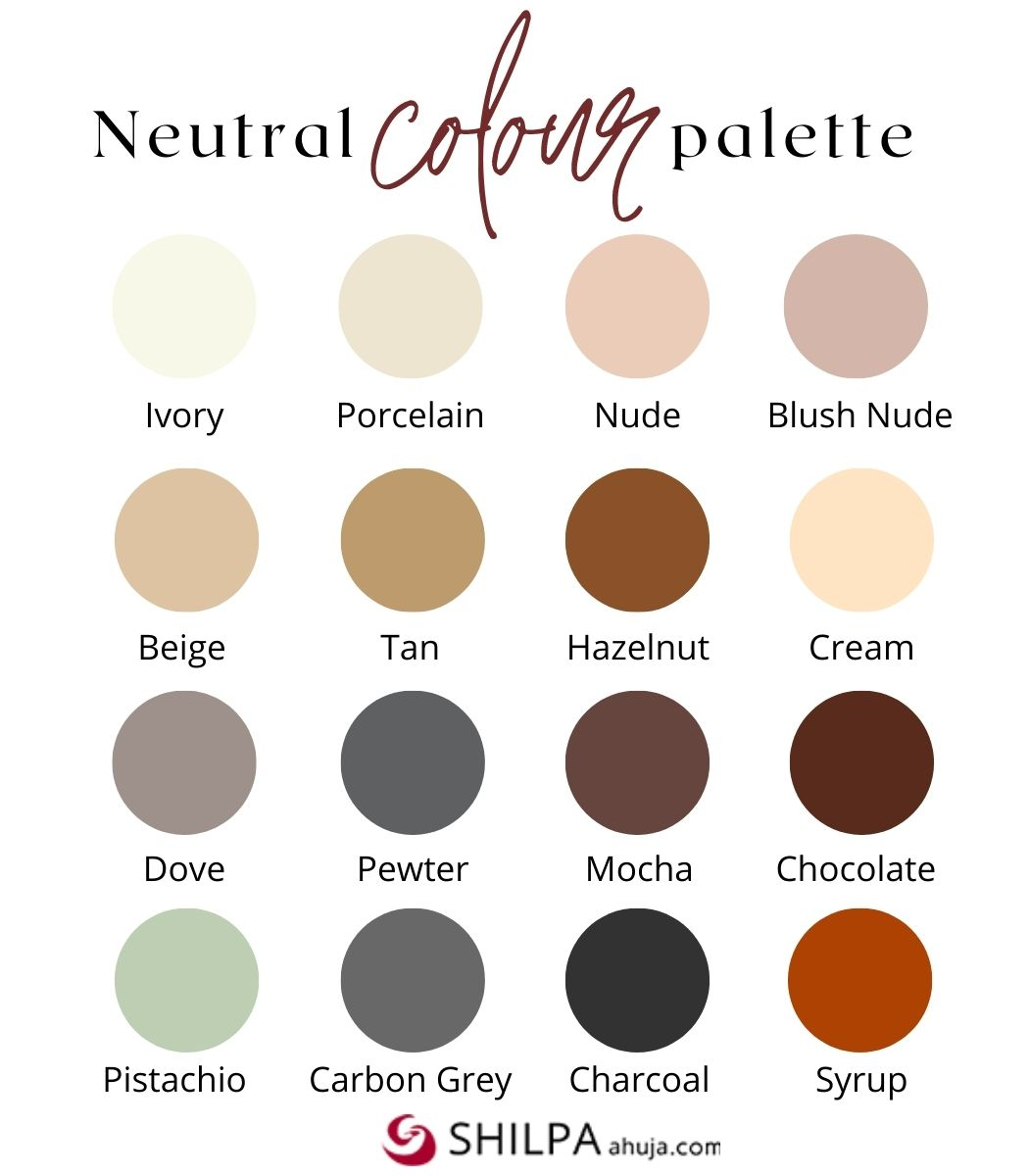
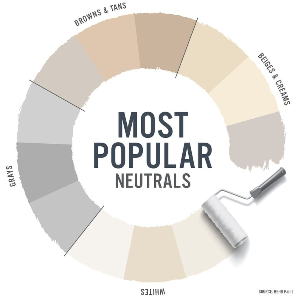
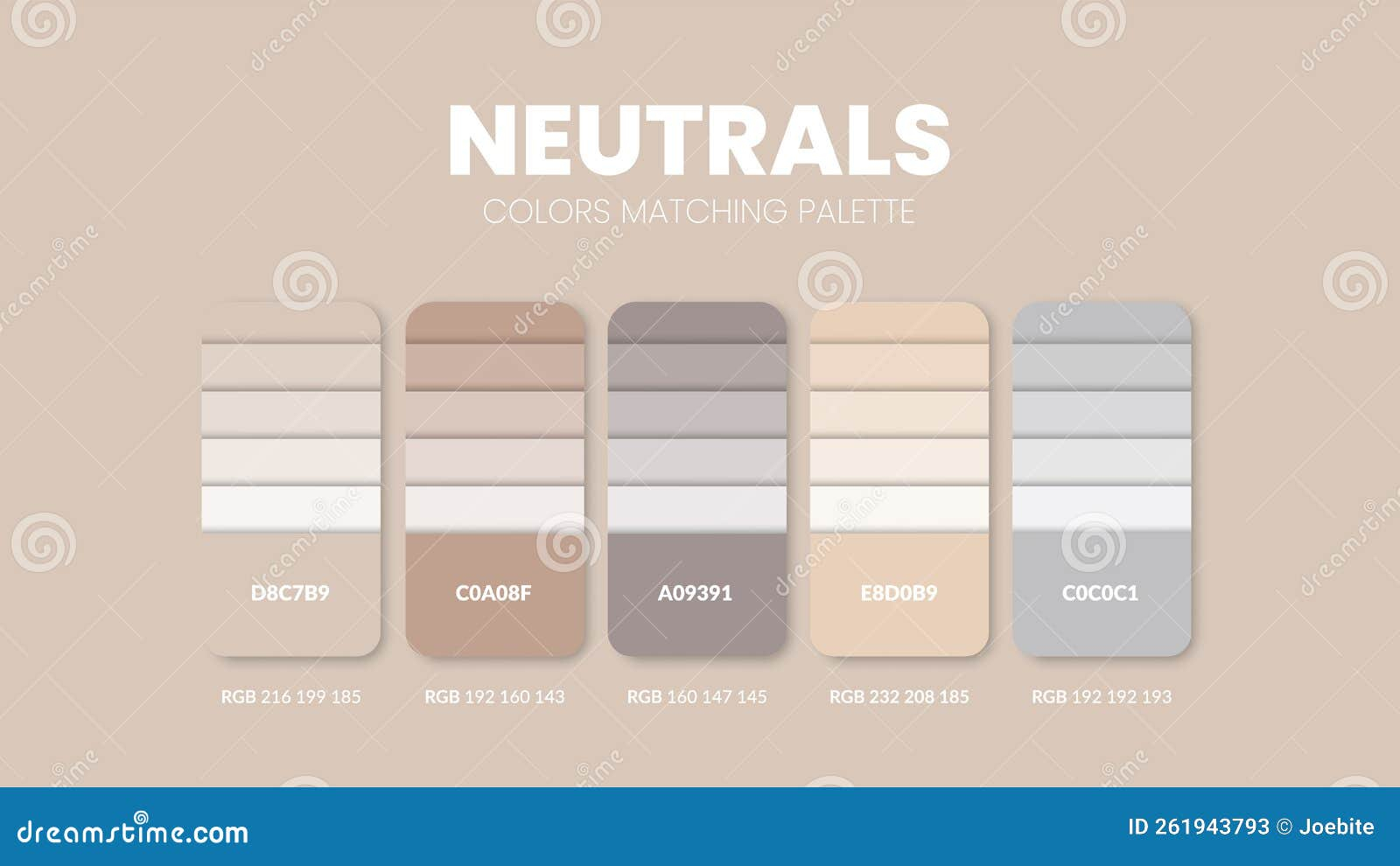
True monochromatic design is actually about exploring an entire color family from its absolute lightest whisper to its darkest shadow. Think about a paint strip from the store. You don’t just use number three; you use number one, number five, and number seven together. That variation is what creates depth.
Without this variety, your shapes disappear. A beautiful sofa blends right into the wall behind it. A key headline on a website vanishes into the background. We need value changes to tell our brains where one object ends and another begins.
Embracing Value Over Hue
So, how do we fix this. The secret weapon here is a concept called "value," which is just a fancy design term for how light or dark a color is. When you strip away the option to use different colors like red and green together, value becomes your primary tool for creating structure.
Imagine taking a black-and-white photo of your design. If everything turns into the exact same shade of medium gray, you have a contrast problem. You want to see crisp whites, deep blacks, and a whole range of grays in between. That high level of variance is what makes a single-color palette dynamic.
Try pairing a very pale, milky coffee shade with a deep, rich espresso brown. They are technically the same color family, but the massive leap in value creates an instant visual punch. It feels intentional and alive rather than accidental.
Texture is Your Secret Weapon
Sometimes, you really do want to keep your values relatively close together for a softer look. When you can’t use big jumps in light and dark, you have to lean heavily on texture. This is where a lot of beginner designers get stuck, but it’s an easy fix.
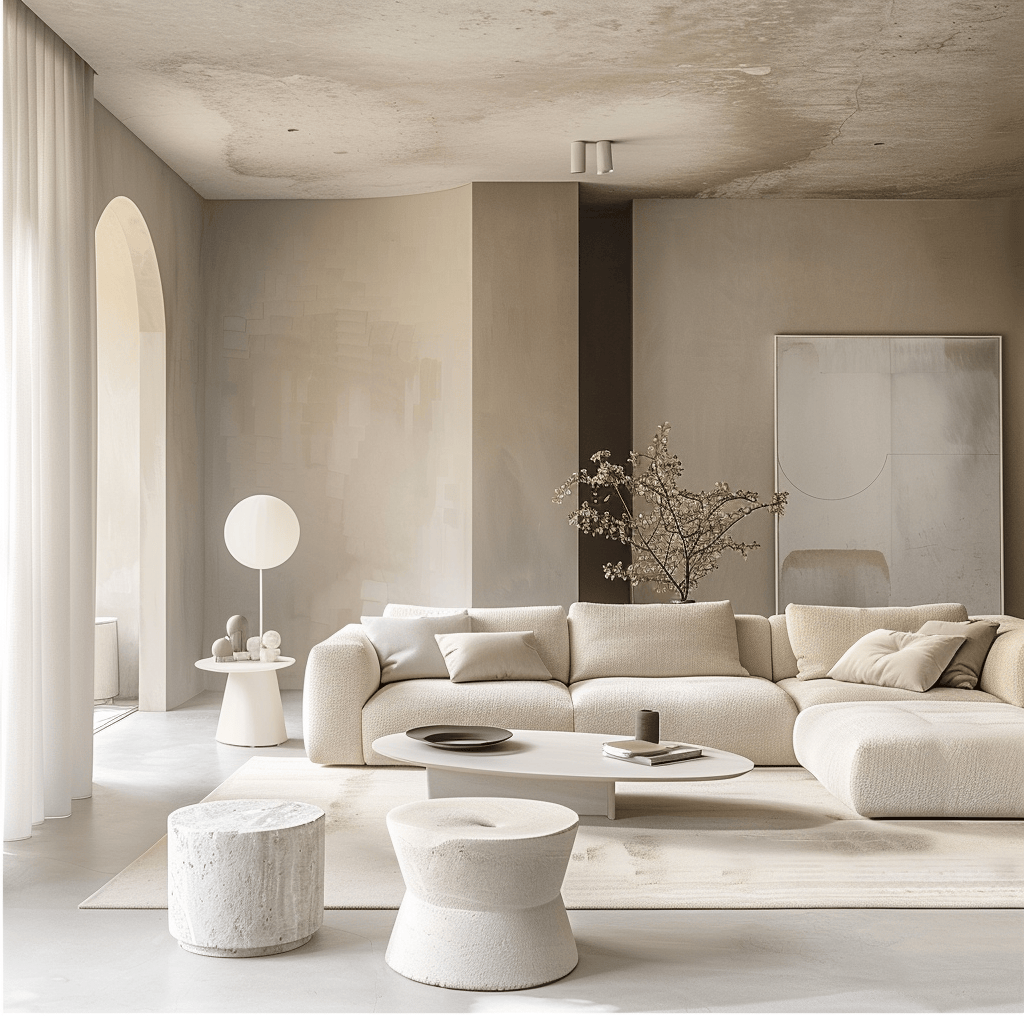
In a living room, this means mixing up your materials. If you have a smooth linen sofa, toss some chunky knit blankets and a rough jute rug into the mix. The way light hits a rough texture compared to a shiny surface creates natural micro-contrasts that trick the eye into seeing depth.
For digital or graphic designers, this translates to using subtle patterns, grain overlays, or mixing matte and glossy finishes if you’re working on print packaging. It breaks up the visual monotony without breaking your one-color rule.
The Power of Temperature and Undertones
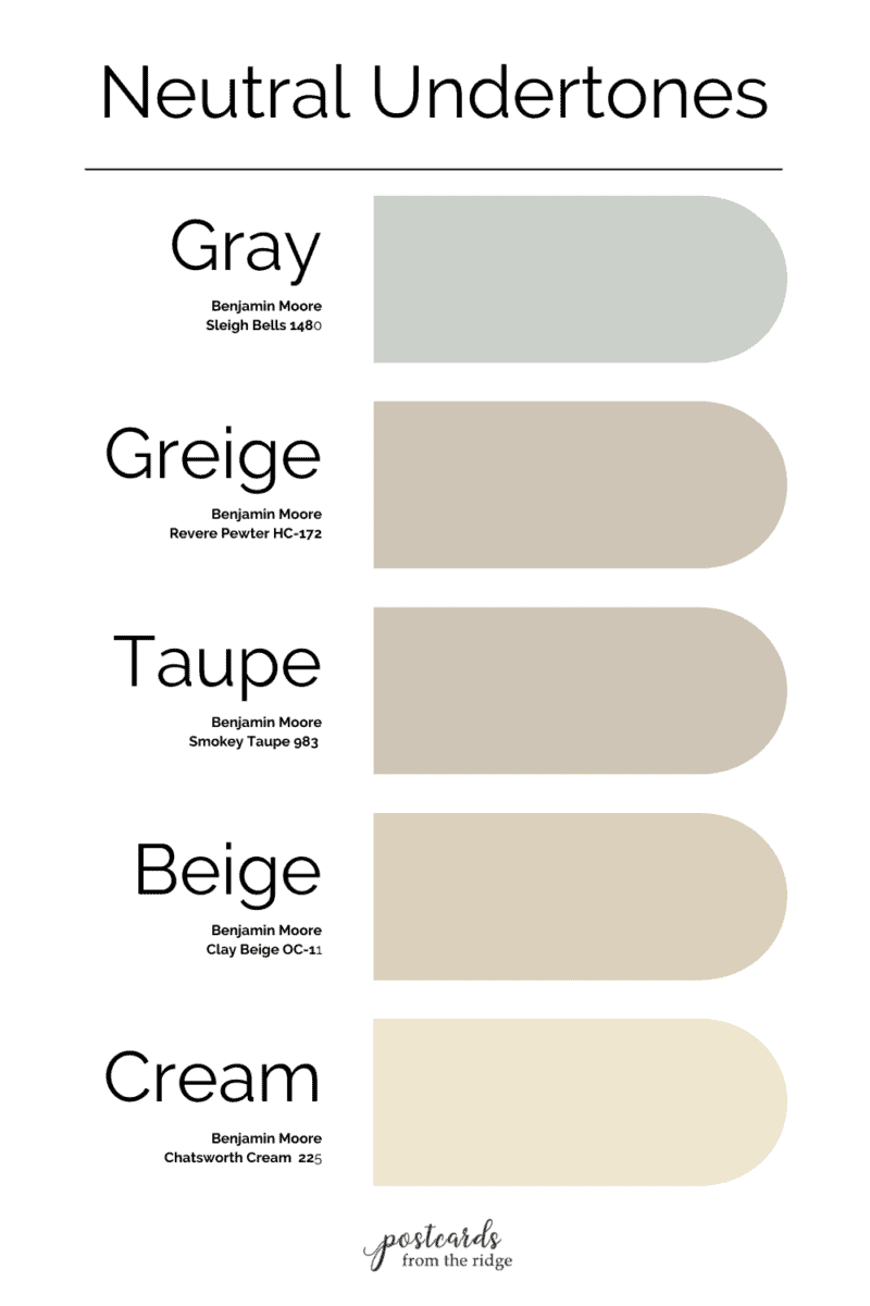
Colors are sneaky. They rarely come in pure forms. Almost every shade has a hidden undertone that leans either warm or cool. Recognizing these subtle shifts is a great way to inject life into a monochromatic scheme.
Take gray, for example. Some grays have a blue or purple base, making them feel cool and icy. Others have a brown or yellow base, making them feel warm and cozy. If you mix a warm charcoal with a cool slate, you create a beautiful, vibrating tension that keeps the eyes engaged.
Just be careful not to mix too many conflicting undertones haphazardly, or it can start to look messy. Pick a dominant temperature for the space or design, and use slight variations to create your boundaries.
Don’t Forget the Details and Hardware
When you are working with a tight color palette, the small things matter immensely. In fact, they become the stars of the show. People often overlook how much a small hinge, a picture frame, or a font weight can change the entire mood of a project.
If you are designing a kitchen with all-green cabinetry, the metal knobs you choose are crucial. Introducing a warm brass or a sleek matte black provides a necessary break for the eyes. It acts like a punctuation mark at the end of a long sentence.
In graphic layouts, this means playing with typography scale. If your background and your text are similar shades of navy blue, make the text incredibly bold or very large so it commands attention despite the low color contrast.
The Role of Lighting and Shadow
Lighting is the ultimate equalizer in design. You can pick the most perfect shades, but if your lighting is harsh or completely flat, your monochromatic palette will suffer. Shadows are actually a great form of contrast.
In physical spaces, directional lighting creates shadows that naturally carve out shapes and give objects form. Think about how a spotlight creates deep pockets of shade under a shelf. That shadow adds a dark value to your palette completely for free.
For digital creators, this means utilizing soft drop shadows or gradients. A tiny touch of a dark gradient at the bottom of an element can lift it off the screen, creating the separation you need without needing to introduce a completely new color.
Creating a successful monochromatic look is a bit of a tightrope walk. It requires you to be quiet with your color choices but loud with your choices of value, texture, and scale. When you get it right, it feels absolutely magical and timeless.
Next time you approach a single-color project, step back and ask yourself the tough questions. Is there enough contrast here. Are my darks dark enough, and are my lights light enough. Can I tell where one shape ends and the next begins.
Don’t be afraid to push the boundaries. Add that extra dark throw pillow, pick the bolder font weight, or scratch up that smooth digital background with some grain. Your designs will thank you for it, and your viewers will notice the difference immediately.