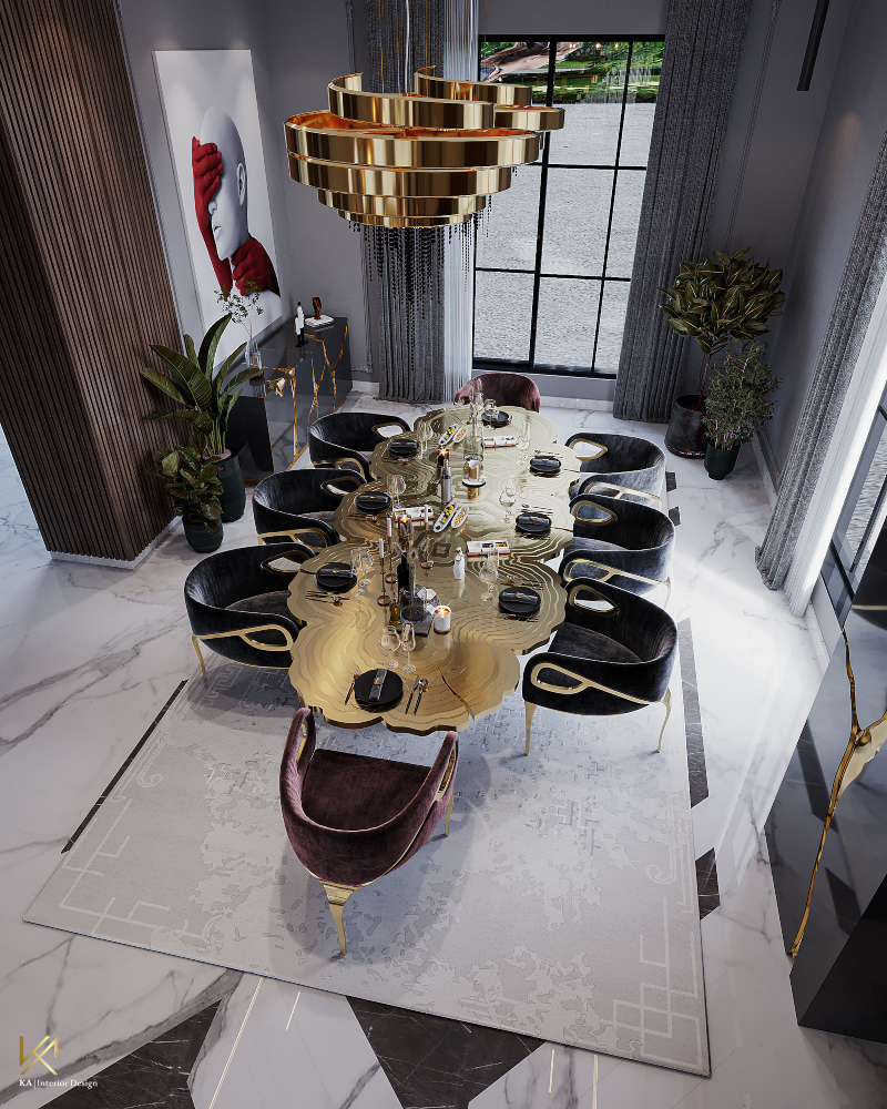
Ever walked into a room that just felt… right? You couldn’t quite put your finger on why. It wasn’t just the color of the walls or the style of the sofa. It was something deeper. Something you could almost feel with your eyes. That’s the magic of texture. In 2026, our homes have become more than just places to sleep and eat; they are sanctuaries. And nothing makes a sanctuary feel real like the interplay of rough wood against smooth glass, or soft wool against cool metal.
But let’s be honest. Mixing textures can feel risky. One wrong move and your chic living room looks like a cluttered attic. Or worse, it feels cold and sterile, like a showroom nobody is allowed to touch. The secret isn’t in buying the most expensive stuff. It’s in understanding balance. It’s about knowing when to stop. It’s about creating a conversation between materials. When you get it right, the room breathes. It invites you in. It asks you to stay awhile.
The Foundation: Understanding Visual Weight
Before you throw a single pillow on that sofa, you need to understand visual weight. It sounds fancy, but it’s actually pretty simple. Think of it like this: some things look "heavy" to the eye, and some look "light." A dark, chunky knit blanket has more visual weight than a sheer linen curtain. A rough stone coffee table feels heavier than a sleek acrylic side table. Balance isn’t about making everything equal. It’s about distributing that weight so the room doesn’t feel like it’s tipping over to one side.
In contemporary design, we often lean towards minimalism. Clean lines. Open spaces. But without texture, minimalism can feel empty. It can feel cold. By adding elements with different weights, you anchor the space. Imagine a room with only smooth surfaces. Glass, polished steel, glossy paint. It’s slippery. Your eye slides right off. Now, add a jute rug. Suddenly, your eye has somewhere to land. It creates friction. Interest. Depth. This is the first step in creating a space that feels grounded yet airy.
The trick is to vary the density. If you have a heavy, solid leather armchair, don’t pair it with another heavy, solid piece right next to it. Give it breathing room. Pair it with something light and translucent. Maybe a glass lamp or a wispy plant. This contrast keeps the energy moving. It prevents the room from feeling stagnant. In 2026, designers are moving away from rigid symmetry. They’re embracing asymmetrical balance. It feels more organic. More human. And honestly? It’s way more forgiving if you’re still figuring things out.
Natural vs. Synthetic: The Great Contrast
One of the biggest trends we’re seeing this year is the bold mix of natural and synthetic materials. For a long time, people kept these worlds separate. Wood went with wood. Plastic went with plastic. But now? We’re breaking those rules. And it’s working beautifully. There is something incredibly satisfying about the tension between the earthy and the manufactured. It tells a story of where we’ve been and where we’re going.
Take acrylic, for example. It’s smooth, modern, and often transparent. On its own, it can feel a bit cheap or clinical. But place it next to raw, reclaimed wood? Suddenly, the acrylic looks sophisticated. The wood looks refined. They elevate each other. The smoothness of the synthetic material highlights the grain and knots of the natural one. It’s a visual pop that adds instant character without needing bright colors. You see this a lot in contemporary living rooms where a clear acrylic chair sits beside a rough-hewn oak console.
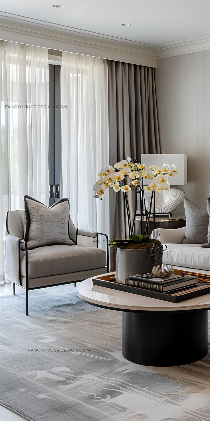
Don’t be afraid to mix metals with organic fibers either. A brushed brass floor lamp looks stunning against a nubby wool sofa. The shine of the metal catches the light, while the wool absorbs it. This play of light and shadow is crucial. It adds dimension. If everything reflects light the same way, the room looks flat. If everything absorbs light, it looks dull. You need both. Try pairing a sleek marble tabletop with a woven rattan basket underneath. The cold hardness of the stone contrasts with the warm flexibility of the wicker. It’s unexpected. And that’s exactly what makes it work.
Layering for Depth and Warmth
Layering is where the magic really happens. It’s not just about picking two textures. It’s about building them up. Think of your living room like an outfit. You wouldn’t just wear a shirt. You’d add a jacket, maybe a scarf, a watch. Each layer adds complexity. In interior design, we start with the big pieces. The flooring. The walls. The main furniture. Then we add the medium layers. Rugs. Curtains. Upholstery. Finally, the small accents. Pillows. Throws. Decorative objects.
Start with your base. If you have hardwood floors, they’re smooth and hard. Add a rug with some pile. A shag rug, a berber, or even a flat-weave kilim. This breaks up the expanse of wood. It defines the seating area. It also adds sound absorption, which makes the room feel quieter. Cozier. From there, look at your sofa. Is it smooth leather? Add a chunky knit throw. Is it a textured fabric like linen or tweed? Add a silk or velvet pillow. The goal is to ensure that no two adjacent surfaces feel exactly the same.
This approach allows you to change the mood of the room with the seasons. In the winter of 2025, many homeowners swapped out lightweight cotton throws for heavy faux fur or cable-knit wool. Come spring, they switched back to breezy linens. It’s an easy way to refresh your space without buying new furniture. Layering also lets you experiment. If you buy a pillow with a wild texture and hate it, you haven’t ruined the whole room. You can just swap it out. It’s low risk, high reward. And it keeps the space feeling dynamic and alive.
The Role of Color in Texture Mixing
Here’s a common mistake: trying to mix too many textures and too many colors at once. It’s overwhelming. The eye doesn’t know where to look. To keep things cohesive, stick to a limited color palette. Neutrals are your best friend here. Whites, creams, grays, taupes, and blacks. When the colors are similar, the textures stand out. You notice the difference between the matte finish of a ceramic vase and the glossy sheen of a metal tray because the color isn’t distracting you.
If you do want to introduce color, use it sparingly. Let the texture be the star. A monochromatic scheme works wonders for highlighting textural differences. Imagine a room in shades of beige. A beige wool rug. A beige linen sofa. A beige wooden coffee table. Because the colors are nearly identical, the variations in surface become the main event. You see the weave of the fabric. The grain of the wood. The nap of the rug. It’s subtle. Sophisticated. And incredibly calming.
However, don’t be afraid of a little contrast. Dark textures recede. Light textures advance. A black leather chair will look smaller and heavier than a white bouclé chair of the same size. Use this to your advantage. If you have a small room, lighter textures can make it feel bigger. If you have a large, cavernous space, darker, richer textures can make it feel more intimate. The key is consistency. Keep the undertones warm or cool, but don’t mix them randomly. A warm gray pairs better with wood tones. A cool gray pairs better with steel and glass. Know your palette, and the rest will follow.
Avoiding the Chaos: Common Pitfalls
It’s easy to get carried away. You find a beautiful macramé wall hanging. A gorgeous velvet ottoman. A rustic wooden beam. You want them all. But putting them all in one room can lead to visual chaos. The room feels busy. Cluttered. Anxious. To avoid this, you need to edit. Ruthlessly. Pick one or two "hero" textures per zone. Let them shine. Keep the rest quiet. If your sofa is highly textured, keep the pillows simple. If your rug is a statement piece, keep the furniture lines clean.
Another pitfall is ignoring scale. Large, bold patterns and textures need room to breathe. Don’t cram a huge, chunky woven basket into a tiny corner filled with other detailed items. It will look stuck. Conversely, delicate textures can get lost in a large space. A thin silk curtain might disappear against a massive wall. Scale it up. Use heavier drapes. Or layer them. Think about the size of the texture relative to the size of the room. Big rooms can handle big textures. Small rooms benefit from finer, smoother finishes.
Also, watch out for the "matchy-matchy" trap. Just because you bought a furniture set doesn’t mean you have to use it all together. In fact, breaking up sets is often better for texture mixing. Pair a modern sofa with a vintage wooden chest. The mismatch creates interest. It shows intention. It shows that you curated the space, rather than just ordering it from a catalog. Don’t be afraid to leave some negative space. Empty walls. Bare floors. These pauses allow the eye to rest. They make the textured elements pop even more. Less is often more.
So, how do you actually start? Don’t try to redo the whole room in a day. Start small. Pick one corner. Look at what’s already there. What textures are dominant? If it’s all smooth, add something rough. If it’s all hard, add something soft. Go to your local thrift store or market. Feel the materials. Run your hand over them. Does it feel inviting? Does it feel interesting? Trust your instincts. Your hands know what your eyes might miss.
Create a mood board. Not just with colors, but with actual samples. Get swatches of fabric. Pieces of wood. Chips of stone. Lay them out together. Do they harmonize? Do they clash in a good way or a bad way? This tactile process is invaluable. It helps you see how light hits different surfaces. It helps you anticipate how they’ll look together in your specific lighting conditions. Natural light changes throughout the day, so check your samples in the morning, noon, and evening.
Finally, live with it. Design isn’t static. It evolves. Add a texture. Live with it for a week. See how it feels. Does it annoy you? Do you love it? Adjust accordingly. Maybe you need more contrast. Maybe you need more harmony. There’s no perfect formula. There’s only what works for you and your life. In 2026, our homes are reflections of our values. Sustainability. Comfort. Authenticity. Mixing textures allows you to express all of these. It allows you to create a space that is not just beautiful, but meaningful. So go ahead. Touch everything. Mix it up. Make it yours.
Creating visual balance through texture is an ongoing journey. It’s not about reaching a final destination where everything is perfect. It’s about creating a space that feels good to be in. A space that responds to you. By understanding visual weight, contrasting natural and synthetic materials, layering thoughtfully, managing color, avoiding chaos, and taking practical steps, you can transform any contemporary living area into a sanctuary of style and comfort. Remember, the best rooms are the ones that invite you to sit down, kick off your shoes, and just breathe.