Have you ever stared at a blank screen, cursor blinking, completely paralyzed by a wheel of infinite colors? It feels a bit like standing in the middle of a massive grocery store with no shopping list and an empty stomach. You know you need something good, but everything looks overwhelming.
Color is emotional before it is logical. Long before a designer ever opens a fancy design program in 2026, they are thinking about how a specific shade of blue makes someone feel safe, or how a pop of sharp orange can wake up a sleepy visitor. Building a color scheme from scratch isn’t just about picking nice hues that match your living room rug. It is a deliberate craft blending human psychology, visual balance, and raw experimentation.
Understanding the Heart of the Color Wheel
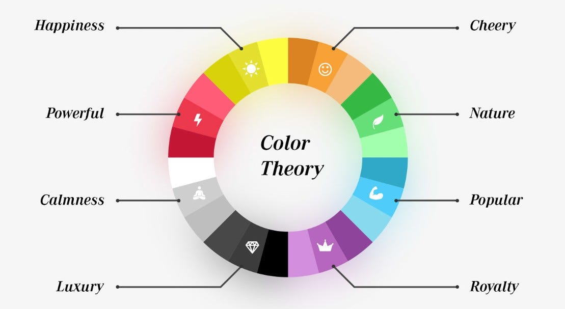
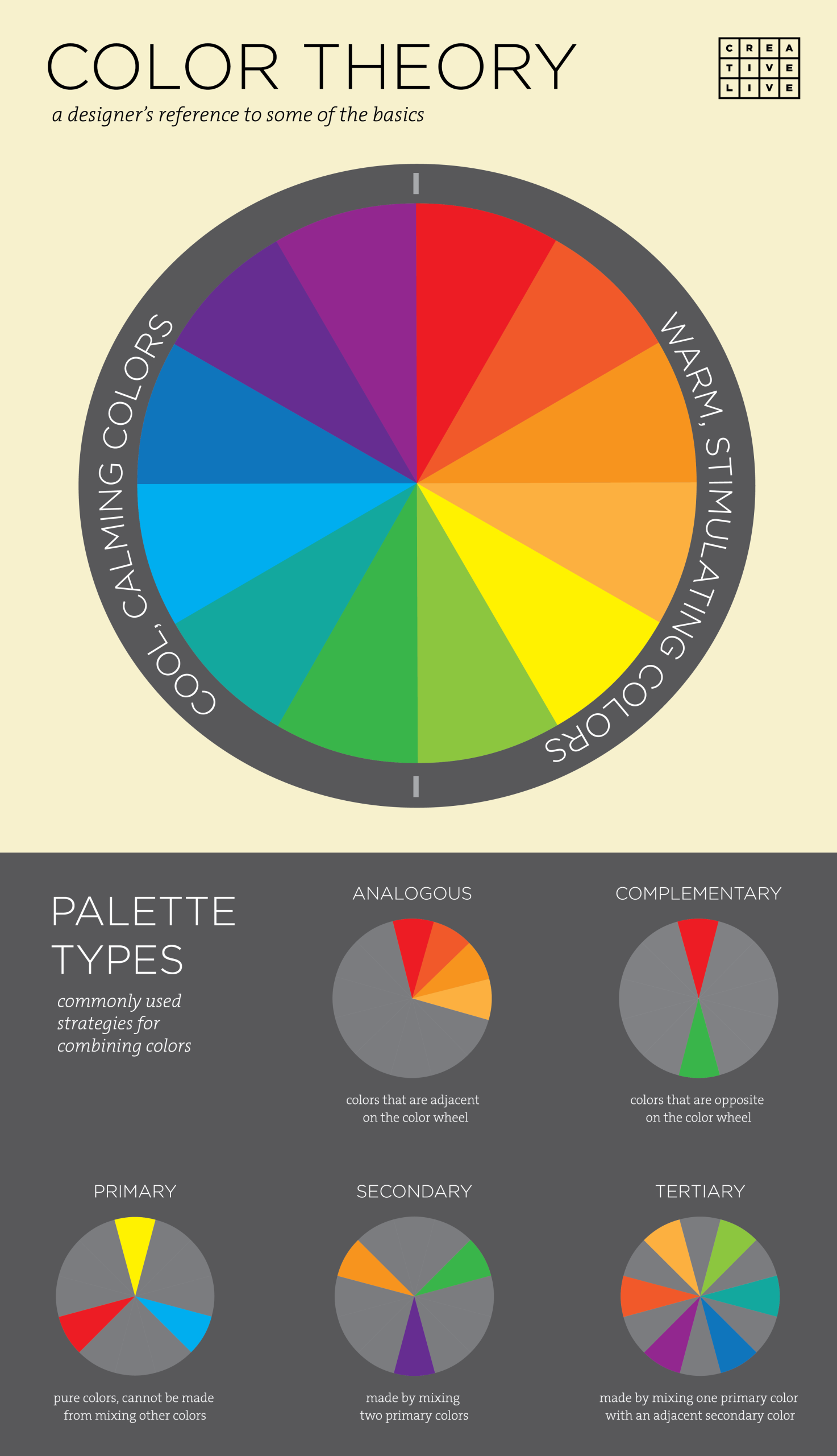
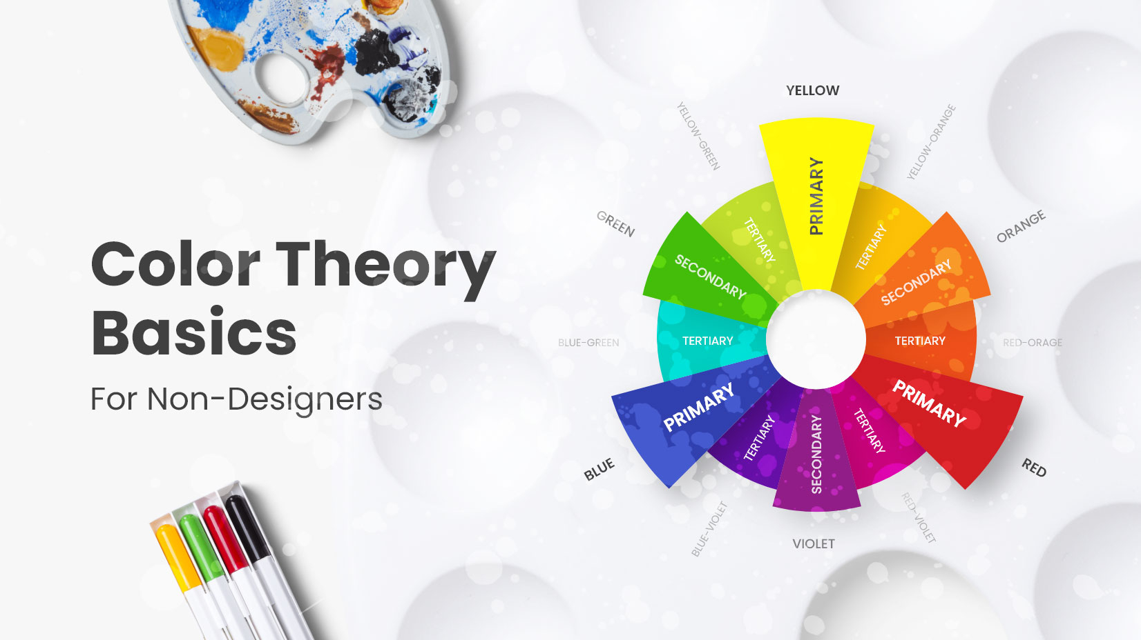
Before touching any digital sliders, you have to look back at the classic color wheel. Think of this wheel as your map. It shows you how different shades relate to each other, whether they are best friends or total opposites.
Professional creators rarely just guess random spots on this wheel. They rely on core harmonies like complementary, analogous, or triadic relationships to build instant visual harmony. Monochromatic palettes rely on varying lightness of a single hue, which keeps things clean and sophisticated without feeling chaotic.
Finding Inspiration in the Wild
The best palettes rarely come from abstract design templates. They usually hide out in plain sight in the real world. A faded photograph from your grandparents’ vacation, the earthy tones of a rainy Tuesday morning walk, or the bright packaging of your favorite vintage snack can all spark a great idea.
When you start collecting these real-world visual cues, your mood board becomes a goldmine. You begin extracting exact hex codes from nature or urban architecture, translating organic moments into digital reality. This approach anchors your choices in something authentic rather than generic stock aesthetics.
Setting the Hierarchy Rule
Ever look at a design where every single element is screaming for your attention at the same time. It gives you a mild headache. Pros avoid this by establishing a strict visual hierarchy using the sixty-thirty-ten rule.
Sixty percent of your space usually belongs to a dominant neutral background color. Thirty percent goes to your secondary supporting tone, and the final ten percent is reserved for that brave accent color that draws the eye. Keeping these proportions balanced prevents visual chaos and guides the viewer smoothly through your work.
Testing for Accessibility and Contrast
A gorgeous palette means nothing if nobody can actually read the text sitting on top of it. Accessibility is no longer an afterthought in modern design. It is a core requirement that ensures folks with visual impairments can interact with your creation comfortably.
Designers run rigorous contrast checks using standard ratio tools to make sure light text on dark backgrounds meets clear readability thresholds. Taking time to test these combinations early saves you from massive headaches later down the road when your project goes live for the public.
Adapting for Different Mediums
Colors behave differently depending on where they live. A crisp neon green that looks stunning on a glowing phone screen might look completely dull or muddy when printed on matte paper.
Understanding the shift between digital RGB formats and print CMYK realities is crucial. Pros always test their custom schemes across various devices, lighting conditions, and physical mediums to ensure consistency everywhere the user might experience it.
One of the biggest traps for beginners is using way too many colors. You start with three, add two more just in case, and suddenly your project looks like a box of melted crayons.
Editing down your palette is an act of courage. Take a hard look at your swatches and ruthlessly cut anything that does not serve a clear purpose. If two shades look almost identical, pick the stronger one and delete the other. Less is almost always more.
Building a striking color scheme from scratch takes time, patience, and a willingness to make a few ugly choices before finding the right one. Remember that every master designer started right where you are now, staring at a blank screen and wondering which shade to pick first.
Trust your gut, keep experimenting with unexpected combinations, and do not be afraid to break a few traditional rules along the way. Your unique visual voice is worth the trial and error.