Green is everywhere. Literally. Look out your window right now. See those leaves? That’s nature’s default setting. But when it comes to slapping a hue onto your logo, website, or packaging, things get tricky fast. It’s not just about picking what looks nice on a mood board. It’s about signaling who you are before you even say a word. In 2026, consumers are smarter than ever. They can smell inauthenticity from a mile away. So if you’re thinking green, you better mean it. Or at least, you better know exactly what message that specific leaf-tone is sending.
We’ve all seen brands try to jump on the eco-bandwagon with a splash of neon lime and call it a day. Spoiler alert: it rarely works. The psychology behind this color is deep, rooted in our evolutionary history as humans who needed to find food and shelter in forests. It signals safety, growth, and balance. But there’s a huge difference between the green of a mossy rock and the green of a dollar bill. One whispers "calm down," the other shouts "cha-ching." Getting this wrong can confuse your audience. Getting it right? That builds trust. And in today’s market, trust is the only currency that really matters.
Understanding the Emotional Weight of Green
Let’s dig into why green hits us so hard. It’s the most restful color for the human eye. Seriously. Our brains don’t have to work hard to process it. That’s why hospitals and waiting rooms often use soft greens. It lowers anxiety. For a brand, this translates to approachability. If you want people to feel safe with your product, green is a strong contender. But it’s not just about relaxation. Green is also the color of renewal. Think spring. New beginnings. This makes it incredibly powerful for tech startups or health brands that want to signal innovation without feeling cold or robotic.
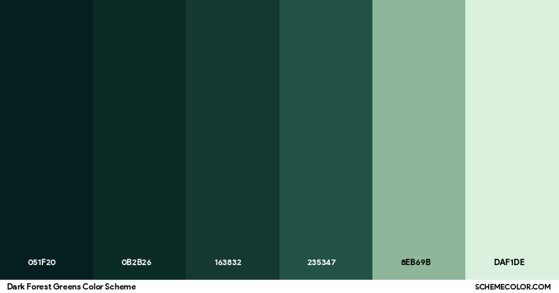
However, context is king. A dark, forest green feels traditional, stable, and maybe even a bit wealthy. It’s the color of old money and established institutions. On the flip side, a bright, electric green feels urgent, modern, and energetic. It’s used a lot in gaming or fitness apps where you need to spike adrenaline. You have to ask yourself: do I want my customer to feel like they’re settling into a comfortable armchair, or do I want them to feel like they just drank a double espresso? There is no wrong answer, but there is definitely a wrong choice for your specific goals.
Don’t forget the cultural angle either. In many Western countries, green means go, money, or envy. In some Eastern cultures, it can represent fertility or even infidelity depending on the shade and context. Since the internet has flattened the world, your brand might be seen globally. A quick check on cultural associations can save you from an embarrassing misstep later. It’s about resonance. Does the emotion you’re trying to evoke match the subconscious reaction your audience has to that specific wavelength of light? If not, keep looking.
Decoding the Spectrum: From Mint to Emerald
Not all greens are created equal. This seems obvious, but you’d be surprised how many businesses treat "green" as a single option. It’s a spectrum, folks. Let’s break it down. First, you have your yellow-greens. Think chartreuse or lime. These are high-energy, youthful, and attention-grabbing. They scream creativity and fun. Brands like Spotify or Fanta have used these tones to stand out. They’re risky though. Too much yellow-green can cause eye strain or feel cheap if not balanced with strong typography and white space. Use these if you’re targeting Gen Z or want to appear disruptive.
Then there’s the true greens. The grass greens. These are balanced and harmonious. They’re safe bets for general consumer goods, organic foods, or community organizations. They say "we’re normal, we’re good, we’re here." Starbucks uses a version of this (though it’s shifted darker over the years) to create a sense of familiar comfort. It’s inviting without being aggressive. If you’re a local bakery or a consultancy firm, this middle ground is often where you’ll find your sweet spot. It’s versatile and plays well with almost any other color.
On the other end, you’ve got blue-greens and dark greens. Teal, sage, emerald, hunter. These are sophisticated. They carry weight. A deep emerald green suggests luxury and exclusivity. Think high-end jewelry or premium financial services. It’s serious business. Sage green, which has been absolutely everywhere in interior design lately, brings a muted, earthy calm. It’s perfect for wellness brands, skincare, or sustainable fashion labels that want to look understated rather than shouty. Choosing between these isn’t just aesthetic; it’s strategic positioning. Are you the friendly neighbor or the exclusive club?
Aligning Shade with Industry Expectations
Certain industries have unwritten rules about color. Breaking them can be genius, or it can be confusing. In the finance sector, green is synonymous with money and growth. Banks and investment firms love it because it subconsciously reassures clients that their assets are safe and increasing. But here’s the catch: if you’re a fintech startup trying to look innovative, using the same dull bank-green as your grandfather’s savings account might make you look outdated. You might lean towards a brighter, digital-friendly teal or mint to show you’re modern while still keeping that financial trust signal.
Health and wellness is another big one. Obviously, green equals health. But the shade matters immensely. A clinical, sterile green might work for a pharmaceutical company, suggesting precision and science. But for a yoga studio or a holistic nutrition brand, you want something organic and soft. Think olive or moss. These shades connect to the earth and natural ingredients. If you sell protein powder, a vibrant lime might suggest energy and performance. If you sell herbal tea, a muted sage suggests relaxation and tradition. Know what your product actually does, and pick the green that mirrors that benefit.
Sustainability is the trickiest arena right now. In 2026, every brand claims to be eco-friendly. Using green to signal this is almost expected, which means it’s also easy to ignore. To stand out, you need authenticity. If your supply chain isn’t actually green, don’t use green as your primary identity. Consumers will find out. Instead, consider using green as an accent to highlight specific eco-initiatives, while keeping your main brand color something else that reflects your core value, like reliability (blue) or passion (red). Don’t let the color do the lying for you. Let it amplify the truth.
Pairing Green with Other Colors for Impact
Green doesn’t live in a vacuum. It needs friends. The colors you pair it with change its personality entirely. The classic combo? Green and white. It’s clean, fresh, and minimalist. Apple used this effectively in its early retail stores. It lets the green breathe and feels uncluttered. Great for tech or medical brands. But add black to that mix, and suddenly it’s sleek, premium, and maybe a bit mysterious. Black and dark green is a power couple for luxury automotive or high-end menswear. It’s masculine and grounded.
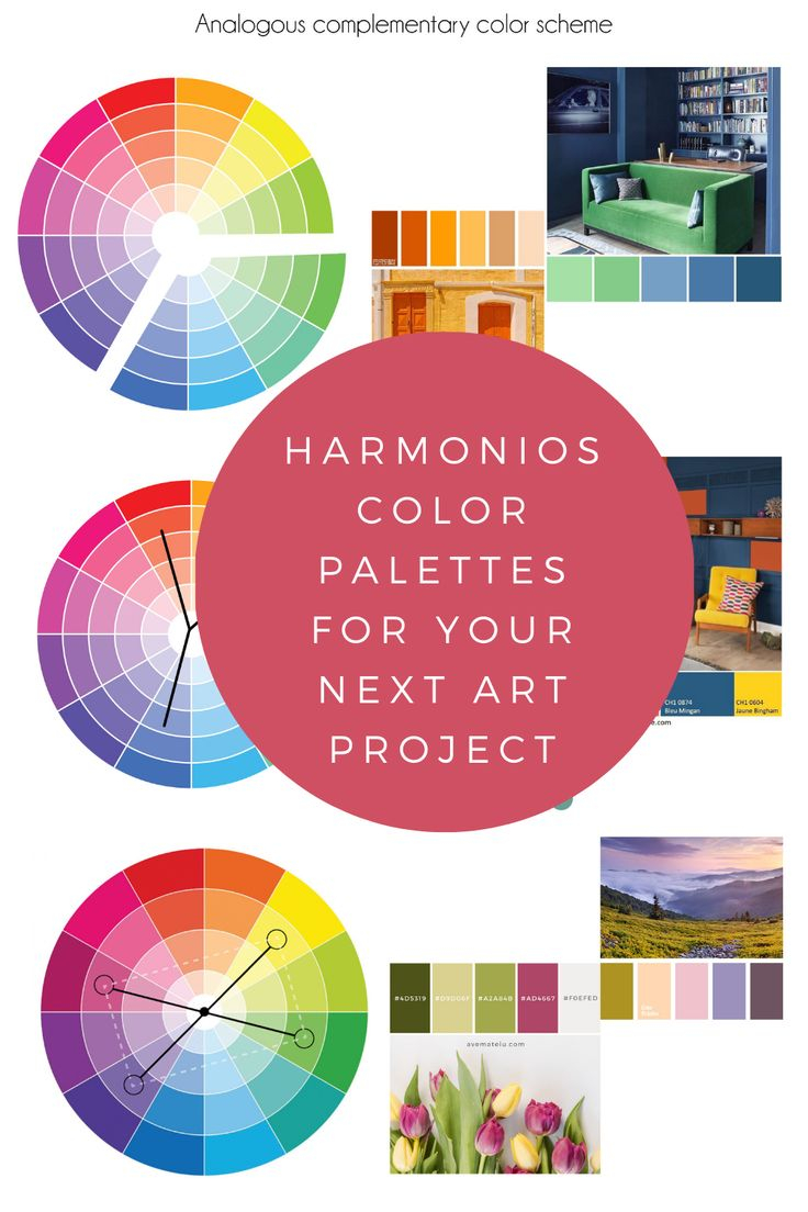
Want energy? Try green and orange. They’re complementary colors on the wheel, meaning they sit opposite each other. This creates high contrast and vibration. It’s playful and loud. Think sports brands or kids’ products. It’s hard to miss. On the softer side, green and pink have had a major moment recently. Especially pastel mint with millennial pink. It’s trendy, gentle, and appeals to a younger, style-conscious demographic. It breaks the traditional "nature" mold and feels more like a lifestyle choice.
Be careful with red and green. Unless it’s December, this combo can look festive in the wrong way or clash violently. If you must use them, adjust the saturation. A deep burgundy with a forest green feels rich and academic. A bright fire-engine red with lime green looks like a warning sign. Always test your combinations in grayscale first to ensure there’s enough contrast for accessibility. If your green logo disappears against your background color, you’ve failed. Legibility is key. Don’t sacrifice clarity for cleverness.
Testing Your Choice in the Real World
You’ve picked a shade. You love it. Great. Now, does it work? Digital screens lie. What looks gorgeous on your calibrated MacBook might look muddy on a cheap Android phone or washed out on a printed flyer. You need to test. Start by printing your logo on different materials. Paper absorbs ink differently than glossy cardstock. A vibrant digital green might turn into a dull swamp color on recycled paper. If sustainability is your vibe, you’re likely using recycled paper, so this test is crucial. Adjust your hex codes accordingly.
Look at your competitors. Not to copy them, but to ensure you’re distinct. If every other coffee shop in your town uses a similar shade of leaf green, you’ll blend into the background. Maybe you need to go darker, or lean into a blue-green teal instead. Stand out by being different, not just better. Create mockups of your brand in real-life scenarios. Put your logo on a tote bag. On a business card. On an Instagram post. Does it hold up? Does it look professional? Ask people who aren’t designers. Their gut reaction is worth more than your designer’s opinion sometimes.
Also, consider accessibility standards. A significant portion of the population has some form of color blindness, particularly red-green color deficiency. If your green is too close to red or brown, it might be invisible to them. Use tools to simulate how your brand looks to colorblind users. Ensure there’s enough contrast between your green text and the background. It’s not just about being inclusive; it’s about not losing potential customers because they literally can’t read your website. It’s a small tweak that makes a huge difference in reach.
Trends are seductive. In the early 2020s, everyone was obsessed with "millennial green" or sage. By 2026, that might feel dated. While it’s okay to be current, building a brand identity on a fleeting trend is dangerous. You want a shade that will still look relevant in five or ten years. Classic greens like forest, emerald, or true grass green tend to age better than neon or overly muted pastels. Think timeless, not trendy. If you do choose a trendy shade, make sure your core brand values are strong enough to carry it when the trend fades.
Another pitfall is overusing green. Just because it’s your brand color doesn’t mean everything needs to be green. That’s overwhelming. Use it strategically. As an accent. As a highlight. Let white space or neutral tones do the heavy lifting. Green should guide the eye, not assault it. If your entire website is a wall of green, users will bounce. They need visual rest. Think of green as the spice, not the main course. A little goes a long way.
Finally, don’t ignore the emotional disconnect. If you’re a high-tech cybersecurity firm, a soft, pastoral green might send the wrong message. People want to feel protected by steel and code, not by a meadow. Match the emotion of the color to the function of your service. It sounds simple, but you’d be amazed how many brands miss this. They pick a color because they personally like it, not because it serves their business goal. Be objective. Step back. Look at your brand as a stranger would. Does the green make sense? If the answer is no, start over. It’s better to fix it now than rebrand later.
Choosing the right shade of green is less about art and more about psychology. It’s a silent ambassador for your brand. Take your time. Test thoroughly. And remember, the best green is the one that feels true to who you are. Not who you think you should be. Authenticity resonates. Fake it, and you’ll fade away. Get it right, and you’ll grow.