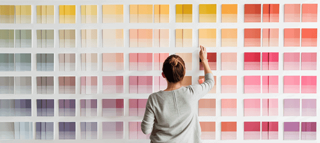
We’ve all been there. You stand in the hardware store aisle, staring at a wall of swatches that all look exactly the same. You grab one that says "Warm White," feel confident, and head home. Two coats later, you step back and wonder why your living room looks like a hospital waiting room or, worse, a dingy basement. It’s frustrating. It’s expensive. And honestly? It’s completely avoidable.
Paint is the cheapest way to transform a room, but it’s also the easiest to get wrong. In 2026, with trends shifting toward more nuanced, earthy tones and sustainable finishes, the stakes feel a bit higher. We aren’t just painting walls; we are curating moods. But the fundamentals haven’t changed. Light still tricks us. Undertones still hide in plain sight. And rushing the process still leads to tears. Let’s fix that.
Ignoring the Light (It’s Not Just About Brightness)
The number one reason people hate their new paint color isn’t the pigment itself—it’s the light. Or rather, how they ignored it. Natural light changes throughout the day, and artificial light changes the game entirely. A color that looks crisp and clean at noon might turn muddy and gray by 8 PM under your LED bulbs. This is the classic blunder that catches almost everyone off guard.
You have to watch the light move. North-facing rooms get cool, indirect light, which makes colors look cooler and flatter. If you put a cool gray in a north-facing room, it will feel icy and unwelcoming. South-facing rooms? They get warm, intense light that can wash out subtle shades. In 2026, many of us are working from home, meaning we see our walls at all hours. You need a color that works at 9 AM during a Zoom call and at 9 PM when you’re winding down.
Don’t just look at the swatch in the store. Store lighting is designed to sell, not to reveal truth. Bring that swatch home. Tape it up. Watch it in the morning, afternoon, and evening. Notice how it shifts. If you rely on lamps, check the bulb temperature. Warm bulbs (2700K-3000K) add yellow/orange tones, while cool bulbs (4000K+) add blue. Your paint needs to play nice with both.
Trusting the Tiny Swatch Card
Let’s be real: those little 2-inch paper cards are liars. They are too small to give you any sense of how a color behaves on a large surface. When you see a tiny square of "Beige," your brain fills in the rest based on the white background of the card. But when that color covers 12-foot walls, it amplifies. Colors always look darker and more intense on a wall than they do on a chip.
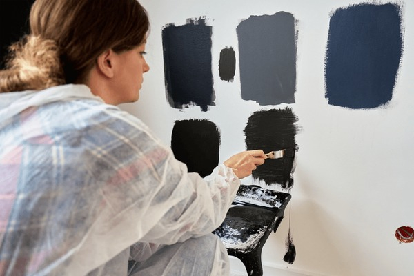
In 2026, the smart move is to skip the paper cards altogether for your final decision. Most major paint brands now offer peel-and-stick samples or large-format swatches. Use them. Paint a big patch—at least 4×4 feet—on different walls in the room. One patch near the window, one in a corner, one on a wall that faces another colored room.
Give it time. Leave those patches up for at least two days. Live with them. Do you find yourself squinting? Does the color make you feel anxious or calm? If you rush this step, you’re gambling. And unlike a casino, the house (your wallet) always wins when you guess wrong. It’s better to spend $20 on samples than $200 on gallons you’ll never use.
Forgetting About Undertones (The Hidden Enemy)
Undertones are the sneakiest part of paint. A white isn’t just white. It has hints of yellow, pink, blue, or green hiding underneath. These undertones don’t show up until you put the paint next to something else. That’s why your "perfect" gray might look purple next to your oak floors, or why your "creamy" white looks sickly next to your stainless steel appliances.
You have to look at what’s staying in the room. Are you keeping the carpet? The countertops? The sofa? These fixed elements have undertones too. If your granite has pink flecks, avoid paints with strong green undertones—they’ll clash and make both look off. In 2026, we’re seeing a lot of warm neutrals making a comeback, but you still need to match the warmth level.
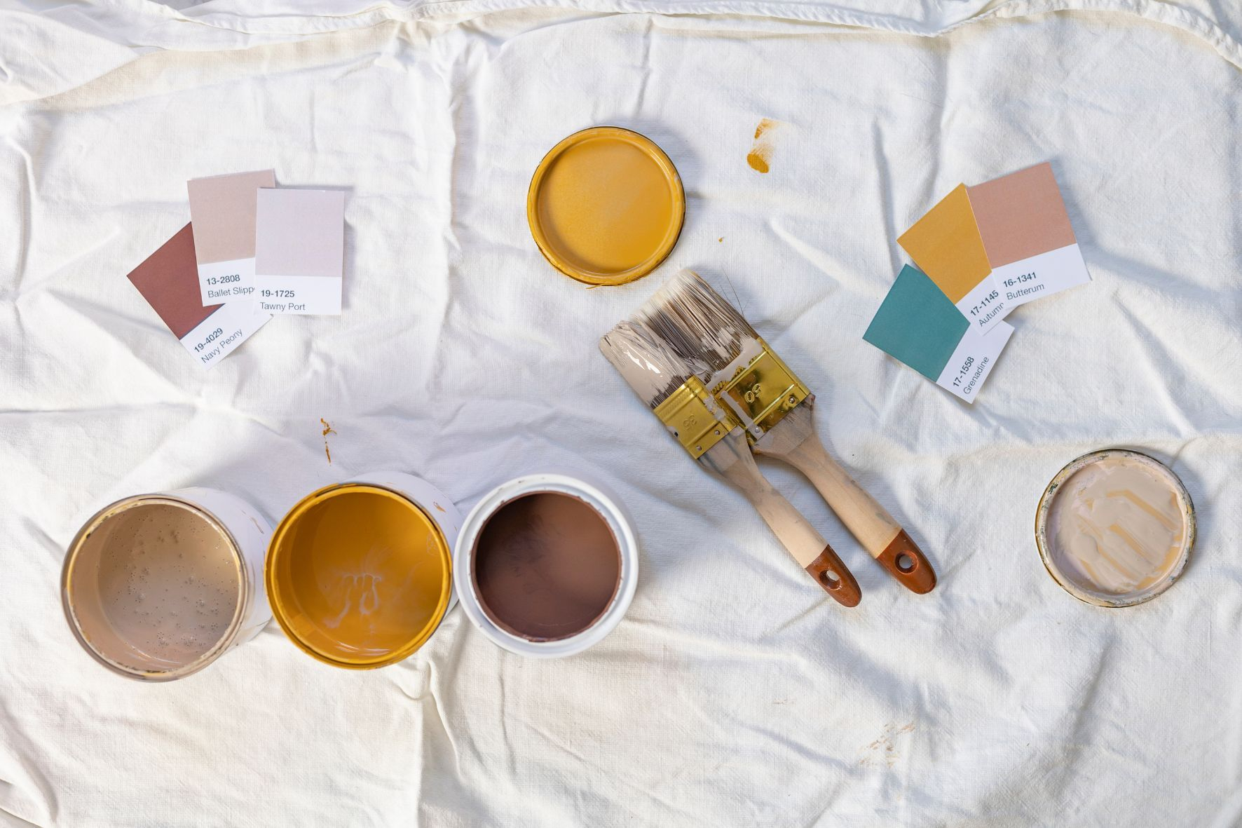
Test your paint against your fixed finishes. Hold the swatch next to the cabinet wood. Lay it on the counter. If it fights with the existing materials, it’s the wrong choice. You want harmony, not conflict. Sometimes, the issue isn’t the wall color; it’s that the wall color is revealing an undertone in your floor that you didn’t notice before. Acknowledge it, and work with it.
Painting Trim White Without Thinking
For decades, the rule was simple: white trim goes with everything. But in 2026, that’s not necessarily true. "White" is arguably the hardest color to pick because it has so many variations. If you pick a stark, bright white for your trim but your walls are a soft, warm ivory, the trim will look harsh and clinical. It creates a visual jar that feels unintentional.
Consider painting your trim the same color as your walls, just in a different sheen. This is a huge trend right now. It creates a seamless, sophisticated look that makes small rooms feel bigger and ceilings feel higher. If you do want contrast, make sure the whites talk to each other. If your wall has yellow undertones, your trim white should probably have a touch of warmth too, unless you’re going for a very specific, high-contrast modern look.
Also, think about the flow between rooms. If your hallway is bright white and your living room is creamy, the transition can feel jarring. Consistency matters. You don’t need every room to be the same, but the trim colors should feel like part of the same family. It’s about cohesion. A disjointed trim color can break the spell of a beautifully painted room.
Rushing the Process (Patience Pays Off)
We get it. You want the project done. You’ve bought the tape, the rollers, the drop cloths. You’re ready to go. But rushing the color selection is the fastest way to end up with regret. Paint is permanent-ish. It’s a pain to redo. Taking an extra week to decide can save you months of annoyance.
Create a mood board. Not just for colors, but for feelings. What do you want this room to feel like? Cozy? Airy? Dramatic? Collect images of spaces you love. Look for patterns. Do you keep saving rooms with deep blues? Or soft greens? Your instincts are usually right, but they need time to surface. Don’t pick a color because it’s trending on social media this week. Trends fade. Your love for a color should last longer than a TikTok cycle.
Talk to people who live in the space. If you have kids or pets, think about durability and maintenance. Dark colors show dust and scratches more easily. Light colors show scuffs. Glossy finishes are easier to clean but highlight imperfections in the drywall. There’s no perfect answer, only the right trade-off for your life. Slow down. Breathe. The paint will wait.
Most people forget the ceiling. They assume white is the default. But in 2026, we’re seeing more painted ceilings. A ceiling that’s slightly lighter than the walls can make a room feel taller. A ceiling that’s the same color creates a cocoon effect, which is great for bedrooms or media rooms. Ignoring the fifth wall is a missed opportunity to control the atmosphere.
Think about the flow from room to room. You don’t want to walk from a dark, moody study into a blindingly bright kitchen without some transition. Consider using a gradient or complementary colors in adjacent spaces. If your living room is sage green, maybe the dining room is a warmer beige that picks up the earthy notes. It’s about creating a journey through your home.
Also, don’t forget the doors and baseboards. If you’re painting walls a bold color, consider whether you want the doors to blend in or pop. In smaller spaces, blending them in reduces visual clutter. In larger spaces, a contrasting door can be a beautiful architectural detail. It’s all connected. Treat your home as a whole, not just a series of isolated boxes.
Picking the right paint color doesn’t have to be a nightmare. It’s about observation, patience, and understanding how light and context change everything. By avoiding these classic blunders—ignoring light, trusting tiny swatches, missing undertones, mismatching trim, rushing, and neglecting flow—you set yourself up for success.
Remember, there’s no such thing as a universally "wrong" color, only the wrong color for your specific space and light. Test it. Live with it. Trust your gut. And if you do mess up? It’s just paint. You can always start again. But chances are, if you take your time, you won’t need to. Your perfect color is out there. You just have to look for it the right way.