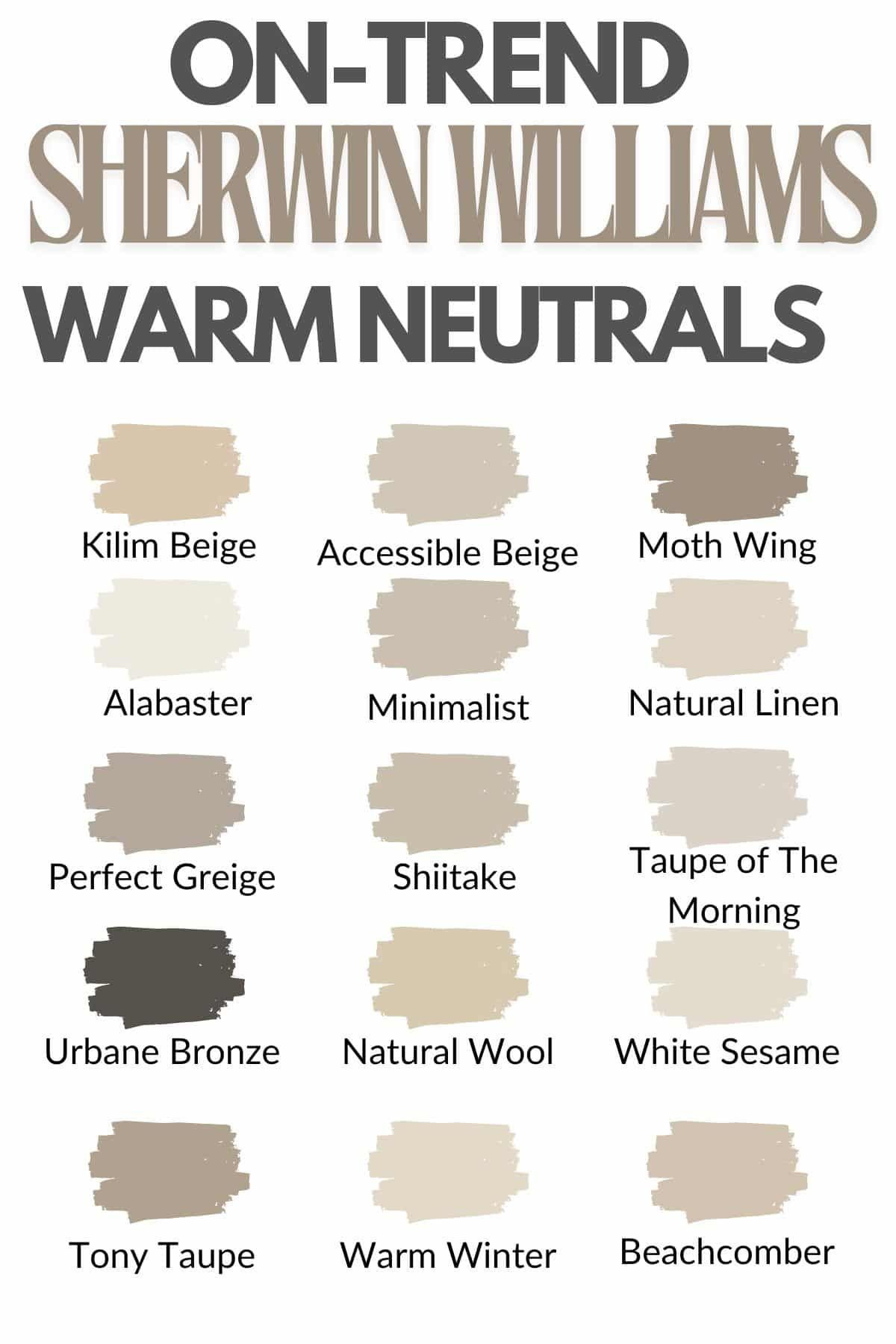
The morning sun cuts across the hardwood floors of a newly renovated suburban ranch, spilling uninterrupted from the east-facing kitchen windows all the way into the far corner of the living room. On paper, this continuous expanse of square footage is the ultimate domestic dream—a breathy, sprawling canvas of modern architecture. But walk into that space with a gallon of paint and reality sets in. Without interior walls to naturally stop the eye, choosing where one color ends and another begins feels like trying to draw boundary lines on water. The sofa looks maroon against the living room wall, yet the exact same throw pillow looks muddy and bruised under the recessed LED cans of the kitchen workspace.
This is the central anxiety of the open-concept home. Break the space up with too many bold hues, and the house fractures into a jarring patchwork quilt. Keep it all one timid, builder-grade beige, and the interior flattens out, stripping the home of soul, architectural definition, and intimate warmth. Designers spend years refining the alchemy required to balance openness with intimacy. It requires more than just picking a pretty swatch off a fan deck; it demands an understanding of light physics, sightlines, human psychology, and the architectural skeleton of your home.
The open floor plan revolutionized residential architecture over the past few decades, permanently dismantling the rigid, compartmentalized box rooms favored by mid-century builders. Families no longer wanted the cook banished to a dark, isolated kitchen while guests gathered in the formal parlor. They wanted sightlines. They wanted the acoustic rattle of dinner preparation to bleed naturally into the laughter of the living area. Yet, architectural freedom brought a distinct design crisis. Walls had long provided natural framing devices for color. Remove the walls, and you remove the safety rails.
The Architecture of Sightlines and Spatial Anchors
When an interior designer steps into an open-concept space, they do not look at walls the way an amateur does. They look at sightlines—the precise corridors of vision created when a human being stands in one zone and looks into another. If you can stand at your kitchen sink and see the television console, the entryway bench, and the dining room chandelier all at once, you are looking at a single visual ecosystem. Every color choice made in that ecosystem affects every other color. Treating rooms as isolated islands in an open layout is the fastest route to visual chaos.
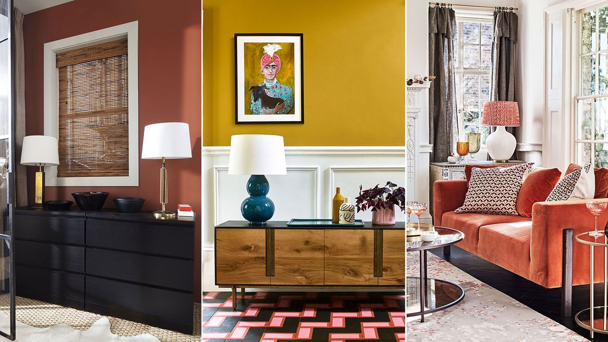
The secret to establishing harmony across multiple zones lies in the 60-30-10 rule, scaled up for macro-architecture. Sixty percent of your visual field should be dedicated to a dominant, unifying backdrop color that flows across every main wall surface. This is your connective tissue. Thirty percent belongs to secondary tones—colors applied to accent walls, kitchen cabinetry, or large foundational furniture pieces that establish the specific character of a sub-zone. The final ten percent is the accent layer, reserved for art, textiles, and decor accessories that inject punch and personality.
Light is the invisible brush that paints your walls throughout the day. A color that reads as a crisp, airy alabaster at 10:00 AM under high-altitude northern light can curdle into a sickly, cold grey by 4:00 PM when struck by the oblique angles of southern exposure. In an open floor plan, this phenomenon is magnified because the light changes across different zones simultaneously. Your kitchen might be flooded with glaring southern sun while your living room sits in the deep, dim shadow of a covered back porch. Understanding how LRV (Light Reflectance Value) operates across these diverse lighting conditions is non-negotiable. Paints with an LRV above 70 bounce light around and expand spatial boundaries, while lower LRVs absorb light, pulling distant walls inward to create cozy, grounded pockets.
Crafting a Cohesive Color Palette Without Falling Into Monotony
The most common trap homeowners fall into is equating visual flow with monotony. Terrified of making a mistake, they paint the entire main floor a single, neutral shade of greige. Six months later, they find themselves living in a house that feels like a high-end corporate hotel lobby—clean, expensive, and utterly devoid of human resonance. True flow is not about painting everything the exact same color; it is about creating a visual conversation where every hue speaks the same dialect.
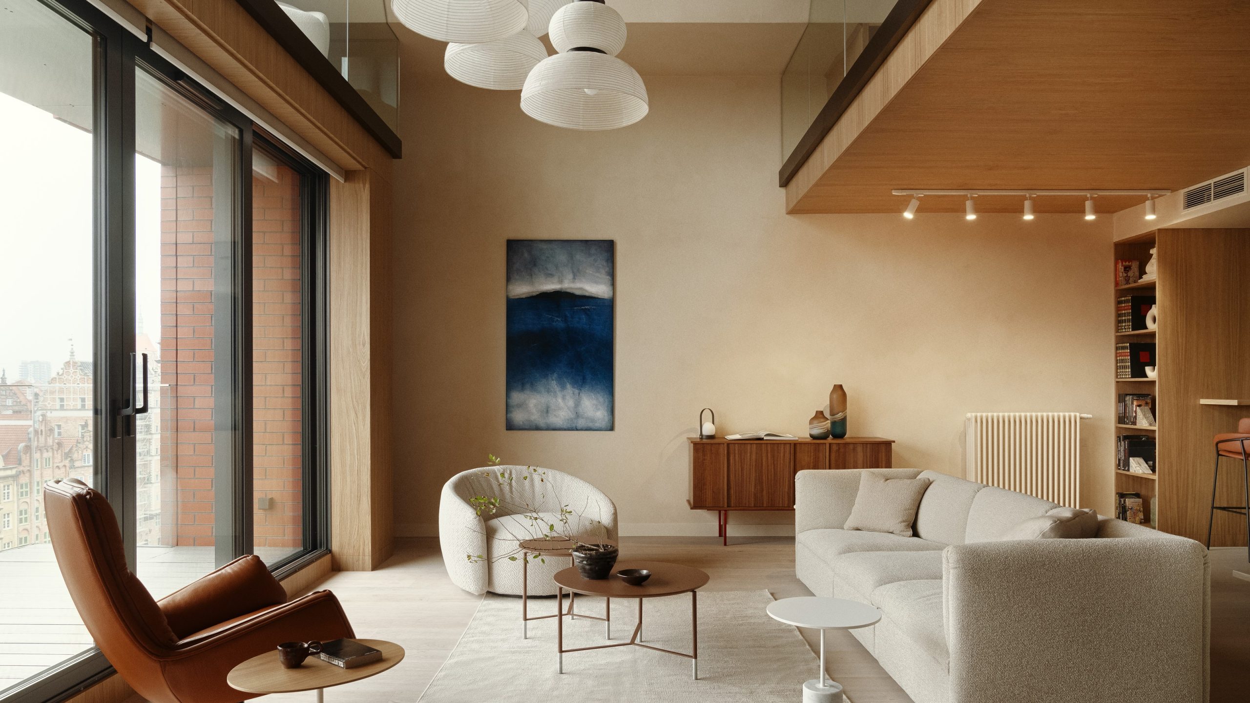
To build a sophisticated tonal palette, interior colorists rely on monochromatic anchoring or analogous harmony. Monochromatic schemes use varying depths of a single color family. If your main living space is painted in a warm, creamy off-white, your kitchen island might wear a deeper, saturated mushroom taupe, and the adjoining powder room could plunge into a dramatic, enveloping charcoal. Because all these shades share undertones—whether red, yellow, green, or blue—they feel like natural extensions of one another rather than competing factions.
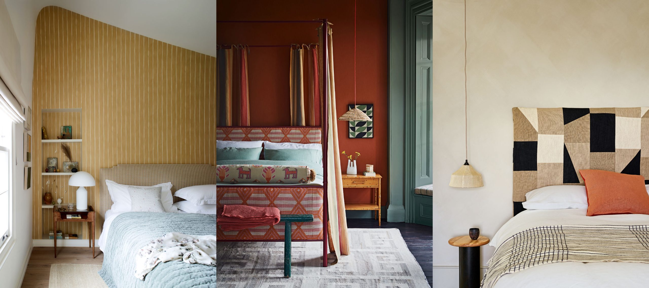
Analogous palettes take a slightly bolder route, utilizing colors that sit next to each other on the color wheel. Picture a soft, sage-green kitchen transitioning gracefully into a warm oatmeal living room, which in turn opens into a study washed in muted amber. These colors harmonize because they share natural affinities, mimicking the organic transitions found in a landscape. The trick is keeping the saturation levels comparable. If your living room color is dusty and desaturated, your kitchen accent cannot be a neon jewel tone without shattering the visual equilibrium.
Step-by-Step Methodology for Mapping Your Open Space
Transforming a chaotic open-concept layout into a cohesive masterpiece requires a disciplined, methodical approach. Skipping steps or rushing into painting without a master plan almost always results in wasted weekends and mismatched walls.
- Step 1 (Map Your Sightlines): Stand in the primary high-traffic areas of your home—the front entry, the kitchen island, and the main seating arrangement. Take photographs looking in every direction. These photos will reveal precisely which walls appear in the same field of vision and must therefore coordinate flawlessly.
- Step 2 (Establish the Master Neutral): Select your primary wall color first. This is the 60 percent rule in action. Choose a flexible neutral with a neutral or warm undertone that complements your permanent finishes, such as your hardwood floor stain, stone fireplace surround, and kitchen countertop slabs.
- Step 3 (Define the Functional Zones): Identify natural architectural breaks where zones transition. These might include a change in ceiling height, a structural support post, a step-down in the floor, or the natural boundary of a kitchen peninsula. Use these transition points as logical places to shift from your primary neutral to a secondary zone color.
- Step 4 (Test Large Swatches in Changing Light): Never judge a paint color by a tiny 2-inch square paper chip. Paint large 2-foot by 2-foot sample boards on drywall or heavy poster board and move them from wall to wall. Observe how the color shifts at sunrise, high noon, and under artificial evening illumination.
- Step 5 (Coordinate Fixed Finishes): Cross-reference your paint samples against unchangeable surfaces. Hold your paint boards directly against your kitchen backsplash tile, window frames, and flooring. If a white paint makes your yellowish floor look dingy or your grey cabinets look blue, discard it immediately.
Common Pitfalls and Field-Tested Workarounds
Even experienced DIYers stumble when tackling large-scale open floor plans. The sheer expanse of surface area magnifies minor errors, turning small miscalculations into glaring design offenses.
- Pitfall 1 (Ignoring Undertone Clashes): Homeowners often mix "warm" beiges with "cool" greys in adjacent zones, creating an accidental clash. Workaround: Stick to a single undertone family (all warm or all cool) across connected spaces, or use a certified balanced neutral with a neutral LRV that bridges the gap.
- Pitfall 2 (Painting All Four Walls in Every Zone): Treating every nook and cranny as an independent box leads to choppy, disjointed sightlines. Workaround: Let your main neutral wrap continuously around corners and through hallways, reserving accent colors strictly for designated feature walls or specific architectural recesses.
- Pitfall 3 (Failing to Account for Gloss Levels): Using the exact same sheen everywhere can make architectural details look flat or highlight drywall flaws in high-glare areas. Workaround: Use a durable eggshell or satin finish on main walls for washability, reserve flat paint strictly for expansive ceilings to hide imperfections, and use semi-gloss on trim to create subtle textural contrast.
- Pitfall 4 (Skipping the Transition Thresholds): Abruptly stopping one color on an outside corner and starting another without a logical stopping point looks amateurish. Workaround: Always transition paint colors at inside corners, doorways, or natural architectural breaks rather than floating mid-wall on a flat plane.
- Pitfall 5 (Testing Colors on Existing Paint): Painting a sample swatch directly over a bright, existing wall color tricks your eye and distorts your perception of the new hue. Workaround: Always paint your test boards with two coats over a white primer base, leaving a 2-inch border of bare white around the edge to isolate the color accurately.
The Psychological and Spatial Impact of Color Flow
Color is never merely decorative; it is deeply psychological. In an open-concept home, the psychological temperature of your rooms shifts constantly based on how colors interact. A space dominated by cool, crisp whites and steely blues encourages alertness, productivity, and cleanliness—ideal for a kitchen workspace. Yet, if that same icy rigor bleeds unchecked into a family room meant for evening relaxation and movie nights, the space can feel unwelcoming, sterile, and cold.
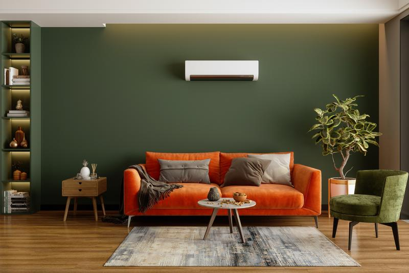
This is where the orchestration of color flow acts as an emotional regulator. By transitioning from brighter, high-LRV energetic tones in active cooking and working zones down to richer, more enveloping, low-LRV cocooning shades in lounging zones, you cue the human nervous system to relax as it moves through the home. You are designing a behavioral landscape. A person walking from a sunlit, creamy white kitchen into a moody, deep forest-green dining nook experiences a subtle psychological decompression that signals a shift in activity and mood.
Furthermore, strategic color placement alters spatial geometry. Open floor plans frequently suffer from the "bowling alley effect"—long, tunnel-like corridors of space where the ceiling feels either oppressively low or uncomfortably cavernous. You can manipulate this geometry using paint physics. Painting a distant accent wall in a rich, warm terracotta or deep charcoal brings that wall forward optically, shortening the perceived length of a room. Conversely, carrying a continuous, light-reflecting neutral up onto sloped or vaulted ceilings blurs the boundary lines, making the entire volume feel lighter, grander, and more expansive.
Actionable Recommendations and Professional Frameworks
Achieving a professional-grade paint flow in an open-concept home requires adopting industry-standard workflows used by high-end residential designers.
Establish a cohesive color ledger before a single drop of paint is purchased. Limit your total palette for a main open-concept floor to no more than three or four meticulously coordinated shades: one dominant all-over neutral, one secondary anchoring tone for cabinetry or a focal wall, and one or two accent shades reserved for smaller architectural features, interior doors, or built-in shelving backs. This self-imposed constraint eliminates decision fatigue and ensures the finished home reads as a unified architectural statement.
Pay meticulous attention to vertical continuity. When sightlines connect your ground floor to an open mezzanine, loft, or second-story hallway, the color conversation must verticalize. If you paint your downstairs living area a warm greige, your upstairs hallway cannot suddenly pivot to a stark, blue-based brilliant white without creating a jarring disconnect when viewed from below. Carry your foundational neutral up stairwells to anchor the multi-level vertical volume, introducing variation through art, rugs, and furniture upholstery rather than radical shifts in wall paint.
Finally, invest in proper lighting alignment. The most sophisticated paint palette in the world will fall flat if your lighting color temperatures are out of sync. Ensure all recessed cans and lamps across your open floor plan emit a consistent Kelvin temperature—ideally between 2700K and 3000K for residential warmth. Mixing cool 4000K daylight bulbs in the kitchen with warm 2700K bulbs in the living room will actively distort your carefully curated paint colors, making even the most harmonious wall palette look fractured and uneven.
Designing an open floor plan with paint is an exercise in restraint, vision, and spatial empathy. It challenges you to look past the individual room and see your home as a single, breathing landscape where light, architecture, and color dance in continuous dialogue. When executed with patience and precision, the result is a home that feels both boundlessly open and intimately grounded—a space where every corner has a distinct personality, yet nothing feels out of place.
As architectural trends continue to evolve, the appreciation for thoughtful, human-scaled interior design only deepens. Trends come and go, but the core principles of good design remain anchored in balance, proportion, and harmony. Trust your eye, test your samples ruthlessly under changing light, and give your home the gift of a unified voice. The reward is a living environment that doesn’t just look beautifully styled, but feels entirely, effortlessly like home.