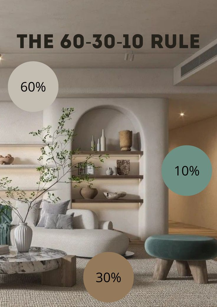
Ever walked into a room that felt… flat? You know the one. Everything is beige. Or white. Or gray. And it just sits there, lifeless, like a holding cell rather than a home. It’s frustrating, isn’t it? Especially when you’re working with limited square footage. Small spaces have a way of amplifying every design choice. Get it wrong, and the walls feel like they’re closing in. Get it right, and that same tiny nook becomes a cozy sanctuary.
The secret isn’t adding more color. It’s adding more feel. In 2026, the trend isn’t about bold statements or chaotic maximalism in compact areas. It’s about the quiet confidence of neutrals done properly. We are talking about the interplay of light, shadow, and touch. It’s about knowing that a smooth linen sofa needs a chunky knit throw. That a matte wall needs a glossy ceramic vase. This balance—this delicate dance between texture and tone—is what turns a "small neutral room" into a space that breathes.
Let’s be honest. Most people think neutral means boring. They pick one shade of off-white, paint four walls, buy a matching bedspread, and wonder why their bedroom feels like a hospital ward. But neutrality is not the absence of character. It’s a canvas. And in a small space, you don’t have the luxury of hiding behind large furniture pieces or expansive art. Every inch counts. Every surface speaks. So, how do you make them sing without shouting? You stop looking at color and start looking at material. You stop worrying about matching and start worrying about contrasting.
The Myth of the Single Shade
Here is a common mistake: picking one paint chip and sticking to it. You might choose "Swiss Coffee" or "Revere Pewter" and use that exact hue on the walls, the trim, the ceiling, and even the upholstery. Sure, it’s cohesive. But it’s also deadening. In a small room, this monochromatic approach eliminates depth. Without variation, the eye has nowhere to rest. It slides off the surfaces because there’s nothing to grab onto.
Instead, think in ranges. A true neutral palette spans a spectrum. You want your whites to have undertones that converse with each other, not just echo. Maybe your walls are a warm, creamy white with a hint of yellow. Your trim could be a crisp, clean white with a blue undertone. The difference is subtle—almost imperceptible at first glance—but it creates a boundary. It defines the architecture. Suddenly, the room has structure. It has bones.
This concept extends beyond paint. Look at your flooring. If you have light oak floors, don’t try to match your rug exactly. Choose a rug that is two shades lighter or two shades darker. This tonal shift creates a visual "step" that grounds the space. In 2026, designers are leaning into these micro-contrasts. It’s less about high-contrast black and white drama and more about the whisper of difference between sand and stone. By layering these slight variations, you create a sense of volume. The room feels bigger because the eye travels across these gentle gradients, perceiving distance where there was none.
Tactile Layering: The Secret Sauce
If tone is the skeleton, texture is the flesh. It’s what makes a room feel inviting. In a small space, you can’t rely on size to make an impact. You have to rely on touch. Well, not literally touching everything, but the promise of touch. When you look at a nubby wool pillow, your brain registers its softness. When you see a sleek marble table, you anticipate its cool smoothness. These sensory cues add weight and interest without cluttering the visual field.
Start with the big pieces. Your sofa, your bed, your main chair. These should anchor the textural narrative. If your sofa is a smooth, tight-weave fabric, you need contrast elsewhere. Maybe a rattan coffee table. Or a shaggy area rug. The key is variety. Don’t let every surface be soft. Don’t let every surface be hard. Mix them. A velvet armchair next to a raw wood sideboard. A silk curtain brushing against a brick accent wall (yes, even faux brick works). This juxtaposition creates tension. And tension is interesting.
Think about the vertical space too. In tiny rooms, floor space is premium real estate. So, look up. Textured wallpaper can add immense depth to a small powder room or hallway. Grasscloth, linen-weave vinyls, or even subtle plaster effects catch the light differently throughout the day. As the sun moves, the shadows shift across the textured surface, making the walls feel alive. It’s a dynamic element that costs nothing in terms of square footage but pays huge dividends in atmosphere. Just remember, in a small room, keep the pattern minimal. Let the texture be the pattern.
Lighting as a Textural Tool
We often forget that light is a physical thing. It interacts with surfaces. It reveals them. In a small neutral space, lighting isn’t just about visibility; it’s about excavation. It digs out the details. A flat, overhead light will flatten your textures. It will wash out those subtle tonal differences we talked about. You end up with a box. To avoid this, you need to layer your lighting just like you layer your textiles.
Ambient light is your base. But accent light is your storyteller. Use wall sconces to graze a textured wall. The light skimming across a plaster finish or a wood-slatted panel highlights every ridge and groove. It creates shadows. And shadows are essential for depth. Without shadow, there is no perception of three-dimensionality. In 2026, LED technology allows for warmer, more nuanced dimming. Use this. Dim your lights in the evening to let the textures soften. The room should feel different at night than it does at noon.
Consider the temperature of your bulbs, too. Neutral tones are chameleons. They shift based on the light source. A cool white bulb can make a warm beige look gray and sickly. A warm bulb can make a crisp white look yellow and dated. Stick to bulbs in the 2700K to 3000K range for living spaces. This warmth enhances the cozy factor of natural materials like wood, wool, and linen. It makes the neutrals feel rich rather than sterile. And please, use multiple sources. A floor lamp here, a table lamp there. Create pools of light that draw the eye to specific textural moments—a vase, a stack of books, a woven basket.
The Role of Natural Materials
There’s a reason biophilic design isn’t going anywhere. Humans crave connection to nature. And in interior design, nothing brings warmth and authenticity like natural materials. In a small neutral space, synthetic materials can feel cheap and cold. Plastic, laminate, polyester—they reflect light in a harsh, uniform way. Natural materials, on the other hand, are imperfect. They have grain. They have knots. They have variation. This imperfection is what makes them beautiful. It’s what makes them human.
Wood is the obvious choice. But don’t just slap any wood in the room. Consider the grain. A wide-plank oak floor has a different energy than a tight-grain maple cabinet. Mix them intentionally. A live-edge wooden stool can serve as a side table, bringing an organic, irregular shape into a room full of straight lines. Stone is another powerful player. A marble tray, a granite coaster, a slate planter. These cold, hard surfaces provide a necessary counterpoint to soft fabrics. They ground the space.
Don’t overlook fibers. Jute, sisal, seagrass, hemp. These materials add a rustic, earthy texture that pairs beautifully with refined neutrals. A jute rug under a sleek modern sofa creates an instant vibe of relaxed sophistication. It says, "I care about design, but I also care about comfort." In 2026, sustainability is huge, so choosing these natural, biodegradable options isn’t just aesthetically pleasing—it’s ethically sound. Plus, they age well. They develop a patina. A leather chair gets softer. A wood table gets scratches that tell a story. This evolution adds character over time, something mass-produced items simply can’t do.
Editing and Negative Space
Here is the hardest part. The part that goes against every instinct. You have to stop. In a small space, less is actually more. But "less" doesn’t mean empty. It means curated. When you’re balancing texture and tone, clutter is the enemy. Clutter creates visual noise. It competes with your carefully layered textures. If every surface is covered with knick-knacks, you can’t appreciate the weave of the curtain or the grain of the floor. The eye gets overwhelmed. It shuts down.
Think of negative space as breathing room. It’s the blank wall between two artworks. It’s the clear patch of floor around the rug. It’s the empty shelf. These voids allow the textures you do have to stand out. They give the eye a place to rest. In 2026, minimalism isn’t about sterility; it’s about intentionality. Every object in the room should earn its place. Does it add textural value? Does it contribute to the tonal harmony? If not, it goes.
This editing process is ongoing. It’s not a one-and-done deal. Live in the space. Notice what feels heavy. Notice what feels chaotic. Maybe that pile of magazines on the coffee table is disrupting the clean lines of the wood. Move them. Maybe that second throw pillow is redundant. Remove it. By constantly refining, you ensure that the balance remains intact. It’s about creating a sense of calm. A small room should feel like a exhale, not a shout. And that calm comes from the discipline of subtraction.
So, how do you apply this tomorrow? You don’t need a renovation budget. You don’t need to repaint the whole house. Start with swaps. Look around your room right now. What’s the flattest thing in it? Maybe it’s a plain cotton duvet. Swap it for a linen one. Linen has a slubbed texture that catches light beautifully. It wrinkles in a charming, lived-in way. Instant upgrade.
Look at your windows. Are your curtains flat polyester? Replace them with something heavier. Velvet, if you want drama. Wool blend, if you want coziness. The way the fabric hangs—the folds, the weight—adds vertical texture that draws the eye up, making the ceiling feel higher.
Check your accessories. Trade out that glossy plastic lamp base for a ceramic one with a matte glaze. Swap the metal picture frames for wood ones. Add a woven basket to hold blankets. These small changes accumulate. They build a language of texture. And because they’re all within the neutral family, they don’t clash. They harmonize. It’s like adding instruments to an orchestra. You started with a piano. Now you’re adding a cello. Then a flute. The melody is the same, but the richness is profound.
Another quick win? Plants. Yes, plants. They are organic texture. A fiddle leaf fig has large, structural leaves. A pothos has trailing, delicate vines. They break up the monotony of man-made materials. They add a splash of green, sure, but more importantly, they add life. In a neutral room, a plant is a sculpture. It’s a focal point that doesn’t demand color attention but demands spatial attention. Place one in a corner to soften the hard angles. It’s a simple trick, but it works every time.
Balancing texture and tone in a small neutral space is an art form. It requires patience. It requires observation. But the reward is a home that feels deeply personal and profoundly peaceful. It’s a space that doesn’t just look good in photos—it feels good to live in. And in a world that’s increasingly loud and chaotic, isn’t that what we’re all searching for? A quiet place to land. A soft place to fall. Start small. Layer slowly. Trust the process. Your home will thank you.