Ever opened a website or picked up a magazine and instantly knew exactly where to look first. That isn’t an accident. It is the result of meticulous planning by top-tier creative directors who understand how the human brain processes information.
In our fast-paced digital world, you only have a few milliseconds to grab someone’s attention. If your design is a chaotic mess, people will simply click away. Let’s look at how the pros handle this.
The Power of Making Things Stand Out
At its core, contrast is all about difference. If every element on your page looks the same, nothing stands out. Creative directors use stark differences in color, size, and weight to signal to the viewer what matters most. Think of it like a shout in a quiet room.
But you can’t just make everything big and loud. That just creates noise. The real trick is using contrast selectively. By making just one key element vastly different from the rest, you instantly create a focal point that captures the eye.
Establishing a Clear Pecking Order
Visual hierarchy is simply the arrangement of elements in a way that implies importance. It is the invisible map that tells the reader’s eyes where to travel next. Top designers usually structure this into three distinct levels.
Your primary level is the big hook—usually a massive headline or a striking image. The secondary level consists of subheads and navigation elements that group information together. Finally, the tertiary level is the main body text, which needs to be incredibly easy to read.
Size Matters More Than You Think
Scale is one of the easiest ways to show importance. Big things look important, while small things look less vital. Creative directors often push scale to the absolute limit to create drama and excitement in a layout.
Imagine a giant, bold number "01" next to a small paragraph of text. Your brain automatically connects them, but the massive size of the number is what pulls you in initially. It creates a dynamic entry point for the viewer.
The Magic of Empty Space
Many beginners make the mistake of filling every square inch of a canvas with clutter. Master designers do the exact opposite; they embrace negative space, which is often called white space. Space gives your elements room to breathe.
When you surround a piece of text or an image with plenty of empty space, you are telling the audience that the item is incredibly valuable. It acts like a spotlight on a stage, forcing attention directly onto the subject.
Color and Value Transitions
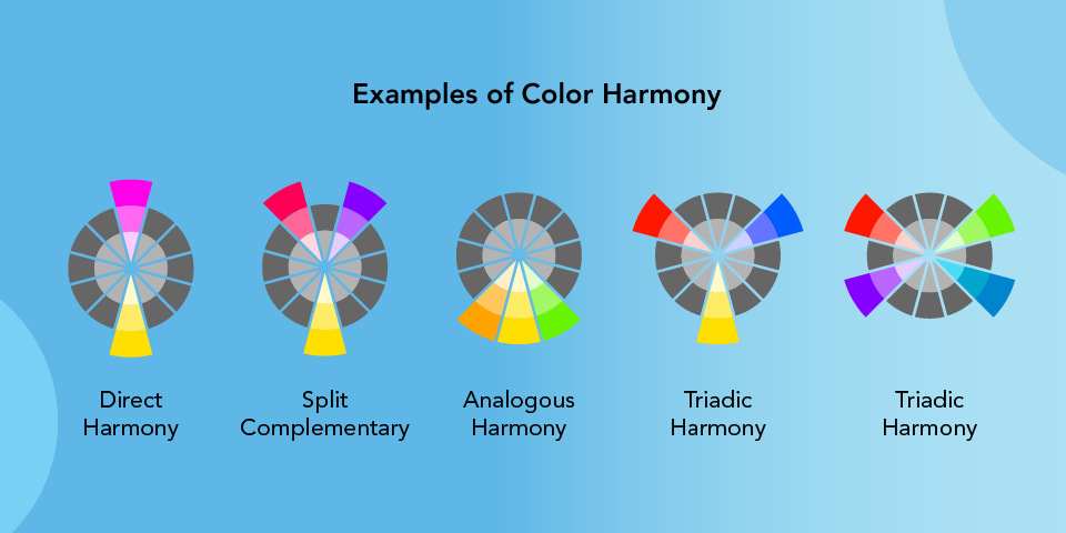
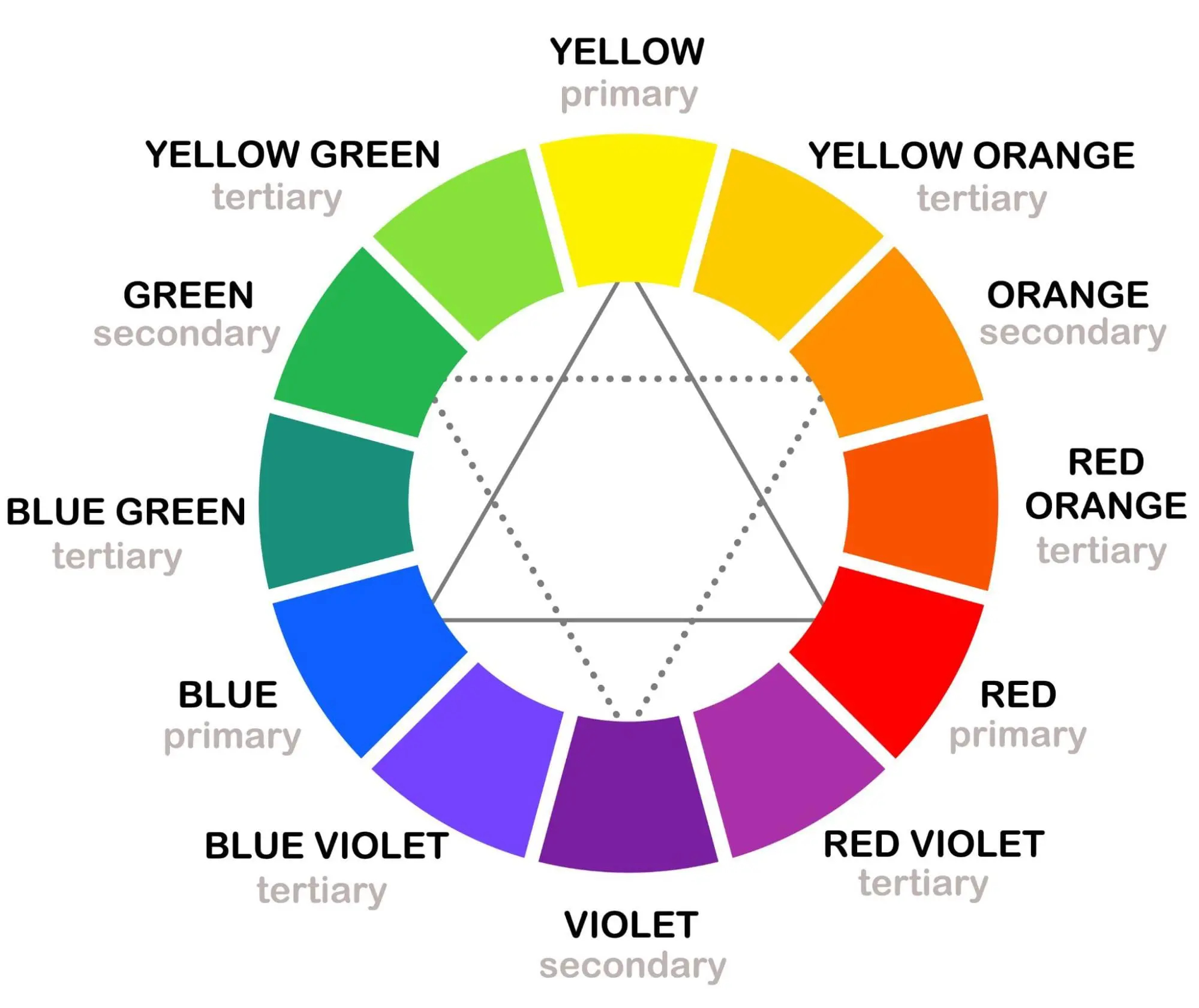
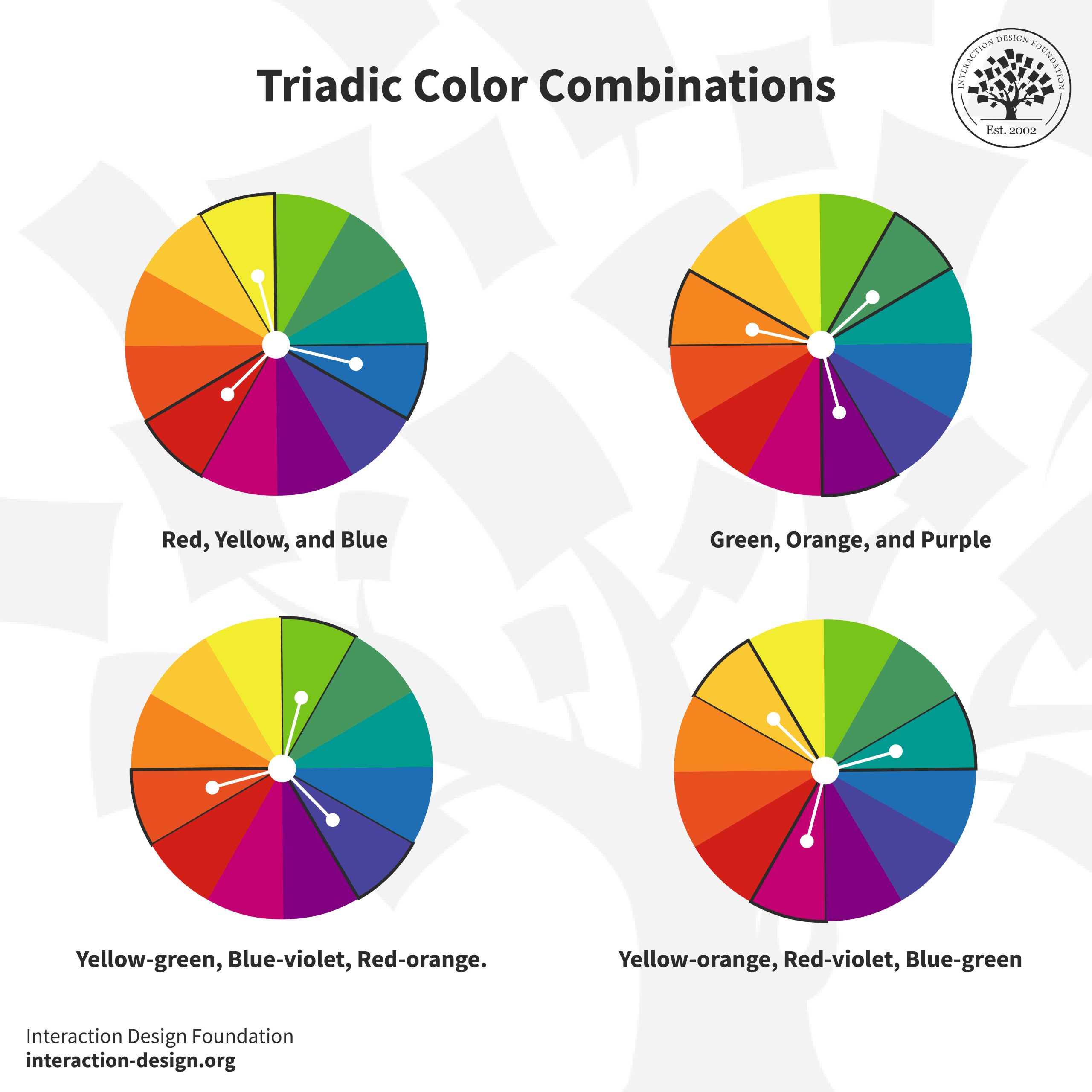
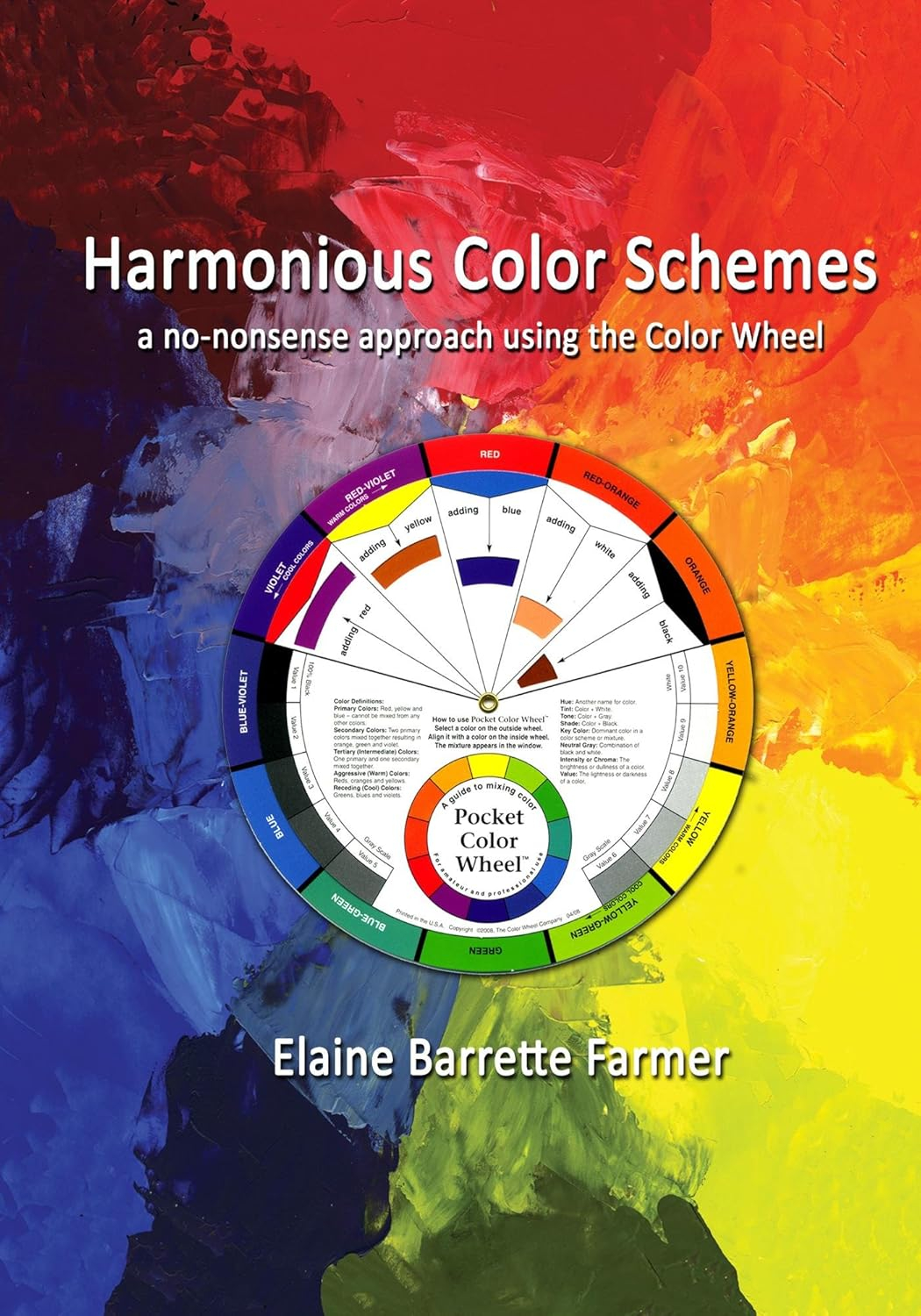
Color isn’t just about making things look pretty; it is a functional tool for direction. Bright colors naturally attract human eyes faster than muted tones. By placing a vibrant button on a dark or neutral background, you create an irresistible urge to click.
Value—how light or dark a color is—also plays a huge role. High contrast between text and its background ensures readability. Directors balance these tones to guide the viewer through a narrative arc smoothly.
Directing the Eye with Strategic Alignment
How you align elements creates an invisible path for the eyes to follow. Western audiences naturally read from top-to-bottom and left-to-right. Designers utilize patterns like the "F-Shape" or "Z-Shape" to place crucial information right where people naturally look.
Breaking these alignment rules on purpose can also be a powerful move. A single crooked element in a sea of perfectly straight boxes will instantly demand attention, making it an excellent trick for key call-to-actions.
Mastering these concepts takes practice, but the rewards are massive. By combining size, color, space, and alignment, you can control the story your design tells. You aren’t just arranging shapes; you are shaping the user’s experience.
Next time you look at a stunning piece of branding or a sleek app interface, try to deconstruct it. Look for the contrast and trace the hierarchy. Once you see the invisible map, you can start drawing it yourself.