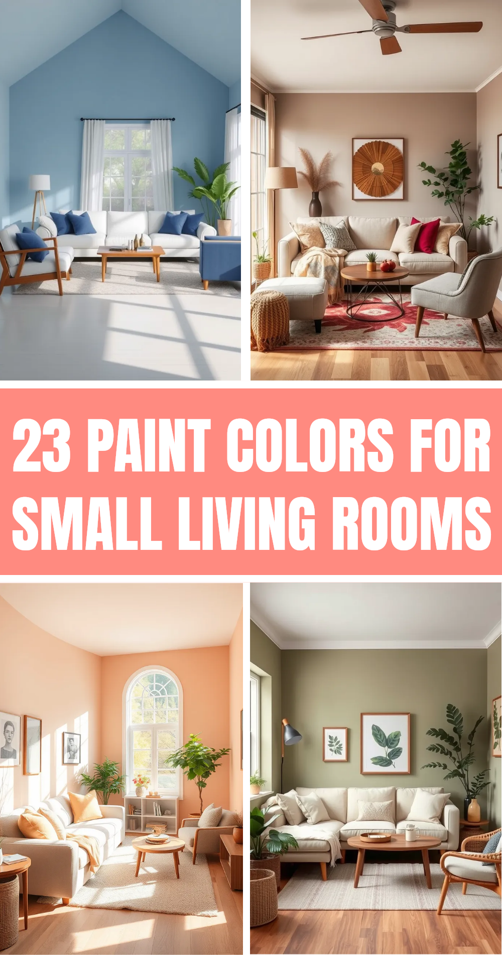
You are standing in the middle of your living room at 11:42 PM, holding a paint swatch that looks entirely different under the harsh glow of an LED bulb than it did in the sun-drenched hardware store aisle. Your phone is a graveyard of open browser tabs: three different interior design blogs, four Pinterest boards labeled with increasingly desperate names like "Moody Living Room V3," and a shopping cart containing velvet throw pillows in a color you aren’t even sure you like. Your chest tightens. What if the rug clashes with the sofa? What if the hallway looks disconnected from the kitchen?
The paralysis of choice has officially set in. In an era dominated by relentless digital inspiration boards, endless micro-trends, and the subtle poison of comparison, decorating a home has stopped being an enjoyable expression of self and turned into an high-stakes exam you are convinced you are failing. Every throw blanket, wall shade, and hardware finish feels like a permanent, irrevocable vote on your taste.
This anxiety is entirely normal, but it is entirely unnecessary. The secret weapon of professional interior designers isn’t a mystical, innate artistic genius; it is a systematic framework. They do not guess, and they certainly do not panic-buy based on Instagram reels. They rely on architectural logic, light physics, and a predictable color formula. By stripping away the noise and learning how to engineer a cohesive color story from the ground up, you can quiet the mental chatter and transform your living space into a unified, intentional sanctuary.
The Psychological Weight of Endless Choices and Why Your Rooms Feel Disconnected
The modern obsession with home decor perfection stems from an unprecedented volume of visual input. Two decades ago, inspiration was limited to monthly print magazines and physical furniture showrooms. Today, we consume thousands of curated interior images a week. This hyper-exposure distorts our perception of what a normal, livable home should look like. We try to stitch together a Scandinavian minimalist kitchen, a maximalist bohemian bedroom, and a transitional living room under one roof, wondering why the final result feels jarring and chaotic rather than curated.
A lack of cohesion is rarely about owning the wrong furniture or choosing an ugly paint color. It is almost always a symptom of disjointed decision-making. When you buy items in isolation—a lamp here because it was on sale, a rug there because it had a good review—you are treating your home as a collection of independent islands rather than a continuous ecosystem. The human eye craves visual rhythm. When a space lacks predictable transitions, color anchors, and repeating material cues, the brain registers it as visual clutter, which subtly triggers low-grade stress and restlessness.
Understanding this dynamic is the first step toward reclaiming your peace of mind. Cohesion does not mean matching. In fact, matching every piece of furniture from a single catalog page is the fastest way to make a home feel sterile, lifeless, and devoid of personality. True interior harmony is about establishing a foundational architectural logic. It means giving the eye places to rest, creating intentional pathways of color from room to room, and recognizing that your home is a backdrop for your life, not a static museum exhibit frozen in time.
Decoding the Anatomy of a Whole-House Color Palette
Building a cohesive home begins with abandoning the notion that every room needs its own distinct theme or color scheme. Instead, professional designers operate on a macro-to-micro scale, establishing a cohesive whole-house palette that stretches from the entryway to the primary suite. This master palette typically consists of three distinct tiers: dominant background tones, structural supporting tones, and accent punctuation marks.
The dominant tones cover roughly 60 percent of your visible space. These are your walls, large-scale flooring, and major upholstery items like sofas. They should be neutral, forgiving, and deeply tied to the natural light quality of your geographical location and architectural orientation. North-facing rooms require warmer undertones to counteract cool, blue light, while south-facing rooms can handle crisper, cooler whites and muted grays.
The supporting tones account for about 30 percent of the space. These are introduced through case goods, wooden furniture, window treatments, rugs, and interior doors. They add depth, warmth, and material variation. Finally, the remaining 10 percent belongs to your accent colors—the dynamic wildcards found in artwork, decorative objects, ceramic vases, and throw pillows.
By defining these tiers before you buy another decor item, you create an unbreakable filter for decision-making. When you see an accent pillow you love, you no longer have to ask, "Does this look good?" You ask, "Does this fit within my 10 percent accent allocation, and does its undertone match my supporting wood tones?" Suddenly, the guesswork evaporates, replaced by clear, analytical boundaries that actually liberate your creativity.
The Step-by-Step Blueprint to Engineering Your Home’s Color Flow
Transforming your decorating process from an emotional rollercoaster into a structured methodology requires a disciplined sequence. Skipping steps or tackling rooms out of order is why overthinking takes over in the first place. Follow this proven roadmap to reclaim control over your space.
- Step 1 (Audit the Unmovable Elements): Before looking at a single paint swatch, catalog every fixed asset in your home that you cannot or will not change. Note your flooring color, kitchen cabinet finishes, fireplace stone, and window frame materials. Your color story must respect these fixed players, not fight them.
- Step 2 (Establish the Anchor Room): Pick the largest or most frequently used space—usually the living room or open-plan kitchen/living area. Build your foundational 60-30-10 color ratio entirely within this space first. This room will serve as the architectural anchor and visual baseline for the rest of the house.
- Step 3 (Define Your Metallic and Wood Palette): Clashing finishes are a primary culprit behind disjointed spaces. Decide whether your hardware and lighting will lean toward unlacquered brass, matte black, brushed nickel, or oil-rubbed bronze. Pair these with a primary wood tone (such as white oak or walnut) to ensure tactile continuity across thresholds.
- Step 4 (Map Room-to-Room Transitions): Stand in your hallway and look into adjoining rooms. Ensure that as your eye travels from space to space, at least one color or material from the previous room is repeated in the next. This creates a subconscious visual bridge that makes small homes feel expansive and large homes feel unified.
- Step 5 (Introduce Accents Through Layers, Not Paint): Keep your walls and major investment furniture neutral. Use textiles, art, and ceramics to test trendier or bolder colors. Because these elements are easily swapped, you can satisfy your craving for novelty without triggering buyer’s remorse or painting a room three times in a single year.
Navigating the Traps: Common Decorating Mistakes and How to Bypass Them
Even with the best intentions, it is easy to fall into psychological traps that derail your design progress and reignite decision fatigue. Recognizing these common missteps allows you to course-correct before wasting time and money on impulse purchases.
- Pitfall 1 (Matching Everything Too Literally): Buying a complete bedroom set or matching every furniture piece from a single collection kills architectural character. Workaround: Mix eras and textures. Pair a mid-century modern wooden dresser with a vintage upholstered headboard and a modern iron lamp. Unified color and material tones will tie disparate styles together effortlessly.
- Pitfall 2 (Ignoring Natural Lighting Conditions): Choosing a paint color purely based on an online photo or a tiny 2×2 inch swatch. Workaround: Always paint a large 2-foot square sample on the actual wall and observe it across morning, noon, and evening light cycles. Light dictates color temperature; respect it before committing.
- Pitfall 3 (Decorating Room-in-a-Vacuum): Designing the guest bedroom completely detached from the aesthetic of the main living areas, resulting in a jarring experience for guests walking down the hall. Workaround: Treat your home as a single narrative arc. Carry at least one accent color or material texture from your main living areas into every secondary room.
- Pitfall 4 (Overcrowding with Micro-Decor): Filling every flat surface with small, disconnected knick-knacks that create visual noise and dusting nightmares. Workaround: Follow the rule of scale. Group smaller objects into intentional trays or vignettes, and invest in fewer, larger statement pieces that command visual authority.
- Pitfall 5 (Chasing Fast Micro-Trends): Buying into every fleeting aesthetic shift promoted on social media feeds. Workaround: Pause for a mandatory two-week waiting period before purchasing any non-essential decor item priced over a certain threshold. If you still love it after fourteen days, integrate it.
The Long-Term Impact of an Intentional Home on Daily Well-Being
When you stop treating your home decor as a continuous series of performance tests and instead build a cohesive, intentional environment, the psychological dividends are profound. Interior space is not merely a backdrop; it is an active participant in your mental health. Studies in environmental psychology consistently demonstrate that organized, harmonious spaces lower cortisol levels, improve cognitive focus, and enhance emotional regulation after a stressful day in the outside world.
Furthermore, building a cohesive color story changes your consumer behavior. When you operate with a clear design framework, you stop impulse-buying cheap, disposable decor items that ultimately end up in landfills. You begin investing in pieces with longevity—solid wood furniture, quality textiles, artisan ceramics, and timeless lighting fixtures. This shift not only saves financial resources over time but also fosters a sustainable relationship with your physical environment.
Your home becomes a reflection of your actual life rather than an aspirational advertisement. It accommodates your habits, forgives the clutter of daily living, and provides a restorative psychological container. Overthinking dissolves not because your home is suddenly "finished"—homes are living, breathing spaces that evolve continuously—but because you trust your ability to make intentional, aligned choices.
Actionable Recommendations for Immediate Peace of Mind
If you are currently staring at a half-decorated room and feeling overwhelmed, take a deep breath and put down the design magazines. You do not need to overhaul your entire house this weekend. True design confidence is built through small, deliberate micro-actions that restore your agency and clear away visual noise.
First, institute a strict clutter and decor freeze for the next thirty days. Do not buy a single pillow, print, or vase. Instead, spend that time editing what you already own. Remove every decorative item from your shelves and tabletops. Live with the clean slate for a few days, and only reintroduce items that either serve a practical daily function or spark genuine, unforced joy. You will often find that your home already contains everything it needs; it was simply drowning in visual excess.
Second, embrace the power of the "pause and evaluate" phase. Interior design is an iterative process, not a sprint. Give your spaces time to breathe. Live with a blank wall for a month before rushing to hang art; let the room tell you what it needs based on how you actually inhabit it, not how you think it should look in a photograph.
Finally, remember that perfection is the enemy of a soulful home. The most captivating, welcoming spaces always bear the subtle, imperfect fingerprints of the people who live inside them. Give yourself permission to make choices that aren’t featured in design glossies, provided they feel authentic to your daily existence. When you stop designing for an imaginary audience of online critics, your home finally becomes what it was always meant to be: your own.
The journey from chronic decorator’s paralysis to quiet confidence is ultimately about self-trust. We overthink our homes because we confuse the physical styling of a room with an evaluation of our personal worth and taste. Once you realize that interior design is simply applied logic—a matter of light, proportion, texture, and color ratios—the emotional stakes drop dramatically.
You now possess the foundational toolkit to look past the endless digital noise and build a space that feels calm, connected, and authentically yours. Start with your fixed elements, establish your color tiers, honor your natural light, and commit to editing with ruthless intention.
The next time you stand in a room questioning whether a lampshade works or a paint color is "right," remember the framework. Trust the process, silence the external chatter, and take that first small, deliberate step. Your home is waiting for you to lead.