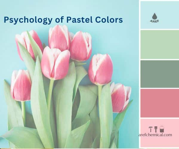
We’ve all been there. Standing in a room that feels heavy. The walls are beige, or maybe a stark, cold white that makes everything feel a bit clinical. You want change, but you’re terrified of committing to a bright red or a deep navy. It’s a common paralysis. For years, the design world told us that soft colors were safe, boring, or strictly for nurseries. But something shifted recently. If you look at the most striking transformations happening in homes across the globe right now, you’ll notice a quiet revolution. It’s not loud. It doesn’t shout. It whispers. And it’s incredibly powerful.
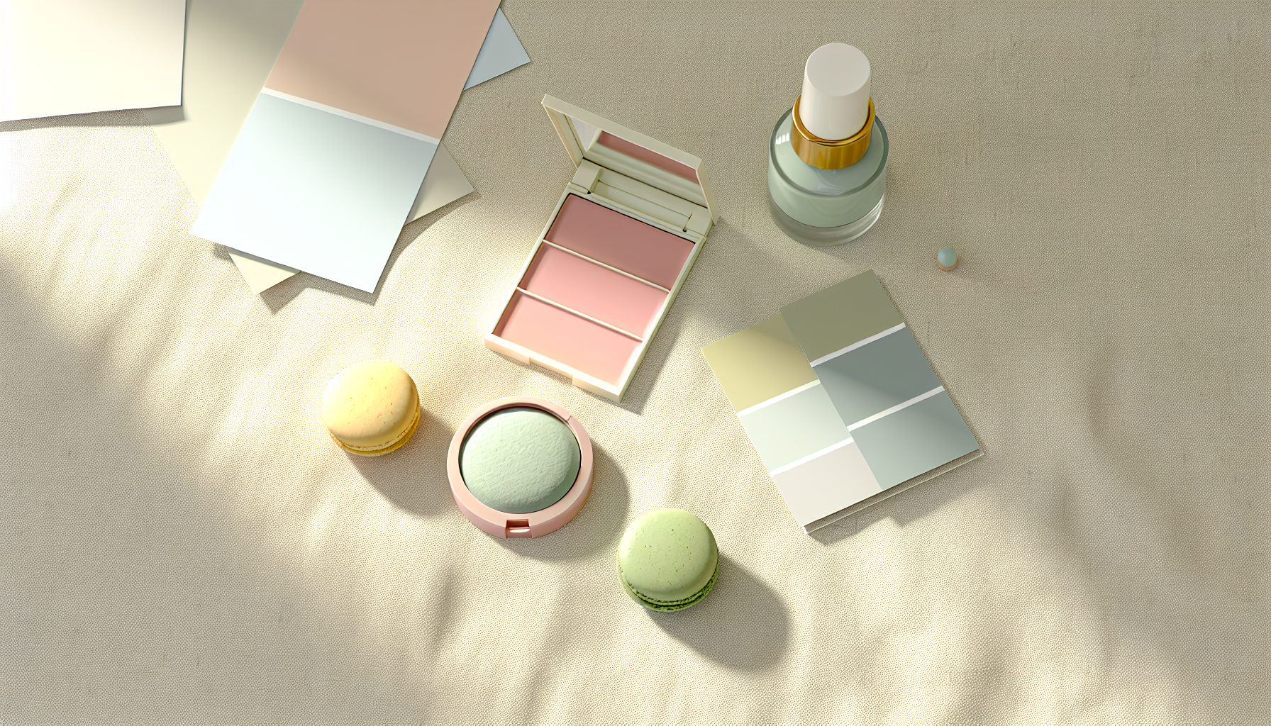
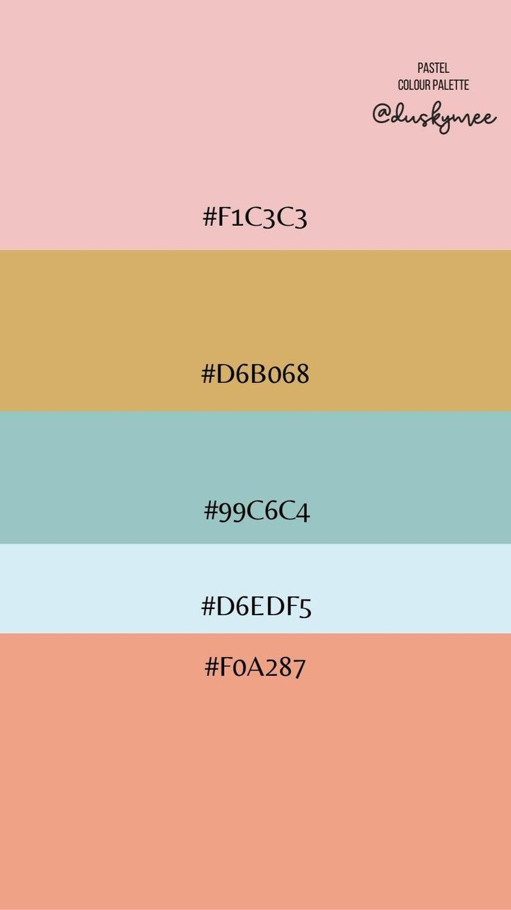
Pastels have shed their reputation for being weak or juvenile. In 2026, they are being used with a confidence that surprises even seasoned designers. We aren’t just talking about painting a wall pink and calling it a day. We are seeing complex layering of sherbet shades, mint greens, and buttery yellows that create depth, mood, and serious architectural interest. The "before" photos often show spaces that are dark, dated, or just plain sad. The "after" shots? They breathe. They feel alive. This isn’t about covering up mistakes; it’s about revealing potential. Let’s dive into why these soft tones are packing such a hard punch.
Breaking the Beige Monotony
For decades, neutral tones dominated our living spaces. Gray was king. Then white took over. But by the mid-2020s, people started craving warmth without the heaviness of dark earth tones. This is where pastels stepped in as the perfect antidote. Take the typical hallway, for instance. Often the most neglected part of a home, these spaces are frequently dark and dingy. A recent makeover highlighted by House Beautiful showed a homeowner transforming a gloomy staircase landing using nothing but paint and some DIY grit. The cost? A mere £87. That’s less than a nice dinner out for two.
The transformation wasn’t just about color; it was about light. By introducing pastel brights, the space reflected natural light rather than absorbing it. The "before" state felt like a tunnel. The "after" felt like an invitation. This is the core magic of pastels. They expand space. They lift moods. And they do it without the visual fatigue that comes with high-saturation primaries. You can stare at a soft lavender wall for hours and never feel overwhelmed. Try that with a fire-engine red. It’s exhausting. Pastels offer a visual rest stop in a chaotic world.
What’s fascinating is how this trend has moved beyond just walls. We see it in cabinetry, flooring, and even fixtures. The Kitchn reported on a kitchen makeover that blended 1950s nostalgia with modern cottagecore vibes. Instead of the expected sterile white cabinets, the designer opted for pastel tones that injected character. This approach ensures the design outlasts fleeting trends. It’s not just "in style" for a season; it feels timeless because it taps into a sense of comfort and history.
The Psychology of Soft Power
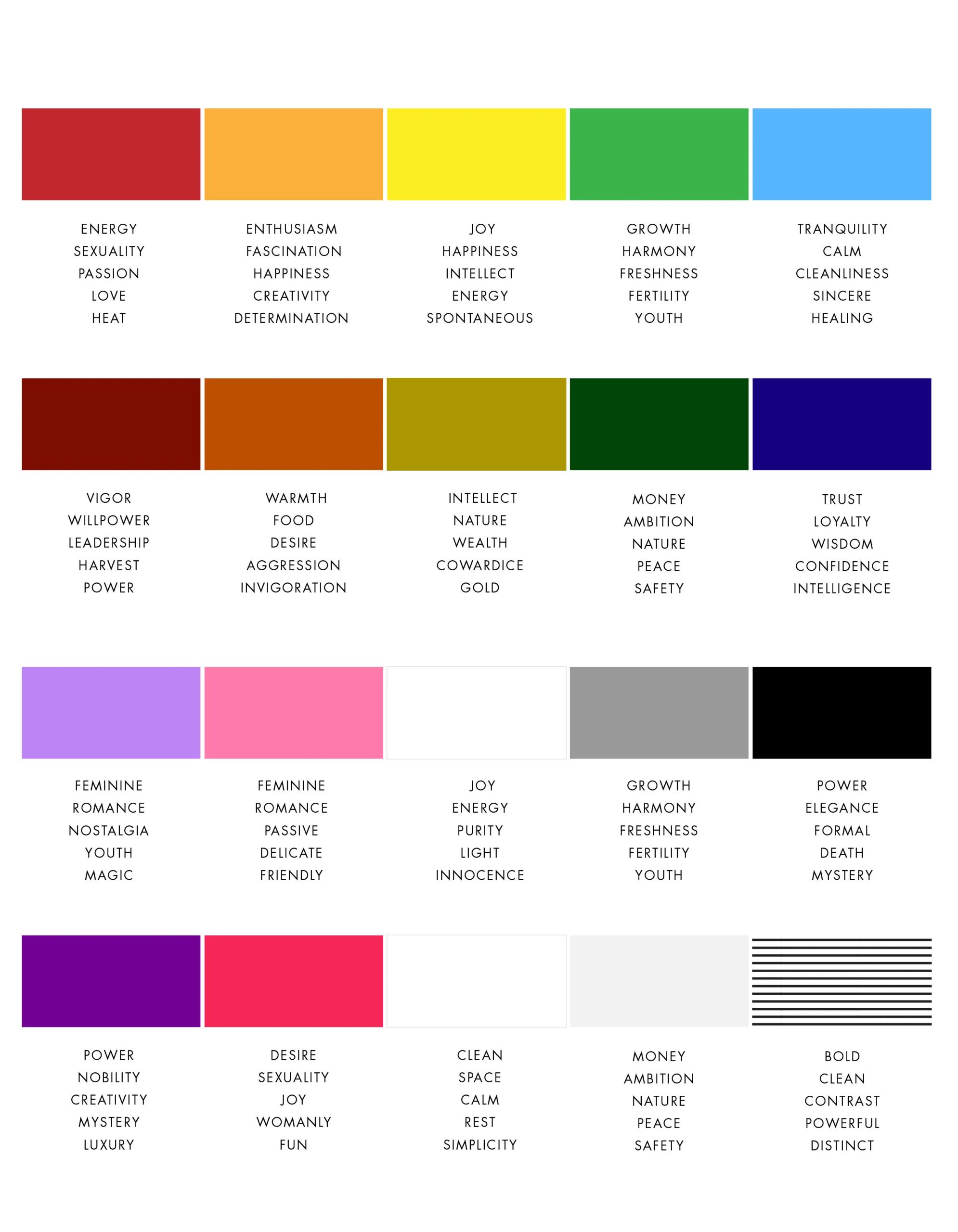
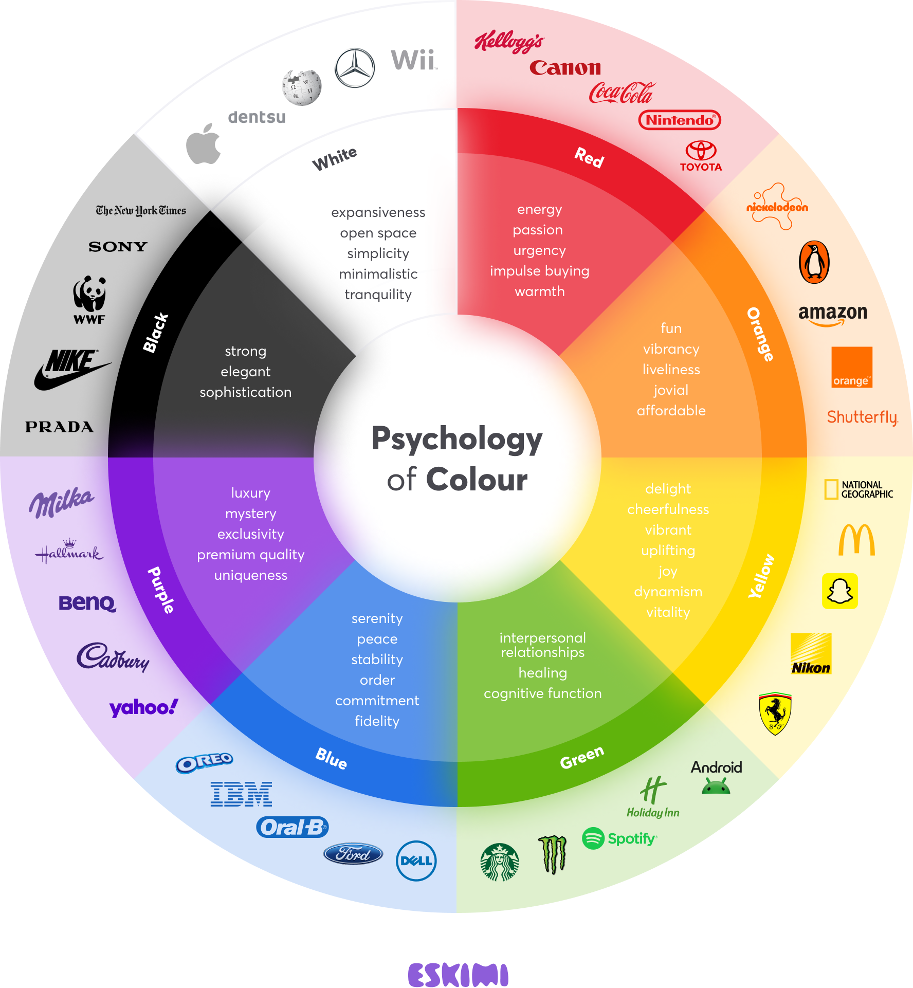
Why do we feel better in these spaces? It’s not just aesthetics; it’s biology. Color psychology has long suggested that softer hues lower cortisol levels. In a post-pandemic world where our homes became our offices, schools, and sanctuaries, this matters more than ever. Michelle McKenna of Space and Grace, featured in Remodelista, noted her lifelong fascination with how color impacts well-being. Her work in London demonstrates that pastels aren’t just decorative; they are functional tools for mental health.
Consider the bedroom. It should be a retreat. A Colormelon case study detailed a bedroom makeover that turned a standard room into a "pastel paradise." The key wasn’t just the paint; it was the atmosphere. By using soft hues, the room became a place to decompress. The addition of a vintage-style gold mirror added a chic, Parisian touch, proving that pastels pair beautifully with metallics. This combination creates a sense of luxury without the stiffness. It’s relaxed elegance.
This psychological benefit extends to productivity too. Home offices painted in soft sage or muted blue help maintain focus without inducing anxiety. It’s a balance. Stark white can feel sterile and hospital-like, leading to eye strain. Dark colors can feel cozy but might induce lethargy. Pastels sit in the sweet spot. They provide enough stimulation to keep the brain engaged but enough calm to prevent burnout. It’s no wonder that in 2026, we are seeing a surge in home offices designed with these principles in mind.
Sophistication Over Sugary Sweetness
The biggest hurdle for most people is the fear of looking childish. "I don’t want my house to look like a candy shop," they say. Valid concern. But the secret to grown-up pastels lies in saturation and pairing. Livingetc experts emphasize that pastel palettes become sophisticated when handled with restraint and intention. It’s about avoiding the "Easter egg" effect. You don’t want every color to be equally bright and sugary.
One effective strategy is grounding. Pair a soft blush pink with charcoal gray or matte black accents. The darkness anchors the lightness. It gives the eye a place to rest and adds contrast. Another method is texture. A pastel velvet accent chair feels rich and adult. A flat, glossy pastel plastic chair feels like a toy. Materiality changes everything. As noted in 1stdibs’ roundup of designer spaces, sumptuous materials like marble, brass, and heavy linens elevate soft colors into the realm of high design.
Also, consider the source of the color. Natural pastels derived from earth pigments tend to feel more grounded than synthetic neon-pastels. Think of the color of sea glass versus the color of a highlighter marker. One feels ancient and calming; the other feels artificial. Designers in 2026 are leaning heavily into these organic, muted variations. They call them "dusty pastels" or "muted sherbets." These tones have gray or brown undertones that make them feel weathered and lived-in, instantly adding a layer of maturity to the space.
Small Spaces, Big Impact
You don’t need a mansion to experiment with this trend. In fact, pastels shine in small, awkward spaces that often get ignored. Laundry rooms, powder rooms, and entryways are prime candidates. Apartment Therapy showcased a transformation of a dark, dreary porch into a botanical laundry room. The homeowner used pastel greens and blues to bring the outdoors in. Over six weeks, the space went from a chore zone to a favorite room.
Why does this work in small doses? Because it’s low risk. If you hate it, you’ve only painted a small closet. But more importantly, these transitional spaces set the tone for the whole house. Walking past a cheerful, pastel-painted laundry room can spark a moment of joy in an otherwise mundane task. It’s the concept of "micro-moments" of happiness built into the architecture of your day.
Budget is another factor. As seen in the hallway makeover mentioned earlier, you don’t need expensive renovations. A lick of paint and some self-taught DIY skills can yield professional results. Pastel paints often require fewer coats than deep, dark colors, which can save money and time. Plus, because the colors are light, imperfections in the wall are less visible than they would be under harsh, direct lighting on a dark wall. It’s forgiving. And for the average homeowner, forgiveness is a valuable feature.
Mixing Eras and Styles
One of the most exciting aspects of the current pastel revival is its versatility across different design eras. It’s not stuck in one decade. You can use pastels to highlight Mid-Century Modern furniture, giving wood tones a warm backdrop. You can use them to soften the hard edges of Industrial design, balancing exposed brick and steel with soft mint or peach. The Kitchn’s article on 1950s-inspired kitchens shows how blending past styles with contemporary features creates a unique narrative.
This eclecticism prevents the space from feeling like a museum exhibit. It feels curated. For example, pairing a pastel wall with a bold, abstract piece of art creates a dynamic tension. The soft background allows the art to pop without competing. Colormelon suggested using oversized abstract art in complementary hues to catch the eye. This technique draws attention to specific focal points, guiding the viewer’s experience of the room.
In 2026, we are also seeing a blend of "Cottagecore" and "Modern Minimalism." Pastels are the bridge. They offer the whimsy of cottage style but can be applied with the clean lines of minimalism. Imagine a minimalist room with white floors and ceilings, but one accent wall in a soft, dusty rose. It breaks the monotony without cluttering the visual field. This hybrid approach appeals to a wide audience who want comfort but crave cleanliness. It’s the best of both worlds.
Ready to try it? Start small. Don’t paint the whole house tomorrow. Pick one room. Or even one wall. Test the light. Pastels change dramatically depending on the time of day and the type of bulb you use. Warm LEDs will make a yellow pastel look creamy and rich. Cool LEDs might make it look washed out. Always sample your paint on a large board and move it around the room before committing.
Next, look at your existing furniture. What colors are already present? If you have a lot of wood tones, a soft green or blue will complement them beautifully. If you have gray upholstery, a blush or lavender can add warmth. Use the 60-30-10 rule: 60% dominant color (walls), 30% secondary color (upholstery/rugs), and 10% accent color (pillows/art). With pastels, you can sometimes flip this, using the pastel as the 30% accent against a neutral 60%.
Finally, don’t forget the trim. White trim with pastel walls is classic, but painting the trim in a slightly lighter or darker shade of the wall color creates a monochromatic, high-end look. It blurs the boundaries and makes the room feel larger. And if you mess up? Paint is cheap. Change is easy. The power of pastels is that they are inviting, not intimidating. They encourage play. So go ahead. Buy that brush. Mix that color. See what happens.
The shift toward pastels in 2026 isn’t just a trend; it’s a reflection of our collective desire for comfort, calm, and gentle beauty. We’ve spent years in high-contrast, high-stress environments. Our homes are becoming the counterbalance. The before and after stories we see online aren’t just about pretty pictures. They are testaments to the emotional impact of our surroundings. A dark hallway becomes a welcoming embrace. A sterile kitchen becomes a heart of the home.
These transformations prove that you don’t need to knock down walls to change your life. Sometimes, you just need to change the light. Pastels offer a way to do that affordably, sustainably, and beautifully. They are accessible to everyone, from the renter with a single accent wall to the homeowner renovating a whole floor. The barrier to entry is low, but the payoff is high.
So, the next time you feel stuck in a beige rut, remember the soft power of these hues. They are strong enough to hold a room together, yet gentle enough to let you breathe. Look at the archives, from ELLE Decoration to Havenly. The evidence is there. Pastels are back, and they are here to stay. Not as a whisper, but as a clear, confident statement of intent. Your home deserves that kind of kindness.