You’ve stood there before. Paint chip in one hand, phone flashlight in the other, squinting at a wall that just doesn’t feel right. Maybe it’s that cool gray you picked because Instagram said it was "clean," but now your living room feels like a dentist’s waiting area. Or perhaps it’s the greige that looked safe in 2021 but now just screams "builder basic." We’ve all been there. You’re drowning in Pinterest boards, paralyzed by choices, and wondering if you should just paint everything white and call it a day.
But here’s the thing about 2026. The trend isn’t about chasing what’s loud. It’s about what feels good. Interior designers are moving away from stark contrasts and toward colors that add depth, warmth, and personality without screaming for attention. It’s less about making a statement and more about creating a feeling. When you walk into a room, does it hug you? Does it energize you? Or does it just sit there, flat and lifeless? That’s the difference a well-chosen accent wall makes. It’s not just paint. It’s mood.
This guide isn’t about telling you which specific shade of blue is "in." Trends fade faster than a cheap tan. Instead, we’re giving you a checklist. A way to think. A method to ensure that when you finally dip that brush, you’re confident. Because a room that feels complete doesn’t happen by accident. It happens when the color connects with the light, the architecture, and you. Let’s fix that off-kilter wall for good.
Check the Light Before You Pick the Pigment
Light is the liar in the room. It changes everything. That deep, moody navy you loved in the store sample? Under your north-facing window, it might look like a bruised plum. And that warm terracotta? In the harsh afternoon sun, it could turn neon orange. You can’t skip this step. Seriously. Don’t even think about buying a gallon until you’ve watched the light in your room for a full day.
Start by observing the direction your windows face. North light is cool and consistent, often making colors appear darker and flatter. If you have north light, you generally need warmer undertones to balance the chill. South light is intense and warm, washing out colors and making them appear lighter. Here, you can get away with deeper, cooler shades because the sun will soften them. East and west light change dramatically throughout the day, shifting from warm golds to cool blues. It’s tricky. But it’s also where the magic happens if you get it right.
Test your samples on the actual wall, not on a piece of paper. Paint a two-foot square. Watch it in the morning. Watch it at noon. Watch it when the lamps are on at night. Does it still feel beautiful in the shadows? Does it glow in the sunlight? If the color looks great at 10 AM but terrible at 7 PM, it’s not the right color. A successful accent wall needs to work in every lighting condition, not just the one you see during open house hours. This is the foundation. Get this wrong, and nothing else matters.
Match the Mood to the Room’s Purpose
What do you actually do in this room? It sounds simple, but most people pick colors based on what looks good in a magazine, not how they live. Your bedroom shouldn’t feel like a high-energy startup office. Your dining room doesn’t need to be a cave. Think about the emotion you want to evoke. Do you want to feel calm? Energized? Cozy? Focused? The color needs to support that goal.
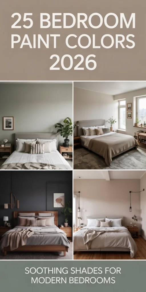
For spaces meant for relaxation, like bedrooms or reading nooks, look toward earthy neutrals and muted blues. These tones lower your heart rate. They signal to your brain that it’s time to slow down. In 2026, we’re seeing a huge shift toward these comforting hues. Think soft sage greens, dusty blues, and warm clays. They aren’t boring. They’re grounding. They provide a backdrop that lets you breathe. If you put a bright red accent wall in your bedroom, you might love the drama, but you’ll probably sleep worse. Biology matters.
On the flip side, if you’re accenting a home office or a creative studio, you might want something with a bit more kick. But "kick" doesn’t mean neon. It means depth. A rich teal or a deep charcoal can stimulate focus without causing eye strain. The key is intentionality. Ask yourself: "How do I want to feel when I’m sitting here?" If the answer is "anxious," you’ve picked the wrong color. If the answer is "centered" or "inspired," you’re on the right track. The color should serve the function, not fight it.
Respect the Architecture and Fixed Elements
Your house has bones. Ignoring them is a mistake. An accent wall shouldn’t feel like a sticker slapped on top of a room. It should feel like it grew there. Look at your flooring. Look at your countertops. Look at the trim. What are the undertones? If you have warm oak floors, a cool, icy gray accent wall will clash. It will look disconnected. You need to bridge the gap.
In 2026, designers are loving colors that feel naturally connected to the room’s architecture. This means pulling colors from your existing palette. Got a marble fireplace with veins of gold? Pick a warm beige or a soft gold-toned neutral for your accent. Have dark walnut cabinets? A deep green or a muted blue can complement that richness beautifully. The goal is harmony. You want the eye to travel smoothly from the floor to the walls to the ceiling. If the accent wall stops the eye dead in its tracks because it’s so jarring, you’ve failed.
Also, consider the size and shape of the room. Dark colors recede, making a room feel larger and cozier. Light colors advance, making a space feel airier but potentially smaller if overused. If you have a small, boxy room, a dark accent wall on the far end can create an illusion of depth. It pushes the wall back visually. But if you have low ceilings, painting the accent wall dark all the way up might make you feel cramped. Sometimes, stopping the color at a chair rail or using a horizontal stripe can help. Work with the structure, not against it.
Choose Depth Over Saturation
Here is a secret that paint stores won’t tell you: saturated colors are hard to live with. Bright, primary hues feel childish and dated fast. In 2026, the trend is firmly toward complexity. We’re talking about colors with gray, brown, or black mixed in. These are called "muted" or "dusty" tones. They have soul. They change with the light. They don’t shout.
Think about the difference between a fire-engine red and a brick red. One is aggressive. The other is sophisticated. The same goes for blues. A sky blue can feel flat. A slate blue with hints of green feels layered. When you’re picking your accent color, look for nuance. Hold the chip up next to a pure white sheet of paper. Does it look muddy? Good. That mud is character. Does it look like a crayon? Put it back. You want a color that reveals different facets depending on the time of day.
This approach also makes decorating easier. A muted accent wall plays nice with almost any furniture style. Whether you have mid-century modern pieces, farmhouse finds, or sleek contemporary sofas, a complex neutral or a deep jewel tone will anchor them. Bright colors demand that everything else in the room coordinate perfectly. Muted colors give you grace. They allow for imperfection. And let’s be honest, our homes aren’t showrooms. They’re lived-in spaces. The color should age well, just like your favorite leather jacket.
Test the Flow With the Rest of the House
Your rooms don’t exist in vacuums. You walk from the hallway into the living room. You glance from the kitchen into the dining area. If your accent wall is a shock to the system every time you turn a corner, it creates visual noise. It’s exhausting. The best accent walls feel like a natural progression from the spaces around them.
Check the sightlines. Stand in the doorway of the room you’re painting. What do you see? If you can see another room with a conflicting color scheme, you need to adjust. You don’t have to match everything, but you need a thread. Maybe it’s a shared undertone. Maybe it’s a similar intensity. If your hallway is warm white, a cool blue accent wall might feel jarring unless you introduce some warm elements in the decor to bridge the gap.
Consider the 60-30-10 rule, but adapt it for accent walls. Usually, 60% of the room is your main wall color, 30% is your secondary color (furniture, rugs), and 10% is your accent. But when the accent is a whole wall, it becomes a major player. Ensure it doesn’t overpower the 60%. If your main walls are a strong beige, a black accent wall might be too heavy. Try a charcoal instead. Soften the blow. The transition should feel seamless. You want guests to notice the beauty, not the dissonance. If they say, "Wow, that wall is… intense," you might have gone too far. If they say, "This room feels so cozy," you nailed it.
Paint isn’t just color. It’s texture. The sheen you choose changes how the light hits the wall, which changes how the color looks. In 2026, we’re seeing a move away from flat matte everywhere. Designers are mixing finishes to add interest. But for an accent wall, you need to be careful. High gloss reflects everything, including imperfections. If your drywall isn’t perfect, gloss will show every bump.
For most accent walls, a satin or eggshell finish is the sweet spot. It has a slight glow that adds depth without being mirror-like. It’s durable enough to wipe down but soft enough to feel inviting. However, if you’re going for a dramatic, moody look, consider a limewash or a textured plaster effect. These finishes add physical depth to the color. They catch the light in tiny ways that flat paint can’t. A dark green limewash wall feels alive. It breathes.
Don’t forget the edges. Where does the accent wall stop? Does it wrap around corners? Does it hit a trim piece? Clean lines matter. If you’re painting a bold color, sloppy edges look worse than they do with white. Take your time. Use good tape. Or, better yet, embrace the imperfect hand-painted look if you’re doing a textured finish. The goal is a room that feels complete, and completeness is in the details. A well-finished edge tells the eye that the job was done with care. It signals quality. And that’s what makes a house feel like a home.
So, where does this leave you? You’ve checked the light. You’ve matched the mood. You’ve respected the bones of your house. You’ve chosen depth over brightness. You’ve ensured it flows with the rest of your home. And you’ve thought about the finish. That’s the checklist. It’s not about finding the "perfect" color because perfect doesn’t exist. It’s about finding the right color for you, right now.
Stop overthinking the trends. Stop worrying if your shade of blue is exactly the same as the one in the magazine. It won’t be. And it shouldn’t be. Your home is your sanctuary. The accent wall is just a tool to help you feel better in it. If you follow these steps, you’ll end up with a room that doesn’t just look good in photos. It feels good to live in. And that’s the only trend that really matters. Go paint that wall. You’ve got this.