Have you noticed how the internet feels different lately? Less shouting, more whispering. If you’ve scrolled through any major brand site or startup landing page this year, you’ve probably felt it too. The harsh contrasts are gone. The flat, sterile whites have been replaced by something warmer, softer, and infinitely more inviting. It’s not just a coincidence. It’s a deliberate shift in how we think about digital spaces.
We are living in a noisy world. Our phones buzz constantly, our inboxes overflow, and our attention spans are stretched thinner than ever before. In response, web design in 2026 has taken a deep breath. Designers are moving away from aggressive visuals and toward environments that feel safe, calm, and grounded. This isn’t just about looking pretty; it’s about creating a user experience that respects the human on the other side of the screen. And at the heart of this movement are two powerful tools: soft neutrals and dynamic gradients.
The Psychology of Calm in a Chaotic Digital World
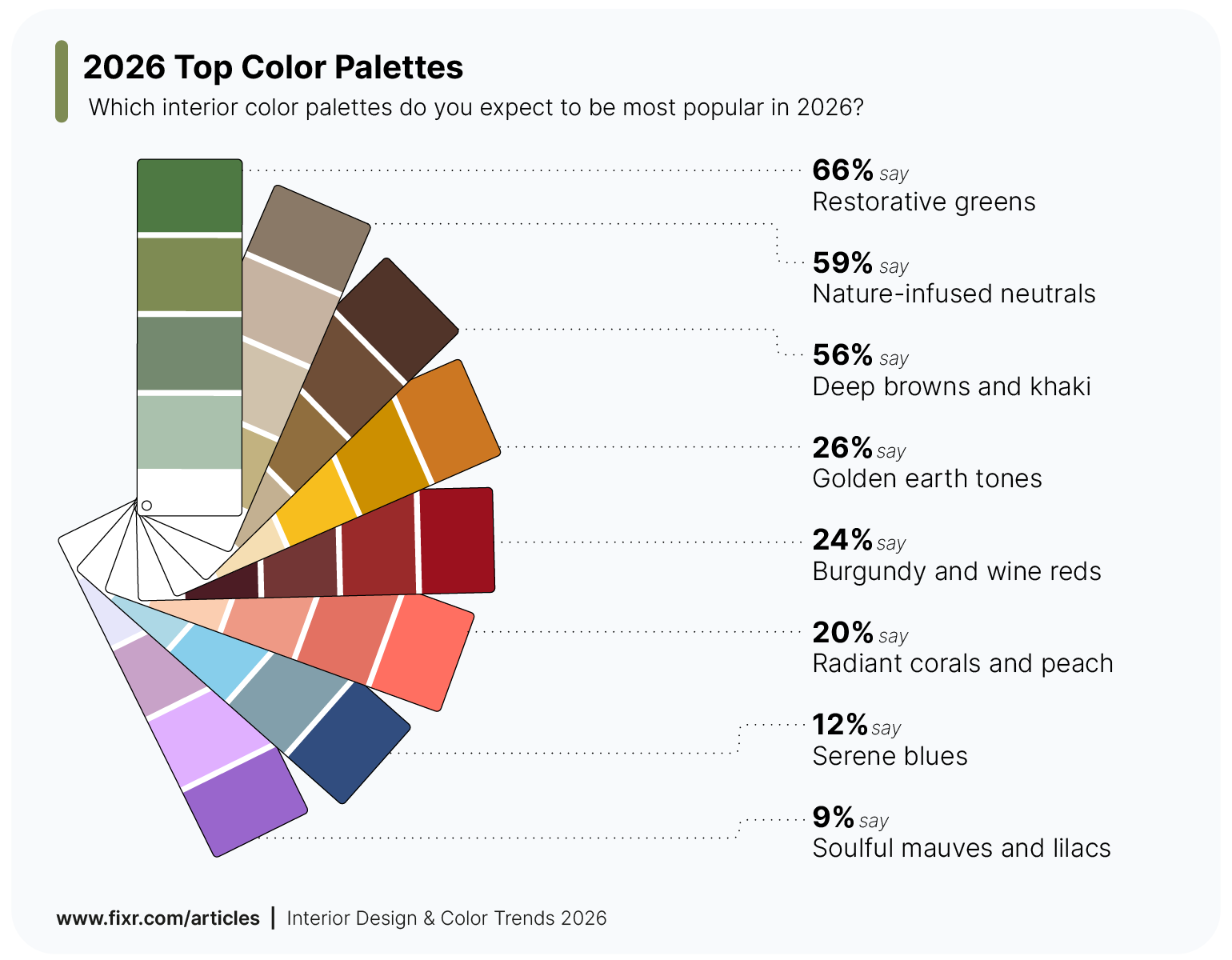
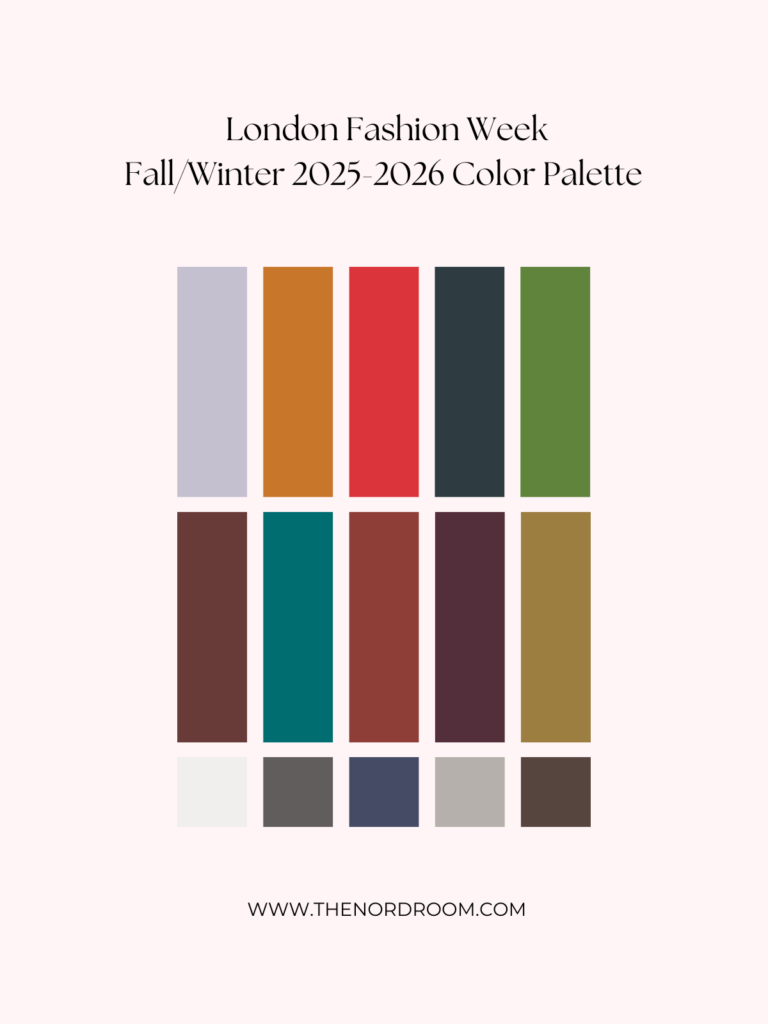
Why are we suddenly craving beige, taupe, and cream? It comes down to cognitive load. When users land on a website, their brains are instantly processing hundreds of visual cues. Bright, saturated colors demand attention. They scream "look at me!" But in 2026, users don’t want to be screamed at. They want to be welcomed. Muted neutrals like soft creams, warm grays, and delicate pastels act as a visual palate cleanser. They reduce eye strain and allow the content to breathe.
Think about the wellness and lifestyle sectors, which have led this charge. Sites in these industries aren’t just selling products; they’re selling a state of mind. By using what some designers call "Cloud Dancer" style neutrals, they create a foundation of tranquility. This approach scales beautifully across devices. Whether you’re on a massive desktop monitor or a small phone screen, these colors remain consistent and soothing. They don’t clash with dark mode either. In fact, they adapt seamlessly, proving that calm is universal.
This shift also reflects a broader cultural move toward mindfulness. People are tired of the digital rat race. They want online interactions to feel less like transactions and more like conversations. Soft neutrals provide the perfect backdrop for this. They step back so the message can step forward. It’s a subtle psychological trick, but it works. When the background is quiet, the user feels more in control. And when users feel in control, they stay longer. They engage more. They trust more.
Gradients Are Back, But They’ve Grown Up
Remember when gradients were everywhere in the early 2010s? Then they vanished, deemed cheesy and outdated. Well, they’re back. But this time, they’re different. The gradients of 2026 aren’t the harsh, linear stripes of the past. They are sophisticated, organic, and often animated. Developers are no longer relying on heavy image assets or flat colors. Instead, they’re using CSS to create fluid, living backgrounds that shift and breathe.
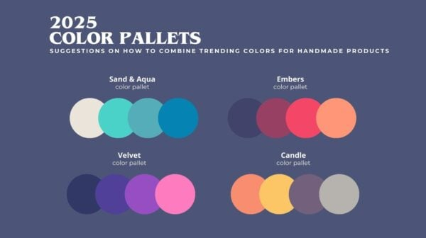
These modern gradients are often described as "cinematic." They evoke emotion rather than just decoration. You might see a subtle shift from a muted lavender to a soft peach, mimicking a sunset. Or perhaps a deep ocean blue fading into a misty teal. These aren’t random choices. They are carefully crafted to guide the user’s eye and create a sense of depth. Mesh gradients, in particular, have become a favorite. They allow for multiple color points to blend together in complex, unpredictable ways, creating a texture that feels almost tangible.
What makes these gradients so effective is their intentionality. As noted by industry experts, the key is using them to enhance the design, not distract from it. A well-placed gradient can highlight a call-to-action button without making it look like a neon sign. It can add warmth to a sterile interface. It can make a static page feel alive. And because they are code-based, they are lightweight and fast. No more waiting for large background images to load. Just smooth, performant color transitions that work on any connection speed.
The Technical Magic Behind the Mood
So, how are designers actually pulling this off? It’s not just about picking nice colors in Photoshop. It’s about leveraging modern web technologies. CSS has evolved tremendously, allowing for complex gradient systems that were impossible just a few years ago. Developers are now using radial gradients, layered blends, and even animated sequences that react to user interaction. This is where the magic happens. The design isn’t just a picture; it’s a program.
One of the biggest advancements is the use of AI-generated gradients. Tools can now analyze a brand’s identity and suggest color combinations that are mathematically harmonious. But it’s not just about automation. It’s about precision. Designers can tweak the opacity, the angle, and the blur radius to get the exact feel they want. This level of control means that every pixel serves a purpose. There’s no waste. No clutter. Just pure, intentional design.
Accessibility is also a huge part of this technical shift. In the past, gradients could make text hard to read. Not anymore. Modern design systems prioritize contrast ratios, ensuring that even the softest neutral backgrounds provide enough distinction for text. Dark mode integration is another critical factor. These gradients are designed to invert gracefully, maintaining their emotional impact whether the user prefers light or dark themes. It’s a holistic approach to color that considers every possible user scenario.
Beyond Aesthetics: Functionality and Performance
It’s easy to think of color as purely decorative, but in 2026, it’s functional. Soft neutrals and gradients play a crucial role in usability. They help establish visual hierarchy. A subtle gradient can draw attention to a primary button without needing a bright red border. A warm neutral background can group related content together, making it easier for users to scan and understand. This is especially important for complex applications like dashboards or e-commerce platforms.
Performance is another key benefit. Heavy images slow down websites. They eat up data and battery life. Gradients, on the other hand, are incredibly lightweight. They are rendered by the browser in real-time, which means they scale perfectly to any screen size. No pixelation. No blurriness. Just crisp, clean color. This is vital for mobile users, who make up the majority of web traffic. A site that loads quickly and looks good on a phone is a site that keeps users engaged.
Moreover, these trends support sustainability. By reducing the need for large image files, websites consume less energy. It’s a small change, but when multiplied across millions of sites, it adds up. Designers are becoming more conscious of their digital carbon footprint. Choosing code over images is a simple way to make the web greener. It’s a win-win: better performance for users and a lighter load on the planet.
Real-World Examples of the Trend in Action
You don’t have to look far to see this trend in action. Take a look at some of the leading fintech apps. They’ve moved away from the cold, corporate blues of the past. Instead, they’re using warm grays and soft greens to make money management feel less stressful. The gradients are subtle, often appearing only when you interact with a chart or a graph. It’s a gentle nudge, not a shove.
Interior design brands are another great example. They’ve always relied on visuals, but now their websites mirror the aesthetics of the homes they sell. Soft taupes, muted browns, and creamy whites dominate. The gradients mimic natural light shifting across a room. It creates an immersive experience that makes you feel like you’re already there. It’s not just browsing; it’s dreaming.
Even tech giants are getting in on the action. Look at the latest updates from major operating systems. The icons, the menus, the backgrounds—they’re all softer. More rounded. More gradient-heavy. It’s a signal that technology is trying to be more human. It’s trying to fit into our lives rather than dominate them. These companies know that if they want users to spend hours in their ecosystems, those ecosystems need to feel comfortable. And comfort, in 2026, looks a lot like a soft neutral palette with a hint of color.
If you’re thinking about updating your own site, where do you start? First, don’t panic. You don’t need to throw out your entire brand identity. Start small. Swap out your stark white backgrounds for a soft off-white or a very light gray. See how it feels. Does it make the text easier to read? Does it reduce the glare? Small changes can have a big impact.
Next, experiment with gradients. But remember the rule: intentionality. Don’t just slap a rainbow on your homepage. Think about the emotion you want to convey. Do you want to feel energetic? Try a subtle shift from yellow to orange. Do you want to feel trustworthy? Try blue to teal. Keep it subtle. The best gradients are the ones you barely notice until they’re gone. Use tools like CSS generators to play with different combinations until you find the right balance.
Finally, test everything. Check your contrast ratios. Make sure your text is readable on both light and dark modes. Ask real people what they think. Do they feel calmer? Do they find the site easier to navigate? Feedback is crucial. Design is not just about what looks good to you; it’s about what works for your users. And in 2026, what works is kindness. Kindness in color, kindness in layout, and kindness in experience.
The dominance of soft neutrals and gradients in 2026 isn’t just a fleeting fashion statement. It’s a reflection of where we are as a society. We’re tired of noise. We’re tired of aggression. We want digital spaces that respect our time and our mental health. By embracing these trends, designers are creating a web that is not only beautiful but also humane. It’s a web that invites us in, rather than pushing us away.
So, the next time you visit a website and feel a sense of calm, take a moment to appreciate the design. Notice the soft tones. Notice the gentle shifts in color. It’s not an accident. It’s a choice. A choice to make the internet a better, more welcoming place for everyone. And honestly? That’s a trend worth sticking around for.