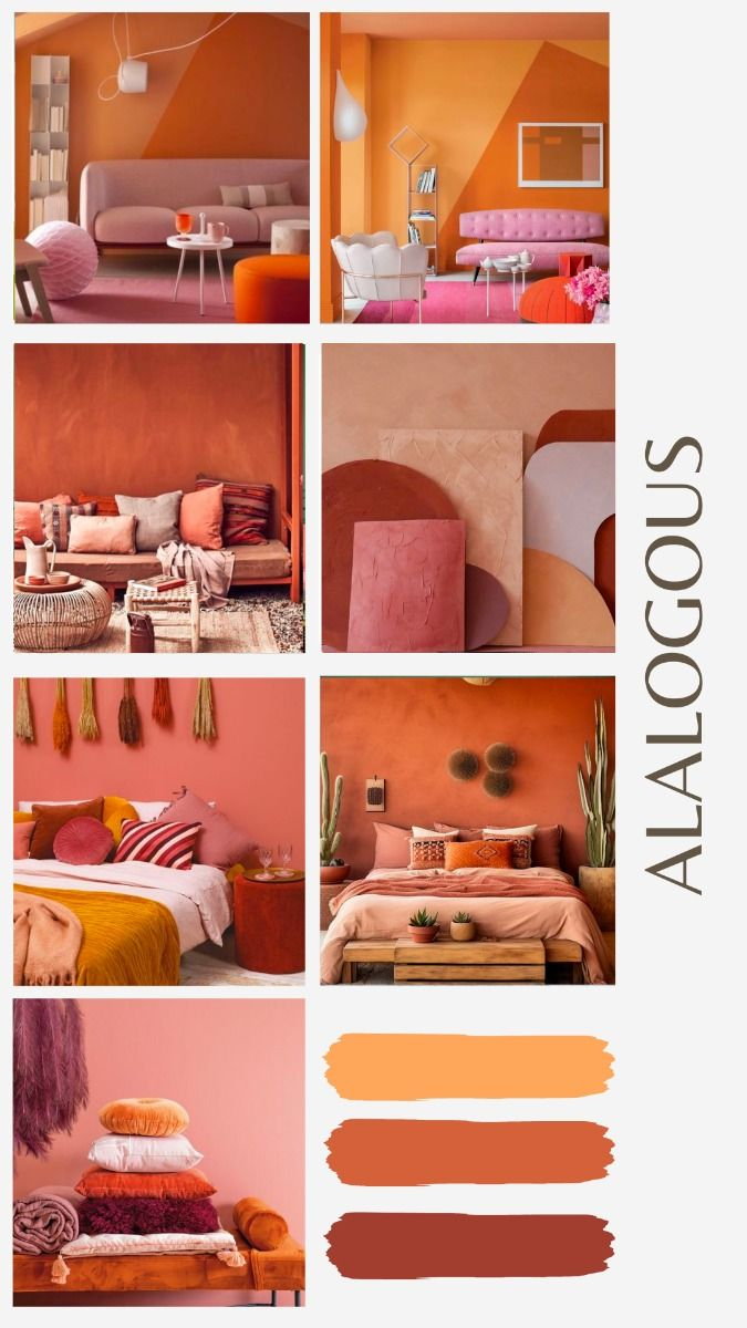
Ever walked into a room and immediately felt a wave of peace wash over you. It is not magic; it is usually just clever color theory at work. Lately, people are moving away from stark, cold minimalist whites and embracing something much warmer. In 2026, the biggest design trend is all about creating a seamless flow using colors that actually sit right next to each other on the color wheel.
This approach, known formally as an analogous color scheme, is making a massive comeback in modern interior design. It feels incredibly intentional yet completely effortless. Let us dive into how you can use these neighboring shades to make your own home feel cozy, connected, and deeply personal.
Understanding the Neighbors on the Color Wheel
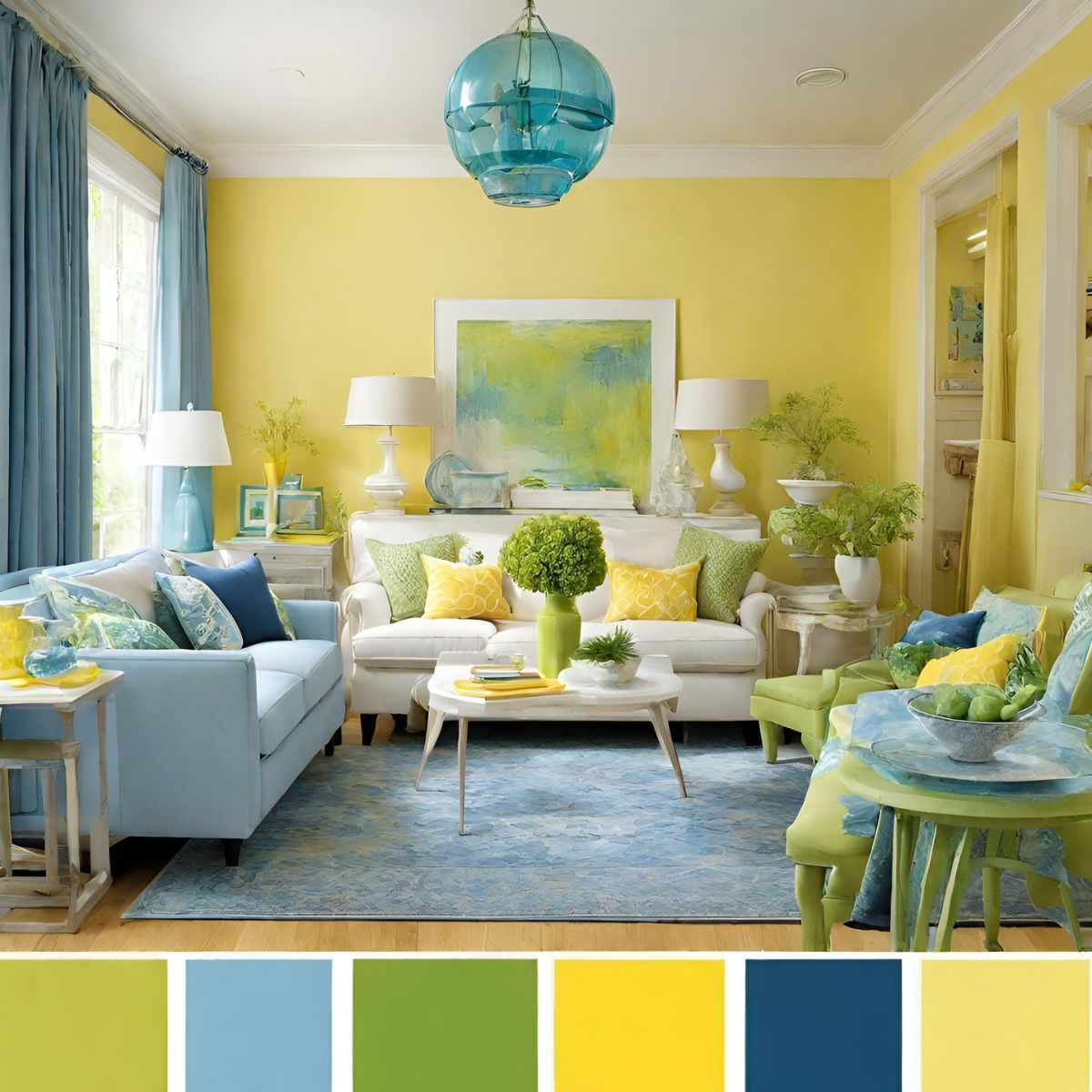
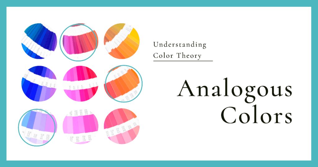
To get started, we need to look at the color wheel. Think of it like a big neighborhood. Analogous colors are the houses right next door to each other. For instance, if you pick blue, its closest neighbors are green and violet. When you use these three together in a room, your eyes naturally glide from one surface to another without any harsh interruptions.
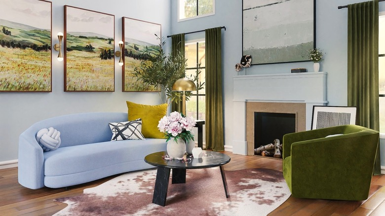
Designers love this technique because it mimics nature. Think about a sunset with its layers of red, orange, and yellow, or a dense forest filled with shades of green, teal, and soft yellow-green. Because our brains are already used to seeing these blendings in the outdoors, bringing them inside feels instantly soothing. It creates a space where you can actually breathe easy.
Picking Your Main Character and the Supporting Cast
A common mistake when decorating with adjacent shades is trying to give every color the exact same amount of spotlight. If you put equal amounts of bright blue, teal, and green in a bedroom, they will start fighting for your attention. Instead, you want to choose one dominant color to do most of the heavy lifting.
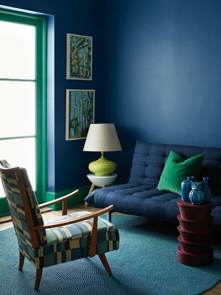
Let’s say you choose a deep, moody teal for your walls. That is your main character. Next, you bring in a softer sage green for your curtains or a large area rug. Finally, you accent the room with small pops of a crisp sky blue through throw pillows or artwork. This creates a beautiful hierarchy where every shade knows its place, keeping the vibe calm instead of chaotic.
Playing with Texture to Keep Things Interesting
When you are working with colors that are very close to each other, there is a tiny risk of the room looking a bit flat. The secret weapon to fix this is texture. By mixing up the surfaces in your room, the same color can look completely different depending on how the light hits it.
- Pair a smooth velvet sofa with a chunky knit blanket in a slightly different shade.
- Use matte paint on the walls and bring in shiny ceramic vases or glass light fixtures.
- Introduce natural wood tones and woven baskets to add depth and warmth.
These subtle shifts in material break up the visual weight of the room. It keeps your eyes moving around the space, discovering new little details without needing loud, contrasting colors to draw attention.
Real Rooms Doing It Right
Let’s look at how this plays out in real life. In a modern living room setup we saw recently, the designer used a beautiful palette of warm terracotta, soft peach, and a muted dusty rose. The walls were painted a very light peach, which made the room feel bright and airy. Then, they anchored the space with a rich terracotta velvet sectional couch.
To tie it all together, the smaller decorations—like the rug and window curtains—featured hints of dusty rose and natural wood tones. The result was a space that felt incredibly warm and welcoming, like a constant warm hug. It proved that you don’t need bright white walls to make a modern space feel clean and contemporary.
Finding the Balance in Bright Spaces
If you prefer brighter, cooler spaces, you can easily apply this trick to the cooler side of the color wheel. A popular blend right now involves mixing deep navy blue, vibrant slate, and soft seafoam green. This palette works wonders in home offices or bedrooms where you want to promote focus and tranquility.
The trick here is to ensure you have enough light, either natural or from warm lamps, so the cool tones don’t end up feeling chilly or gloomy. You can balance the cool shades by introducing warm metallic accents like brushed gold or brass hardware on your cabinets and light fixtures. This adds a dash of elegance while keeping the seamless color flow intact.
Ready to try this in your own home. Start small. You do not have to repaint your entire house this weekend to test out this look. Pick a small corner of your home, like a reading nook or an entryway, and experiment with three neighboring colors using things you might already own or small decor pieces.
- Start with a favorite piece of art or a patterned pillow that already has adjacent colors in it.
- Use the 60-30-10 rule: 60% dominant color, 30% secondary shade, and 10% accent hue.
- Don’t forget to look at the space under different lighting, as colors change drastically from morning light to evening lamplight.
Decorating your home should be a fun process, not a stressful chore. By leaning into the natural harmony of adjacent hues, you remove a lot of the guesswork out of matching colors. It allows you to create a beautiful, cohesive environment that feels uniquely yours, proving that sometimes, the best design answers are right next door.