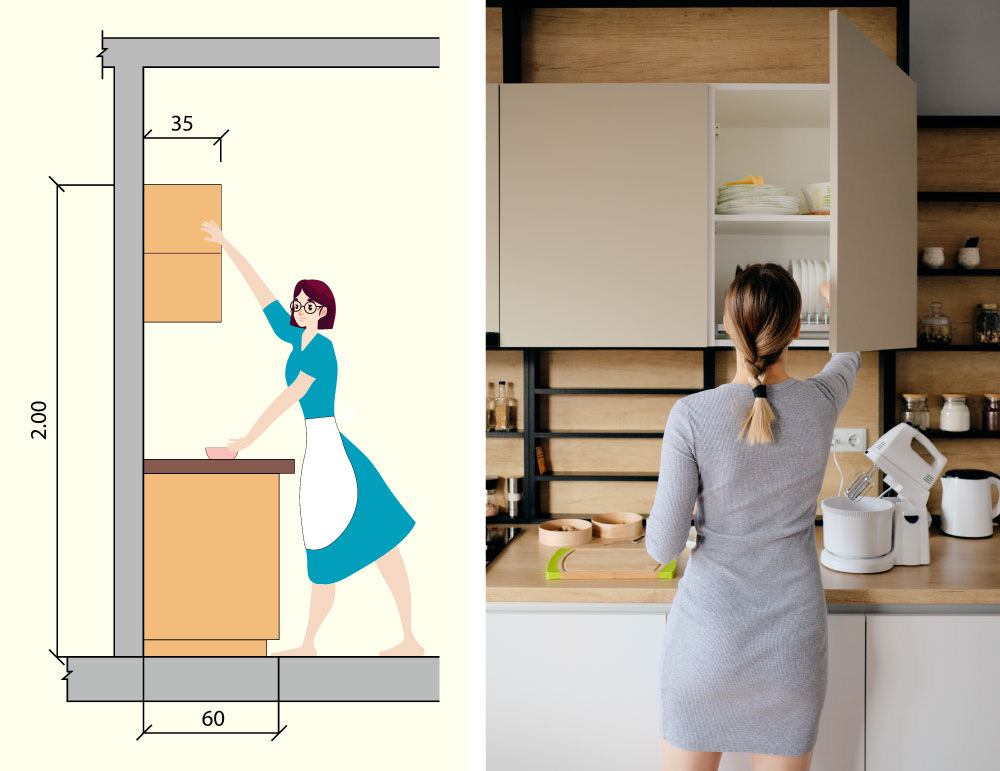
Ever walked into a kitchen and felt like it was fighting you? Maybe the cabinets were just out of reach, or the floor was slicker than ice, or you had to twist your body into a pretzel just to grab a pot from the back of a deep cupboard. We’ve all been there. It’s frustrating, sure, but it’s also a sign that the space wasn’t built with everyone in mind. For decades, home design followed a rigid set of rules that assumed every user was five-foot-nine, able-bodied, and possessed perfect vision. But life isn’t like that. People come in all shapes, sizes, and stages of mobility.
That’s where universal design steps in. It’s not just a buzzword for architects or a special accommodation for someone with a disability. It’s a philosophy that says our living spaces should work for us, not the other way around. In 2026, this approach is finally moving from niche luxury to standard expectation. Why? Because it makes sense. A kitchen that is easy for a grandparent to navigate is also easier for a parent carrying a toddler. A countertop that adjusts for a wheelchair user is also perfect for a teenager baking their first cake. It’s about creating a hub that welcomes everyone, without compromise.
Think about the last time you hosted a dinner party. Did you worry about your uncle with the knee replacement navigating the island? Or maybe you noticed your young niece struggling to see what was on her plate because the lighting was too dim. These aren’t isolated incidents; they are design failures. Universal design fixes these glitches before they happen. It’s proactive, not reactive. It builds empathy into the drywall and the cabinetry. And the best part? You don’t have to sacrifice style for function. In fact, some of the sleekest, most modern kitchens today are universal by default, proving that accessibility can be beautiful.
Rethinking the Layout: Space to Breathe and Move
The first thing you notice in a universally designed kitchen is the space. Not just square footage, but usable space. Standard codes often dictate minimum aisle widths, but universal design pushes those boundaries. We’re talking about walkways that are at least 42 inches wide, though 48 inches is even better. Why does this matter? Imagine trying to pass someone while holding a hot casserole dish. Or maneuvering a wheelchair or a walker through a tight squeeze. Wide aisles reduce stress and prevent accidents. They allow multiple people to cook together without bumping hips or elbows. It creates a flow that feels natural, almost effortless.
Then there’s the turning radius. If you’ve ever tried to turn a shopping cart around in a cramped grocery store aisle, you know the feeling of being stuck. In a kitchen, we want a clear 5-foot circle somewhere in the room. This isn’t just for wheelchairs; it’s for anyone who needs room to pivot. Maybe you’re using crutches. Maybe you’re just carrying a heavy load of groceries and need to set them down without tripping. This open space acts as a buffer zone, a breathing room in the heart of the home. It changes the energy of the room from chaotic to calm.
Let’s not forget the floor plan itself. The classic "work triangle" between the sink, stove, and fridge is still relevant, but it’s evolving. In 2026, designers are looking at "work zones" instead. A prep zone, a cooking zone, a cleaning zone. Each zone has its own counter space and storage nearby. This minimizes the distance you have to travel with heavy or hot items. It’s efficient for a professional chef, and it’s a lifesaver for someone with limited stamina. By organizing the layout around tasks rather than just appliances, we create a kitchen that supports the way people actually live and cook.
Countertops and Surfaces: Height Matters More Than You Think
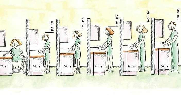
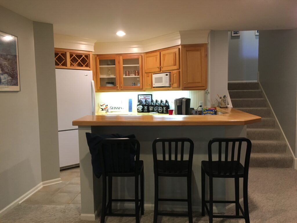
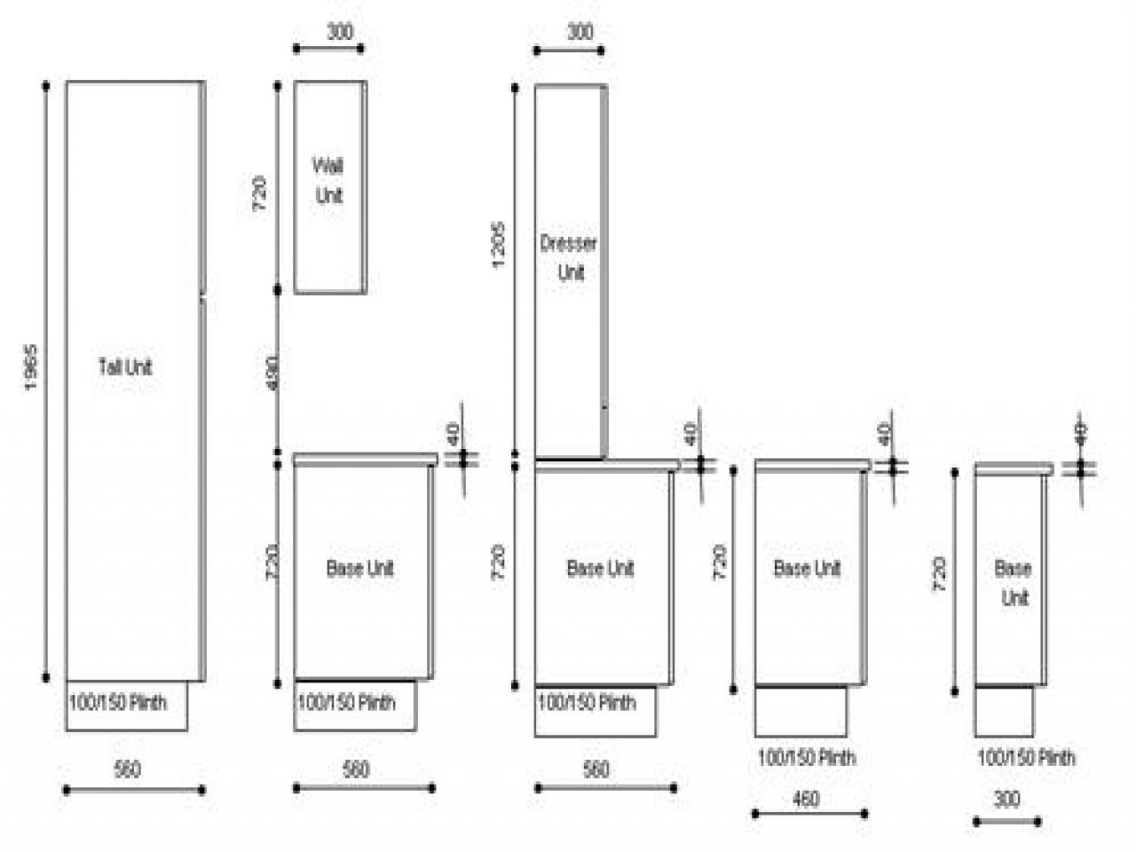
One size definitely does not fit all when it comes to countertops. The standard 36-inch height is a relic of the past. For a tall person, it’s too low, causing back strain. For a shorter person or someone seated, it’s way too high, forcing uncomfortable shoulder elevation. Universal design embraces variation. We’re seeing more kitchens with multi-level counters. A section at 30 inches for seated work or for kids helping out. A main section at 36 inches for standard tasks. And maybe a raised bar at 42 inches for eating or quick prep. This tiered approach ensures that everyone can find a comfortable spot to work.
Adjustable countertops are also gaining traction. Thanks to advances in motorized lifts and manual crank systems, you can now change the height of your workspace with the push of a button. It sounds futuristic, but it’s becoming more affordable and reliable. Imagine lowering the counter to chop vegetables while sitting down, then raising it to knead dough while standing. It’s adaptable. It respects the body’s changing needs throughout the day and over a lifetime. Plus, it’s a great feature for resale value, as buyers increasingly look for homes that can age with them.
The surface material matters too. We need edges that are forgiving. Sharp, square corners are a hazard. Rounded or bullnose edges reduce the risk of injury if you bump into them. They’re softer to the touch and easier to clean. And let’s talk about glare. High-gloss finishes might look shiny in a showroom, but they create eye strain under bright lights. Matte or satin finishes are easier on the eyes and hide fingerprints better. It’s these small details—the height, the edge, the finish—that add up to a surface that invites you to use it, rather than warning you away.
Storage Solutions: Out of Sight, But Never Out of Reach
Opening a cabinet and staring into a dark abyss is a universal frustration. You know the item is in there somewhere, but finding it requires a contortionist act. Universal design tackles this with smart storage solutions. Pull-out shelves and drawers are non-negotiable. They bring the contents to you, eliminating the need to crawl on the floor or stretch onto tiptoes. Full-extension slides ensure you can access everything, even the stuff in the very back. It’s simple mechanics, but it changes the game. No more lost spices or forgotten pots.
Lazy Susans and corner carousels are another hero feature. Corner cabinets are notoriously difficult to use. By installing a rotating shelf, you turn dead space into prime real estate. You can spin it around and grab what you need with ease. This is helpful for everyone, but especially for those with limited range of motion. It reduces twisting and reaching, which protects the shoulders and back. And let’s be honest, it’s just satisfying to watch things spin into place.
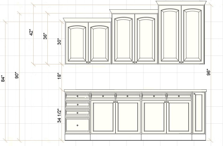
Placement is key. Heavy items should be stored between knee and shoulder height. This is the "power zone" where lifting is easiest and safest. Lighter, less frequently used items can go higher or lower. Drawers are generally better than doors for base cabinets because you can see everything at once. You don’t have to dig. Transparency is the goal. Some designers are even using glass-front upper cabinets with internal lighting, so you can see your dishes without opening the door. It reduces clutter visual noise and makes finding that specific mug a breeze.
Lighting and Visibility: Seeing Clearly Without Glare
Lighting is often an afterthought, but in a universal design kitchen, it’s a priority. We need layers of light. Ambient light for general illumination. Task light for specific jobs like chopping or reading recipes. And accent light to highlight features or create mood. The goal is even distribution. Shadows are the enemy. They hide spills, obscure knife blades, and cause eye strain. By placing lights under cabinets, inside pantries, and above islands, we eliminate dark spots. It makes the space feel larger and safer.
Color temperature matters too. In 2026, we know that cool, blue-white light can be harsh and clinical. Warm white or neutral light (around 3000K to 3500K) is more flattering and easier on the eyes. It helps distinguish colors accurately, which is crucial when checking if meat is cooked or if vegetables are fresh. Dimmers are essential. They allow you to adjust the brightness based on the time of day or the task. Bright light for cleaning, soft light for evening wine. Control gives comfort.
Contrast is another subtle but powerful tool. People with low vision rely on contrast to navigate. A countertop that contrasts with the cabinets helps define the edge. A faucet that stands out against the sink makes it easier to locate. Even the color of the floor versus the walls can help with orientation. It’s not about making the kitchen look like a hospital; it’s about using color strategically to guide the eye and the hand. These choices make the environment intuitive, reducing the cognitive load of simply existing in the space.
Safety and Flooring: Slip-Resistant and Supportive
The floor is the foundation of safety. Slip-resistant flooring is a must. Glossy tiles might look elegant, but they become ice rinks when wet. Textured tiles, vinyl, cork, or rubber offer better traction. They provide grip even when spilled water or oil is present. This prevents falls, which are a leading cause of home injuries, especially for older adults. But traction isn’t the only factor. The floor needs to be firm enough to support wheels and walkers, yet slightly cushioned to reduce fatigue for people standing for long periods. It’s a balancing act between stability and comfort.
Transitions between rooms should be seamless. Thresholds and lips are tripping hazards. We want flush transitions from the kitchen to the dining room or hallway. If there must be a change in level, it should be gradual, like a ramp, not a step. This allows for smooth movement for wheelchairs, strollers, and anyone who might stumble. It also makes cleaning easier, as there are no cracks for dirt to hide in. A continuous floor surface creates a sense of unity and flow throughout the home.
Appliance safety features are also part of the equation. Induction cooktops are cooler to the touch than gas or electric coils, reducing burn risks. They also shut off automatically when no pot is detected. Ovens with side-opening doors or wall-mounted units eliminate the need to bend over to pull out heavy roasts. Refrigerators with French doors allow access to both fresh and frozen foods without bending or stretching excessively. These appliances aren’t just convenient; they are protective. They anticipate potential dangers and mitigate them.
At its core, universal design is about dignity. It’s about allowing people to do things for themselves. To cook a meal without asking for help. To get a glass of water without struggle. To host friends without anxiety. When a space works well, it fades into the background. You don’t notice the wide aisles or the pull-out shelves; you just enjoy the experience of being there. It removes barriers, both physical and psychological. It says, "You belong here."
This approach also fosters independence. For aging adults, it means staying in their own homes longer. For parents, it means involving kids in cooking safely. For people with disabilities, it means participating fully in family life. It breaks down the stigma of "accessible" design by making it invisible. It’s not a special wing of the house; it’s just the house. And that normalization is powerful. It teaches us that diversity in ability is normal, and our environments should reflect that reality.
In 2026, we’re seeing a shift in how we value our homes. It’s not just about aesthetics or resale price. It’s about livability. A universally designed kitchen is a resilient kitchen. It adapts to life’s changes. It welcomes new family members. It supports us through injuries and aging. It’s a space that cares for us. And isn’t that what a home should be? A place that makes life a little bit easier, a little bit safer, and a lot more joyful. So, whether you’re remodeling now or just dreaming for the future, remember: design for everyone. Because eventually, everyone includes you.