Remember when every house on the block looked like it was painted in the same shade of sterile, office-park gray? Yeah, those days are long gone. We’ve all been there, staring at a swatch that looked perfect in the store but turned our living room into a dentist’s waiting area once the sun went down. It’s a common mistake, but luckily, design trends have shifted dramatically. In 2026, we aren’t just picking colors; we’re curating feelings. And right now, the feeling everyone is chasing is warmth without the dated vibe of old-school beige.
The shift away from cool, flat interiors has been building for a few years, but it hit its stride recently. People are tired of spaces that feel cold or impersonal. They want homes that hug them back. This is where warm grays come in. They sit in this magical sweet spot—sophisticated enough to feel modern, but earthy enough to feel grounded. It’s not about abandoning neutrality; it’s about giving it a pulse. If you’ve been hesitant to jump on the bandwagon because you’re afraid of your walls looking muddy or dull, don’t worry. We’re going to break down exactly how to get this look right, why it matters, and which shades actually work in real life.
The Great Gray Rebellion
Let’s be honest for a second. For a long time, gray was the king of interior design. It was safe. It matched everything. But somewhere along the line, it lost its soul. By the mid-2020s, designers and homeowners alike started noticing that cool grays, while sleek, often felt a bit… empty. They lacked the emotional resonance that makes a house feel like a home. This wasn’t just a fleeting trend; it was a reaction to a world that felt increasingly chaotic. People wanted sanctuaries, not showrooms.
Enter the warm gray. Or as some folks call it, "greige" (a mix of gray and beige), though that term feels a bit played out now. These new neutrals have undertones of brown, taupe, or even a hint of green. They don’t shout for attention, but they whisper comfort. According to recent industry reports, warm browns, soft greys, and creamy whites are being used to create layered, textured spaces that feel both elegant and comforting. It’s a subtle drama. It’s understated yet profoundly engaging. This isn’t about painting over the past; it’s about evolving it. We’re keeping the sophistication of gray but injecting it with the hospitality of beige.
Why does this matter? Because color affects mood. Cool tones can be calming, sure, but they can also feel distant. Warm tones foster relaxation and comfort. They make a space feel grounded. When you walk into a room painted in a warm, mushroom-toned gray, your shoulders drop. You breathe easier. It’s a psychological shift as much as an aesthetic one. In 2026, this is the design language of contemporary real estate. It transforms how we perceive home as a modern refuge. It’s no longer just about what looks good in a photo; it’s about how it feels to live there every single day.
Decoding Undertones: The Devil is in the Details
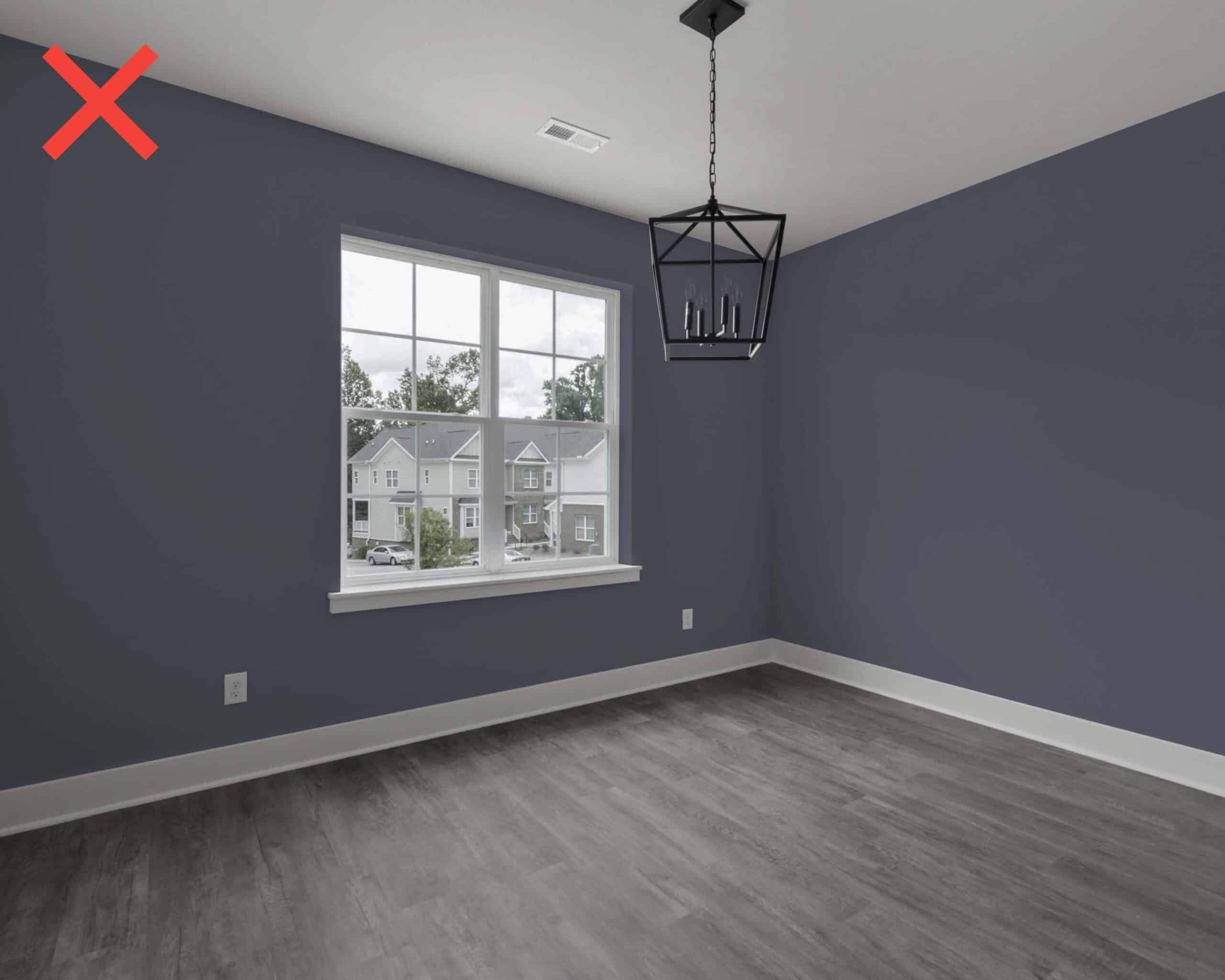
Here is the tricky part, and where most people mess up. Not all grays are created equal. In fact, most grays you see in big-box stores are cool-toned. They have blue or purple undertones. If you put those on your wall, especially in a room with north-facing light, you’re going to end up with a space that feels icy. The key to mastering warm gray is understanding undertones. You need a gray that leans into the earth. Think of it like coffee. A cool gray is black coffee served in a steel mug. A warm gray is a latte with a dash of cinnamon in a ceramic cup. Same base, totally different vibe.
Mushroom and stone tones are leading the charge here. These mid-tone neutrals draw directly from nature. Mushroom tones range from pale oyster to deep porcini. They have a organic quality that feels timeless. Stone tones are a bit more mineral, but still warm. They remind you of river rocks warmed by the sun. When you’re shopping for paint, don’t just look at the name. Look at the strip. Hold it up against a piece of white paper. Does it look pinkish? Brownish? Greenish? If it looks blue or stark white, put it back. You want those earthy hints.
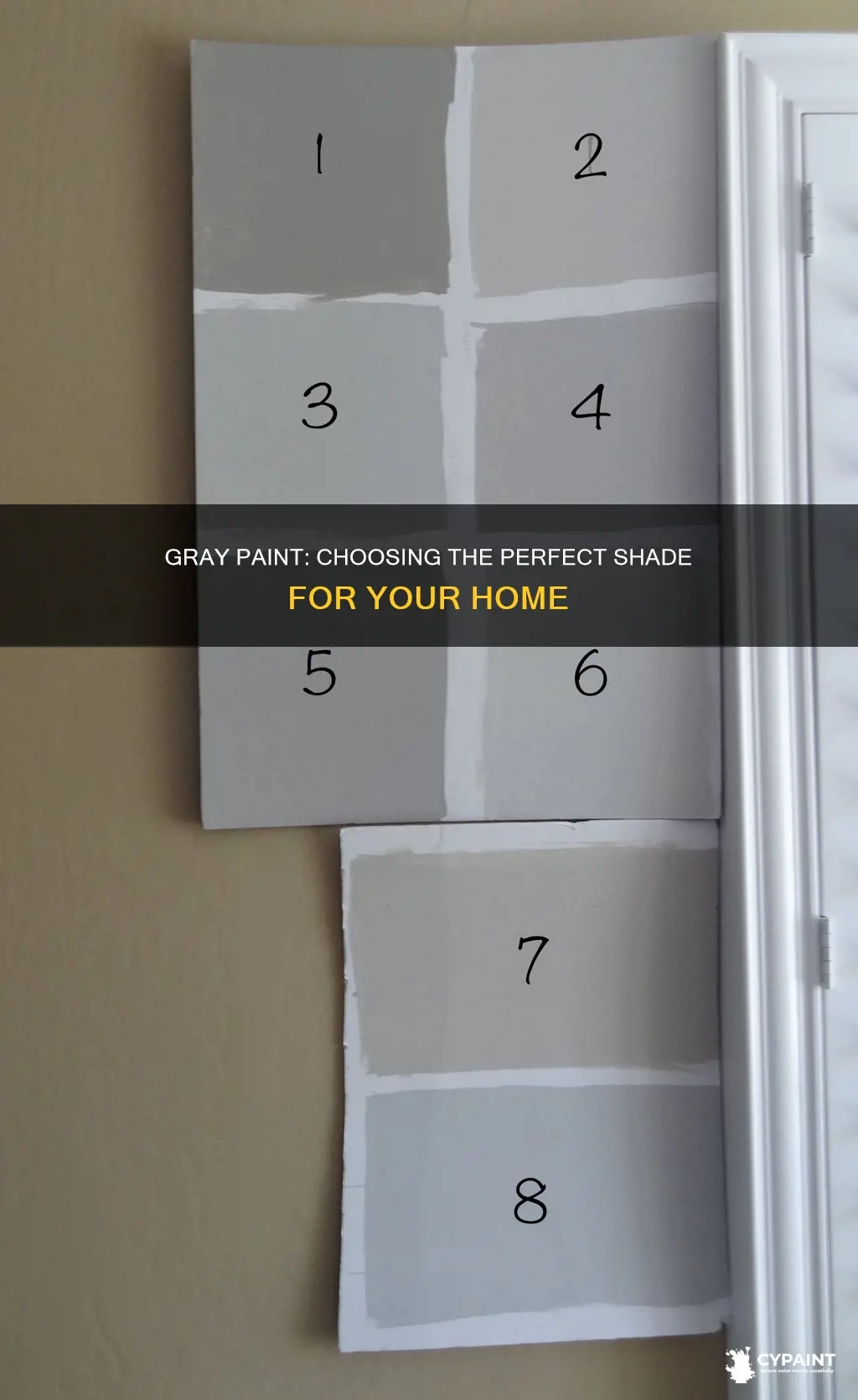
Testing is non-negotiable. Seriously, do not skip this step. Many grays that look warm in small samples reveal cool undertones once they’re on the wall. The surface area changes how light hits the pigment. Paint a large poster board or a section of your wall. Watch it throughout the day. Morning light is different from afternoon light, which is different from evening lamp light. A good warm gray will shift slightly but stay cozy. A bad one will turn slate-blue by dusk. Take your time with this. It’s better to spend a week testing than a year regretting.
Lighting: The Invisible Paint Color
You can pick the perfect warm gray, but if your lighting is wrong, it won’t matter. Lighting is the invisible paint color. It can make a warm tone look cold or a cold tone look warm. Natural light is the biggest variable. South-facing rooms get warm, golden light all day. In these spaces, you can go with a slightly cooler warm gray because the sun will balance it out. North-facing rooms get cool, bluish light. Here, you need a gray with strong beige or brown undertones to counteract the chill. If you ignore this, your carefully chosen "warm" gray will look like a hospital corridor.
Artificial lighting plays a huge role too. LED bulbs come in different color temperatures, measured in Kelvins. A 3000K bulb is warm white, while a 5000K bulb is daylight. If you use cool daylight bulbs in a room with warm gray walls, you’re fighting yourself. The light will wash out the warmth. Stick to 2700K to 3000K bulbs for living spaces. This enhances the cozy undertones of the paint. It’s a simple fix, but it makes a massive difference. Don’t let expensive paint go to waste because you bought the wrong lightbulbs.
Also, consider the time of day you use the room most. If you’re mostly in the living room at night, test your paint samples under your actual lamps. See how the fabric of your sofa interacts with the wall color. Does the brass lamp look good against it? Does the wood floor pop? These interactions matter. Warm grays are chameleons. They reflect their surroundings. Use this to your advantage. Let the light and your decor work together to create a dynamic, living space that changes with the rhythm of your day.
Pairing with Texture and Materials
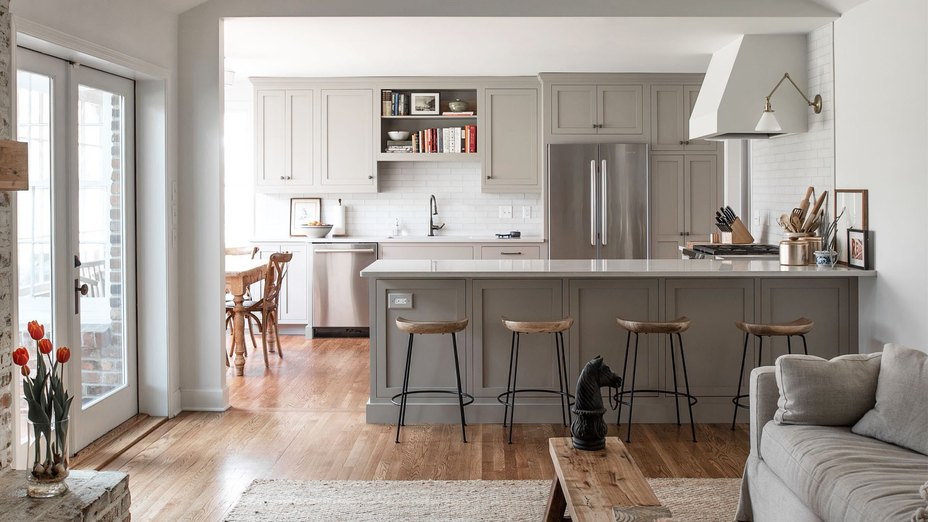
Color doesn’t exist in a vacuum. It lives alongside furniture, floors, and fabrics. One of the best things about warm grays is how well they play with natural materials. Wood is your best friend here. Whether it’s light oak or dark walnut, the grain adds visual interest that keeps the neutral walls from feeling flat. Brass and gold accents also shine against warm grays. They pick up the subtle yellow or brown undertones in the paint, creating a harmonious glow. Avoid chrome or silver if you want to keep the vibe cozy; they can feel too sharp and industrial.
Textiles are another layer of warmth. Think linen, wool, and cotton. A chunky knit throw in a cream or camel color looks incredible against a mushroom-gray wall. It adds tactile depth. Rugs with natural fibers like jute or sisal ground the space. They bring in that earthy element that complements the paint. The goal is layering. You don’t want everything to be the same shade. You want contrast in texture, even if the colors are similar. This creates a rich, inviting atmosphere that feels curated, not catalog-bought.
Plants are the final touch. Greenery pops beautifully against warm neutrals. The organic shapes of leaves break up the straight lines of walls and furniture. Plus, the green connects back to the natural origins of these paint colors. It reminds us that these tones come from the earth. Don’t be afraid to mix metals and woods either. A mix of matte black, brass, and wood tones adds character. It keeps the space feeling lived-in and personal. Warm grays provide the perfect backdrop for this eclectic mix. They don’t compete; they support.
Top Shades Leading the Trend in 2026
So, what should you actually buy? While brands change names constantly, the profiles remain consistent. Look for shades described as "taupe," "mushroom," "stone," or "warm charcoal." Benjamin Moore’s latest trends highlight shades like Silhouette, a deep, warm charcoal that offers the moodiness of gray but with a sophisticated, chocolatey undertone. It feels lived-in rather than industrial. This is perfect for a dining room or a study where you want a bit of drama without the darkness of pure black.
For lighter options, look for soft sandy shades and pleasing beige hues. Designers are loving paints that hover right on the edge of gray and beige. These are versatile colors that work well in a lot of spaces. Some popular choices include tones that mimic wet sand or dried clay. They bring a sense of timelessness and coziness. If you’re worried about it looking too beige, remember that lighting will pull out the gray. In shadow, it reads gray. In light, it reads warm. It’s a dynamic duo.
Don’t forget the deeper ends of the spectrum. Walnut brown and soft caramel are making waves as accent walls or even full-room colors in smaller spaces like powder rooms. These earth tones foster relaxation. They are bold but not loud. They anchor a room. If you’re feeling brave, try a deep, warm gray in a bedroom. It can be incredibly restful. Just make sure you have enough light sources to keep it from feeling cave-like. The key is balance. Pair dark walls with light bedding and airy curtains. It creates a cocoon effect that is hard to beat.
Transitioning to warm grays doesn’t mean you have to redo your entire house overnight. Start small. Pick one room that gets good light. Maybe the living room or the primary bedroom. Test three different shades. Live with them for a few days. See how they make you feel. Do you feel calm? Energized? Sluggish? Your reaction is the best data point. Once you find the winner, commit. Paint the trim a crisp, warm white to frame the space. This keeps it looking fresh and modern.
If you’re renting or just not ready to paint, you can still embrace the vibe. Swap out cool-toned decor for warmer pieces. Add a rug with beige and gray tones. Change your pillow covers to linen in oatmeal or taupe. Bring in wooden baskets or trays. These small changes shift the temperature of the room. They soften the existing walls. It’s a low-risk way to see if you like the aesthetic. Often, you’ll find that the decor alone makes the space feel completely different.
Remember, design is personal. There are no strict rules, only guidelines. If you love a certain shade of gray that others say is too cool, but it makes you happy, keep it. But if you’re feeling that your home lacks warmth, give these tones a try. They are forgiving. They are flexible. And in 2026, they are everywhere for a reason. They work. They create spaces that are not just beautiful, but breathable. They invite you to stay awhile. And isn’t that what a home is supposed to do?
Wrapping this up, the move toward warm grays is more than a trend; it’s a return to comfort. We’ve spent years chasing the ultra-modern, the sleek, and the cool. Now, we’re realizing that home should feel like a hug. Warm grays offer that balance of style and substance. They are sophisticated enough for a dinner party but cozy enough for a Sunday nap. By paying attention to undertones, lighting, and textures, you can create a space that feels uniquely yours. So grab a sample pot, head to the store, and start exploring. Your walls are waiting to tell a warmer story.