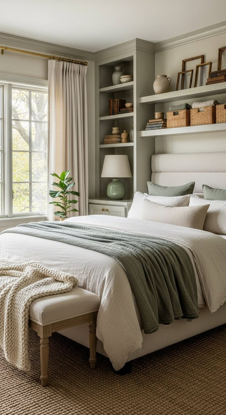
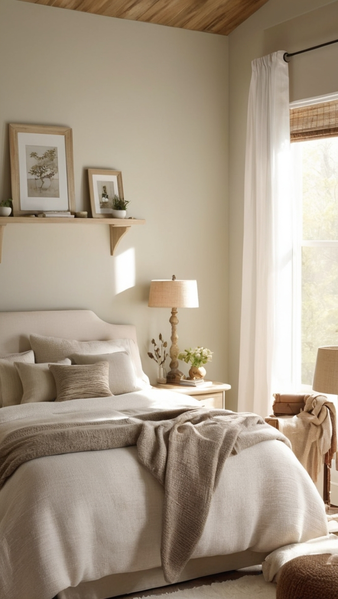
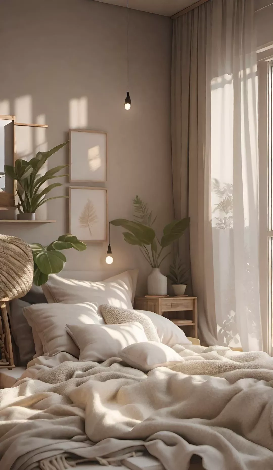
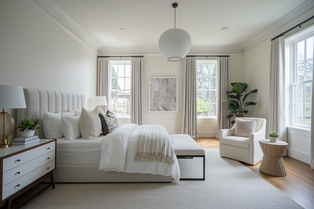
Ever walked into a room and just felt your shoulders drop? That instant exhale. It’s not magic, though it feels like it. It’s usually the result of intentional design choices, specifically around light and color. We spend so much time curating our digital lives, but our physical spaces often get left on autopilot. Yet, the walls surrounding us and the light filtering through our windows have a profound impact on our mood, stress levels, and overall well-being. Creating a calm, restorative home isn’t about following strict rules or buying the most expensive furniture. It starts with the basics: soft neutrals and thoughtfully selected window treatments.
In 2026, the trend toward "neutral sanctuaries" has moved beyond just being an aesthetic choice; it’s become a lifestyle necessity. People are craving clarity and tranquility in their daily lives, and the home is the primary place to find it. But here’s the thing—neutral doesn’t mean boring. It doesn’t mean sterile white boxes that feel like a hospital waiting room. True neutrality is warm, layered, and deeply comforting. It’s about understanding how creamy whites, gentle taupes, and muted grays interact with natural light. And perhaps most importantly, it’s about choosing the right shades to frame that light. Whether you’re dealing with harsh afternoon sun or dim morning glow, the right window coverings can instantly transform a space. Let’s dive into how you can make these choices with confidence, turning your home into the peaceful retreat it was always meant to be.
Understanding the Power of Soft Neutrals
Neutral tones are timeless for a reason. They create spaces that feel serene, balanced, and effortlessly elegant. But before you rush out to buy paint, you need to understand that "neutral" is a broad category. It includes everything from crisp whites and soft beiges to muted grays and even gentle greens. The key is in the undertones. A cool gray might look sleek and modern, but in a north-facing room with little natural light, it can feel cold and unwelcoming. On the other hand, a warm taupe or creamy white can add a sense of coziness and brightness, making a space feel larger and more inviting. This is why selecting your base neutral is the first critical step. You want to choose one or two calming neutrals as your foundation. Think of them as the canvas upon which the rest of your room will be painted.
When we talk about creating harmony, neutral tones are perfect for fostering a sense of peace and balance. They give a space an organized, peaceful flow that allows the eye to rest. In 2026, designers are seeing a shift away from stark, high-contrast looks toward softer, more blended palettes. This approach reduces visual clutter, which in turn reduces mental clutter. Imagine walking into a bedroom where the walls are a soft, warm beige and the trim is a slightly lighter cream. There’s no jarring contrast, just a gentle transition that signals to your brain that it’s time to relax. This subtle interplay of colors is what turns a house into a sanctuary. It’s not about hiding personality; it’s about creating a backdrop that supports it. By keeping the large surfaces neutral, you allow your favorite art, textiles, and personal items to shine without competing for attention.
Warm vs. Cool: Finding Your Temperature
One of the first decisions you’ll need to make when decorating with neutral tones is whether to lean warm or cool. This choice largely depends on two factors: the existing elements in your room (like flooring and fixed cabinetry) and the direction your windows face. Warm neutrals include shades like beige, tan, cream, and warm grays with hints of brown or yellow. These colors reflect light in a way that feels golden and inviting. They work beautifully in spaces where you want to encourage conversation and comfort, like living rooms and dining areas. If your home has hardwood floors with reddish or honey tones, warm neutrals will complement them perfectly, creating a cohesive and grounded feel.
Cool neutrals, on the other hand, include crisp whites, pure grays, and tones with blue or green undertones. These shades tend to feel more airy, clean, and modern. They are excellent for spaces where you want to promote focus and clarity, such as home offices or bathrooms. If you have a south-facing room that gets abundant, hot sunlight, cool neutrals can help balance that intensity, making the space feel fresher. However, be cautious. Too much cool tone in a dark room can feel dreary. The trick is to test your samples. Paint a large swatch on different walls and observe it at various times of day. Does it look pink in the evening? Does it look blue in the morning? Understanding how light affects the color is crucial. By carefully choosing shades that complement your specific lighting conditions, you achieve a harmonious look that enhances the overall ambiance of your home, rather than fighting against it.
Selecting the Right Shade Style for Function
Once you’ve nailed down your color palette, it’s time to think about the actual window treatments. This is where function meets form. Not all shades are created equal, and the style you choose should depend on what you need the room to do. For a true sanctuary, light control is paramount. You want the ability to filter light during the day for a soft glow and block it out completely at night for restful sleep. Cellular shades, also known as honeycomb shades, are a top contender here. Their unique structure traps air, providing excellent insulation while diffusing light beautifully. They come in various opacities, from sheer to blackout, making them versatile for any room. Plus, their clean lines fit seamlessly into a minimalist, neutral aesthetic.
Roman shades are another fantastic option, especially if you want to add a bit of texture and softness. When raised, they fold up into neat pleats; when lowered, they hang flat like a curtain. This adds a layer of fabric warmth that hard blinds just can’t match. In 2026, we’re seeing a rise in natural fiber Roman shades made from linen or cotton blends, which bring an organic, earthy feel to the space. For kitchens or bathrooms where moisture might be an issue, faux wood blinds or roller shades with moisture-resistant fabrics are practical choices. The key is to match the window treatment to both the style and function of the room. Soft cellular shades or roman shades work well in most calm settings because they offer a tailored look without feeling rigid. Remember, the goal is to enhance the room’s aesthetic while meeting your practical needs for privacy and light management.
The Art of Layering and Texture
A common mistake people make when going neutral is assuming it means flat and one-dimensional. Nothing kills a sanctuary vibe faster than a lack of depth. The secret to making neutral spaces feel rich and inviting is layering textures. Since you aren’t relying on bold colors to create interest, you must rely on touch and visual weight. Think about combining a smooth, painted wall with a nubby linen roman shade. Or pair sleek, modern roller shades with a chunky knit throw blanket on the sofa. These contrasts create a tactile experience that makes the space feel lived-in and cozy. In 2026, interior design is heavily focused on sensory experiences, and texture is the primary tool for achieving this in a neutral palette.
Window treatments play a huge role in this textural landscape. If you choose a simple roller shade, consider adding floor-length drapery panels in a complementary neutral tone. Even if you never close them, the fabric adds vertical lines and softness that frame the window beautifully. Sheer curtains are also a wonderful way to diffuse harsh sunlight while maintaining a view of the outdoors. They act as a filter, softening the edges of the outside world and bringing a dreamy quality to the room. Don’t be afraid to mix materials. A bamboo shade paired with a wool rug and a velvet cushion creates a sophisticated, layered look that feels intentional and curated. This approach ensures your neutral sanctuary doesn’t feel empty, but rather full of quiet, comforting details.
Coordinating Colors Without Clutter
Now that you have your base neutrals and your shade styles, how do you tie it all together without it looking messy? The answer lies in coordination, not matching. You don’t need your shades to exactly match your walls. In fact, a slight variation often looks more sophisticated. If your walls are a warm beige, consider shades in a slightly lighter cream or a deeper taupe. This creates a monochromatic scheme that is visually pleasing and easy on the eyes. Pro tip: You can always start with neutral blinds and introduce color through drapery, throw pillows, or rugs for flexibility. This allows you to change the mood of the room with the seasons or your whims without having to replace expensive window treatments.
When selecting the color of your blinds or shades, consider the trim and molding in your room. If you have white trim, white or off-white shades will blend in seamlessly, making the windows appear larger and the ceilings higher. If you have dark wood trim, a darker neutral shade can anchor the window and create a striking frame. The right roman shade color can make all the difference, so use color theory to guide you. Look at the color wheel. Neighbors on the wheel (analogous colors) create harmony, while opposites (complementary colors) create contrast. In a neutral sanctuary, you generally want harmony. Stick to shades that are within the same family as your wall color but vary in lightness or darkness. This subtle differentiation adds depth without introducing visual noise. It’s about creating a seamless flow from the wall to the window to the view beyond.
Before you hit the buy button, there are a few practical steps you should take to ensure you’re happy with your choice. First, order samples. This cannot be stressed enough. Colors look different on a screen than they do in your home. Lighting conditions, existing furniture, and even the time of year can change how a shade appears. Most reputable companies offer sample programs where you can get small swatches of fabric or material. Tape them to your window frame and live with them for a few days. Watch how they look in the morning light, the afternoon glare, and under artificial light at night. This small investment can save you from costly mistakes and returns.
Second, consider the operation mechanism. In a sanctuary, ease of use is key. Motorized shades have become increasingly affordable and accessible in 2026. Being able to lower your shades with a voice command or a smartphone app adds a layer of convenience and luxury that enhances the calming experience. No more fumbling with cords or wands. If motorization isn’t in the budget, look for cordless options for safety and a cleaner look. Finally, think about maintenance. Light-colored shades show dust more easily, so if you’re prone to allergies or live in a dusty area, you might want to choose a material that’s easy to wipe down or vacuum. Eco-friendly materials are also a growing trend, with many brands offering sustainable fabrics that are free from harmful chemicals. By considering these practical aspects, you ensure that your neutral sanctuary is not only beautiful but also functional and easy to maintain for years to come.
Creating a neutral sanctuary is less about following a strict design rulebook and more about listening to what your space—and your soul—needs. It’s about choosing soft, muted shades that invite tranquility and clarity into your daily life. From creamy whites to gentle taupes, these understated hues provide the perfect backdrop for a life well-lived. By understanding the nuances of warm and cool tones, selecting functional yet stylish window treatments, and layering textures for depth, you can transform any room into a peaceful retreat. Remember, the goal is harmony. Let your window shades be the frame that highlights the beauty of your space, not the distraction. Take your time, order those samples, and trust your instincts. Your sanctuary is waiting to be created, one soft neutral shade at a time.