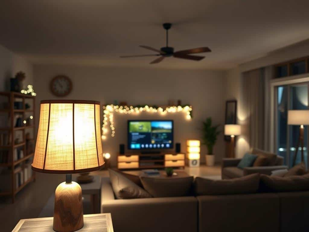
You walk into a room. The furniture is Italian leather. The floors are wide-plank oak, sourced from a sustainable forest in France. The art on the walls? Originals. But something feels… off. It’s sterile. Cold. Maybe even a little bit clinical. You can’t quite put your finger on it, but the space doesn’t feel like a home. It feels like a showroom that forgot to turn off the overheads.
That feeling? That’s the lighting.
In 2026, we’ve finally moved past the era of "brighter is better." For years, homeowners and builders alike thought that flooding a room with light was the key to luxury. They were wrong. The biggest mistake making expensive homes look cheap right now isn’t the color of the paint or the style of the sofa. It’s the reliance on flat, uniform, cool-toned recessed lighting that strips a room of its soul. It’s the absence of shadow. It’s the lack of layers. And frankly, it’s ruining some of the most beautiful architectural projects out there.
The Trap of the "Swiss Cheese" Ceiling
Let’s talk about recessed lights. Or as architects like Brian Shull have pointed out recently, the overuse of them. Back in the early 2020s, it seemed like every renovation involved punching dozens of holes in the ceiling. The logic was simple: if one light is good, twelve must be better. But here we are in 2026, and that grid of downlights is looking incredibly dated. It’s the interior design equivalent of a padded-shoulder power suit from the eighties. Loud, aggressive, and missing the point.
When you rely solely on recessed cans, you create what designers call "flat light." There’s no depth. No drama. Every corner is lit equally, which sounds nice in theory, but in practice, it makes a room feel two-dimensional. It removes the natural hierarchy of space. Your eyes don’t know where to rest because everything is shouting for attention at the same volume. This is why even a million-dollar living room can feel like a dentist’s waiting area if the only source of illumination is a array of LED downlights spaced evenly across the drywall.
The fix isn’t necessarily to rip them all out—though that’s an option if you’re doing a full gut. The fix is to stop letting them be the only player in the game. Think of recessed lights as the background vocals, not the lead singer. They should provide general ambient glow, sure, but they shouldn’t be the star. If you find yourself squinting under the harsh glare of a ceiling full of pots, you’re experiencing the exact vibe kill that’s plaguing modern luxury homes. It’s harsh, it’s uninviting, and it screams "builder grade" no matter how much you spent on the marble countertops.
The Color Temperature Chaos
Here’s a scenario that happens way too often. You buy a beautiful floor lamp with a warm, cozy bulb—maybe 2700 Kelvin, which gives off that golden, sunset-like glow. Then, you have recessed lights installed by a contractor who grabs whatever bulbs were on sale at the hardware store. Those happen to be 4000K or even 5000K. That’s "daylight" white. It’s blueish. It’s stark.
Now you have a room fighting with itself. The floor lamp says "relax," while the ceiling says "wake up and do taxes." This inconsistency in color temperature is a dead giveaway of amateur design. In 2026, cohesion is king. When your light sources clash in tone, it creates visual noise. It makes the space feel disjointed and chaotic, even if the rest of the decor is perfectly curated. It’s subtle, but our brains pick up on it immediately. We feel unsettled without knowing why.
Architects and lighting designers are stressing the importance of sticking to one primary color temperature per zone. For most living spaces, bedrooms, and dining areas, that means staying in the 2700K to 3000K range. This warmer spectrum mimics natural firelight and candlelight, triggering a relaxation response in our nervous systems. Save the cooler, bluer tones for task-heavy areas like garages, laundry rooms, or maybe under-cabinet lighting in the kitchen where you need to see the true color of your vegetables. But for the spaces where you live, love, and unwind? Keep it warm. Consistency creates calm. And calm feels expensive.
It’s also worth noting that cheap LEDs often have a poor Color Rendering Index (CRI). This is a technical term, but basically, it means how accurately the light shows the true colors of objects. Low CRI lights make rich woods look muddy and vibrant fabrics look dull. If you’ve spent a fortune on a Persian rug or a velvet sofa, don’t let a $5 bulb make it look like it came from a discount bin. Check the box. Look for a CRI of 90 or higher. It’s a small detail that makes a massive diference in how luxurious your materials appear.
The Death of Shadow and Depth
We have a weird relationship with shadows. For a long time, we tried to eliminate them. We wanted every corner bright. We wanted no dark spots. But in doing so, we eliminated depth. Shadow is not the enemy of good design; it’s the partner. Without shadow, light has no meaning. It’s like trying to hear a melody without any silence between the notes. It’s just noise.
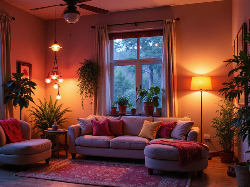
High-end design in 2026 is embracing "moody" lighting. This doesn’t mean your house should be dark. It means it should have contrast. It means using light to highlight specific textures—the grain of the wood, the weave of the linen, the curve of a sculpture. When you light a room from multiple low levels, you create pools of light and areas of soft darkness. This guides the eye. It creates intimacy. It makes a large room feel cozy rather than cavernous.
Think about your favorite hotel lobby or a high-end restaurant. Notice how few overhead lights there are? Most of the illumination comes from table lamps, sconces, and hidden strips. The ceiling is often dark. This draws your focus down to the human level, to where the interaction happens. It feels grounded. When you replicate this in your home, you stop feeling like you’re under interrogation and start feeling like you’re in a sanctuary.
So, how do you get this look? Start by turning off the big switch. Seriously. Try living with just your lamps for a week. See how the room changes. Notice how the corners soften. Then, add lighting intentionally. Use a picture light to graze a piece of art. Use an uplight behind a plant to cast interesting shadows on the wall. Use a strip of LED tape inside a bookshelf to make the objects pop. These are small moves, but they build a complex, layered visual experience that flat ceiling lights simply can’t achieve.
Layering: The Secret Sauce of Luxury
If there’s one word you need to remember, it’s "layering." Good lighting is like a good outfit. You have a base layer, a statement piece, and accessories. In lighting terms, these are Ambient, Task, and Accent lighting. Most cheap-looking homes only have the first one. They have the ambient glow from the ceiling, and that’s it. Boring.
Ambient light is the general fill. It’s the recessed lights (used sparingly) or a central fixture that provides enough light to walk around without tripping. Task light is functional. It’s the pendant over the kitchen island, the reading lamp by the chair, the vanity lights in the bathroom. It helps you do stuff. Accent light is the jewelry. It’s the light that hits the artwork, the architectural column, or the textured wall. It’s there purely for beauty.
In 2026, the trend is to blend these layers seamlessly. You want the transition between them to be invisible. For example, instead of a harsh downlight over your kitchen counter, use under-cabinet lighting (task) combined with a few pendants (ambient/accent) and maybe a strip of light along the toe kick (accent/ambient). This creates a glow that seems to come from everywhere and nowhere at once. It feels magical. It feels custom.
The mistake people make is thinking they need to choose one type. They don’t. They need all three. And they need them to work together. If you have a beautiful chandelier (ambient/accent) but no reading light next to the sofa (task), the room fails functionally. If you have great task lighting but no accent lights to highlight your decor, the room lacks personality. Balance is key. It’s about creating a symphony of light sources that support each other, rather than a solo act that dominates the space.
Fixture Fatigue: Choosing Form Over Function (and Vice Versa)
Let’s address the fixtures themselves. There’s a trend that’s been lingering too long: the generic, trim-less recessed light that looks like a black hole in the ceiling. While sleek, when used in excess, it creates a "starry night" effect that feels more like an airport terminal than a home. Designers are moving away from this. They’re choosing fixtures that are sculptural elements in their own right.
But here’s the trap: buying a trendy fixture that doesn’t fit the scale of the room. A massive, ornate chandelier in a small entryway looks cramped and tacky. A tiny, dainty pendant over a huge dining table looks stingy and lost. Scale matters. Proportion matters. In 2026, the "cheap" look often comes from fixtures that feel like afterthoughts. They were bought online because they were on sale, not because they were right for the space.
Another issue is the finish. Mixed metals can work, but they need intention. Randomly mixing brass, chrome, and black matte in the same room without a unifying theme looks messy. It looks like you grabbed whatever was available. Stick to a primary finish for your hardware and lighting, and use a secondary finish sparingly for contrast. This creates a cohesive narrative.
Also, consider the quality of the diffuser. Cheap fixtures often have plastic diffusers that yellow over time or create a harsh, spotted light pattern. High-end fixtures use glass or high-quality acrylic that softens the light, making it gentle on the eyes. When you look directly at a light source, it shouldn’t hurt. It should invite you in. If your fixtures are glaring at you, they’re failing. Replace the bulbs, or better yet, replace the fixtures with ones that prioritize light quality over flashy design.
Smart Light, Dumb Mistakes
Technology has changed everything, hasn’t it? In 2026, smart lighting is standard. We can control our lights with our phones, our voices, and even our circadian rhythms. But technology is a tool, not a solution. The mistake here is over-complicating the user experience. If you need an app, a password, and a tutorial to turn on the lights in your guest bathroom, you’ve failed.
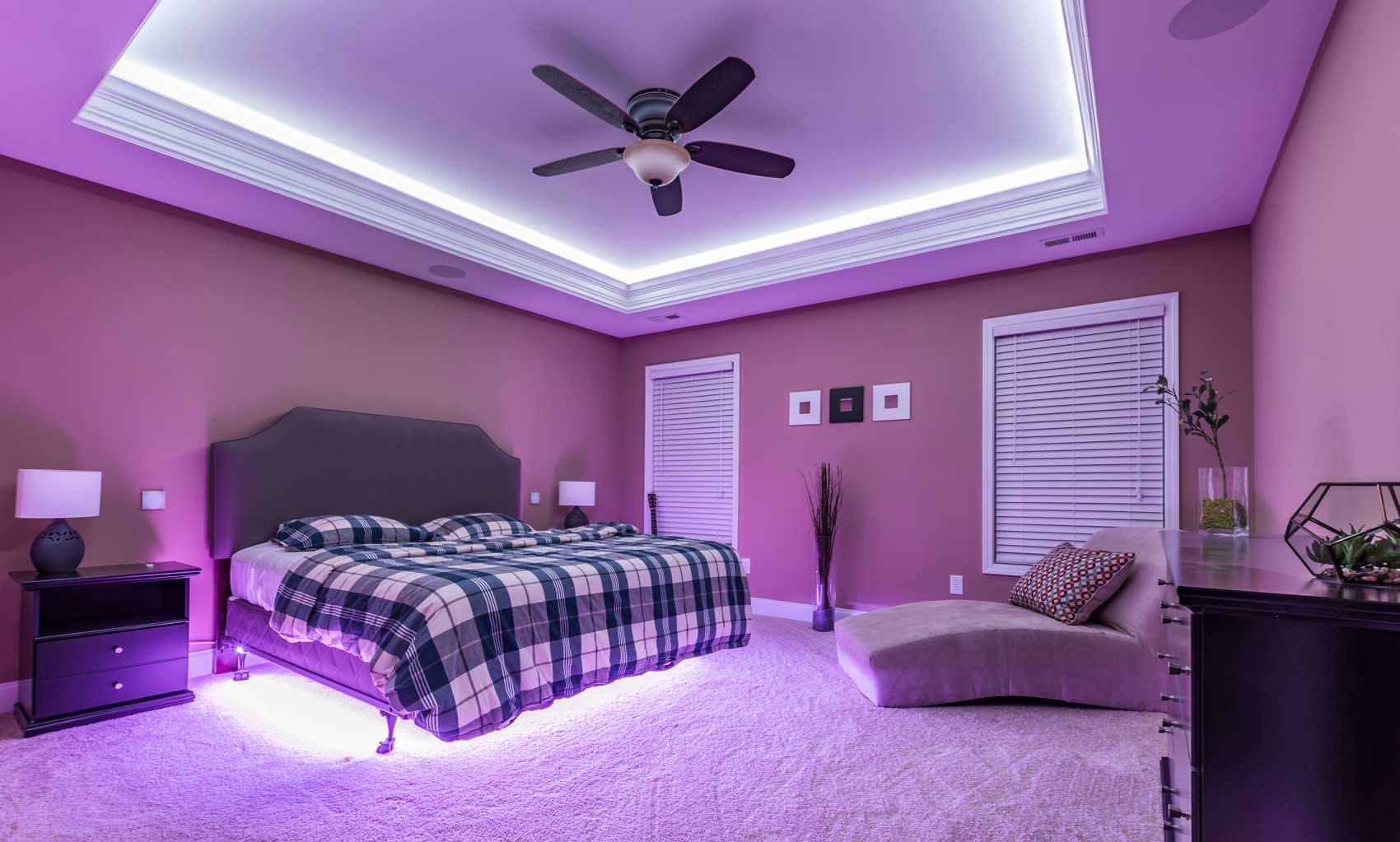
Smart lighting should be invisible. It should work automatically. It should dim when you watch a movie. It should brighten when you’re cooking. It should warm up in the evening to help you sleep. But if it’s glitchy, or if the colors are neon and jarring, it detracts from the home’s value. Nothing says "cheap" like a living room that accidentally turns purple because of a software update.
The key is simplicity. Use smart controls to enhance the layers we talked about earlier. Create scenes. "Morning," "Evening," "Party," "Read." One button press should adjust all the layers to the perfect balance. This isn’t just about convenience; it’s about setting the mood instantly. It allows you to change the character of your home with a tap. But ensure the underlying hardware is high quality. Flickering smart bulbs are a nightmare. Invest in reliable systems. And please, for the love of design, avoid the rainbow disco mode unless you’re actually hosting a rave. Subtlety is the ultimate sophistication.
Also, don’t forget the manual override. Guests shouldn’t need a PhD in computer science to find the light switch. Always have physical switches in intuitive locations. Technology should serve the human, not the other way around. When tech works seamlessly, it feels like magic. When it doesn’t, it feels like a gimmick. And gimmicks age poorly.
So, what’s the takeaway? How do you fix the "cheap" vibe in your home without tearing down walls? Start small. Audit your color temperatures. Make sure everything in a room matches. Swap out those cool, blue-white bulbs for warm, inviting ones. It’s the cheapest fix with the biggest impact.
Next, add layers. Buy a floor lamp. Add a table lamp. Put a light inside a cabinet. Create those pools of light and shadow. Turn off the overheads and see how the room breathes. You’ll be surprised at how much cozier it feels. You’ll notice the textures in your rugs and the details in your art. The room will start to feel like yours.
Finally, be intentional. Don’t just light a space because it’s dark. Light it because you want to highlight something. Light it to create a mood. Light it to guide the eye. Lighting is the jewelry of the home. It’s the final touch that pulls everything together. When done right, it transforms a house into a home. It makes the expensive furniture look richer. It makes the architecture sing. It makes you feel good.
In 2026, luxury isn’t about brightness. It’s about atmosphere. It’s about warmth. It’s about the quiet confidence of a well-lit room that doesn’t need to shout to be heard. So dim the lights. Light a candle. And let your home breathe.