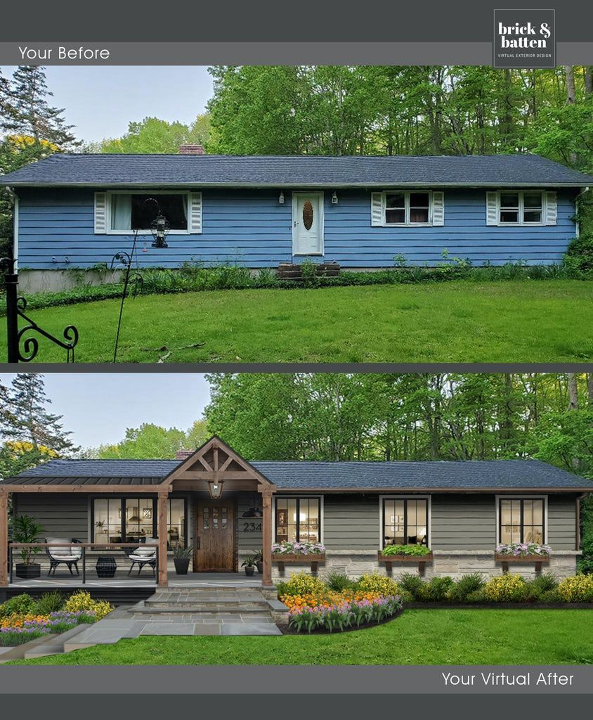
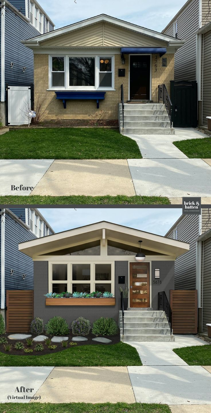
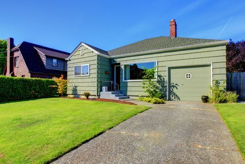
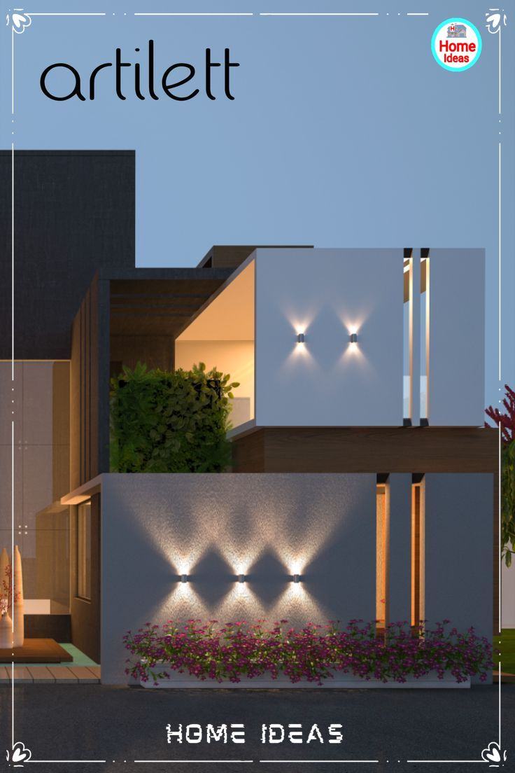
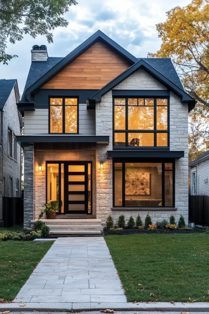
You know that feeling when you drive past a house and just… stop? It’s not always the biggest mansion on the block. Sometimes, it’s the little cottage with the perfect mix of rough stone and smooth wood that catches your eye. It feels warm. Inviting. Like it has a story to tell. For owners of compact homes, this is the secret weapon. You don’t need square footage to make a statement. You need texture.
In 2026, the trend isn’t about making small houses look bigger by painting them all one bland shade of beige. It’s about celebrating their coziness through contrast. Mixing materials like cedar shakes, vertical panels, and stone veneer creates a visual rhythm that draws the eye up and around. It turns a flat, forgettable facade into something dynamic. And the best part? You don’t need an architect’s degree to pull it off. You just need to understand how light hits different surfaces and how to balance the chaos.
Let’s be honest. Small exteriors can feel tricky. One wrong move and things look cluttered. But get it right, and you’ve got a home that stands out for all the right reasons. It’s about layering. It’s about thinking of your home’s skin like an outfit. You wouldn’t wear a plain t-shirt and plain pants if you wanted to turn heads, right? You’d add a leather jacket or a silk scarf. Same logic applies here. Let’s dive into how you can mix textures like a pro, even if your footprint is tiny.
Why Texture Matters More Than Color on Small Facades
We’ve been taught to obsess over paint swatches. Pick the perfect gray! Find the right blue! But color is flat. It sits on the surface. Texture has depth. It changes throughout the day as the sun moves across the sky. On a compact house, where wall space is limited, texture does the heavy lifting. It creates shadows and highlights that make the structure feel more substantial than it actually is. Think of it as visual weight. A smooth wall disappears. A textured wall demands attention.
Recent design insights from 2025 and 2026 show a huge shift away from monochromatic, single-material exteriors. People are craving authenticity. They want homes that feel grounded. Mixing a rough material like stacked stone with something sleek like fiber cement panels creates a tension that is incredibly pleasing to the eye. It breaks up the mass of the building. Instead of seeing one big box, you see distinct zones. This is crucial for small homes because it prevents the "toy house" effect. It adds sophistication.
Consider the psychological impact too. Smooth surfaces feel modern and clean, but they can also feel cold or sterile. Rough-hewn wood or natural stone feels organic and safe. By combining them, you get the best of both worlds. You get the crisp lines of modern design with the warmth of traditional craftsmanship. This balance is what makes a curb appeal makeover stick. It’s not just a quick fix; it’s a fundamental upgrade to how the home interacts with its environment. And honestly, it’s way more fun to look at than another white box.
The Rule of Three: Keeping It Cohesive
Here is where most people trip up. They get excited and throw four or five different materials at the wall. Bad idea. It looks like a patchwork quilt made by someone who ran out of thread. The golden rule for mixing textures, especially on a smaller canvas, is the Rule of Three. Stick to three main materials max. Usually, this means one dominant material, one secondary accent, and one small highlight. This keeps things from feeling chaotic.
Your dominant material should cover about 60-70% of the exterior. This is usually the standard siding, like lap siding or shingles. It sets the tone. Then, your secondary material takes up maybe 20-30%. This could be board-and-batten on a gable end or stone veneer on the foundation. Finally, that last 10% is your highlight. Maybe it’s metal flashing, a wooden front door, or a specific trim detail. This hierarchy guides the viewer’s eye. It tells them where to look first, second, and third. Without it, the eye just bounces around confused.
Harmony is key. Dave and Jenny Marrs, those flipping experts, often talk about material harmony. It’s not just about slapping two things together. They need to speak the same language. If you’re going for a rustic vibe, pair wood with stone. If you’re going modern, pair smooth panels with metal accents. Don’t mix a super ornate Victorian trim with ultra-minimalist steel sheets. It clashes. In 2026, the trend is towards intentional contrasts. You want the materials to complement each other, not fight for dominance. Keep it simple. Let one material shine while the others support it.
Classic Combos That Never Fail
So, what actually works? Let’s talk specifics. You don’t need to reinvent the wheel. Some combinations have stood the test of time because they just look good. One of the most popular pairings right now is horizontal lap siding mixed with vertical board-and-batten. The horizontal lines ground the house, making it feel wide and stable. The vertical lines draw the eye upward, adding height. On a short, squat cottage, this is magic. It elongates the silhouette without adding a single inch of physical height.
Another winner is stone veneer paired with wood shakes. Stone brings weight and permanence. It anchors the home to the earth. Wood shakes bring movement and softness. They catch the light differently every hour. Put the stone on the lower third or around the entryway, and let the shakes cover the upper stories. It’s a classic look that feels both upscale and cozy. It works particularly well on craftsman-style bungalows or modern farmhouses. The contrast between the hard, cold stone and the warm, organic wood is visually satisfying.
Don’t sleep on metal accents either. Corrugated metal or standing-seam metal roofing used as siding accents is huge in 2026. It’s durable, eco-friendly, and adds an industrial edge. Pairing metal with smooth fiber cement creates a sleek, contemporary look. It’s low maintenance too, which is a big selling point for busy homeowners. Imagine a dark charcoal metal accent wall next to crisp white panels. The pop of contrast is instant drama. It’s bold, but because it’s contained to a small area, it doesn’t overwhelm the small footprint. These combos are tried and true for a reason. They work.
Playing with Light and Shadow
Texture is nothing without light. Seriously. You can pick the most expensive stone in the world, but if it’s installed on a flat plane with no variation, it’ll look boring. The goal is to create shadow lines. Shadows give the eye somewhere to rest. They create depth. When you mix materials, think about how they protrude from the wall. Shakes have a thick profile. Lap siding has a slight overlap. Stone is irregular. These differences create micro-shadows that change as the sun moves.
On a compact house, you want to maximize this effect. Use deeper reveals. If you’re installing board-and-batten, make sure the battens stick out enough to cast a sharp shadow. If you’re using stone, choose a variety pack with different thicknesses rather than uniform tiles. This irregularity catches the light in interesting ways. It makes the wall feel alive. In the morning, one side might glow while the other is in deep shadow. By afternoon, it flips. This dynamic quality makes a small home feel larger because there’s more to see.
Color plays a role here too, but it’s secondary to form. Darker colors absorb light and hide texture. Lighter colors reflect light and highlight it. If you want your texture to pop, go lighter. If you want a moody, mysterious vibe, go dark but ensure the material has a lot of physical depth. A common mistake is picking a mid-tone gray for everything. It flattens the look. Instead, try a light body color with dark accents. The contrast will emphasize the transition between materials. It’s like outlining a drawing. It defines the shapes. Pay attention to the direction of your siding too. Horizontal vs vertical changes how light travels across the surface.
Budget-Friendly Ways to Fake the Look
Let’s get real. Not everyone has the budget for real cedar or genuine stone. And that’s okay. Technology has come a long way. In 2026, high-quality vinyl and composite sidings are incredibly convincing. They mimic the grain of wood and the roughness of stone without the maintenance headache. Vinyl is praised for its durability and low upkeep. Composite offers unmatched beauty and versatility. You can get the look of luxury for a fraction of the price. The key is choosing premium lines that don’t look plastic.
Look for products with varied molds. Cheap vinyl repeats the same pattern every few feet. It’s obvious. Good vinyl has randomization. No two pieces look exactly alike. This breaks up the repetition and fools the eye. Same with stone veneer. Lightweight cultured stone is much easier to install than real rock. It doesn’t require heavy structural support. You can often DIY it or hire a handyman for a weekend job. This makes it accessible for smaller budgets. You get the texture boost without the massive construction bill.
Another trick is to use texture strategically. You don’t need to re-side the whole house. Just accent the areas that matter most. The front gable. The porch columns. The entryway surround. By focusing your budget on these high-visibility spots, you get maximum impact for minimum spend. Paint can also add texture. While it’s not physical texture, using a high-quality elastomeric paint on stucco or brick can enhance the existing surface. Or, use trim to create the illusion of panels. It’s about being smart with where you put your money. Don’t spread it thin. Concentrate it where it counts.
It’s easy to get carried away. We’ve all seen houses that look like they were designed by committee. The biggest mistake on a small home is overcrowding. Too many textures compete for attention. It creates visual noise. If you have stone, shakes, metal, and brick all on one facade, the eye doesn’t know where to land. It’s exhausting. Simplify. Edit ruthlessly. If a material doesn’t serve a purpose, cut it. Your home should breathe. Give each material room to exist.
Another pitfall is ignoring the roofline. The roof is a huge part of your exterior’s texture. If you have a busy facade, keep the roof simple. If the facade is smooth, you can get away with a more textured roof, like dimensional shingles or even a metal roof with seams. The roof and walls need to work together. Don’t treat them as separate entities. They are one system. Also, watch your trim. Thick, chunky trim can overwhelm a small house. Keep it proportional. Slim profiles often look better on compact structures. They feel more refined.
Finally, don’t forget the landscaping. Your exterior textures don’t exist in a vacuum. Plants add softness. A rough stone wall looks even rougher next to soft ferns. A smooth white wall looks crisp against dark green boxwoods. Use plants to frame your textures. Don’t let vines cover up the hard work you did mixing materials, but use foliage to enhance the contrast. And please, avoid matching your garage door to your siding exactly. It disappears. Make it an accent. Break up the monotony. These small details add up to a cohesive, thoughtful design. It’s the difference between a house that looks "done" and one that looks "designed."
Mixing textures on a compact home is less about following strict rules and more about feeling out the balance. It’s an art form. You’re sculpting with light and material. Start small. Maybe just add some board-and-batten to a gable. See how it feels. Live with it. Then maybe add a stone accent later. It doesn’t have to happen all at once. The goal is to create a home that feels like you. A home that welcomes you with character and warmth. In a world of cookie-cutter builds, a textured exterior is a breath of fresh air. It shows you care. It shows you paid attention. And really, isn’t that what curb appeal is all about? Making a connection before you even open the door.