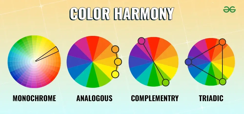
Ever stared at a blank canvas, a digital design file, or even your closet, feeling paralyzed by the sheer number of choices? You know you want it to look good. You know "blue and orange" is a thing. But somehow, when you try to put it together, it feels stiff. Or muddy. Or just… wrong. We’ve all been there. For decades, we’ve been taught that the color wheel is the law. If you don’t follow the triangles and lines, you’re breaking the rules.
But here’s the secret nobody tells you in art school: the wheel is a map, not the territory. In 2026, with AI tools generating thousands of palettes in seconds and our screens displaying billions of colors, the old rigid formulas feel outdated. They’re useful, sure. But they’re not the whole story. Real harmony doesn’t come from memorizing angles. It comes from feeling. It comes from understanding how light hits a surface, how mood shifts with saturation, and how our eyes actually process contrast. Let’s stop overthinking the geometry and start trusting our gut.
The Myth of the Perfect Triangle
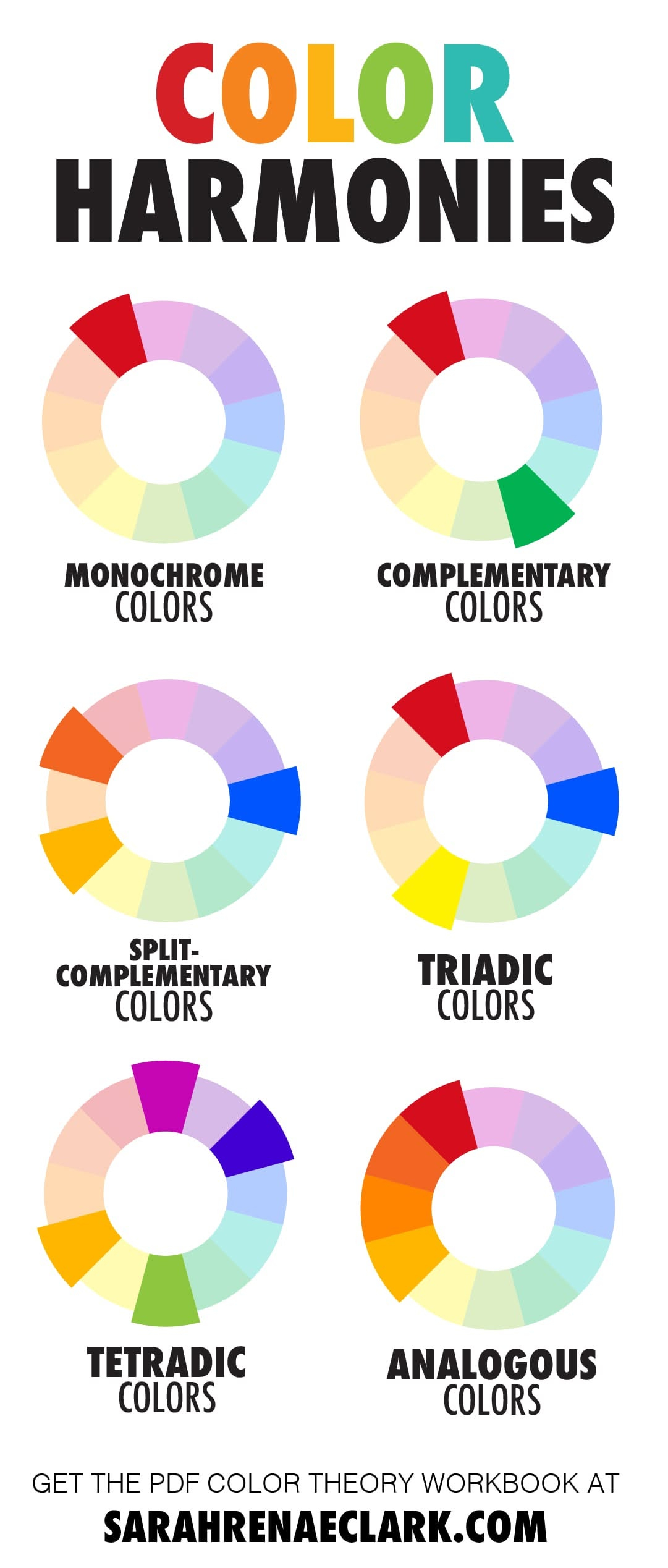
We need to talk about why those classic diagrams—complementary, triadic, split-complementary—often fail us in the real world. When you look at a standard color wheel, you’re seeing pure, saturated hues in a vacuum. Red sits exactly opposite green. Blue opposes orange. It’s neat. It’s clean. And it’s almost never how we experience color in nature or daily life.
The problem isn’t the theory itself; it’s the application. When designers or artists strictly adhere to these geometric rules without adjusting for tone, value, or context, the result often feels artificial. It screams "I used a tool." Think about a sunset. Is it perfectly complementary? No. It’s a messy, beautiful gradient of pinks, purples, oranges, and deep blues bleeding into each other. The harmony comes from the transition, not the opposition.
In 2026, we have access to better tools than ever, but the best creators are moving away from rigid adherence. They use the wheel as a starting point, a rough sketch. Then they break it. They desaturate one side. They shift the temperature. They let intuition take the wheel. The goal isn’t mathematical perfection; it’s emotional resonance. If a palette feels right, it is right, regardless of where the colors sit on a circle.
Trusting Your Eyes Over the Algorithm
Let’s be honest: technology is amazing. There are apps now that can scan a photo and tell you the exact hex codes for a "harmonious" palette. But have you noticed how those suggestions sometimes feel flat? That’s because algorithms optimize for data, not feeling. They don’t know that you want your design to feel nostalgic, or urgent, or calm. Only you know that.
Start training your eye to see color relationships in the wild. Look at a street scene. Notice how the grey concrete makes the red stop sign pop. That’s complementary harmony, but it’s subtle. The grey isn’t just grey; it has hints of blue or brown. This is called "muddying" or "toning down," and it’s the secret sauce of professional palettes. Instead of picking two bright opposites, pick one bright color and one neutral that contains a tiny bit of its opposite.
Try this exercise: go outside or look around your room. Find three colors that naturally sit together. Don’t name them. Just look. How do they make you feel? Do they clash? Do they soothe? Write down the feeling, not the names. "Warm and dusty." "Cool and sharp." This shifts your focus from technical correctness to atmospheric accuracy. In 2026, the most valuable skill isn’t knowing the definition of "analogous"; it’s knowing how to replicate a mood.
The Power of Value and Saturation
Here is where most people get stuck. They pick great hues—say, a nice teal and a coral—but when they put them together, it vibrates uncomfortably. Why? Because the value (lightness/darkness) and saturation (intensity) are fighting. Color harmony isn’t just about hue. It’s mostly about balance in value and saturation.
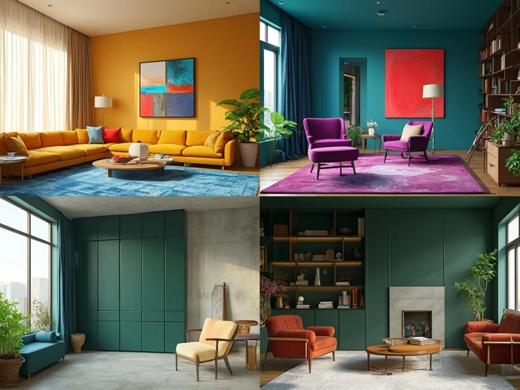
Imagine you’re painting a landscape. If your sky and your grass are both 100% saturated, the viewer’s eye doesn’t know where to rest. It’s exhausting. Professional designers use the 60-30-10 rule, but they also apply a "saturation hierarchy." Maybe your main color is muted and earthy. Your secondary color is slightly brighter. Your accent color? That’s where the pop happens. By keeping two of your three colors subdued, you create space for the third to shine.
This approach saves you from the "clown suit" effect. You don’t need five different hues to make a rich palette. You can make a stunning monochromatic scheme just by varying the light and dark. Think of a charcoal sketch with a single wash of watercolor. It’s powerful because of the contrast in value, not the variety of hues. Stop worrying about finding the "perfect" second color. Instead, ask yourself: is this too bright? Does it need to be darker? Adjusting these dials often fixes harmony issues faster than changing the hue entirely.
Context is King (and Queen)
Color doesn’t exist in a void. A shade of yellow looks cheerful on a sunny beach poster but sickly in a hospital brochure. This is the contextual trap. In 2026, with global audiences and diverse cultural backgrounds, understanding context is more critical than ever. What works for a tech startup in San Francisco might fail miserably for a heritage brand in Kyoto.
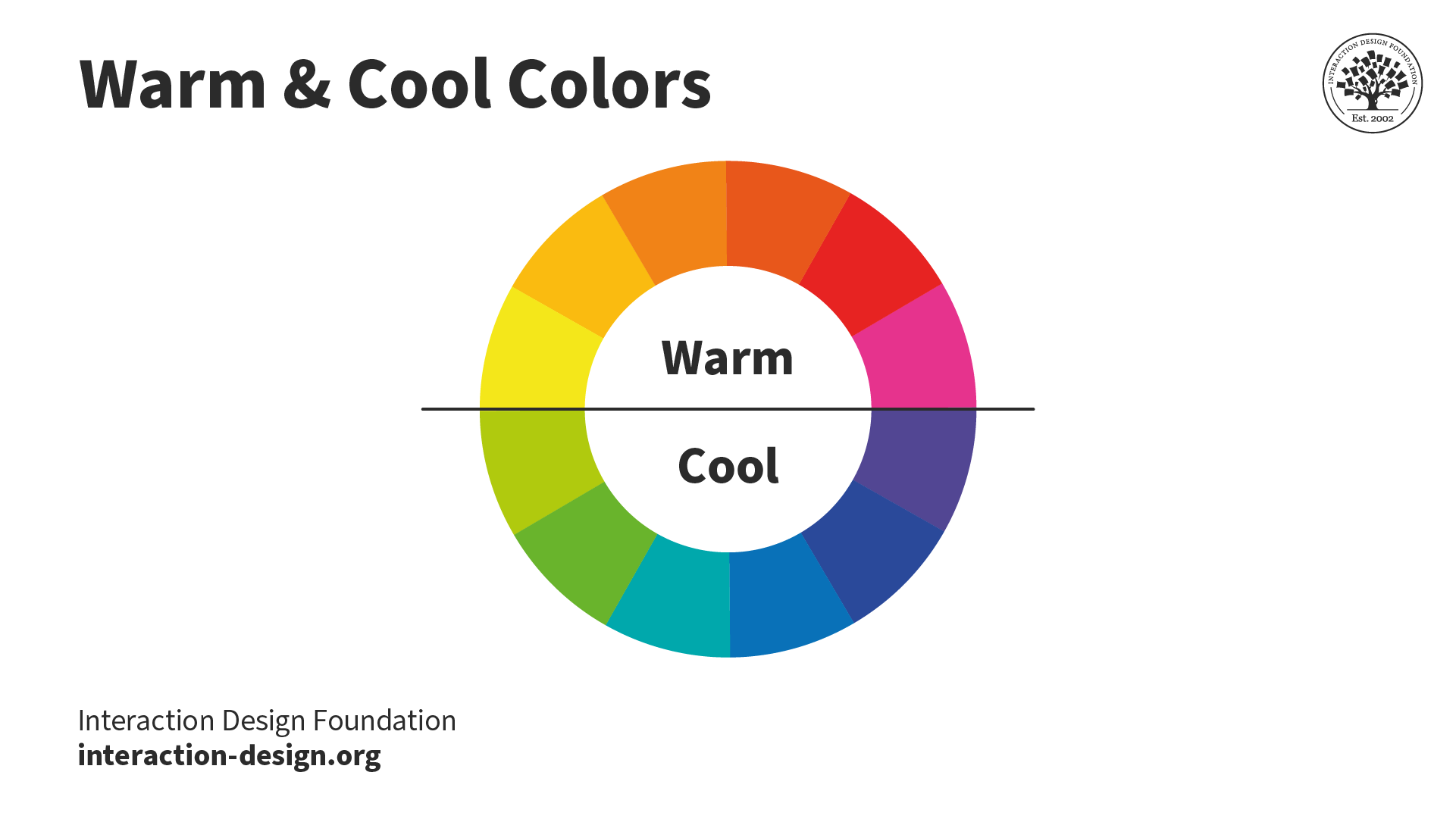
You have to consider the medium, too. Colors look different on an OLED screen versus printed on matte paper. They change under warm indoor lighting versus cool daylight. If you’re designing a physical product, order samples. Look at them at different times of day. If you’re working digitally, check your palette in dark mode and light mode. Does the harmony hold up?
Also, think about the content. Are you highlighting data? Telling a story? Selling a feeling? If the content is serious, a neon palette might undermine the message, no matter how "harmonious" the wheel says it is. Harmony supports the message. It shouldn’t distract from it. Ask yourself: what is the job of this color? If it’s shouting when it should be whispering, it’s out of harmony with the intent, even if it matches the triangle on the wheel.
Breaking the Rules with Intent
Once you understand the basics, you can break them beautifully. Some of the most memorable designs in recent years use "discordant" colors intentionally. Think of the brutalist web design trend or the neo-retro aesthetics popping up in 2026. These styles often pair colors that traditional theory says shouldn’t work—like bright red and bright pink, or neon green and brown.
Why does this work? Because it creates tension. And tension grabs attention. But here’s the key: it’s intentional. It’s not an accident. The designer knows it’s clashing and uses that clash to create energy. If you accidentally mix clashing colors, it looks like a mistake. If you do it on purpose, with control over value and spacing, it looks like style.
Don’t be afraid to step off the beaten path. Try pairing colors that are "too close" on the wheel. Try using three complements instead of two. The risk is part of the fun. The worst that happens is you delete the layer and try again. Digital tools make experimentation cheap and fast. Use that to your advantage. Play until something surprises you. Often, the "wrong" choice leads to the most unique and memorable outcome. Remember, rules are for learning. Mastery is about knowing when to ignore them.
Practical Steps for Everyday Harmony
So, how do you actually do this tomorrow? Start small. Limit your palette. Three colors is plenty. Four if you’re brave. Five is usually chaos. Pick one dominant color that sets the mood. Pick one supporting color that adds depth. Pick one accent for the spark. Stick to this limit. Constraints breed creativity.
Use natural references. Take a photo of something you love—a leaf, a building, a cup of coffee. Pull the colors from that image. Nature has already done the hard work of harmonizing those tones. You’re just borrowing its homework. This is a cheat code that never fails. If it exists in nature, it works.
Finally, step away. Squint at your work. When you squint, the details disappear, and you only see the big blocks of color and value. Does it look balanced? Is one area too heavy? Does your eye get stuck somewhere? Fix the big shapes first. The details will follow. And remember, there’s no such thing as a final version, only a stopped version. Trust your instinct. If it feels good, it probably is.
Mastering color harmony isn’t about memorizing a diagram. It’s about developing a relationship with how you see the world. The color wheel is a tool, like a hammer. Useful, yes. But you wouldn’t build a house by only swinging a hammer in perfect geometric patterns. You’d look at the wood, feel the grain, and adjust your strike.
In 2026, we have more information than ever, but less time to process it. Simplify. Trust your eyes. Understand that value and saturation matter more than hue. Let context guide your choices. And don’t be afraid to make a mess. Some of the best palettes come from happy accidents.
So, close the tabs. Put down the textbook. Look at what’s in front of you. What color feels right today? Start there. The rest will follow. You’ve got this.