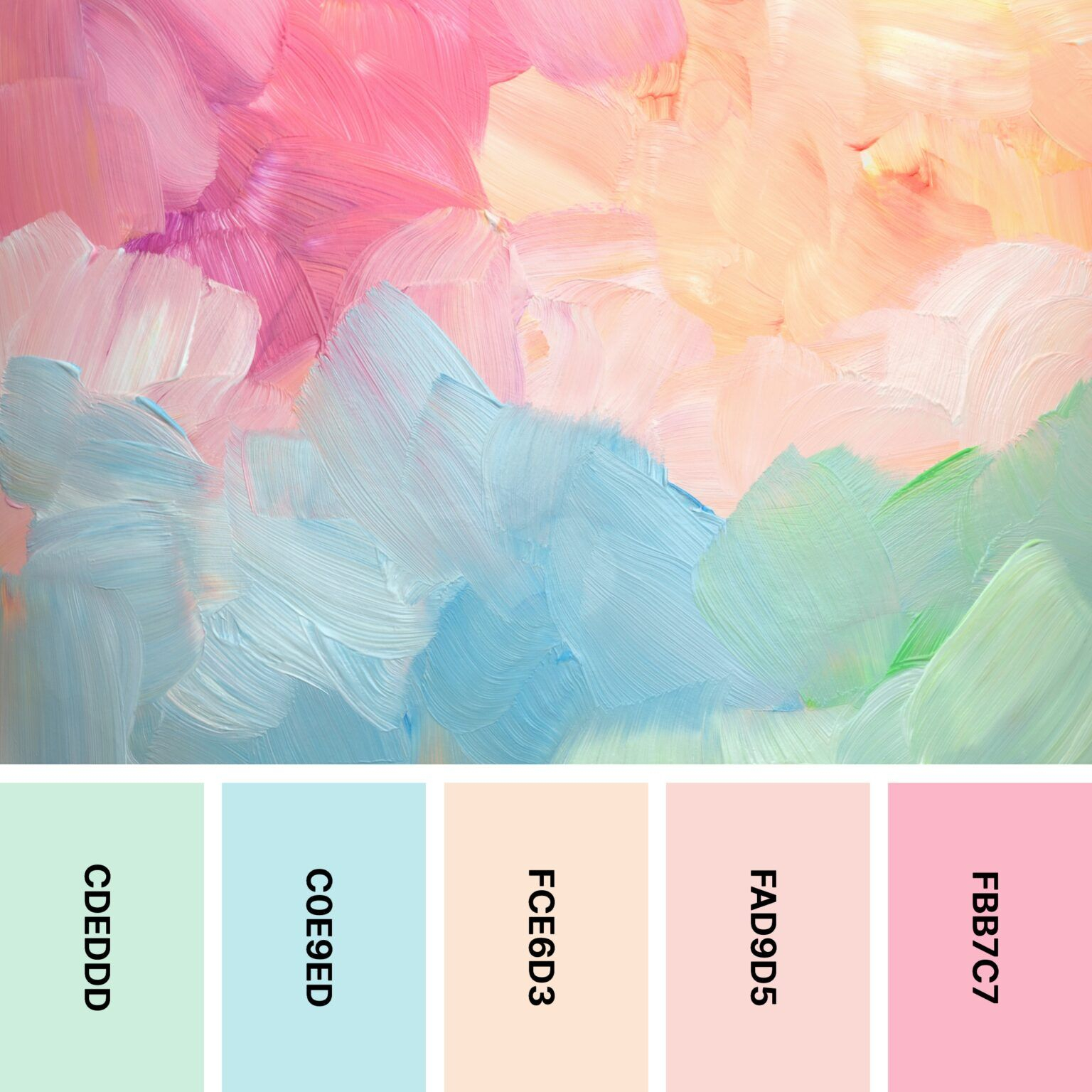
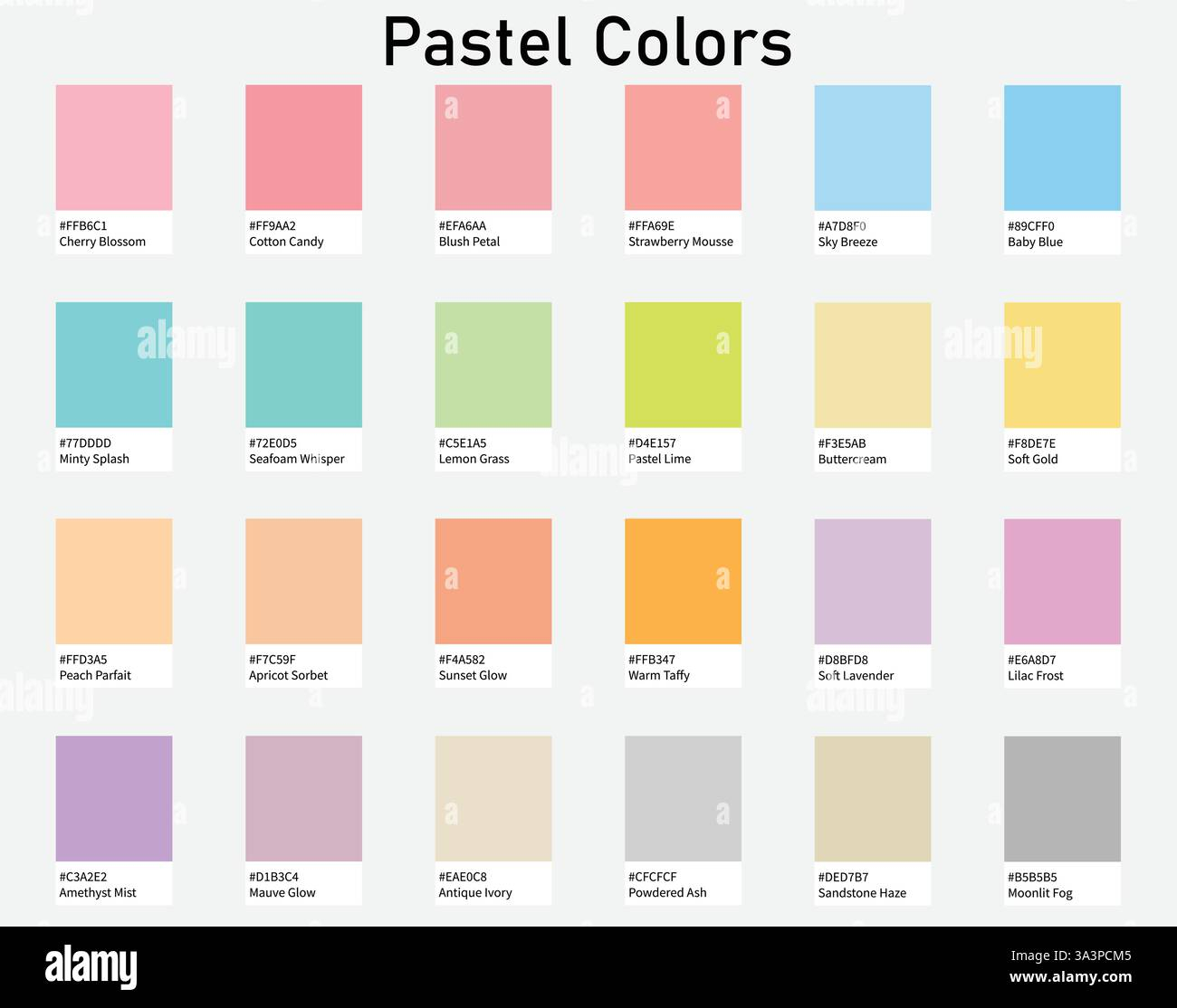
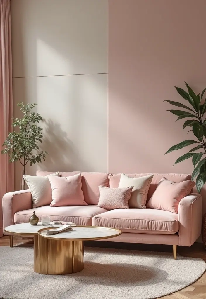
The garage smells faintly of linseed oil, mineral spirits, and the sweet, chalky undertone of titanium dioxide. Sunlight cuts through the dust motes, illuminating a line of half-empty quart cans from past renovations—a defiant crimson, a moody Prussian blue, an earthy ochre. Standing over a clean plastic mixing bucket, you hold a stirring stick like a wand. You do not need to drop forty dollars on a boutique can of chalk-finish "Muted Lilac" or "Seafoam Whisper" ordered from an artisanal paint atelier online. You can make it yourself. Right here, using what you already own.
The economics of the modern DIY movement have shifted dramatically. Specialty paint finishes, bespoke color lines, and curated pastel palettes command staggering premiums at hardware stores and boutique suppliers alike. Walk into any trendy design boutique or scroll through a lifestyle feed, and you will find soft, desaturated hues marketed as rare artistic achievements. Yet, at their core, pastels are simply high-saturation pigments aggressively diluted with white. Understanding this chemical and optical relationship frees you from the tyranny of pre-mixed color libraries, transforming your workshop into a custom color laboratory.
For the budget-conscious renovator, upcycler, or fine artist working on canvas, mastering pastel creation is an exercise in resourcefulness. It eliminates the waste of buying single-use specialty colors that gather dust after a single accent wall or dresser transformation. By learning how to manipulate value and chroma with basic raw materials, you unlock an infinite spectrum of soft, dreamy shades on demand. This isn’t just about saving a few bills; it is about reclaiming creative control over your living space and understanding the physical realities of the medium you choose to work with.
The Chemistry of Color: Why White Is Not Just a Filler
Color theory in the abstract world of color wheels often fails us the moment we pick up a brush and a can of liquid polymer or alkyd resin. When mixing pigments, you are dealing with subtractive color synthesis. Every particle of color absorbs certain wavelengths of light and reflects others. When you introduce white paint—typically heavily laden with opaque titanium dioxide—you are not merely watering down the color; you are scattering light. This optical dispersion is what creates the ethereal, milky quality characteristic of every true pastel.
Titanium dioxide possesses immense covering power, which presents a hidden hazard for the uninitiated. A single heavy-handed dollop of white into a rich, deep-base paint can violently swing your mix from a vibrant mid-tone straight past your target pastel into a chalky, washed-out ghost of a color. This phenomenon catches many DIYers off guard. Understanding pigment load is essential. Higher-quality paints feature denser, more finely milled pigment particles that hold their integrity when white is added, whereas cheap, heavily extended budget paints tend to turn muddy or chalky rather than soft and luminous.
Furthermore, you must account for the binder system you are using. Whether you are working with water-based acrylics, latex wall paints, chalk-style furniture paints, or heavy-body artist oils, the carrier liquid influences how light passes through the dry film. Acrylics dry darker as water evaporates and the emulsion cures, meaning a wet pastel mix on your palette will look deceptively light compared to its cured state on a wall or canvas. Accounting for this dry-down shift separates amateur guesswork from professional results, ensuring your dreamy mint green or buttery yellow doesn’t dry looking flat and chalky under room lighting.
Economic Realities and the True Cost of Custom Mixing
The financial logic of mixing your own pastels becomes glaringly obvious the moment you calculate cost-per-ounce ratios. Premium pastel paints often carry a markup of fifty to one hundred percent over standard base whites and primary colors. Paint manufacturers capitalize on the aesthetic trend of soft interiors by packaging them in designer tins with evocative names, charging consumers for the convenience of a pre-mixed formula. When you buy a gallon of neutral white wall paint or a standard artist tube set, you already own the primary vehicle for your color experiments.
Consider the typical furniture flipping or room-accent project. You might need a mere pint of a specific dusty rose to paint a vintage nightstand or a small hallway nook. Buying a full quart or gallon of a custom-mixed boutique paint leaves you with excess material that degrades over time, alongside a dent in your project budget. Conversely, keeping a large container of high-grade white base paint on hand—alongside small artist tubes or sample pots of primary colors (magenta, cyan/phthalo blue, and yellow)—allows you to formulate exact quantities. You mix only what you need for the task at hand, drastically minimizing material waste and financial expenditure.
Beyond direct material savings, there is the hidden economic value of inventory reduction. Cluttered garages and art studios are graveyard testaments to single-use hobby supplies bought for a solitary weekend project. By consolidating your inventory into versatile foundational bases and concentrated colorants, you streamline your workspace. This minimalist approach to DIY supplies saves physical storage space, prevents the frustration of dried-up specialty cans, and puts you firmly in control of your project’s financial footprint from start to finish.
Step-by-Step Methodology for Crafting Flawless Pastels
Achieving that elusive, professional-grade pastel requires discipline, patience, and a methodical approach to ratios. Never dump white paint directly into a large container of bold color unless you are prepared to create gallons of paint. Instead, always reverse the process: start with your white base and add your colorant incrementally. This golden rule of color mixing saves both material and sanity, as it takes exponentially more white to tone down a dark color than it does to tint a white base.
- Step 1 (Establish Your Clean Workspace and Lighting): Set up your mixing station under natural daylight or high-CRI (Color Rendering Index) LED lighting. Artificial yellow bulbs distort color perception, tricking you into adding too much blue or green to your mix. Lay down butcher paper or plastic sheeting, and gather your clean mixing containers, stirring sticks or palette knives, and your base white and chromatic tubes or sample pots.
- Step 2 (Pour the Foundation White): Dispense the vast majority of your expected paint volume—roughly eighty to ninety percent—using your pure white base paint into a clean, airtight mixing container. If you are mixing wall paint, ensure the sheen matches your project requirements (matte, eggshell, satin), as mixing different sheens can result in uneven light reflection.
- Step 3 (The Micro-Addition Method): Dip a clean palette knife or the tip of a stirring stick into your chromatic colorant. Introduce this tiny amount—literally a pea-sized drop for small batches or a teaspoon for larger wall pots—into your white base. Remember that you can always add more color, but extracting it is impossible.
- Step 4 (Homogeneous Blending): Stir the mixture thoroughly using a folding motion rather than a whipping motion. Whip marks introduce microscopic air bubbles into the paint film, which can cause pinholes, foam, or texture irregularities when applied to your substrate. Scrape the bottom and sides of the container to ensure no unmixed white or raw pigment hides in the corners.
- Step 5 (The Dry-Down Test and Adjustment): Paint a small swatch of your mixed hue onto a scrap piece of drywall, paper, or raw wood, and use a heat gun or hair dryer to accelerate the drying process. Observe the color under your room’s actual lighting conditions once dry. If it is too saturated, add another microscopic touch of white; if it is too grey or washed out, nudge it forward with a whisper of the original chromatic colorant.
Navigating Common Pitfalls and Practitioner Workarounds
Even experienced makers fall into predictable traps when attempting to formulate delicate pastel shades. The most common error involves chromatic contamination—accidentally introducing a complementary or muddying color that turns a vibrant soft peach into a dull, brownish beige. Understanding how pigments interact chemically helps you steer clear of these pitfalls and salvage imperfect batches before they ruin your project surfaces.
- Pitfall 1 (The Muddy Mix Disaster): Mixing opposing colors on the color wheel (such as adding a touch of red to a green pastel base) instantly neutralizes chroma, creating a dull grey-brown. Workaround: Always stick to a clean, single-pigment family when building your pastel. If you want a warm pastel, use warm primaries (cadmium yellow, quinacridone magenta); if you want cool pastels, stick to cool primaries (phthalo blue, lemon yellow).
- Pitfall 2 (Ignoring Dry-Down Shifting): Assuming the wet paint color on your mixing stick is the final dried product, leading to surprises after curing. Workaround: Always force-dry a test patch on a scrap surface before committing your paint to furniture or walls. Keep a detailed color recipe notebook, noting exact drops or proportions so you can replicate successful batches effortlessly.
- Pitfall 3 (Using Incompatible Paint Formulations): Mixing oil-based enamels with water-based latex or acrylics, causing immediate chemical curdling or separation. Workaround: Strictly maintain chemical continuity. Only mix paint products within the same medium family (water-based with water-based, solvent-based with solvent-based).
- Pitfall 4 (Inadequate Stirring Leading to Streaks): Failing to incorporate pigment fully, resulting in uneven streaks of raw color rolling onto your project surface during application. Workaround: Use a flat-edged stirring stick or a stiff metal palette knife. Scrape the container walls meticulously, and stir for a full two minutes longer than you think is necessary.
- Pitfall 5 (Inconsistent Batch Scaling): Mixing a small test cup of pastel paint, falling in love with it, and failing to calculate the proper multiplier when scaling up to paint an entire wall. Workaround: Measure your components by weight (using a digital kitchen scale in grams) or by precise volume ratios (using syringes or measuring spoons) rather than eyeballing drops, ensuring seamless scalability for larger projects.
The Broader Philosophy of Custom Color and Sustainable Craft
Embracing DIY paint formulation connects us to a long, rich lineage of makers, artisans, and tradespeople who understood that color is not merely a commercial commodity bought off a shelf. Before the advent of computer color-matching spectrophotometers in hardware stores, every master painter, decorator, and craftsperson mixed their own tints on-site. This hands-on engagement fosters a deeper aesthetic literacy, training your eye to perceive subtle undertones, value shifts, and chromatic temperatures that pass unnoticed by the casual observer.
From a sustainability standpoint, mixing your own custom pastels aligns perfectly with circular design principles. Millions of gallons of leftover white wall paint sit in basements and garages across the country, destined for hazardous waste disposal sites simply because homeowners view them as spent resources. By treating base white paint as a living canvas and utilizing artist pigments, universal colorants, or leftover craft paints to tint them, you divert usable materials from the waste stream. You give dormant inventory a second life, transforming forgotten white emulsion into sophisticated, dreamy pastel features.
This approach also nurtures creative confidence. When you stop relying on pre-packaged commercial solutions for every specific design whim, your relationship with your environment changes. A child’s nursery, a sunlit studio, or a revitalized vintage dresser becomes an authentic expression of your own tonal vision. You no longer compromise on a color because the store was out of stock or because the boutique brand required a prohibitive shipping fee. You simply take stock of your materials, measure your ratios, and mix the exact shade you envisioned.
Actionable Frameworks for Successful Pastel Projects
To turn your custom paint-mixing aspirations into consistent, repeatable successes, rely on structured workflows and disciplined testing habits. Treat your workspace like a professional atelier where precision dictates quality. By establishing reliable routines, you eliminate guesswork and ensure that every project—from a canvas painting to a sprawling living room accent wall—achieves that coveted, high-end designer aesthetic without the inflated price tag.
- The Palette Testing Protocol: Always create a gradient test card for every custom mix. Paint three distinct vertical stripes: one raw mix, one with a touch more white, and one with a hint more chromatic base. Label them clearly and let them dry overnight before making your final application decision.
- The Storage and Sealing Rule: Store your custom-mixed pastels in airtight, clean glass or high-density plastic jars. Press a small circle of parchment paper directly onto the surface of the wet paint inside the jar before sealing the lid to prevent a dry skin from forming.
- The Sheen Continuity Check: When matching touch-ups or mixing larger quantities across multiple cans, verify that the base paints share identical sheen ratings (gloss, semi-gloss, satin, eggshell, or matte). Mixing different sheens creates unsightly flash marks and uneven light reflection under directional room illumination.
- The Pigment Load Limit: Recognize the structural limits of your base medium. Adding excessive fluid colorant or water to a standard wall paint base can compromise its binder integrity, leading to poor adhesion, chalking, or reduced scrub resistance. Keep colorant additions under ten percent of total volume for wall paints.
The act of mixing paint is fundamentally transformative. It takes disparate, raw elements—inert white pigments, concentrated chromatic colorants, fluid binders—and fuses them into a singular, cohesive expression of mood and light. When you bypass the commercial markup of designer pastels and formulate your own dreamy shades, you are not merely cutting costs. You are engaging in a tactile, highly rewarding dialogue with materials, sharpening your observational skills, and stamping your living spaces with undeniable authenticity.
As you step up to your workbench with your stirring stick and your white base, remember that perfection is not found in a factory barcode. It is found in the deliberate, mindful calibration of tone and value tailored precisely to your vision. Embrace the minor missteps as tuition in color theory, celebrate your successes with every stroke of the brush, and enjoy the quiet satisfaction of knowing that the beautiful, soft hue gracing your walls or furniture is entirely, uniquely yours.