The fluorescent hum of the refrigerator cuts through the quiet of an Tuesday morning, bouncing starkly off miles of builder-grade, gloss-white thermofoil cabinets. For the third time this week, you stand by the island holding a mug of coffee, feeling an inexplicable drain of energy. Nothing is technically broken. The layout works. The storage is adequate. Yet, the room feels hollow, clinically sterile, and completely disconnected from the life lived within it. This is the silent psychological fatigue of the uninspired culinary space—a domestic vacuum where meals feel less like rituals and more like administrative chores.
Then, the impulse hits. You reach for a paint swatch deck, bypassing the safe, whispered grays and soft ivories that dominated the previous decade. Your fingers pause over deep aubergine, saturated forest green, or obsidian black. The thought of coating twenty linear feet of millwork in a color that demands attention feels terrifying, almost rebellious. But beneath that hesitation lies a quiet craving for impact. You want the heart of your home to stop whispering and finally speak.
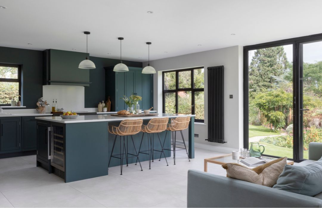
Kitchens are no longer merely functional boxes designed for food extraction and cleanup. They are the emotional epicenters of domestic life, functioning simultaneously as therapeutic retreats, command centers, and entertainment lounges. When homeowners execute a dramatic color transformation—swapping anemic neutrals for enveloping, saturated pigments—they are not just redecorating. They are weaponizing color psychology to rewrite how a space feels, how time moves within it, and how human interactions unfold around the island.
For decades, the real estate industrial complex conditioned homeowners to treat kitchen color as a financial liability. We were warned that anything darker than a neutral cream would crater resale values, induce claustrophobia, and age faster than milk. This aversion to drama created an ocean of sameness: seas of gray islands, white subway tile backsplashes, and stainless steel appliances that rendered residential interiors indistinguishable from corporate breakout rooms.
Yet, interior architecture has shifted dramatically. Driven by a collective exhaustion with sterile minimalism and a renewed appreciation for nesting, homeowners are embracing dark and moody palettes, high-contrast jewel tones, and rich earth pigments. This is not a fleeting aesthetic whim. It is a psychological counter-rebellion. When you flood a kitchen with rich, chromatic depth, you alter the optical boundaries of the room, manipulate cortisol levels, and trigger visceral comfort. Understanding why these dramatic shifts succeed—and why others crash and burn—requires looking past Pinterest boards and examining the underlying wiring of human spatial perception.
Decoding the Emotional Architecture of Saturated Palettes
Color is rarely just visual data; it is an active neurochemical stimulus. When photons hit the retina and travel to the amygdala and hypothalamus, they trigger immediate, subconscious emotional states. In a kitchen, where the autonomic nervous system is constantly toggling between alertness (choicing knives, boiling liquids) and relaxation (evening wine, slow weekend breakfasts), the chosen palette acts as a silent thermostat for mood. Saturated, dramatic colors—think midnight navy, rich oxblood, or deep olive—operate differently than tints and shades of white. They absorb light rather than reflecting it aggressively, creating an optical enclosure that feels protective rather than confining.
This phenomenon relies heavily on the concept of perceived shelter. Evolutionary psychology suggests our brains are hardwired to seek spaces that offer visual safety—niches that mimic the protective canopy of a forest or the deep warmth of a hearth. When a kitchen is painted in a high-chroma, deep-value color, the harsh edges of the room soften. The boundaries blur in low ambient light, making the space feel less like an echoey gymnasium and more like a tailored alcove. This shift reduces sensory overload. Instead of bouncing light into your eyes from every white-lacquered surface, a dramatic kitchen absorbs the chaos of daily life, offering a quiet, grounding visual anchor.
Furthermore, dramatic color choices heavily influence our relationship with time and pacing in the home. Bright, high-reflectance environments encourage speed and transactional behavior—grab your toast, pack the lunches, move along. Conversely, deep, enveloping tones naturally slow down human movement. They invite lingering. When the walls are bathed in a rich, moody charcoal, pouring a glass of wine at 9 PM feels like an intentional ritual rather than a casual pit stop. The psychological weight of the color commands a lower vocal register and a calmer physical posture, effectively changing how human bodies inhabit the room.
The Optical Physics of Contrast, Light Absorption, and Spatial Illusion
A common fear preventing homeowners from executing a dramatic kitchen transformation is the persistent myth that dark colors make small spaces feel microscopic. This is a fundamental misunderstanding of optical physics. White paint reflects all wavelengths of light, exposing every awkward corner, mismatched grain, and shadow line. In a poorly lit kitchen, white paint often looks dingy, gray, and sad rather than expansive. Dark colors, by contrast, possess high light absorption. By eliminating crisp shadow lines in corners, deep pigments cause the walls to visually recede. The boundaries of the room become ambiguous, which can actually make a compact kitchen feel more expansive, sophisticated, and infinite.
Achieving this optical illusion, however, requires mastering the interplay between paint finish, natural lumens, and artificial kelvin ratings. Glossy or high-satin finishes on dark cabinets act like dark mirrors, bouncing directional light around the room and creating pockets of jeweled brilliance. Matte finishes drink light entirely, offering a velvety, tactile richness that feels expensive and intentional, though they require careful consideration regarding fingerprint resistance and scrubability. The secret to making a dramatic kitchen work lies not in avoiding dark tones, but in balancing them with strategic moments of high reflectivity—such as unlacquered brass hardware, polished soapstone counters, or warm, linear LED under-cabinet strip lighting.
Light temperature is the invisible conductor of this visual orchestra. If you paint your kitchen a dramatic, moody forest green and illuminate it with harsh, cold 4000K LED bulbs, the space will immediately feel like an industrial morgue. The pigments require warm-spectrum lighting—ideally between 2700K and 3000K—to pull out the rich undertones of the paint. This warm luminescence interacts with deep pigments to create micro-shadows and rich gradients that flat, neutral palettes can never achieve. It transforms flat cabinetry into dynamic sculptural elements that shift character from morning sun to evening incandescent glow.
A Practical Blueprint for Executing a High-Impact Color Shift
Executing a dramatic kitchen transformation demands a rigorous, methodical approach. You cannot simply grab a brush and hope for the best; deep pigments are notoriously unforgiving of poor prep work, inadequate priming, and uneven application.
- Step 1 (Auditing Natural and Artificial Luminosity): Map out how light moves through your kitchen across a 24-hour cycle. Note exact window orientations, shadowing from neighboring structures, and the color temperature of your existing overhead fixtures before selecting any paint sample.
- Step 2 (The Large-Format Swatch Test): Never paint small squares directly onto existing cabinet doors. Paint two coats of your chosen dramatic color onto large 2×2 foot MDF boards and move them around the room, observing how the hue reacts to morning sun, midday glare, and evening artificial light over 48 hours.
- Step 3 (Meticulous Surface Preparation and Priming): Degrease all cabinet surfaces using a TSP (Trisodium Phosphate) substitute, sand down glossy clear-coats with 220-grit sandpaper to ensure mechanical adhesion, and apply a high-adhesion tinted primer that matches the LRV (Light Reflectance Value) base of your final topcoat.
- Step 4 (Spray Application or Professional-Grade Rolling): For factory-smooth results on cabinetry, use a professional HVLP (High Volume Low Pressure) paint sprayer or micro-fiber rollers specifically designed for enamels, applying multiple thin, uniform coats with proper curing times in between.
- Step 5 (Hardware and Fixture Calibration): Pair your newly transformed dramatic surfaces with complementary hardware finishes. Unlacquered brass, brushed copper, and matte black hardware interact with deep colors by providing necessary visual weight and tactile contrast, completing the transformation.
Navigating Structural Pitfalls and Environmental Hazards
Even the most thoughtfully chosen color palette can fail if technical execution ignores fundamental material realities. Kitchens are punishing environments. They experience thermal cycling from ovens, grease vaporization from stovetops, high humidity from dishwashers, and heavy physical impacts from pots, pans, and family pets. When you commit to a dark or high-saturation transformation, maintenance realities shift dramatically compared to forgiving white surfaces.
- Pitfall 1 (Ignoring Paint Formulation Durability): Using standard wall paint on kitchen cabinetry leads to rapid chipping, peeling, and staining from cooking oils. Workaround: Always specify a moisture-resistant, waterborne alkyd enamel or a two-component polyurethane cabinet paint that cures into a hard, impact-resistant shell capable of withstanding daily scrubbing.
- Pitfall 2 (Failing to Account for Undertone Clashes): Selecting a dramatic paint color in isolation without checking how its undertones interact with fixed elements like stone countertops, flooring, and tile. Workaround: Bring physical samples of your tile, flooring, and stone into the paint store, placing them directly under spectrum-correct lighting to spot hidden pink, blue, or green undertones before buying gallons of paint.
- Pitfall 3 (Overlooking Grease and Fingerprint Vulnerability): Deep matte finishes show natural skin oils and culinary grease splatters far more readily than mid-tone or textured surfaces. Workaround: Reserve ultra-matte finishes for vertical surfaces or low-touch accent walls, and specify a satin or pearl sheen for heavily handled lower cabinet drawers and island bases.
- Pitfall 4 (Monochromatic Overkill): Painting every single surface—walls, ceiling, trim, and cabinets—in the exact same dark shade without balancing elements. Workaround: Introduce tonal variation by using different sheens of the same color, or break up the visual mass with contrasting open shelving, natural wood accents, or a dramatic stone slab backsplash.
- Pitfall 5 (Rushing the Paint Curing Window): Reinstalling cabinet doors and loading heavy items onto shelves before the paint has fully polymerized, resulting in permanent dents and sticking doors. Workaround: Respect the manufacturer’s true cure time—which often takes anywhere from 14 to 30 days—handling newly painted doors with extreme care during the initial post-application weeks.
The Long-Term Psychological Dividend and Spatial Longevity
Investing emotional and financial capital into a dramatic kitchen transformation yields returns that extend far beyond initial aesthetic satisfaction. In an era dominated by hyper-mobility and temporary design trends, a deeply personalized kitchen acts as an anchor of permanence. When you reject the bland, algorithmic neutrality demanded by speculative real estate trends and instead tailor your home to your psychological needs, you reclaim your living space as a genuine expression of identity.
Consider the economic reality as well. While conventional wisdom warns that bold colors destroy resale value, real estate markets are increasingly rewarding distinctiveness over sterile blank slates. Buyers touring homes are visually fatigued by endless rows of generic white-and-gray kitchens. A professionally executed, deeply atmospheric kitchen with bespoke cabinetry, rich color depth, and considered hardware tells a story of craftsmanship and care. It signals that the home has been loved, curated, and upgraded with intention.
Moreover, the psychological dividend manifests in daily behavior. People who love their kitchen spaces cook more often at home, host more intimate gatherings, and report higher baseline levels of domestic satisfaction. The kitchen transforms from a utilitarian workshop into a restorative sanctuary. By shifting the color palette from passive neutrality to active, dramatic expression, you fundamentally alter your daily relationship with the most heavily utilized room in your home.
Strategic Frameworks for Harmonizing Color with Spatial Function
To ensure your dramatic kitchen transformation stands the test of time, you must integrate color choice with functional spatial zoning. A kitchen is a multi-tasking ecosystem containing distinct zones: prep, cooking, cleaning, and consumption. Treating the entire room as a monolithic block of color can sometimes flatten its architectural potential. Instead, experienced designers use color blocking and tonal layering to define functional zones while maintaining an overarching dramatic narrative.
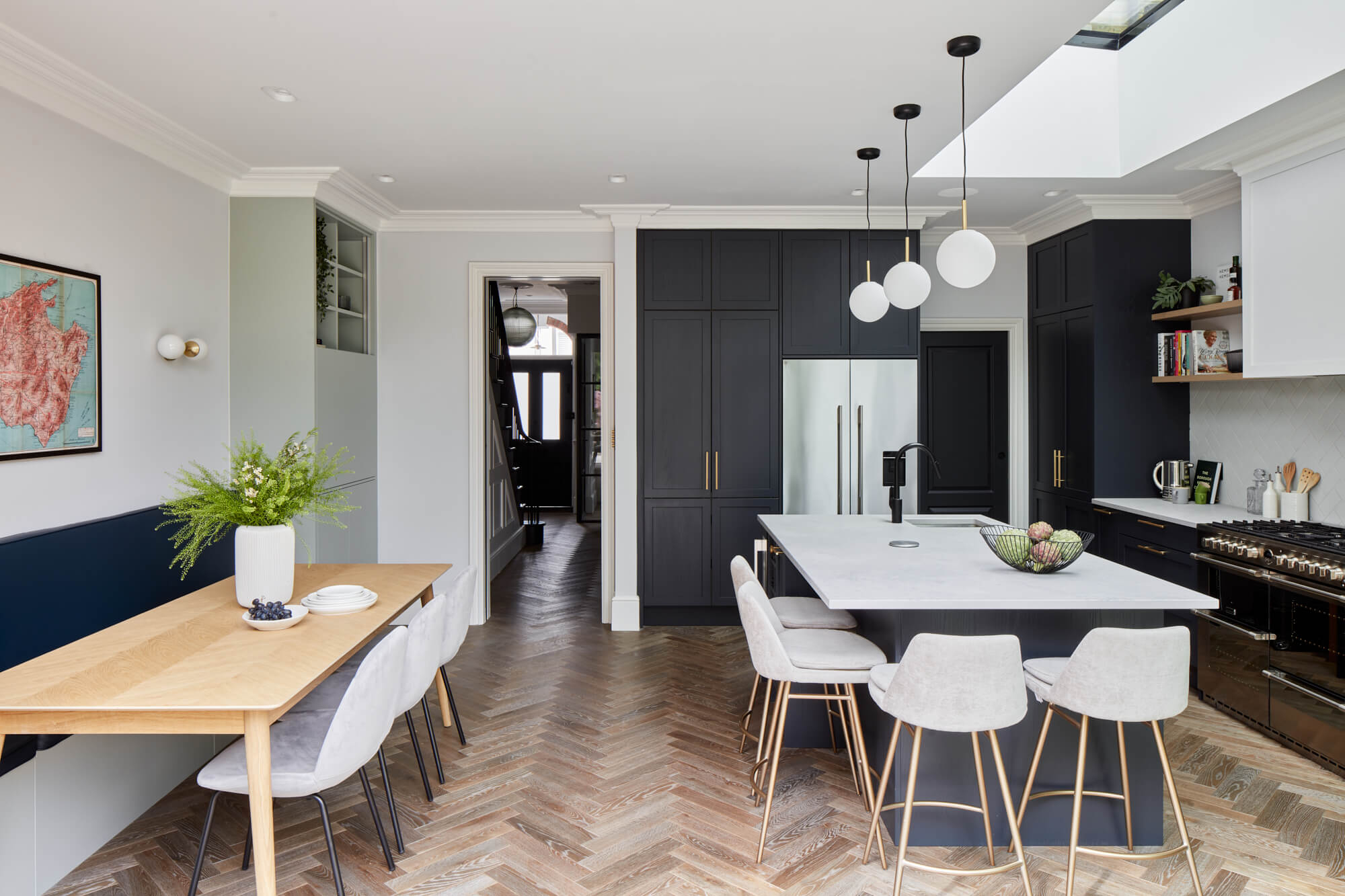
Consider anchoring the cooking and island zone in a heavy, grounding color—such as deep slate or rich plum—while keeping pantry built-ins or perimeter coffee stations in a lighter, complementary shade that bridges the kitchen to adjacent living areas. This visual hierarchy guides the eye, creates natural focal points, and prevents the space from feeling oppressive. It acknowledges that drama, when distributed intelligently, feels intentional and sophisticated rather than chaotic or claustrophobic.
Ultimately, successful kitchen transformations rely on balancing courage with technical discipline. Embracing drama does not mean abandoning logic; it means applying rigorous color theory, understanding material science, and respecting how light behaves within architectural envelopes. When these elements align, the result is more than just a newly painted room. It is a complete psychological reclamation of your living space—a bold, beautiful environment that welcomes you home every single day.
Stepping back to survey a newly transformed kitchen, the air in the room feels different. The harsh, clinical glare of yesterday has dissolved into rich, velvety shadows and warm, inviting highlights. That initial flicker of doubt—the fear that choosing a bold, saturated color would overwhelm the room—gives way to an undeniable sense of triumph. You realize that great design is not about playing it safe to appease an imaginary future buyer; it is about having the courage to craft an environment that feeds your soul in the present.
As residential architecture continues to evolve, the sterile white box is rightfully yielding to spaces defined by personality, warmth, and emotional resonance. The kitchen is no longer hiding behind neutral disguises. By understanding the psychological mechanics of color, respecting the physics of light, and executing your transformation with professional discipline, you create a space that does not just function—it inspires.
Your kitchen is now alive. Pour the coffee, dim the overheads, turn on the warm accent lights, and watch how the room responds. The transformation is complete, and the heart of your home is finally beating in your rhythm.