Ever walked into a room that felt less like a cozy haven and more like a cardboard box. We have all been there. When you are dealing with tight square footage, it is easy to feel trapped by the physical walls. But what if the boundary lines of your room were mostly just an illusion in your mind?
The truth is, how we see space has less to do with actual tape measures and much more to do with how our brains process light and color. By leaning into simple color psychology, you can trick your eyes into seeing a cramped corner as a bright, open sanctuary. It is not magic—it is just science and a bit of visual storytelling.
The Power of Pale and Reflective Shades
It is no secret that light shades make a space feel bigger. But why does this happen. Light tones have a high Light Reflective Value, which means they act like a mirror, bouncing sunshine and lamp light all around the area. When light bounces instead of getting absorbed, it blurs the hard edges of a room, making the boundaries seem further away than they actually are.
Soft whites, gentle creams, and pale grays are your best friends here. Instead of trapping your eyes on a specific wall, these hues let your gaze wander freely. It creates an airy vibe that mimics the open sky. If you are painting a small bedroom in 2026, starting with a crisp, light backdrop is the easiest win you can get.
Don’t Fear the Dark Side
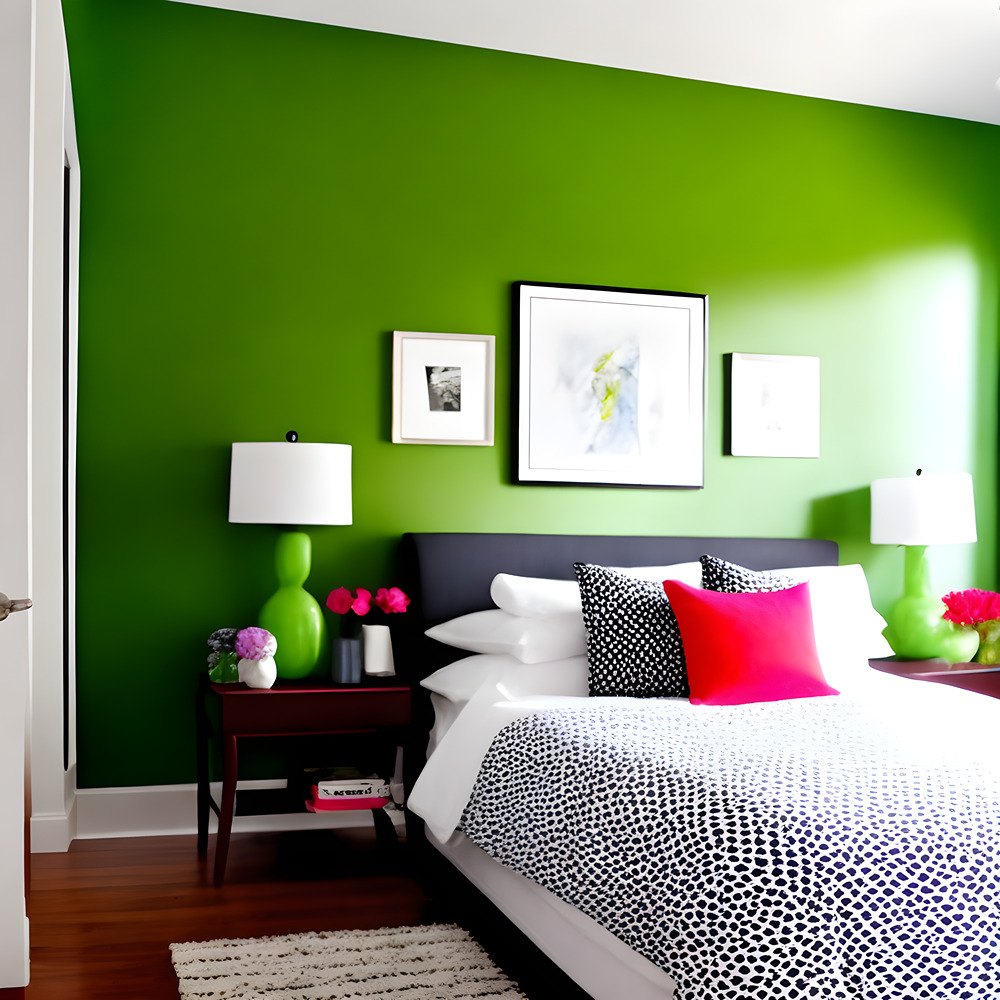
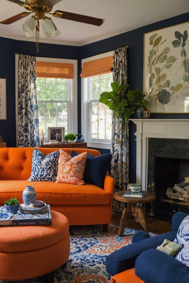
Now, here is a twist that surprises a lot of people. You do not have to banish dark paint completely. In fact, deep tones like navy blue, charcoal, and forest green can create an incredible sense of depth. Think about the night sky—it feels infinite because you cannot quite tell where the darkness ends.
When you paint a small room a rich, dark hue, you are leaning into the shadows. The corners disappear into the dark, which tricks your brain into thinking the space goes on forever. This works beautifully in tiny powder rooms or cozy dens where you want to lean into a moody, sophisticated vibe without feeling trapped.
The Monochromatic Magic Trick
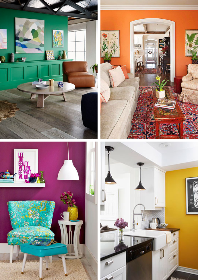
One of the biggest mistakes people make in tiny spaces is using too many contrasting colors. When your eyes have to jump from a green wall to a white baseboard, then to a brown door, it creates visual clutter. Every single contrast acts like a tiny speed bump for your brain, chopping the room into bite-sized pieces.
To fix this, try painting your walls, trim, doors, and even the ceiling in the exact same color. Using a single hue creates a seamless flow. Without those sharp color changes to stop your eyes, your gaze glides effortlessly across the room, making the entire layout feel vastly more expansive and unified.
Cooling Down the Visual Temperature
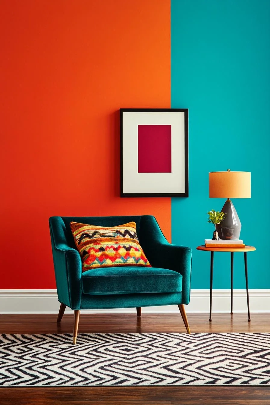
Colors have temperatures, and these temperatures change how we perceive distance. Cool tones—like soft blues, gentle greens, and light purples—are known as recessive colors. In psychological terms, this means they appear to move away from us. They literally seem to step backward.
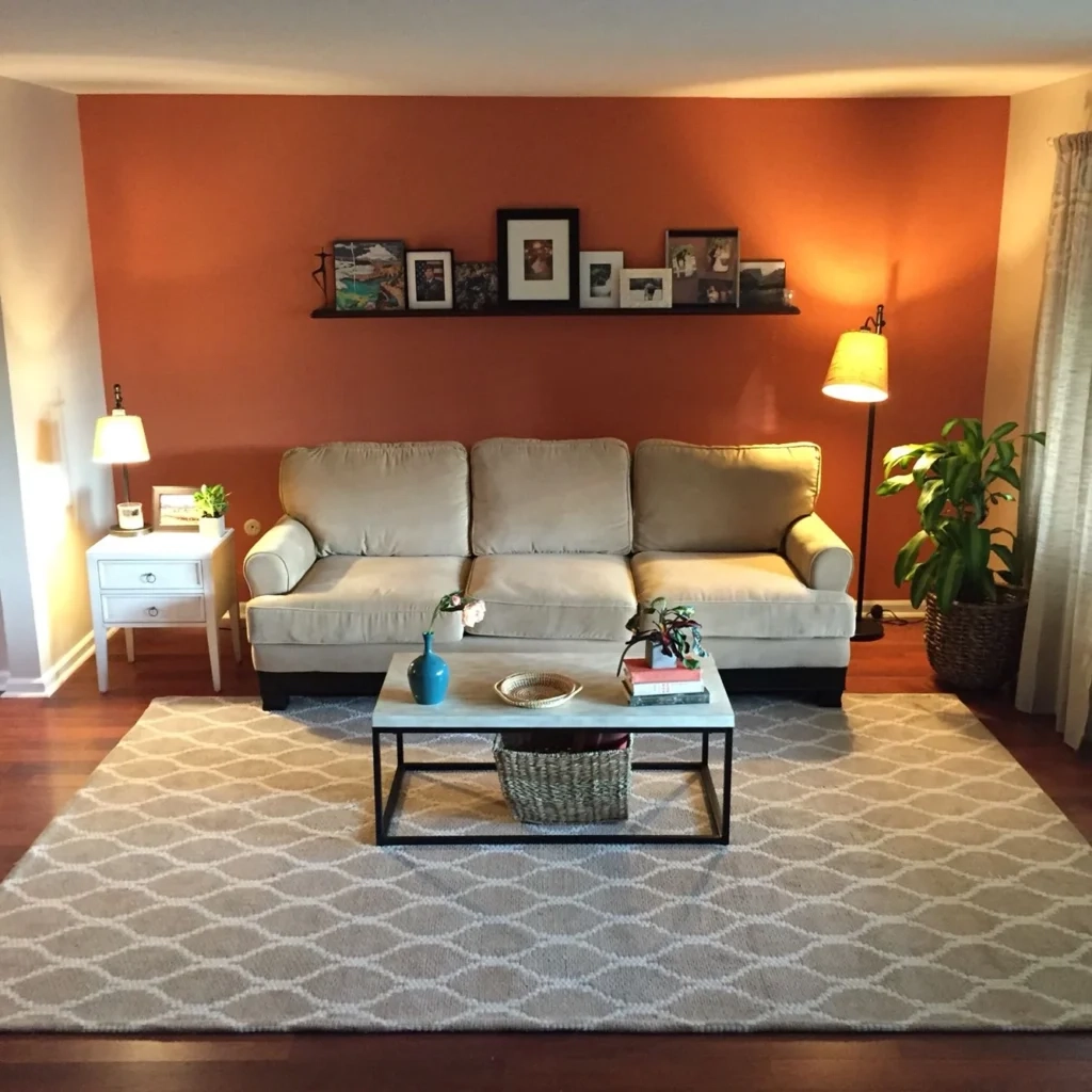
On the flip side, warm tones like reds, oranges, and deep yellows are advancing colors, meaning they rush forward to meet your eyes. If you want to push your walls outward, painting them a soft mist blue or a pale sage green will make them feel like they are expanding away from the center of the room.
Raising the Roof with Ceiling Illusions
We often forget to look up, but the ceiling is a massive canvas that dictates how big a room feels. If you have low ceilings, a dark or heavy color will make you feel like the sky is falling. To lift the room, pick a ceiling paint that is a few shades lighter than your walls, or stick to a pure, bright flat white.
This contrast draws the eye upward and creates the optical illusion of extra height. Want to take it a step further? Paint vertical stripes or use tall, slender shelving units that match the wall color. This guides the human eye on a vertical journey, making the whole place feel grander.
Textures and Finishes Matter Too
Color psychology does not stop at the hue itself; it is also about the finish you choose. A flat matte paint absorbs light, which is great for hiding bumps on old walls but bad for creating space. On the other hand, eggshell, satin, or semi-gloss finishes have a soft sheen that catches the light beautifully.
By using an eggshell finish on the walls and a slightly glossier semi-gloss on the trim, you create a subtle dance of light. The glossier parts will glint in the sun, creating an extra layer of visual interest and depth that makes a flat wall look three-dimensional and spacious.
Transforming a cramped area does not require knocking down walls or spending a fortune on