Walk into a room painted in aggressive, saturated cadmium red, and your pulse shifts almost imperceptibly. Your jaw tightens, your breathing shallowly accelerates, and your internal alert system flickers awake. Now, walk into a space draped in desaturated, earthy sage greens and muted slate blues. The physiological noise subsides. Your shoulders drop an inch. You do not merely see these spaces; you feel them in your nervous system.
We live in a chromatic ocean, yet most of us treat color like wallpaper—a superficial layer slapped onto an interface, a brand identity, or a living room wall at the eleventh hour. We pick hex codes based on fleeting trends or safe neutrality, wondering why our living spaces feel hollow or our digital products fail to evoke loyalty. The missing link is rarely technical execution. It is emotional resonance.
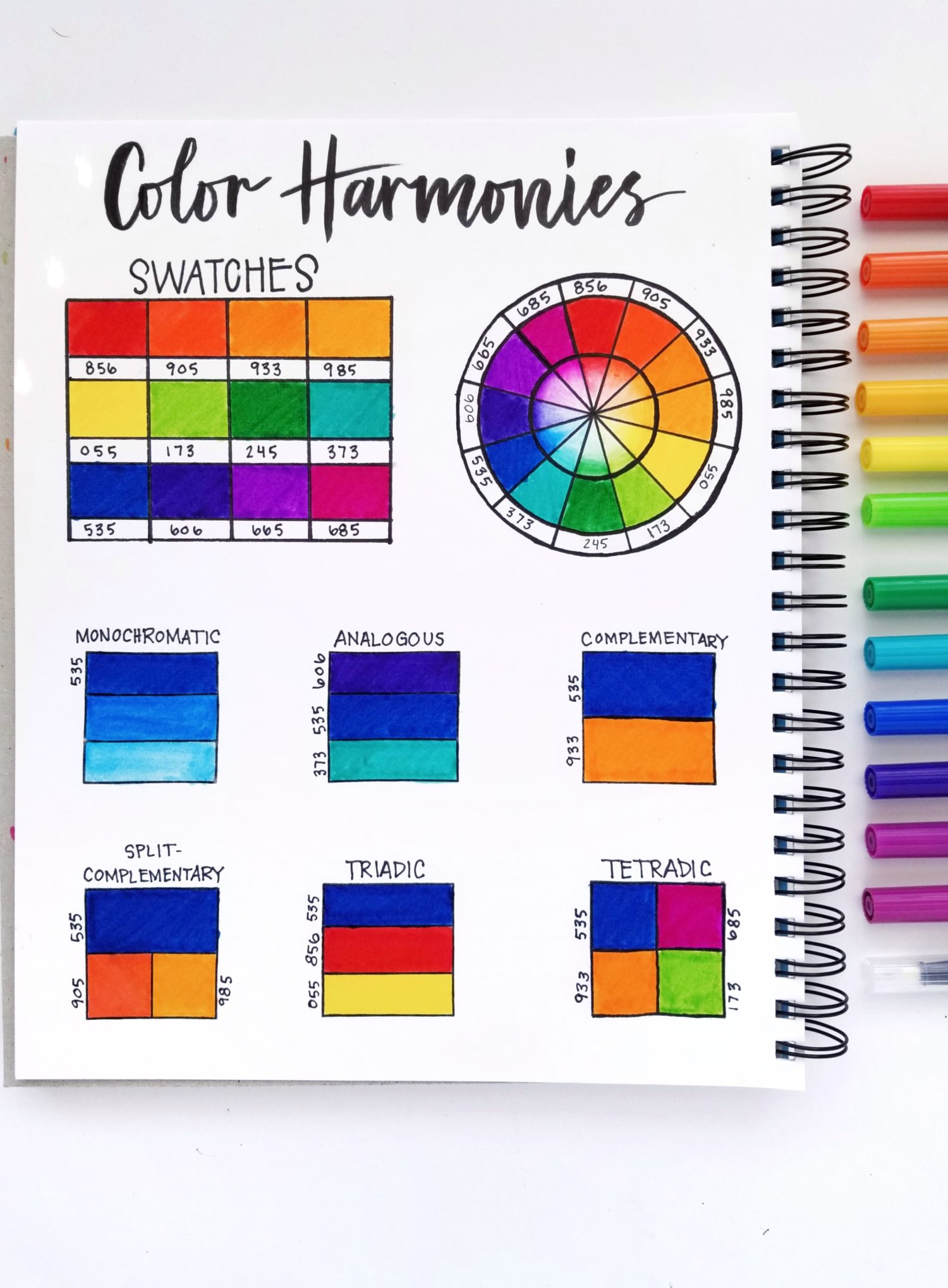
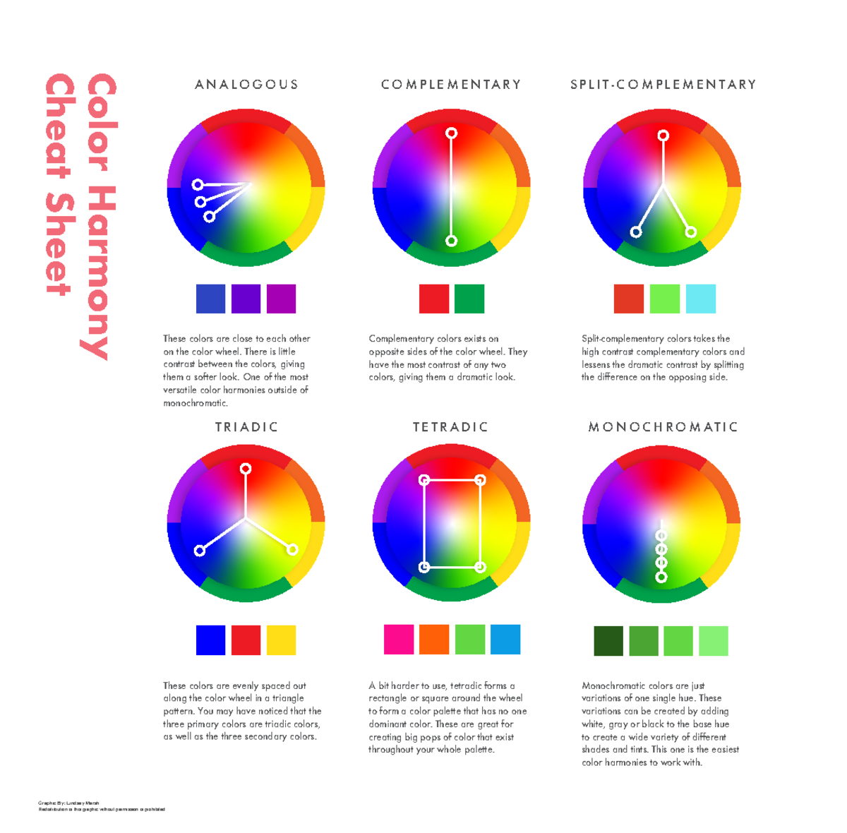
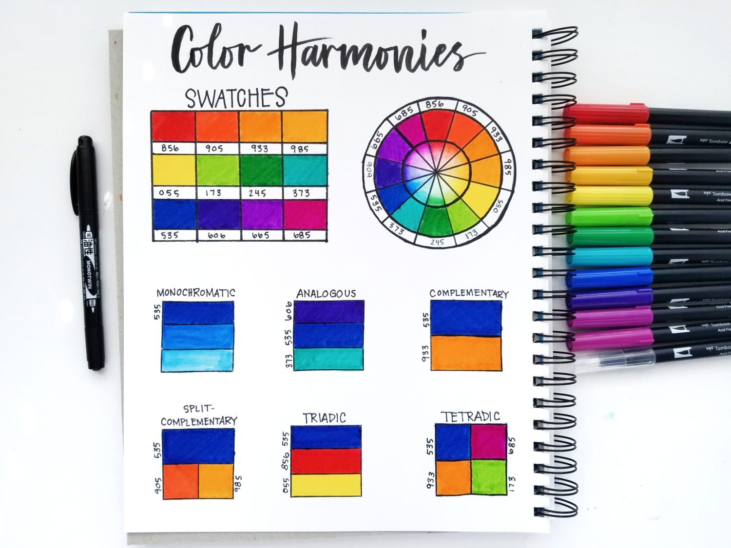
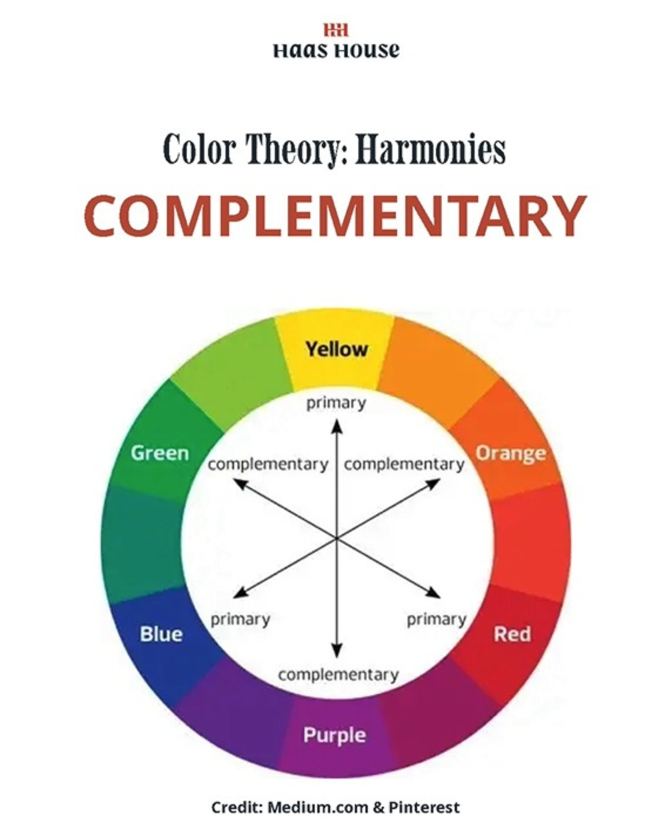
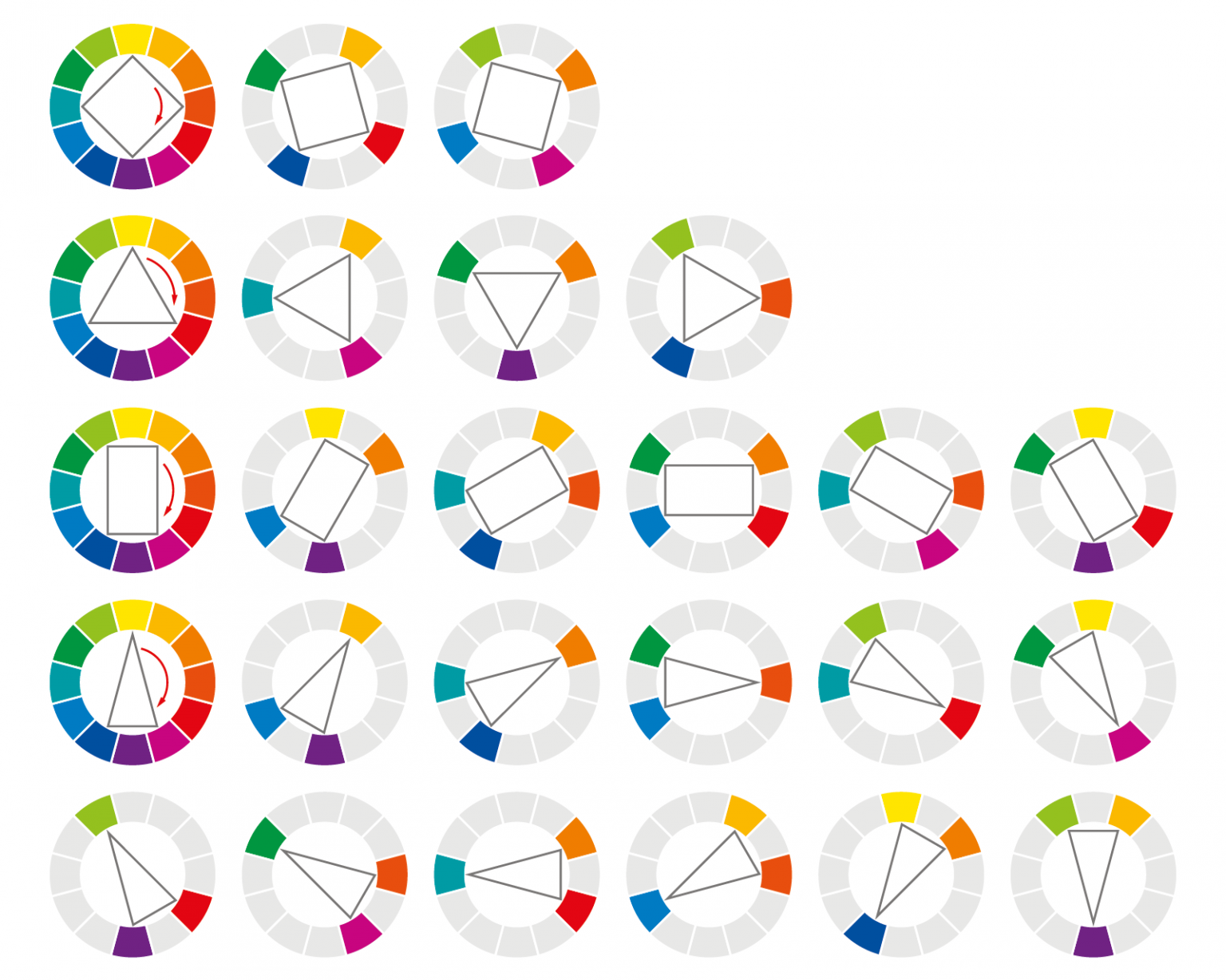
Color is not just light bouncing off a surface; it is an unspoken, primal language translated directly by the amygdala before our rational brain ever gets a vote. When designers talk about palettes that "work," they are usually referring to mathematical color harmony—complementary wheels, analogous gradients, triadic geometry. But mathematical balance does not guarantee human connection. A palette can be theoretically flawless and emotionally sterile. The color combinations we actually connect with—the ones that stick in our collective memory and drive authentic behavior—are those engineered through the lens of emotional resonance, cultural anthropology, and psychological weight.
The Neurobiology of Chromatic Feeling and Psychological Triggers
Long before humans invented pigments or digital screens, our survival depended on reading the emotional language of color. A bright crimson berry signaled nourishment, while a dark, bruised violet hinted at toxicity. A blazing orange sunset warned of encroaching darkness and predatory danger, whereas the deep, resonant blue of a midday sky promised stability and shelter. These ancient hardwirings remain intact beneath our modern veneer, dictating how we respond to color combinations on a physiological level.
When we look at a curated color palette, our brains do not process each hue in isolation. We process relationships, tensions, and resolutions. Chromatic contrast acts as an emotional narrative arc. Pair a high-arousal warm color like burnt sienna with a low-arousal cool tone like deep ocean teal, and you create a visual push-and-pull. The warm hue stimulates excitement, curiosity, and bodily alertness, while the cool tone anchors the composition, preventing cognitive overload. This interplay mimics the emotional rhythms of human experience—excitement balanced by grounding, passion tempered by reflection.
Understanding these psychological triggers requires moving past simplistic color associations like "blue means trust" or "yellow means happiness." In reality, human emotional states are deeply nuanced, and effective design mirrors that complexity. A single shade of mustard yellow can feel nostalgic and inviting when paired with warm walnut wood and cream, or jarring and anxiety-inducing when slammed against stark neon purple. The magic, and the emotional resonance, lives entirely in the connective tissue between the colors. We connect with combinations that validate our internal states or offer a visual sanctuary from them.
Deconstructing the Anatomy of Authentic Visual Harmony
Many creators stumble into aesthetic blandness by leaning too heavily on rigid color rules. They build palettes straight out of textbook color wheels, resulting in compositions that feel stiff, predictable, and ultimately forgettable. Authentic visual harmony requires embracing tension, imperfection, and contextual depth. It is the deliberate juxtaposition of the unexpected that forces the human eye to linger and the human heart to engage.
Consider the role of value and saturation in building emotional depth. A palette dominated by fully saturated, high-purity hues screams for attention, leading to sensory fatigue within seconds. Conversely, desaturated earth tones paired with a single, highly saturated accent color create a natural focal point that feels intentional rather than overwhelming. This is the chromatic equivalent of a whisper in a crowded room; it demands attention precisely because it refuses to shout. Materiality also plays an undeniable role. A digital hex code rendered on a glossy OLED screen evokes a very different emotional response than the exact same color applied as a matte, chalky mineral paint on a rough plaster wall.
To build palettes that resonate, we must look beyond the screen and consider how textures, lighting conditions, and temporal shifts alter our perception. A color combination that feels crisp and modern under 5000K office LED lighting might feel cold, sterile, and unwelcoming under the warm 2700K ambient glow of a residential living room. Crafting a truly resonant palette means designing for the environment it will inhabit, factoring in how natural weathering, aging, and daily human touch will soften its edges over time.
Step-by-Step Methodology for Designing Emotionally Resonant Palettes
Creating a color scheme that bridges the gap between raw psychology and visual execution requires a disciplined, step-by-step approach. By stripping away arbitrary choices and focusing on intentional emotional framing, you can build palettes that feel deeply human and universally engaging.
- Step 1 (Define the Core Emotional Objective): Before opening a design tool or swatching paint, articulate the exact emotional response you want to elicit. Are you aiming for quiet introspection, nervous excitement, nostalgic comfort, or authoritative stability? Write down three distinct adjectives that capture the desired mood.
- Step 2 (Establish the Dominant Anchor Tone): Select your primary color—the 60% rule foundation. This anchor hue should embody the baseline mood. For instance, a deep, desaturated forest green establishes a baseline of organic stability and grounded calm.
- Step 3 (Introduce Chromatic Tension and Contrast): Select a secondary supporting hue that introduces intentional contrast. If your dominant tone is a cool green, introduce a warm, earthy terracotta or muted clay. This temperature contrast creates visual dynamism and prevents the palette from feeling monotonous.
- Step 4 (Incorporate Neutral Mediators): Add one or two neutral tones that act as breathing room. Avoid stark, digital white or pure black unless specifically required. Instead, opt for complex neutrals—stone greys with warm undertones, oatmeal, charcoal with a hint of navy, or soft alabaster—to bridge the gap between your primary and secondary choices.
- Step 5 (Apply the Accentuation Rule): Reserve less than 10% of your composition for a high-impact accent color. This should be used sparingly to guide the eye toward critical focal points, mimicking how nature uses sudden bursts of color—like a red berry in a green thicket—to draw focus.
Navigating Common Traps and Field-Tested Workarounds
Even experienced designers frequently fall into predictable traps when attempting to craft emotionally resonant palettes. Recognizing these missteps and applying practical workarounds separates superficial decoration from enduring visual storytelling.
- Pitfall 1 (Over-Saturation Fatigue): Flooding a design with multiple fully saturated primary and secondary colors. Workaround: Desaturate the base and supporting tones significantly, reserving maximum saturation strictly for micro-accents to eliminate visual noise.
- Pitfall 2 (Ignoring Cultural Context): Applying color symbolism universally without accounting for regional, historical, or cultural variations in meaning. Workaround: Research the specific audience demographic and cultural associations of your chosen hues to prevent unintended alienation or miscommunication.
- Pitfall 3 (Relying Solely on Digital Monitors): Designing entirely within RGB color spaces without testing how values translate to physical print, fabric, or architectural finishes. Workaround: Always verify physical physical swatches under varying lighting temperatures before finalizing any major color commitment.
- Pitfall 4 (Lack of Value Hierarchy): Choosing colors that share the exact same lightness and darkness value (luminance), resulting in muddy contrast and accessibility failures. Workaround: Convert your design to grayscale immediately to test whether distinct luminance steps exist between adjacent elements.
- Pitfall 5 (Trend Chasing): Adopting hyper-trendy micro-palette combinations that quickly feel dated and inauthentic. Workaround: Anchor 80% of your palette in timeless, nature-derived archetypes, limiting trendy hues strictly to easily swappable accent elements.
The Broader Implications of Chromatic Design on Well-Being and Commerce
Color choices extend far beyond mere aesthetics; they directly influence human cognitive function, workplace productivity, retail behavior, and psychological well-being. Healthcare facilities shifting away from sterile, institutional white toward biophilic palettes featuring soft olives, warm woods, and restorative sky blues report measurable decreases in patient anxiety and faster recovery times. Similarly, educational environments that abandon harsh primary colors in favor of balanced, low-glare earth tones see noticeable improvements in student focus and emotional regulation.
In commercial spaces and digital branding, emotional resonance translates directly to brand loyalty. Consumers can instinctively sense when a brand’s visual identity is a genuine reflection of its core ethos versus a hollow marketing ploy. When a company’s color palette aligns seamlessly with its mission—such as an outdoor conservation brand utilizing deep pine, weathered stone, and subtle lichen accents—it builds instant, subconscious trust. This alignment reduces cognitive friction, making the user’s journey through a physical space or a digital interface feel effortless, intuitive, and deeply satisfying.
Furthermore, the economic sustainability of design is inherently tied to emotional resonance. Palettes that genuinely connect with human psychology have staying power. They resist the frantic churn of fast-paced design trends, reducing the need for constant rebranding or costly interior renovations. By investing time upfront in understanding the psychological underpinnings of color relationships, creators build systems that endure, proving that beauty and functional utility are inextricably linked when grounded in authentic human feeling.
Frameworks for Long-Term Color Strategy and Application
Translating emotional resonance into a repeatable, long-term strategy requires building internal frameworks that guide future design decisions. Whether you are managing a growing brand design system, curating a residential architectural portfolio, or developing physical products, having a structured chromatic philosophy prevents arbitrary decision-making.
Start by cataloging your successful palette combinations not just by their hex codes, but by the emotional narratives they tell. Create internal design briefs that categorize palettes by their psychological use cases: "Restorative Sanctuary," "Vibrant Collaboration," "Authoritative Trust," or "Nostalgic Intimacy." When a new project begins, team members can select a psychological category first, narrowing down the chromatic possibilities to those engineered for that specific human experience.
Document the lighting conditions, material finishes, and contextual constraints associated with each palette. Establish a living style guide that includes accessibility benchmarks, ensuring that high emotional resonance never comes at the cost of readability or inclusivity. By treating color systems as living, breathing psychological tools rather than static design assets, you ensure that every visual touchpoint continues to foster deep, meaningful human connections over years of use.
Color is ultimately an act of empathy. When we curate combinations that resonate on a visceral, emotional level, we are acknowledging the complex inner lives of the people who will experience our work. We are offering them a moment of calm in a chaotic digital landscape, a spark of inspiration during a sluggish afternoon, or a sense of deep, rooted belonging in a physical space.
The future of design does not lie in algorithmic perfection or automated palette generators that strip away human nuance. It lies in our willingness to look closer at the world around us—at the weathering of stone, the shift of twilight across a mountain range, the subtle interplay of shadow and light—and translate those observations into intentional visual narratives. By respecting the profound psychological weight of color and designing with genuine emotional intent, we create work that is not only seen, but deeply and lastingly felt.