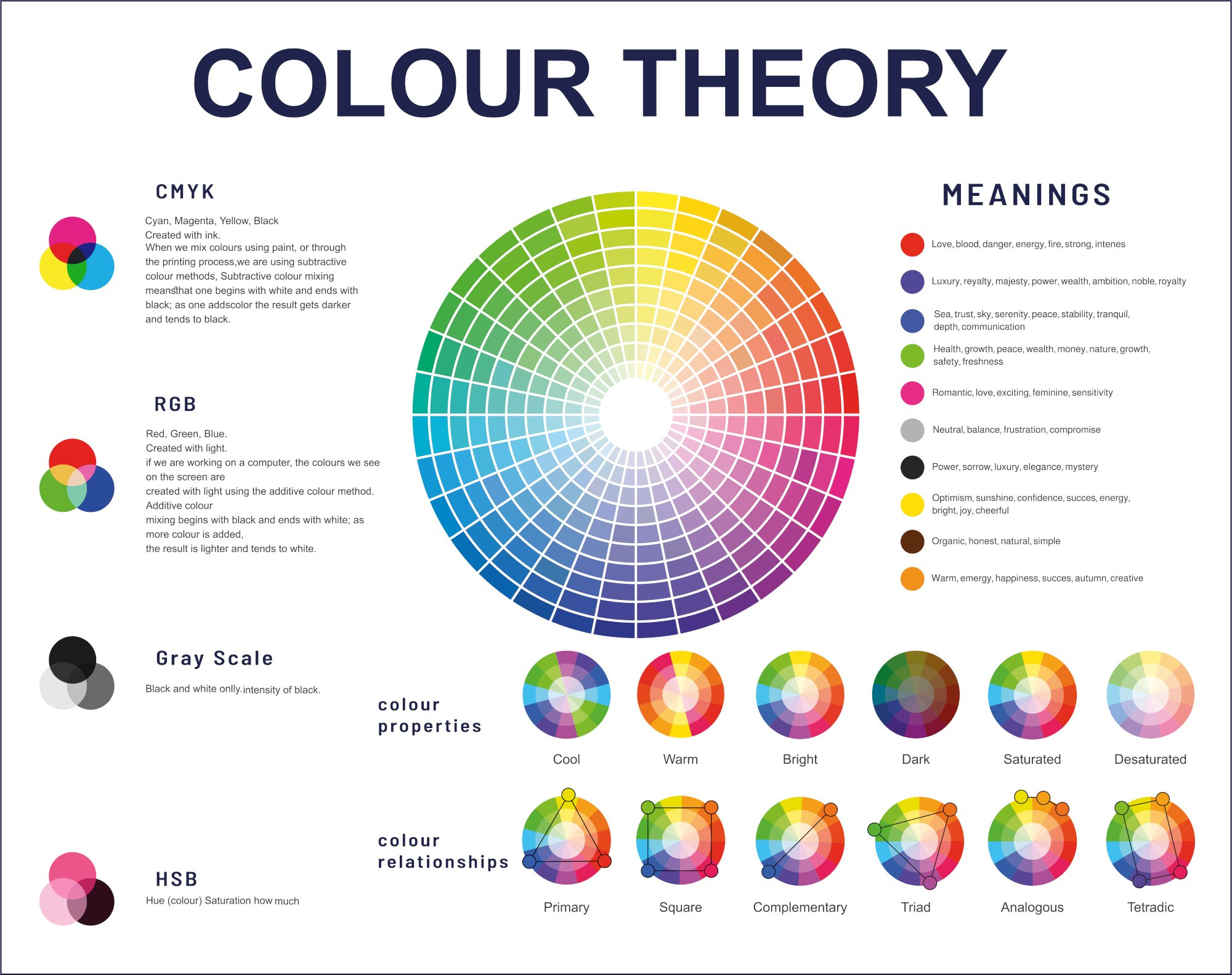
Have you ever landed on a website and felt an immediate, unexplainable jolt. Maybe it was a neon lime green smashed against a deep, moody burgundy. Your brain takes a millisecond to process it, and suddenly, you are locked in. You aren’t bouncing off the page; you are intrigued.
For decades, web design played it incredibly safe. We lived in a world dominated by "tech blue" and clean, sterile minimalism. But recently, something shifted. As we navigate through 2026, the internet has become a crowded, noisy highway. To stand out, brands are throwing the traditional color wheel out the window and embracing pairings that used to be considered complete design sins.
The End of Safe Design
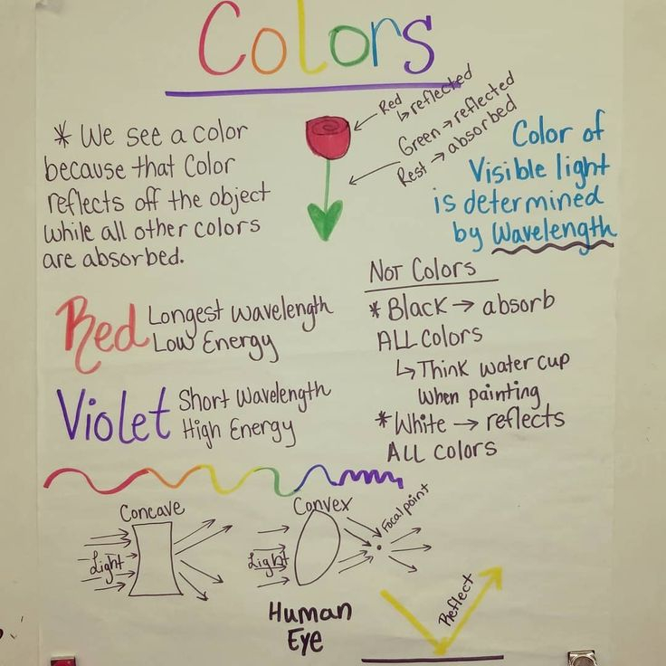
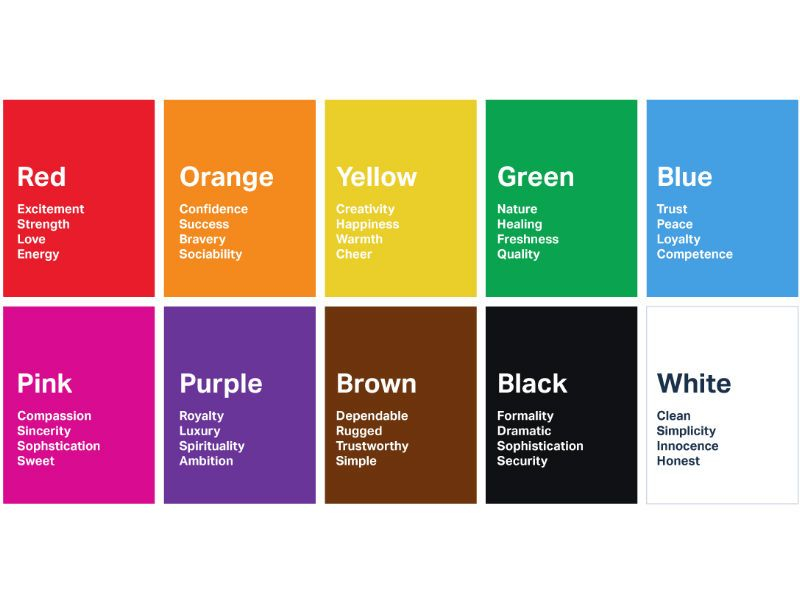
Let’s be honest, we were all getting a little bored of the same corporate websites. You know the ones—white backgrounds, safe blue accents, and gray text. It felt clean, sure, but it also felt entirely soul-less. This clinical approach was built on old-school color psychology, which told us that blue equals trust and red equals urgency.
But humans adapt quickly. When every banking app and software platform uses the exact same palette, those colors lose their psychological magic. They become digital wallpaper. Designers realized that to make people feel something genuine, they had to disrupt the pattern. That is where unexpected pairings come into play. By clashing colors that supposedly do not belong together, websites trigger a tiny, pleasant shock to our cognitive systems.
Why Contrast Captures Our Brains
Our brains are essentially pattern-recognition machines. We glide through the digital world on autopilot, predicting what comes next based on past experiences. When a website violates those predictions with a weird color combo, it forces us into a state of active attention. Psychologists call this the bvon Restorff effect, which basically means that an item that stands out like a sore thumb is the one you will remember.
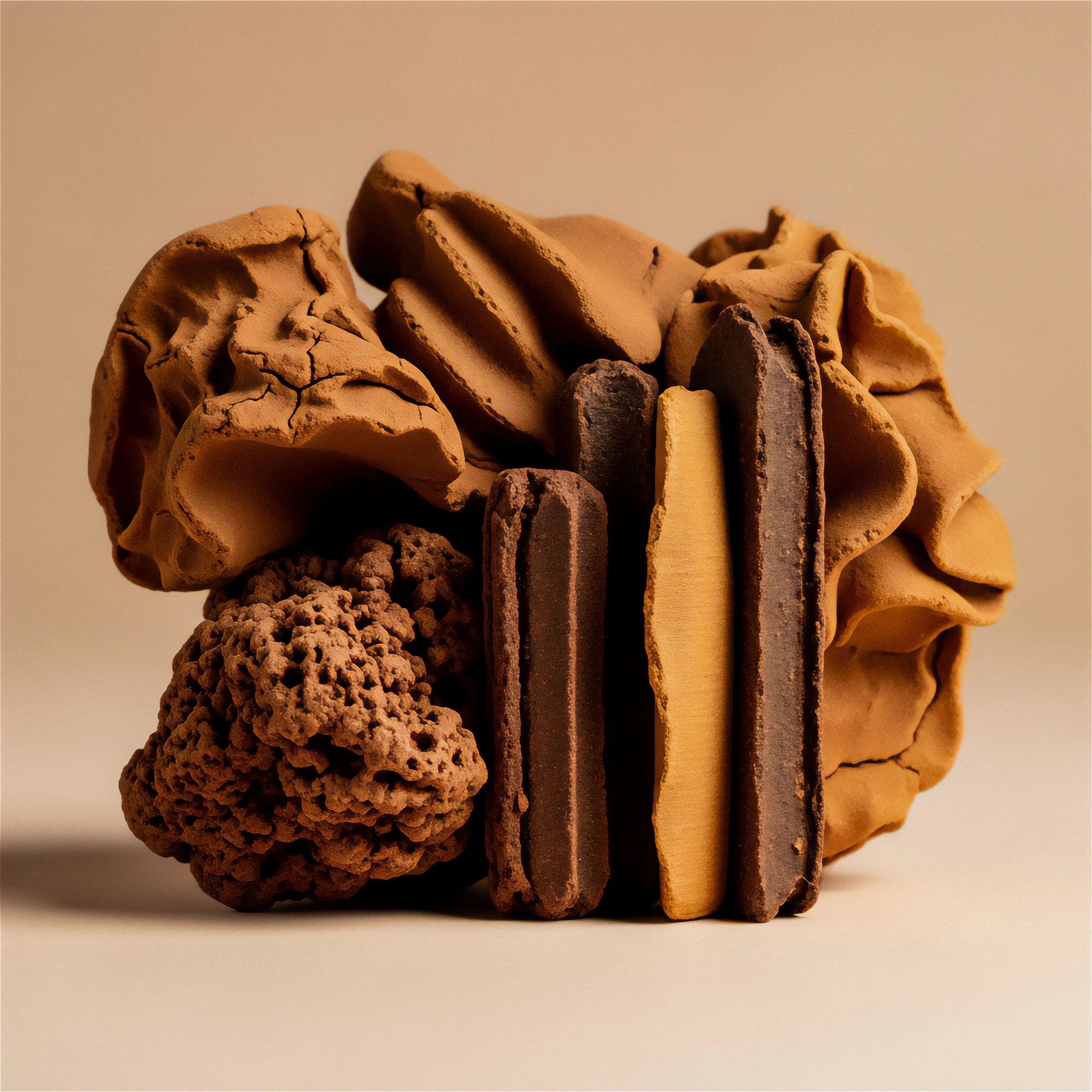
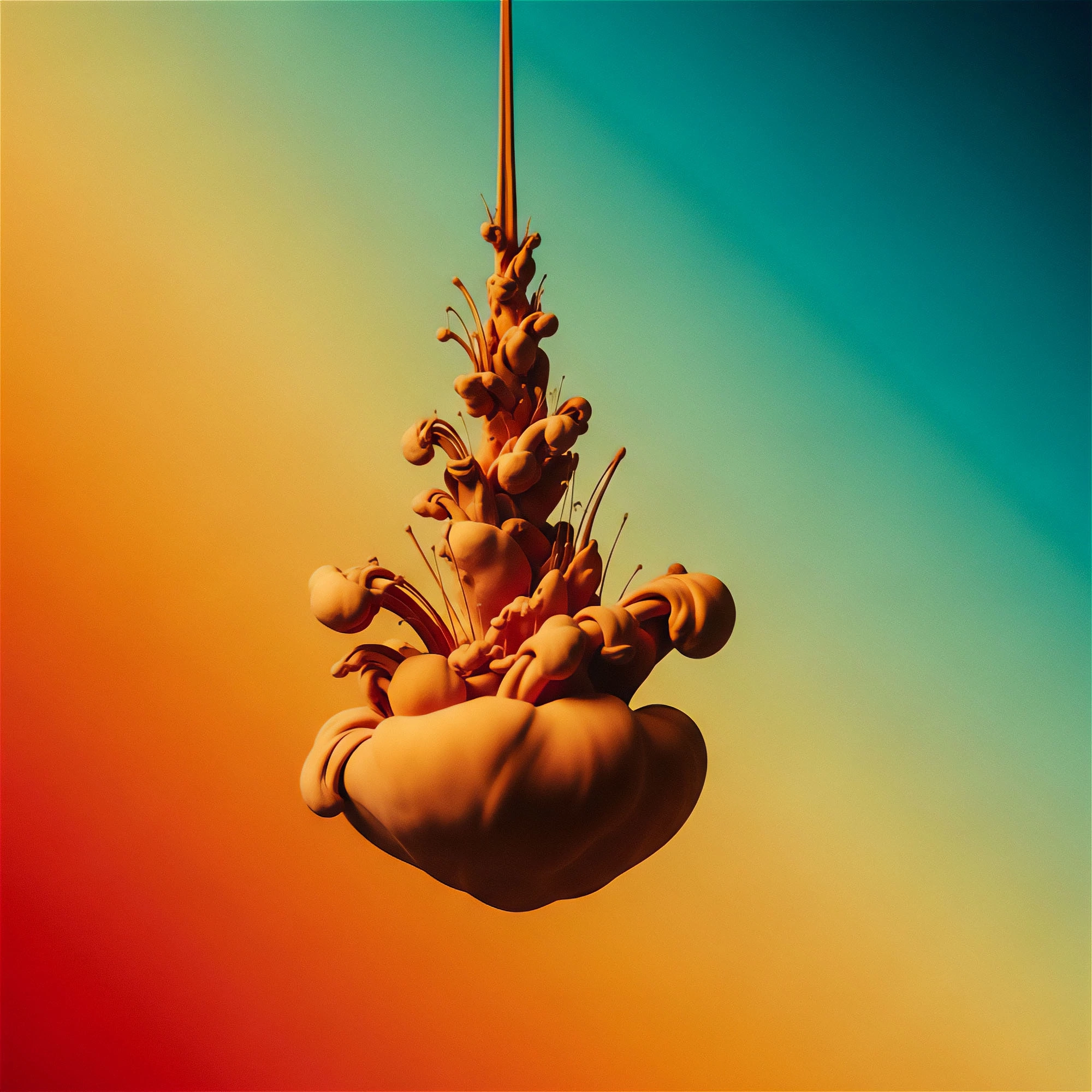
Imagine pairing a soft, vintage pastel peach with a sharp, electric digital blue. It shouldn’t work, yet your eyes can’t look away. The pastel whispers comfort, while the electric blue screams futurism. This friction creates a unique emotional tension. Instead of feeling soothing or aggressive, the site feels alive and dynamic.
Emotional Friction and Brand Memory
When you use colors that fight a little bit, you create emotional friction. This isn’t a bad thing. In fact, it is the secret sauce for building a brand that sticks in someone’s head for days. If a user feels a slight sense of surprise, their brain releases a tiny splash of dopamine. Suddenly, your brand isn’t just another service; it is an experience.
Take a look at some of the trendiest fintech and creative portfolios launching this year. We are seeing things like deep mustard yellow paired with a vibrant lilac. The yellow brings warmth and energy, while the lilac adds a touch of mystery and luxury. It breaks the boring "corporate trust" mold and replaces it with something that feels human, artistic, and fiercely independent.
The Cultural Shift of 2026
Our relationship with the digital space has changed drastically over the last few years. In 2026, internet users—especially younger generations—crave authenticity over perfection. Perfect, hyper-curated color schemes can actually feel manipulative or fake. Clashing or strange color combinations, however, feel raw and real.
It is a bit like fashion. A generation ago, matching your shoes to your belt was the golden rule. Today, the most stylish people mix patterns and colors that seem totally chaotic at first glance. Web design is finally catching up to this cultural desire for self-expression. We want websites that look like they were made by an artist, not an automated algorithm.
Making the Mess Work: A Balancing Act
Now, there is a very fine line between a brilliant, unexpected color pairing and a total eyesore. You can’t just throw random colors together and hope for the best. The secret usually lies in controlling the real estate of the screen. Designers often use a dominant, muted tone for 80% of the page, then hit the user with a wild, unexpected contrast for the remaining 20%.
For instance, a site might feature a very dark, earthy forest green as its backdrop. That feels grounded and calm. But then, the navigation buttons and call-to-action text are rendered in a blazing hot pink. The pink shouldn’t be there, biologically speaking, but because it is used sparingly, it acts as a perfect homing beacon for your mouse. It guides the eyes exactly where they need to go without causing a headache.
Practical Tips for Bold Creators
If you are thinking about experimenting with this in your own projects, start small. You don’t have to overhaul your entire brand identity overnight. Try introducing one rogue color into your secondary elements. If your brand relies heavily on cool grays and navies, try dropping in a splash of burnt orange or a neon lime accent.
- Test for readability: No matter how cool a combo looks, if people can’t read your text, they will leave. Always check the contrast ratio.
- Use the 60-30-10 rule: Keep 60% of the site dominant, 30% secondary, and save that weird, unexpected color for the final 10% punch.
- Listen to feedback: Drop your new design in front of everyday people and ask them how it makes them feel, rather than just asking if they like it.
Ultimately, the rise of unexpected color pairings tells us that the web is becoming a more vibrant, expressive place. We are moving away from the rigid frameworks of the past and entering an era where breaking the rules is highly rewarded. It turns out that a little bit of visual chaos is exactly what we needed to wake up from our digital slumber.
As we move forward through 2026 and beyond, expect to see even wilder experiments. The brands that win will be the ones brave enough to make their audiences stop, blink, and look a little closer. So, don’t be afraid to mix that vintage olive green with a bright sky blue. Your users’ brains will thank you for the spark.