Ever walked into a room that felt less like a home and more like a high-end tech lab? For a long time, we were obsessed with those clinical whites and ultra-crisp, cool greys. It looked great on a screen, sure, but living in it day in and day out. That is a whole different story.
As we move through 2026, there is a massive shift happening right under our feet. People are tired of sterile spaces. We want our homes to feel like a big, warm hug at the end of a chaotic day. That is exactly why designers everywhere are tossing out the cold palettes and embracing a new kind of canvas: calming sage greens and complex, muted taupes.
Moving Away from the Cold, Sterile Past
Let’s face it, the cool-toned neutrals that dominated the last decade have finally run their course. Stark whites and flat greys can feel incredibly harsh, especially when the natural daylight outside is a bit gloomy. In 2026, homeowners are actively craving spaces that feel layered and emotional rather than pristine and untouched. We want rooms that show a little personality.
By moving away from these rigid backdrops, we are opening the door to colors that actually react to light and shadow. Instead of a room looking flat, these newer tones provide an instant sense of architectural depth. It is all about creating a sanctuary where you can actually kick your shoes off without feeling like you are ruining a gallery display.
Why Sage Green is the New Universal Background
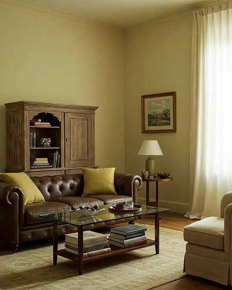
Green has officially become the undisputed neutral of the year. But we aren’t talking about bright lime or heavy hunter greens here. Sage green, with its soft grey and subtle yellow undertones, acts as a beautiful, quiet foundation. It is colorful enough to feel interesting, yet subtle enough that it doesn’t shout for attention.
Designers love it because it is an incredible "gateway color" for people who are usually terrified of anything other than beige. When you coat a living room or a kitchen island in a gorgeous sprig of sage, it instantly changes the energy. It feels restorative. It is almost like bringing a little bit of the quiet wilderness right into your everyday routine.
Muted Taupe and the Magic of Complexity
Now, if sage green is the star, muted taupe is definitely the secret weapon. For a while, regular old beige got a bad reputation for being bland and boring. But the taupes we are seeing in 2026 are entirely different. These are complicated, nuanced shades that sit comfortably between grey, brown, and sometimes even a hint of dusty pink.
Because these colors are so rich with undertones, they look completely different depending on the time of day. In the bright morning sun, a taupe wall might look like sun-bleached linen, while under warm evening lamps, it transforms into a cozy, cocooning mushroom shade. It adds a tactile, earthy vibe that makes any desing look instantly expensive and curated.
The Power of Nature-Inspired Living
A huge reason behind this sudden color revolution is our obsession with biophilic design. This is just a fancy way of saying we want to feel closer to the natural world. In an increasingly digital era, spending hours looking at glowing screens makes us crave organic textures and grounding tones when we finally look up.
Sage green and muted taupe echo the natural palettes of pottery, eucalyptus leaves, stone, and rich soil. When you surround yourself with these hues, your nervous system can actually relax. It is amazing how much a simple paint swap can alter the emotional resonance of a room, transforming a basic bedroom into a spa-like refuge.
Practical Tips for Layering the Look
So, how do you actually use these colors without making your house look like a muddy forest. The trick is all about monochromatic depth and smart contrast. Instead of just painting one accent wall, designers are leaning into color drenching—painting the walls, trim, and sometimes even the ceiling in variations of the same soft tone to make a space feel larger and unified.
You can pair caramel kitchen cabinets with a soft sage backsplash, or use a rich taupe on the walls while bringing in light sage green textiles through linen curtains and wool throws. Mixing these two specific neutrals creates a gorgeous balance where the cool undertones of the green perfectly offset the cozy heat of the taupe.
Adding the Perfect Textures and Accents
To keep these earthy neutrals looking fresh and modern, you need to think about what materials you are pairing them with. Because these colors are rooted in nature, they absolutely sing when they are placed next to raw wood, authentic stone, rattan, and unlacquered brass.
If you want a little more drama, you can easily introduce some of 2026’s bolder accent trends. Think about dropping in a rich chocolate brown armchair, a few terracotta flower pots, or even small pops of deep burgundy and charcoal. These darker, moodier accents give the soft sage and taupe background a beautiful, polished frame.
At the end of the day, this shift toward calming sage greens and muted taupes isn’t just a fleeting trend. It represents a deeper realization about what our homes should actually do for us. We don’t need spaces that merely look perfect for a social media feed; we need environments that nurture our well-being and make us feel safe.
By trading in the clinical, cold grays for these soft, nature-rooted alternatives, you are creating a timeless backdrop that can evolve alongside your personal style. So, if you’ve been thinking about refreshing your space this year, don’t be afraid to lean into the warmth. Pick up a few paint samples, watch how they change in your evening light, and enjoy the process of creating your own peaceful sanctuary.