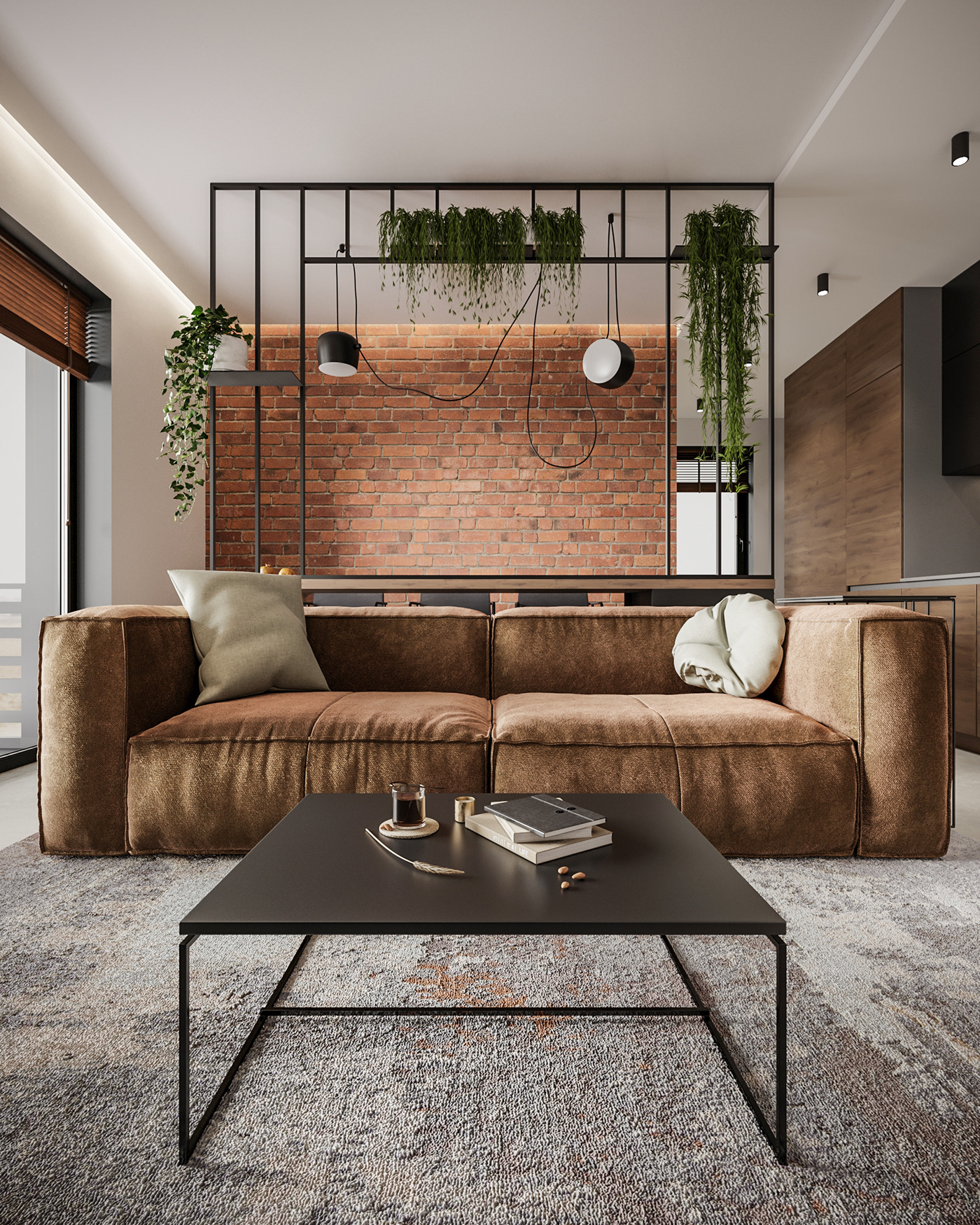
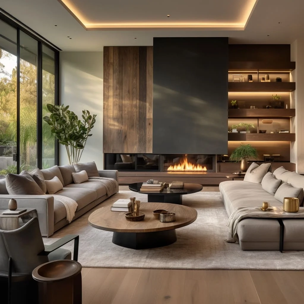
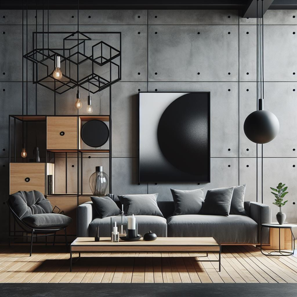
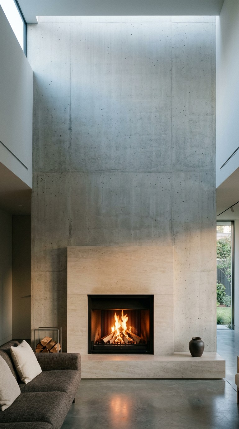
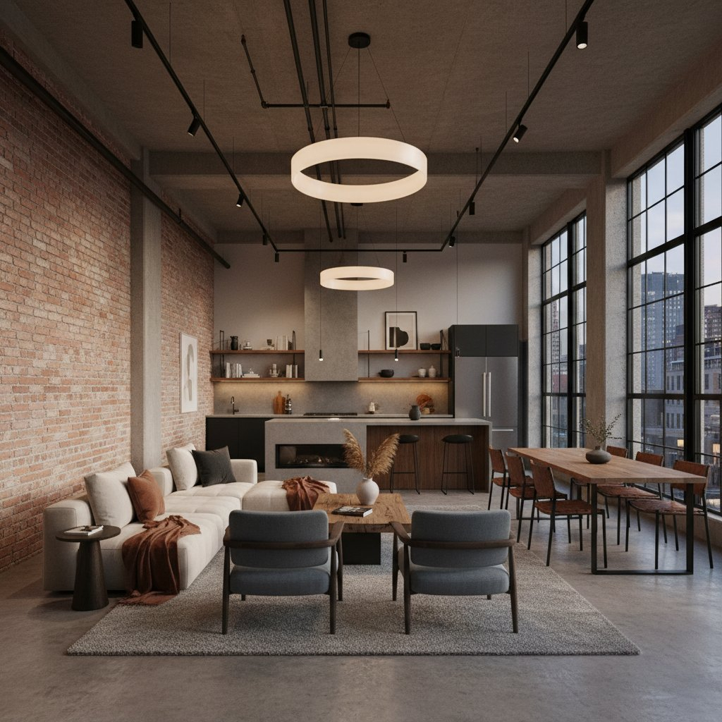
Step into a turn-of-the-century textile mill converted into a modern residential loft. The morning light cuts through multi-pane steel windows, casting long, geometric shadows across unvarnished concrete floors. There is no clutter, no extraneous decoration, and no visual noise. Every surface tells a story of structural necessity—from the flanged iron pipe brackets supporting open oak shelving to the charcoal-toned masonry walls that have weathered decades of urban history. This is where minimalism meets industrialism, creating an environment that feels simultaneously austere and deeply grounding.
Navigating the intersection of minimalist reduction and industrial utility requires more than simply painting a room gray and hanging an Edison bulb. It demands an intimate understanding of how color interacts with raw, unadorned materials. When you strip a space or a product design down to its absolute essentials, color ceases to be a mere decorative afterthought. Instead, it becomes a structural language. It dictates spatial perception, highlights material integrity, and communicates functional intent.
The fusion of these two design philosophies has evolved from a niche urban revival into a defining aesthetic of contemporary architecture, interior styling, and industrial product design. Whether you are outfitting a high-end commercial workspace, designing a consumer hardware product, or renovating a brutalist apartment, mastering these color schemes bridges the gap between cold warehouse utility and serene, intentional living. The goal is to avoid sterility while honoring the unyielding honesty of raw materials.
The Architectural Roots and Material Physics of Raw Palettes
Industrial design draws its lineage from the factory floor, the shipyard, and the infrastructure of the industrial revolution. Structural steel, poured concrete, weathered brick, and utility-grade timber were never chosen for their aesthetic charm; they were selected for tensile strength, fire resistance, and cost-efficiency. Over time, the patinas left behind by machine oil, oxidation, soot, and natural weathering created an accidental palette of profound depth. When minimalism enters this equation, it imposes a strict editorial eye. It edits out the chaotic mess of the working factory, retaining only the clean lines, load-bearing forms, and honest materials.
Understanding the physics of these materials is the first step in building a coherent color scheme. Natural concrete is rarely a flat, uniform gray. It is a complex aggregate of limestone, sand, and water that cures into mottled variations ranging from cool slate to warm, earthy taupe. Steel transitions from a bright, reflective mill finish to deep charcoal-black and, when oxidized, rich rust-orange. Wood used in industrial contexts—often reclaimed joists or scaffolding planks—brings deep tannins, amber undertones, and visible grain patterns that counteract the chill of masonry and metal.
Minimalism acts as the clarifying lens for these heavy, utilitarian elements. By reducing visual clutter, the minimalist framework allows the microscopic color variations within raw materials to command attention. A single wall of exposed red brick does not need competing artwork when framed by stark matte-white drywall. The contrast between the rough, porous terracotta and the smooth, reflective plane of white paint creates a dynamic spatial dialogue. This balance prevents the space from feeling like an abandoned warehouse while keeping it anchored in reality.
The interaction of light within this environment cannot be overstated. Industrial spaces historically featured massive fenestration designed to flood workspaces with natural daylight. Consequently, industrial color schemes rely heavily on light absorption and reflection values (LRV). Dark charcoal and matte black absorb light, creating intimate zones and defining spatial boundaries, whereas off-whites and pale concrete grays bounce daylight deep into a room. Balancing these values is what separates a thoughtfully designed industrial interior from a dark, cave-like enclosure.
Decoding Factory-Inspired Neutrals and Metallic Undertones
The foundation of any successful industrial minimalist palette rests upon a carefully curated spectrum of neutrals and metallic finishes. Far from being a boring absence of color, these hues form a sophisticated ecosystem of tone and temperature. Getting this right requires categorizing neutrals not merely by their shade, but by their undertones. A gray paint with a heavy blue undertone will feel cold and clinical when paired with stainless steel, whereas a gray with a green or brown undertone instantly warms up, harmonizing with exposed timber and weathered brick.
At the core of the palette are the foundational neutrals: off-whites, greys, and deep charcoals. Pure stark white can occasionally feel blinding and artificial against raw materials; therefore, designers often lean toward chalky off-whites, alabaster, or gypsum hues that mimic raw plaster. These shades provide maximum light reflectance while softening the transition to heavier elements. Moving along the spectrum, concrete grays occupy the middle ground, serving as the ultimate transitional bridge between stark white walls and dark metal fixtures.
Metals provide the punctuation marks in an industrial color scheme. However, treating all metals as interchangeable is a frequent miscalculation. Polished chrome belongs in a mid-century diner or a sterile hospital, not an authentic industrial minimalist scheme. Instead, the focus shifts to hot-rolled steel, wrought iron, blackened bronze, and brushed nickel. These finishes carry low reflectivity and deep, absorbing color properties. When used for window frames, stair stringers, or furniture legs, they anchor the room’s composition.
Earth tones and mineral pigments complete the spectrum. Natural browns derived from raw leather, unsealed oak, and terracotta bridge the gap between cold industrial structures and human habitation. When introducing these elements, the palette remains disciplined. Instead of flooding a space with multicolored decor, the color story relies on the intrinsic hues of the materials themselves. A leather Chesterfield sofa or a walnut workbench introduces rich chromatic warmth without disrupting the minimalist requirement for visual restraint.
Strategic Integration of Saturated Accents and Functional Pops
While minimalism preaches reduction, strict monochrome can quickly devolve into monotony. The introduction of color in a minimalist industrial setting follows a strict operational rule: color must serve a function or highlight a focal point. Historically, machinery, safety zones, and directional signage in factories utilized high-visibility saturated colors to guide human interaction and prevent accidents. This utilitarian heritage offers a brilliant blueprint for modern color accents.
When deploying chromatic pops within a restrained palette, precision is paramount. Rather than spreading accent colors haphazardly across pillows, rugs, and wall art, designate a single anchor color. Classic industrial accents include signal yellow, emergency orange, utility navy, and deep forest green. These hues echo the paint codes historically applied to heavy machinery, crane hooks, and electrical switchboards. By limiting the accent to a solitary, purposeful object—such as a matte yellow task lamp, a single navy-painted steel door, or a moss-green leather chair—the design gains punch without sacrificing calm.
Another highly effective approach involves leveraging organic accents through living botany. Deep green foliage against a backdrop of concrete and black steel introduces a vital organic contrast. Plants like the Ficus lyrata (fiddle-leaf fig), Sansevieria, or cascading pothos bring organic asymmetry into rectilinear spaces. The vibrant green cuts through the heavy gray-and-black neutrality, injecting life into the architectural rigor.
When selecting these functional pops, material finish remains just as important as hue. Glossy or high-sheen finishes should be avoided unless mimicking enameled factory signage. Matte, powder-coated, or chalky finishes maintain the tactile, tactile honesty of the industrial aesthetic. Every color injection must feel as though it belongs in a high-performance workshop or a converted urban studio—deliberate, rugged, and entirely unpretentious.
Step-by-Step Methodology for Building a Custom Palette
Translating theory into a cohesive spatial or product design requires a disciplined, step-by-step workflow. Skipping phases often leads to visual chaos or an environment that feels disjointed and overly staged. This proven methodology ensures that every element of your minimalist industrial scheme works in absolute harmony.
- Step 1 (Audit the Existing Architecture): Inventory your permanent structural elements before choosing a single paint swatch. Note the exact shade of your concrete floors, the color variation in your exposed brick, and the natural light orientation (north-facing light demands warmer neutrals; south-facing light can handle cooler grays).
- Step 2 (Establish the 60-30-10 Baseline): Allocate 60% of your visual field to dominant foundational neutrals (off-whites, soft plaster grays), 30% to structural structural materials and secondary tones (exposed steel, timber, charcoal masonry), and 10% to deliberate metallic accents or functional color pops.
- Step 3 (Select Your Metal and Hardware Family): Commit to a single primary metal finish for hardware, light fixtures, and structural framing. If you choose blackened steel, carry that finish across door handles, shelf brackets, and window muntins to maintain visual continuity.
- Step 4 (Introduce Textural Contrast): Counterbalance hard, reflective surfaces with tactile, light-absorbing textures. Pair a poured concrete floor with a heavy wool rug, or set a sleek steel table atop weathered wood flooring to prevent the space from feeling acoustic-heavy or stark.
- Step 5 (Edit and Restrain): Step back and remove any decorative item that does not serve a structural, ergonomic, or deeply personal purpose. If an element does not align with the material honesty or color discipline of your framework, edit it out.
Navigating Common Pitfalls and Field-Tested Workarounds
Even seasoned designers occasionally stumble when balancing the stark austerity of minimalism with the rugged complexity of industrial design. Recognizing these common traps before picking up a paintbrush saves both time and budget.
- Pitfall 1 (Creating a Cold, Uninhabitable Cave): Relying exclusively on gray concrete, black steel, and stark white creates an uninviting environment. Workaround: Introduce organic warmth through unsealed leather, honey-toned oak, and woven jute, while incorporating layered, warm-temperature lighting (2400K to 2700K) to soften harsh architectural edges.
- Pitfall 2 (Over-Styling with Fake Industrial Cliches): Sourcing mass-produced, artificially distressed furniture that looks like a themed restaurant set rather than an authentic space. Workaround: Invest in genuine salvage, architectural surplus, or clean-lined modern reproductions that emphasize honest fabrication over faux-aging techniques.
- Pitfall 3 (Ignoring Lighting Temperature): Using daylight-balanced or cool LED bulbs (4000K+) that turn neutral grays into sickly blue tones. Workaround: Stick strictly to warm white LED sources with high Color Rendering Index (CRI 90+) ratings to ensure that masonry, wood, and paint undertones render accurately and richly.
- Pitfall 4 (Clashing Undertones in Neutrals): Pairing a yellow-based beige wall with a blue-based gray concrete floor, resulting in an uncomfortable visual dissonance. Workaround: Sample your paint directly against your permanent structural materials in natural daylight before committing to full-room coverage.
- Pitfall 5 (Visual Clutter Disguised as Minimalism): Accumulating too many small black metal accessories that clutter horizontal surfaces and violate minimalist principles. Workaround: Embrace negative space. Allow large surfaces to remain entirely bare to emphasize the scale and form of the room.
The Long-Term Economic and Environmental Value of Restraint
Adopting a minimalist industrial color and material framework is not merely an aesthetic choice; it is a profound commitment to longevity, sustainability, and economic mindfulness. In an era dominated by fast-furniture cycles and rapidly shifting micro-trends, the minimalist industrial philosophy offers a timeless antidote. Because the palette relies on raw, durable materials that age gracefully rather than degrading, spaces and products designed this way boast exceptional lifespans.
Economically, investing in high-quality foundational elements pays dividends over decades. Poured concrete, structural steel, solid brick, and unvarnished hardwoods do not need constant repainting or trendy updates. When a refresh is desired, it requires minimal intervention—perhaps shifting a single accent color or swapping out a pendant light—rather than a complete gut renovation. This reduces material consumption, minimizes landfill waste, and aligns perfectly with modern circular-economy principles.
Furthermore, the psychological benefits of this design approach are increasingly backed by spatial psychology research. Clutter-free environments dominated by calm, natural neutrals reduce cognitive load and visual fatigue. In modern workspaces and homes alike, stripping away superficial decorations allows individuals to focus, rest, and engage more deeply with their surroundings. The room ceases to be a distraction and becomes a quiet sanctuary of utility and peace.
The intersection of minimalism and industrialism proves that restrictions breed creativity. By constraining the palette to raw neutrals, honest metals, and restrained functional accents, designers unlock a profound level of sophistication. This is an aesthetic rooted in truth—where materials are what they appear to be, color defines purpose, and simplicity reigns supreme.
Mastering minimalist and industrial color schemes is ultimately an exercise in listening to your materials. When you stop fighting the natural gray of concrete, the deep warmth of reclaimed timber, or the structural honesty of blackened steel, design decisions become instinctive. You stop adding superfluous layers and start revealing the inherent character of the space or object.
As we look toward the future of architecture and product design, the demand for authentic, sustainable, and mentally grounding environments will only accelerate. The lessons learned from the factory floor—durability, clarity, and purpose-driven aesthetics—will continue to guide how we shape our living and working environments.
Take these principles, examine your own space with a critical and editorial eye, and begin stripping away the unnecessary. Embrace the raw, honor the foundational neutrals, and let the materials speak for themselves. The result will be a space of enduring beauty, clarity, and strength.